The implications for your client’s ecommerce store should be crystal clear based on mobile’s surging popularity: If you’re not making the mobile shopping experience as seamless, convenient, and pain-free as possible, your client’s going to lose out on a lot of business.
There’s just no stopping mobile. At least, that’s the consensus when you look at the stats. Marketing research firm Smart Insights reports that mobile is outclassing desktop in two, important areas: media time and usage. Put simply, more people than ever are spending time on the Internet on their mobile phone or tablet instead of their traditional desktop computer.
This also means that more people than ever are enjoying their online shopping experience. In fact, a report from The Street.com highlights how customer satisfaction with ecommerce increased by more than 5% this year. As more and more people have positive experiences with online shopping, more people are going to be shopping online than in brick-and-mortar stores.
Here’s where you can put your web-design skills to excellent use. By designing mobile sites that have a great user experience, you can help your client’s online store make more money. In turn, this will lead to more business and clients for you. So how do you do it?
One way is by using color contrast in mobile design. Here’s how.
You might also like: 10 Beautiful Ecommerce Website Color Schemes
Color contrast in hierarchy
In web design, hierarchy is defined as the relationships between different design elements that your users perceive, as well as the importance placed on said different elements. Essentially, hierarchy is a way of communicating what element on a webpage is more important than another and that your user should pay attention to a specific element with greater urgency.
Once you understand and appreciate how hierarchy can be harnessed to influence how your users perceive page elements, you can design more effective mobile e-commerce pages that support your clients’ goals of increased conversions.
Speaking of conversions in e-commerce, the hierarchy of importance dictates that a product, related products, or an offer on a page is first communicated to the shopper, after which he then has the chance to act on the call to action with a simple click.
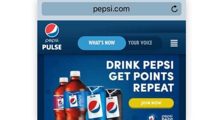
Pepsi’s mobile site demonstrates a great example of this:

Note how the big-font headline in white at the top of the page grabs your attention almost immediately. The color contrast between white and blue and the large letters facilitates easy reading. Plus, the headline is right at the end of the first horizontal movement that makes up the typical, F-shaped reading pattern common among readers on the web. All these elements work together to contribute to making the title the most important feature on the page’s hierarchy, which still maintaining the brand's ecommerce color palette.
From there, users’ eyes will drift to the yellow call to action button right beneath the headline because the color contrast is even more stark there. Because the button is smaller than the headline, however, users’ eyes should only pay attention to it after reading the headline.
The use of contrast to display hierarchy between these two page elements is a premier example of how color is used in the mobile experience to drive conversions. From here, users can simply sign up to Pepsi’s points program on the next page.
Color contrast in directional cues
As I discuss in an earlier blog post, directional cues are page elements that strongly point the shopper’s attention to your client site’s call to action button. If you’ve ever seen pages with a noticeable arrow or finger pointing at the “buy” or “sign up” button, then you’ve seen them. These are examples of explicit directional cues because they’re pretty much in-your-face!
However, color contrast can work as a directional cue as well, just in a subtler manner that’s still effective for helping drive conversions for your clients.
Remember that all a directional cue has to do is focus your shopper’s attention on the call to action button. Macy’s mobile site understands this fundamental design principle very well.
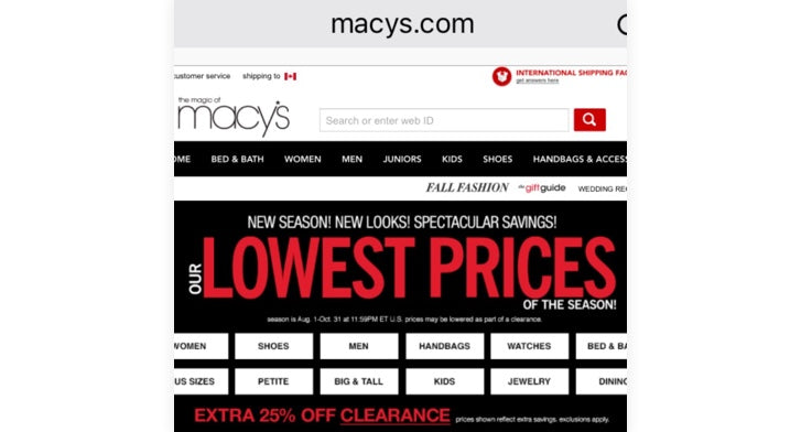
On the retailer’s mobile homepage, you’ll notice the overwhelming use of three colors: red, black and white. This isn’t by accident, of course: All three colors contrast with each other sharply and effectively.
Macy’s mobile homepage has used this contrast in various places to draw shoppers’ attention to very important parts of its site.
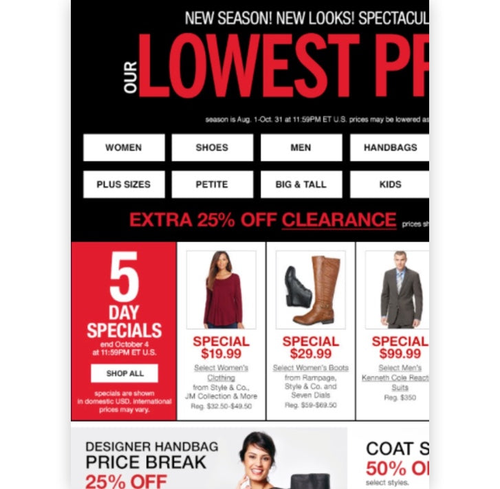
The most obvious example of a directional cue that relies on color contrast is the announcement of the store’s “5 Day Specials” on the left of the screen.

Note how the background of this section is red, but the “Shop All” call to action button is white. White on red creates crystal-clear contrast, thus directing the shopper’s eyes to the button.
But that’s not all. Further pushing this contrast is the use of a black font inside the call to action button for the copy. “Shop All” starkly stands out against the white call to action button, which, again, focuses the shopper’s attention on the desired action!
Okay, that was a straightforward example relating to a call to action. However, Macy’s also uses this very effective color contrast for its search feature at the top of the page.

The search feature is a highly significant part of every ecommerce site because it helps people quickly find what they’re looking for on your client’s site. That’s why it’s got to be easy to use on the page, and Macy’s knows this.
The search bar’s white field contrasts sharply with the red magnifying glass that, according to design-affordance best practices, functions as the search button. Anyone’s eye will easily be drawn to the search button because it stands out quite starkly. Now, if we take the concept of contrast just a bit further, we also see how the in-field description that explains what users are supposed to type into the bar is black, which sets off nicely against the bar’s white background.
Both design decisions greatly increase the chances that shoppers will understand what to type into the search bar and where to click to perform the search.
You might also like: 5 Ways to Improve Your Ecommerce Design for Colourblind Users
Color contrast to highlight images
Images are vital to the mobile retail experience. They are the next best thing to actually picking up a product with your hands and examining it close-up. Showing shoppers high-quality and super-detailed pictures allows them to see and experience exactly what they’re going to buy.
Studies have been done that show that including images on product pages boosts conversion rates. When customers can’t physically examine the products your client’s store is selling, they understandably think twice about purchasing, which makes sense. Who wants to buy something they can’t thoroughly see?
In order to highlight these all-important images on product pages, web designers also use color contrast to make them jump out at customers better, allowing them to see images sharper.
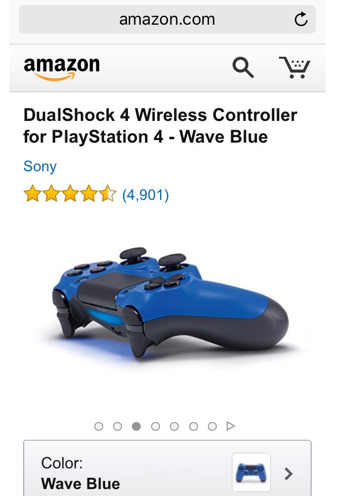
The internet's biggest online store, Amazon.com, excels at displaying images in such a way that color contrast is used to make it super-easy for customers to see exactly what they’re going to buy.
On the product page for the DualShock 4 Wireless Controller for PlayStation 4, the “wave blue” controller contrasts beautifully against the white background, making the controller more vivid to shoppers. As a result, they can appreciate what it’s going to look and even feel like in their hands when they buy it. Props also to Amazon for displaying the controller in numerous, different angles, making it easy for shoppers to imagine how they’ll interact with it once they’ve bought it.

A touch of color for better mobile ecommerce designs
A serious chunk of today’s ecommerce market is on mobile. According to the latest info from Statista.com, mobile ecommerce spending surpassed $11 billion in the first quarter of 2015. This number is higher than ever and demonstrates a spending trend that indicates only higher mobile ecommerce spending in the future. That’s why, as a designer, your mobile layout has to facilitate smooth buying from the user’s perspective. Your clients will thank you for extra tweaks and considerations in mobile design.
One easy technique you can add to your design arsenal immediately is color contrast. It doesn’t take highly technical knowledge, just a basic understanding of color theory and how contrast juxtaposes different elements on a page with great effect.
As you can see, big retailers are already using color contrast with significance and ubiquity on their mobile sites. That’s because it works! Contrast promotes the goal of each e-commerce site, which is to get sales and conversions. It helps guide shoppers and makes life easier for them when navigating on mobile sites.
If you can harness this color-contrast knowledge in different design projects, you can impress your clients and provide a lift for their conversion rates. So the next time you need to emphasize hierarchy, include a directional cue, or show off some useful images, consider color contrast for great success.
In sum, color contrast works in mobile e-commerce design through:
- Hierarchy
- Directional Cues
- Images
What’s your strategy for using color in mobile sites? Share your tips in the comments below.
Read more
- Building a Clickable Call-to-Action Button for Your Shopify Theme
- 5 Common Digital Content Problems and How to Avoid Them
- Shopify's Mobile Device Testing Lab Gets Wheels
- Enhancing the On-Screen Reading Experience With Variable Fonts
- Typography in UI Design
- The Age of Nanodesign: How Mobile Commerce is Transforming UX and CX Forever
- How to Use an Empathy Map in the Design Process
- Improve Your Design Process With These 4 Deliverables
- Paul Boag Shares a Favorite Ecommerce Project
You might also like: The Ultimate List of Online Colour Palette Generators for Web Design

