Designing a killer landing page will lead to a noticeably bigger number of conversions on your client’s product page. Designing a killer landing page will also drastically boost the number of user-data signups (email addresses, etc.) your client will collect, thus allowing your client to more successfully market to leads. When you design a stellar landing page, you empower your client’s business to earn more money, thereby making you look like a genius in the eyes of your client.
Landing pages, done well, are pure power in e-commerce: This case study shows how one well-designed landing page made $1 million for Moz, the well-known inbound-marketing and analytics company.
That’s why learning how to design effective landing pages is a skill that no web designer should be without. It is a direct path to your client getting more conversions and sales, which is the only reason you’re building a website in the first place. The better you get at it, the more clients you’ll get, the more references you’ll receive, and the more significant the projects you work on will become.
You might also like: 5 Simple Hacks for an Optimized Mobile Ecommerce Design
Two types of landing pages for different purposes
There are two types of landing pages, both equally important: the click-through landing page and the lead-generation landing page.
The former is a webpage that describes a product, service, or offer in such detail that it sufficiently entices or persuades the user to click through to the waiting product or offer page to make a purchase or sign up for the offer. The idea is that a user who’s had the chance to read and absorb all the info on the landing page will be more likely to convert once on the next page.
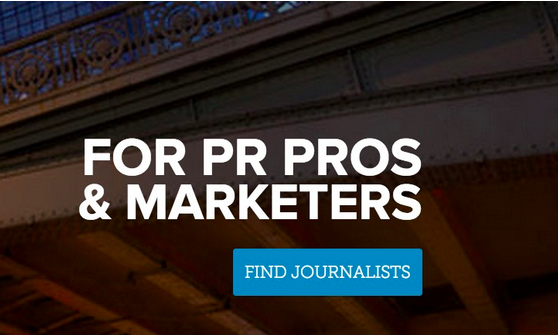
Here’s an example of a click-through landing page. Note how this long-scrolling page entices the site visitor with juicy info so that he’s primed and ready to convert once he clicks on the “Find Journalist” or “Build Free Portfolio” button.
The latter captures user-data information like names, email addresses, and other basic, personal details. The idea here is that your client’s business will receive this information, so they have the user’s contact info on hand to subsequently market to him. The lead-generation landing page has to contain a web form and a description of what the user will get in return for signing up and giving up his contact info. Typically, it’s a free gift like a white paper, free trial, case study, or an ebook, just to name a few.
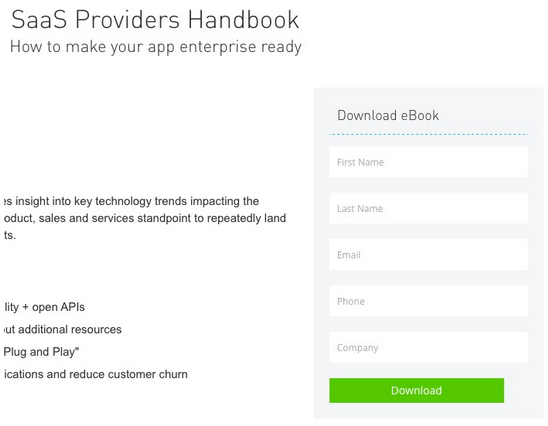
Here’s an example of a lead-generation landing page. Note how site visitors who provide their contact info will get a free ebook; the company behind the landing page then has the person’s contact info for further marketing opportunities.
Throughout this article, I’m going to run down several design elements that you should include in both types of landing pages to make them as highly converting as possible!
You might also like: How to Use Video in Ecommerce Web Design to Boost Conversions
Trustworthy testimonials
Credibility is crucial when selling on the Internet, which is why we recommend that you include testimonials from important people on your client’s landing page. Ideally, they should be satisfied customers of your client’s business, who can therefore then provide a positive testimonial of how good your client’s product or service was. These will raise conversion rates.
In fact, Visual Website Optimizer referenced a case study where WikiJob added testimonials to its landing page—resulting in a 34% increase in conversions after A/B testing the original page and the new one! Specific examples like this are golden because they reveal how powerful testimonials really are on landing pages.
If you want a stellar example of a landing page that makes brilliant use of a testimonial, look no farther than West LegalEdcenter’s. The designer of this landing page really outdid himself by presenting a superb testimonial that raises the company’s credibility tremendously.
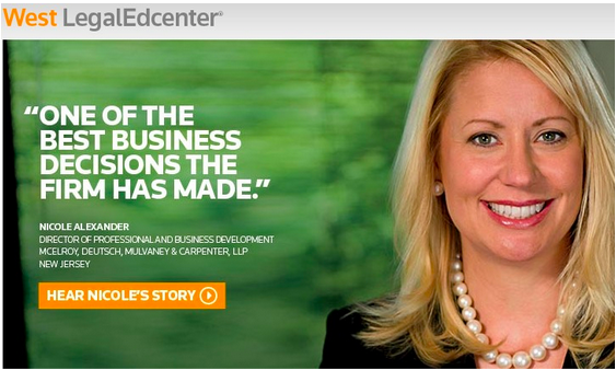
Note the quote, the picture, and the specific title/credentials of the woman, who just happens to be a high-ranking person at West LegalEdcenter’s client. Oh, and her testimonial comes in the form of a video, which is very appealing because it lets leads watch and hear the testimonial instead of just reading it, which raises credibility even further!
Friction elimination
Friction is what stands in the way of conversions. As a designer or developer, your job is to eliminate this friction as much as possible on a landing page. For inspiration on how to do this, see Wistia’s landing page.
The few fields in the form immediately stand out as pros on this landing page because shorter forms are associated with a greater conversion rate, according to Marketing Experiments. In this case study, Marketo found that its web form with just five fields had a conversion rate of 13.4%, yet when it added one more field for six in total, the conversion rate dropped to 12%!
Going back to Wistia’s landing page, we see that it has just five fields, in line with the best practices of form length.
A word of caution, though: Keep in mind that shorter forms do produce more leads, but longer forms produce higher-quality leads. Which your client wants to pursue is up to him alone.
Directional cues
Directional cues on a landing page are elements like arrows or even people looking in a certain direction. They provide that extra motivation to site visitors to convert by performing the action in the call to action button. Forbes’ Drew Hendricks reports that directional cues are a proven factor in boosting conversions and sales on pages.
With this in mind, let’s explore WebDAM’s landing page. The location of the directional cue is in the best place possible: right in the actual call to action button. This increases the effectiveness of the call to action since it offers an additional push to get site visitors to click on the button.
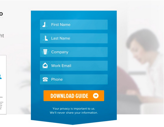
To help boost your client’s landing page conversions, add a directional cue into the page design.
Shorter landing pages
Many people on the Internet simply don’t take the time to read every word on a page. In fact, many just skim through the content as they make their way down a page. A classic and highly regarded study by the Nielsen Norman Group determined that just 16% of users read word-by-word.
Now that you know this, it’s imperative that you shorten your client’s landing page to adapt to this user behavior. ConversionXL tested this phenomenon and found that shorter pages actually outperformed longer pages when it came to conversions! You can take this vital finding and apply it to your landing page design.
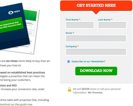
For inspiration, see Velaro’s landing page. Everything is above the fold; there’s no scrolling necessary. The page features just a few, short sentences and a really short form, to boot.
Impactful headlines
By now, it’s pretty clear that the purpose of the landing page you design is to grab the attention of visitors, so they can click through to a product or services page or leave their important contact info. Well, another surefire way to create a landing page your client will love is by including killer headlines.
Killer headlines make an impact, but they don’t have to be long. In fact, some of the shortest ones (see a pattern here in terms of brevity?) are the most effective (remember that people don’t really read on the web?). When coming up with the headline, craft copy around a typical sentiment that many people relate to and enjoy.
For instance, Airbnb’s landing page. The headline is “Welcome Home,” which makes a huge impact because it relates to Airbnb’s business of travel lodgings, uses a benevolent term everyone’s familiar with, and assures people they have a place away from home.
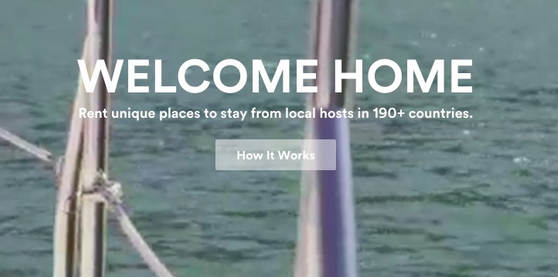
Bonus: This landing page gets extra credit for having a sub-headline that provides important details about what Airbnb does for its clients.
High-quality images
Landing pages are made stronger when you include sharp and dazzling images for people to focus on. Smashing Magazine even published an article that talked about how to use images to increase online conversion rates.
That’s because people are visual creatures, and that applies to the leads and visitors going to your client’s landing page.
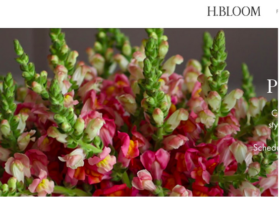
H.Bloom’s landing page shows a brilliant, high-quality mega image in the header. Not only does this serve the practical purpose of clearly showing customers what its amazing floral arrangements look like, but it also makes the page more impressive-looking.
Incorporate these best practices and start designing some high converting landing pages
Designers are always under pressure to deliver landing pages for their clients that have good conversion rates. With these tips—all of which are based on sound research, evidence, and case studies—you can deliver a landing page design to your client that’s going to convert at a far higher rate than what the average designer produces.
Since a huge part of being gainfully employed as a designer is racking up a continuous list of happy clients, you can only help yourself and your career by incorporating these elements the next time you’re designing a landing page.
When you do and produce a high-converting landing page for your client, you’ll look great, boost your reputation, and enjoy a happy client. What more could you ask for?
To wrap up, here are the vital elements designers should incorporate for high converting landing pages:
- Trustworthy testimonials
- Eliminating friction
- Directional cues
- Short landing pages
- Impactful headlines
- High-quality images
Read more
- Top 4 Tips to Tell Your Clients About Their Product Images
- How to Direct, Control, and Hold Focus Through Design
- Working With a Grid Layout: How Breaking the Grid Can Create Memorable Experiences for Clients
- 13 Web Design Trends to Watch in 2020
- 6 Design Conferences to Last You 'Til The End of 2016
- Top Ecommerce Resources for October
- 8 Best Practices for Designing an Ecommerce Site that Converts
- How to Build a Winning Ecommerce Design: An Interview with Vitaly Friedman
- Designing for Conversion: A New Course Series to Level up Your Skills
You might also like: 3 High-Impact Tips for Designing an Ecommerce Site That Converts

