Customer conversion tips aren’t just for store owners. Regardless of whether you’re a partner, designer, developer, photographer or a marketer in the industry, you need to have a good understanding of what can make or break a sale if you really want to impress your clients.
One thing that is often overlooked by ecommerce store owners is the importance of good product images. As humans are drawn to visual imagery over text, product images form a large part of a potential customer’s first impression and can lead to them checking out related products as well. Blurry, inconsistent and small product images can lose potential sales.
Here are four tips on product images to share with your client before they launch their Shopify store.
You might also like: Design Your Store Faster With Product CSVs and Images
1. Keep it simple
A simple, white background will give any Shopify store a professional and consistent look. It will draw attention to what’s being sold and match any colour, so if your client chooses to change their Shopify theme in the future, their product images won’t need replacing. Alternatively, if your client sells on another marketplace such as Google Shopping, eBay or Amazon, or if they share their product images on social media, a white background won’t clash with any other website design.
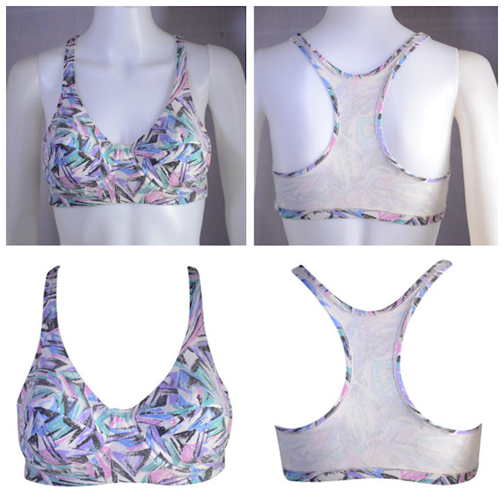
Removing the background also makes it possible to create a ghost image, which will take any online clothing store to the next level. A ghost image, or ghost mannequin effect, is where the item of clothing looks like it’s floating on an invisible mannequin, giving it a more realistic and 3D shape.
Creating ghost images takes a bit more work when it comes to both editing and shooting, and they also require the use of a mannequin or model as well as a more advanced photo-editing software like Photoshop. However, they can be really effective and help shoppers visualise the products by giving them a bit of shape. To make a ghost image, just follow these steps:
- Fit your model or mannequin with the product and take a normal photo from the front.
- Fit your model or mannequin with the product inside-out, and take a photo from the back.
- Remove the background from both product photos.
- Digitally stitch them together and save.
- Drag and drop the final image into your usual template.
Another option to upgrade clothing line photography is using online t-shirt templates or downloadable t-shirt mockup files to avoid the nuances of finding models and perfecting studio lighting.
2. Size matters
What determines the size of an image? Let’s start from the beginning and consider the basic structure of a digital photograph.
Contrary to how they appear, digital images are actually made up of tiny squares known as pixels. Each of these squares is a different colour which come together to create the picture that we see. Just like our own eyes, most images known as '24 Bit RGB' can produce 16 million different colours.
We use these pixels to determine the dimensions of digital photographs, expressed as the “width x height” of the image. Multiplying these two numbers gives you the total number of pixels in the digital image, known as megapixels. This is your resolution and the size of the image (don’t confuse this with the size of the file). The more pixels, the higher the resolution, and the larger the image. It’s that easy.
When it comes to product photography, the bigger the better. The image that your client uploads to their Shopify store acts as the base image. A Shopify template will have pre-set dimensions for the size of the image on the product’s listing page, as well as the thumbnail that appears on the shop page. It is uncommon for a template to be larger than 450 pixels on the longest size, but when you consider that the size of an average 13 inch laptop screen is about 1,300 pixels, that’s actually really small. Unless you’ve changed the settings or are using an extremely old device, most smartphones, point-and-shoots, and DSLRs will produce a much larger image.
A lot of store owners make the mistake of resizing their images to the template size before uploading them, thinking the base image must be the same size of the template. Don’t let your client fall into this trap! As long as the ratio of a product image’s dimensions match those of the template, the image will be automatically displayed at the size of the template without any awkward cropping or blocks or space around the side, preserving the size of the base image.
Why is this important? One of the best ways to improve the user experience of a customer is for your client to install a zoom feature. Regardless of whether it’s a click or hover zoom function, when the customer zooms they are actually just viewing the image at its full size – it’s not a magnification or ‘zoom’ as the name suggests. This means that if your base image is the same size as your template, the zoomed image will be the same size as that displayed on the product listing… so much for improved user experience. It is recommended that your product image should be anywhere between 1,200px and 1,600px on the longest side.
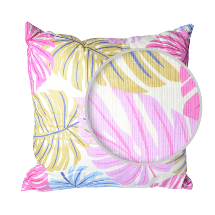
And when it comes to the template itself, this article by Econsultancy outlines three case studies where bigger images have proven to increase conversion rates. When Skinner Auctions increased their product images from 250 to 350px wide, 63% more visitors clicked to start the bidding process and 329% more bidders filled out the online forms needed to place a bid – that’s huge! VWO also did an A/B test on product images and found that larger images increased sales by close to 9.5%.
You might also like: Ways to Customise the img element in Shopify Themes
3. Consistency is key
A white background is just the first step to giving your client’s Shopify store a clean, consistent look. Suggest to your client that they create a template; it will save them time cropping, resizing, and judging the consistency of their product images by eye.
Creating a template in Photoshop is the best way to go, and requires just a few simple steps.
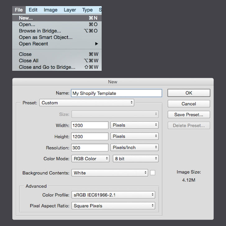
- Create a new file by selecting File > New…
- Name the file and choose the dimensions for the base image.

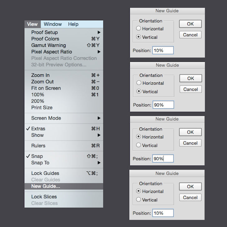
- Start creating guides by selecting View > New Guide…
- For the product to take up 90% of the canvas, create vertical and horizontal guides for 10% and 90%.

- Create a vertical and horizontal guide for 50% to make centering the product easier. The template is ready!

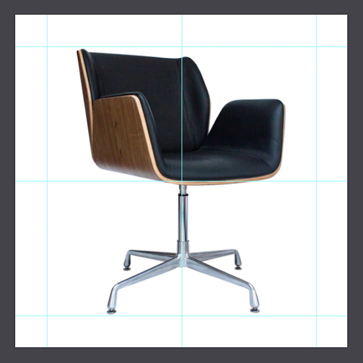
- Open the product image on Photoshop.
- Drag the product image into the template.
- Adjust the size of the product until it meets the guidelines by using the Free Transform Tool (Ctrl + T or Command + T). The product needs to touch two opposite guides, depending on whether it’s longer vertically or horizontally.

- Save the image as a JPEG of maximum quality (12) and it’s ready to go!
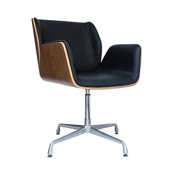
If your client doesn’t have access to Photoshop and edits their own photos, suggest they create a template in Canva or use the free photo editing software, Gimp. They will have to centre and resize the product by eye, but at least all products will be placed into the same base image template.
4. Less is not more
When it comes to online shopping, one of the biggest causes of consumer purchase resistance is the inability to visualize a product. Encourage your client to take multiple photos of their product; your client will appear confident in what they’re selling and as a result, the customer will be confident in what they’re buying. Products that don’t meet the customer’s expectations for whatever reason can be damaging to your reputation and you’re likely to lose the sale, lose the customer and get more returns.
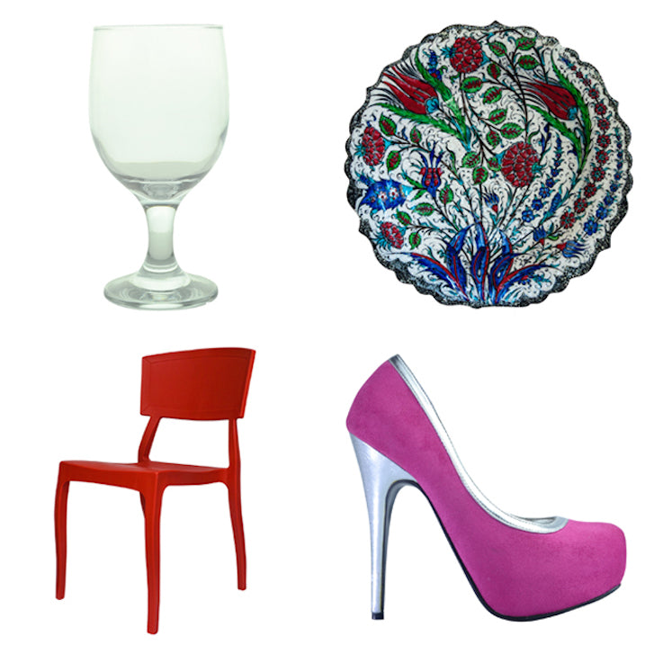
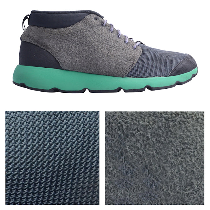
Get your client to start off with a ‘hero image’. This photo will be the first of a series under your product listing and represent the product itself on the ‘shop’ page. Usually, the hero image is a front-on shot of the product, but there are a few exceptions; shoes are usually taken from the side, plates from above, and chairs from a 45 degree angle.
Following on from the hero image, It’s important to add a series of photos that will online shoppers visualize the entire product, most importantly close-ups of special features or textures and shots from alternative angles.
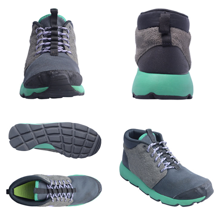
The best way to end a series of product images is with an in-context photo. If you’ve ever flicked through a furniture catalogue and wanted to buy an entire room, or flicked through a lookbook and realised you need that entire outfit, you’ve witness the power of in-context photos firsthand.
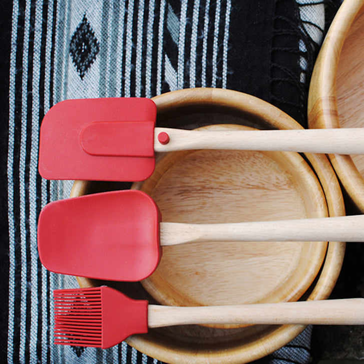
An in-context shot is a well-composed photo of the product complemented with people, nature, food, a textured background or even other products. Combining elements to create an in-context photo will help your client convey a certain quality, tone, or mood that will influence the viewer’s perception of your client’s product and ultimately their Shopify store.
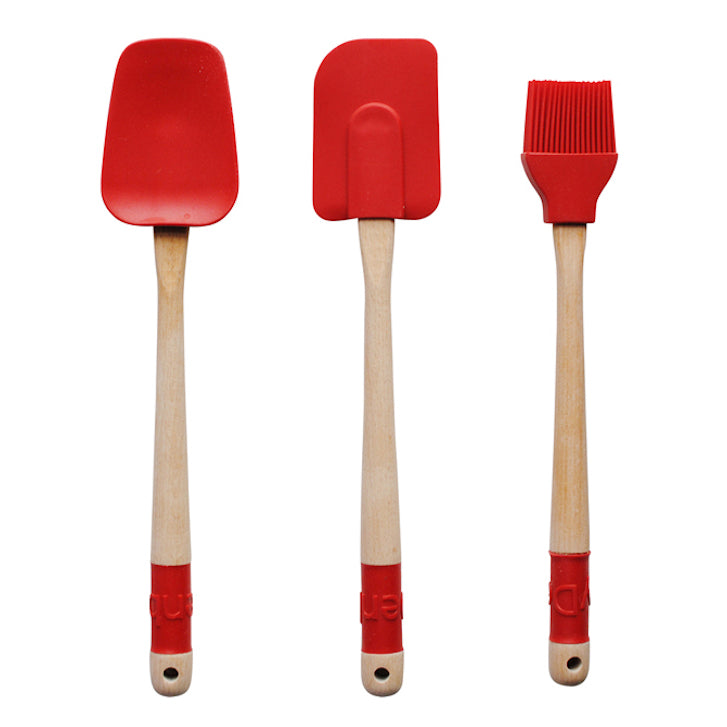
Have a look at the spatula set below. The first photo is a great example of a hero image; a front-on shot with a clean background and a centred product that takes up 80-90% of the canvas. The second photo is a great example of an in-context shot for that particular product. The combination of colours and arrangement of the spatula set, the wooden bowls, and the tea towel give off a warm and homely vibe, which is exactly what your client needs to convey if they sell homeware products.
Share these four tips with your client and watch as their Shopify store starts to look much more professional. Feel free to ask any questions in the comments or shoot us an email and we’ll do our best to help!
Read more
- How to Direct, Control, and Hold Focus Through Design
- Designing With Customer Service In Mind Above All Else
- Top Ecommerce Resources for December
- Working With Technology Clients: Strategies, Apps, and Themes to Consider
- Top Ecommerce Resources for October
- Top 10 Trends in Mobile Design in 2018
- Color Psychology: How Color Influences Decisions
- Top 13 Web Design Conferences You Should Attend in 2016
- 4 Things to Consider When Designing Wholesale Stores for Clients
You might also like: Shopify Tutorial: The product.liquid template

