Balancing creative design with functional UI is a challenge for developers looking to build memorable experiences for online stores. Many clients want a site that makes their products stand out, while at the same time performing how customers would expect.
Established page layouts that rely on grids are the norm for most websites, but some designers have been experimenting by ‘breaking the grid’, to introduce dynamic effects and grab customers’ attention. Since traditional grid layouts are ubiquitous across the web, a site that attempts to present a unique experience can emphasize a brand’s visibility and boost conversion.
With careful use of asymmetrical positioning of text, overlapping images, and irregular shapes, you can add originality into a client's site without sacrificing usability . In this article, I’ll outline some of the ways to break the grid and explore some real-life examples to show how broken grid design has allowed brands to engage with customers.
What is a grid and why should we break it?
Before breaking the grid, we need to learn about the grid itself and explore its advantages and disadvantages. In simple terms, a grid is a structure for arranging text and images on a screen. The purpose of the grid is to establish a rhythm, or framework, for how elements should be organized.
Almost all of the websites we visit use grids to ensure that text, images, white-space, and navigation buttons are all arranged and sized relative to each other. Grids provide a guideline when designers are wireframing their pages, and define a visual language that enables visitors to understand content and navigate a website.
One of the most popular forms of grids found online is the 960 grid system, which according to 960.gs, is “an effort to streamline web development workflow by providing commonly used dimensions, based on a width of 960 pixels.” This is a highly divisible number, so the layout opens a lot of possibilities when determining the dimensions of elements on a page.
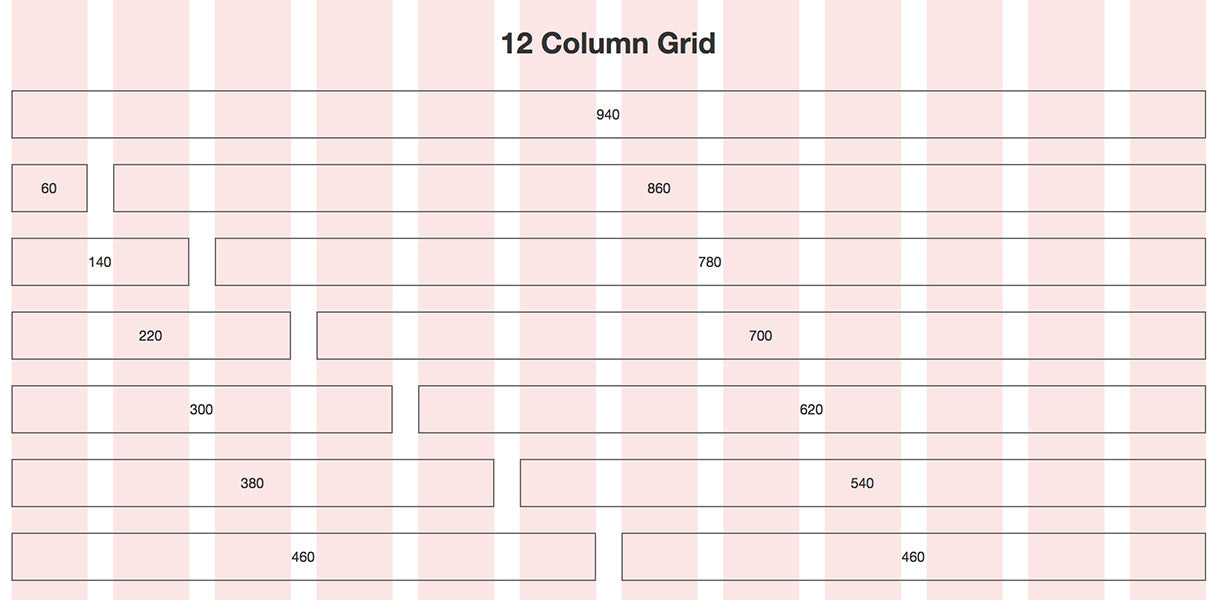
When elements are arranged according to this defined grid, it gives the placement of buttons and images a sense of familiarity. Grid systems like 960, or Bootstraps responsive framework, have made the jobs of designers immeasurably easier, but they have also had a homogenizing effect on web design.
The potential disadvantage with a grid system like 960 is that it can remove some of the creativity of design. The layouts that we are accustomed to seeing online are consistent, but they can also feel predictable and restrictive.
Ways to break the grid
Developers who approach the grid as a guide, instead of an absolute rule, have the opportunity to do something different , and bring their client’s personality into the design. Here are some techniques that you can consider when you are thinking about breaking the grid.
Unusual positioning
It might go without saying, but the easiest way to break the grid is to position elements in ways that are non-relative to each other and don’t follow a linear layout. By playing with how images and text are arranged on a page, designers can build impressive pages that ignore tradition in favor of inventiveness.
New York designer Michael Nelson hosts a particularly good example of unusual layout with text, headers, images, and white space all existing in a seemingly random arrangement. The irregular shaped header, inconsistent alignment, and ‘cut-out’ imagery gives the site the feeling of a digital scrapbook, and invites a curious customer.
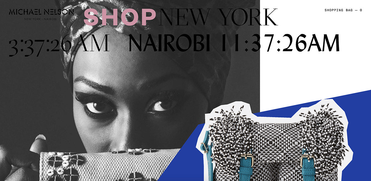
The layout of the store matches the bold design of Michael Nelson’s bags, with bright shapes, asymmetrical elements, and striking lines. Just as his bags are unique objects, so too does his site deliver a unique experience.
Initially, the homepage seems totally chaotic, and it’s surely a website customers will not forget in a hurry. Key components, like the shopping cart button and terms and conditions, do, however, appear in areas where a customer would expect them, proving that designers can get experimental without abandoning the basic UI principles of web design.
Using layers
Layering different elements on a page can give a pleasing collage effect, and breaks the grid without sacrificing unity. When elements are clustered or overlapped, they feel connected and we interpret them as one main object.
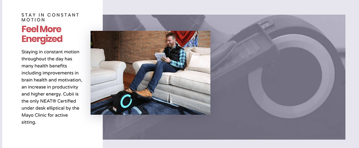
Cubii do a great job of layering background animation, product imagery, and text to create an experience that feels more like reading a magazine than scrolling down a regular webpage. The use of animation here adds another level of dynamism and emphasizes the importance that motion plays in their overall brand.
Another great example of how layers can play liberally with the grid is Stories & Objects designed by Mote, which mixes symmetrical and asymmetrical elements on their homepage. The customer can see that a grid does exist along the middle, but the individual products are offset against each other, creating an irregular spacing effect.
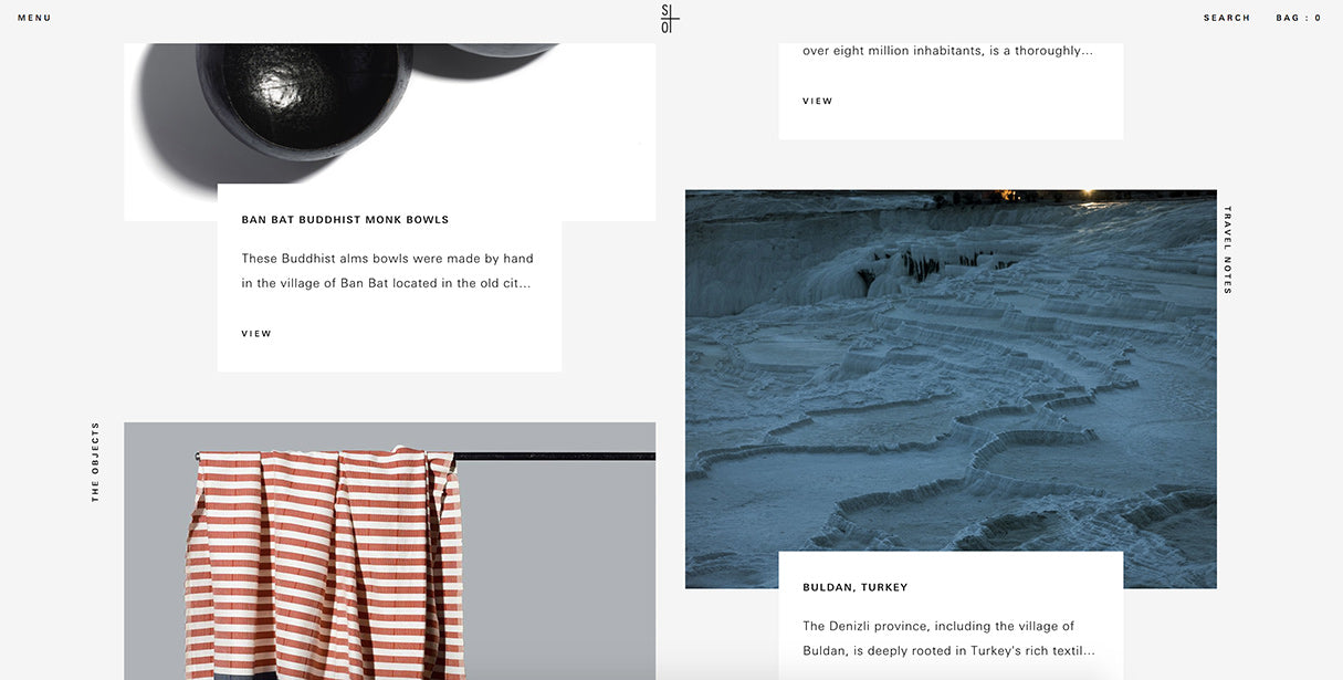
Impressively, Mote are aware that this effect may not translate well to the mobile experience, and so the layout is a traditional product list when viewed on smaller screens. The lesson here is that responsiveness shouldn’t be forgotten when experimenting with different grid layouts.
You might also like: Build an Eye-Catching Non-Rectangular Header Design.
Subtle touches
Breaking the grid doesn't always need to be a dramatic statement—some designers use minor embellishments to add some originality to a page. These small details can make a page instantly more engaging, without risking conversions or sales.
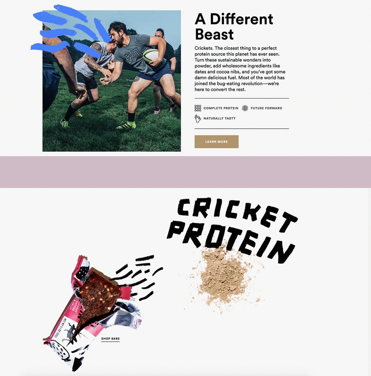
Energy bars are a popular online product, but Exo’s playful site design allows them to stand out from the pack. Commonplace product orientation is avoided, as the designers have literally drawn outside the lines to evoke a humorous, yet active, mood.
These lines and drawings show that Exo are thinking outside the box, and it also ties into the overall aesthetic of their brand imagery. Smaller touches like these illustrations add decoration to websites and give brands an opportunity to express their identity in a visually appealing way.
One area where some creative flair can break up the monotony of grids is on the collection page. It’s hard to escape grid layouts on collection pages, but Phoebe James uses irregularly-shaped imagery to successfully introduce variety to their collection pages.
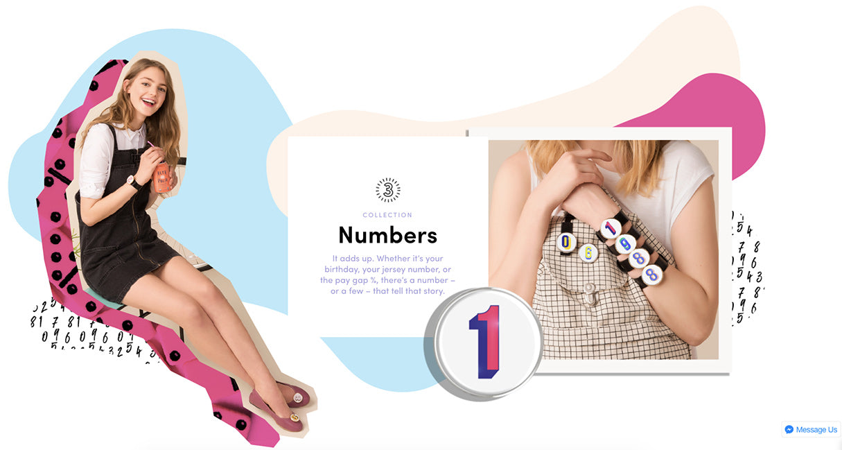
Designed by SMAKK Studios, the site defies customer expectation with eye-catching patterns and colors on a page that can be the most challenging to personalize. Products still appear in a grid, and the page remains functional, but the abstract shapes and cut-out effects add charm and allows the brand to tell its story in a creative way.
Breaking with care
As we’ve seen, stepping away from an overly-structured approach can produce unexpected results and generate opportunities for brands to showcase their personality. It’s important, however, to be mindful of where breaking the grid will and won’t work. Some industries welcome innovative design more than others, and a broken grid layout will simply not suit some clients.
Breaking the grid also doesn’t mean abandoning typical UI conventions. It’s crucial that online stores remain accessible and easy to navigate, even when trying out an experimental approach. It doesn’t matter how inventive the page is—if a customer can’t purchase a product, the design is not successful.
Finally, testing your design on various screen sizes is crucial for ensuring that none of the functionality is lost on smaller devices. With the right approach, breaking the grid can bring your clients closer to their customers and produce unique storytelling opportunities.
Read more
- A CSS Grid Framework for Shopify Collection Pages
- Top Ecommerce Resources for October
- Product Photography Tutorials — Master Ecommerce Images with These 6 Post-Production Techniques
- Top Ecommerce Resources for August
- 13 Web Design Trends to Watch in 2020
- Designing Social Proof Into Your Ecommerce Website
- Top Ecommerce Resources for September
- 6 Design Conferences to Last You 'Til The End of 2016


