Everyone here knows the importance of good web design. But with attention spans seemingly falling by the minute and competition ever on the rise, it's never been more vital that users are kept interested and engaged.
Isn’t it annoying when visitors veer randomly off the path you’ve laid for them? Have you ever wished you could reach out through your website and guide the visitor through it? You may not be able to hold each visitor's hand but—using clever design—you can hold, and steer, their attention.
Together, we’re going to explore five easy ways to increase engagement and conversions through some simple design hacks.
1. Make the most of movement
Animations cover everything from scroll effects to slideshows, and have huge potential for grabbing users’ attention and increasing the time they spend on pages.
The first and most obvious use of animation is to feature video on your site. Videos come with shining, golden promises attached to them—for example, the fact that using video on landing pages can increase conversion rates by up to 80 percent.
This may be an exciting prospect, but to pull off that kind of uplift, you need to use video right. When used poorly, videos can be distracting, annoying, and increase page load speeds unnecessarily. Instead, grab and hold attention by following a few of these handy tips:
-
Be ruthless. Research has shown that the ideal length of a video is under two minutes long. If you have a video that’s 30 seconds over that two minute mark, cut it down.
- Take a look at your site’s content, and decide which type of video would benefit your clients the most. Does the business revolve around the team behind it? Include an “about us” video. Is it an online store? 96 percent of online shoppers find videos helpful when deciding what to buy. Make sure your video reflects and adds to the site.
-
Be careful of autoplay, especially with sound. A huge 82 percent of people have exited a webpage because of an autoplaying video advert, so make sure you grab your user for the right reasons. As well as being annoying, autoplay can also be confusing for visually impaired people, as they don’t work well with screen readers.
-
Include a CTA in your video. Don’t leave your visitor wondering where to go next—include a call to action, whether that’s encouraging them to buy, sign up, or simply learn more.
- Tell a story. Whether you’re simply demonstrating how your client’s product works, or appealing to your visitors to donate money, try to create a story with your video. This helps create a stronger connection with your brand, as well as engaging viewers—who doesn’t love a good story?
These are the five key elements you should think about when creating video for your webpage.
Below is an example from the Shopify-built store Raven Roxanne, which features a video on its homepage that shows the artist creating her work. This is perfect for showing off the heart of the brand, and for creating a connection with the user.
This video auto-plays, but leaves the sound as an option for you to turn on, which works well.

Animations don’t have to be in your face to grab attention, and of course, they don’t always come in the form of video.
Good web designers know when to hold back, so try out subtle shakes or bounces of buttons, call to actions, or even navigations, to encourage the visitor’s movement through the site. Don’t let them wonder where they should click next.
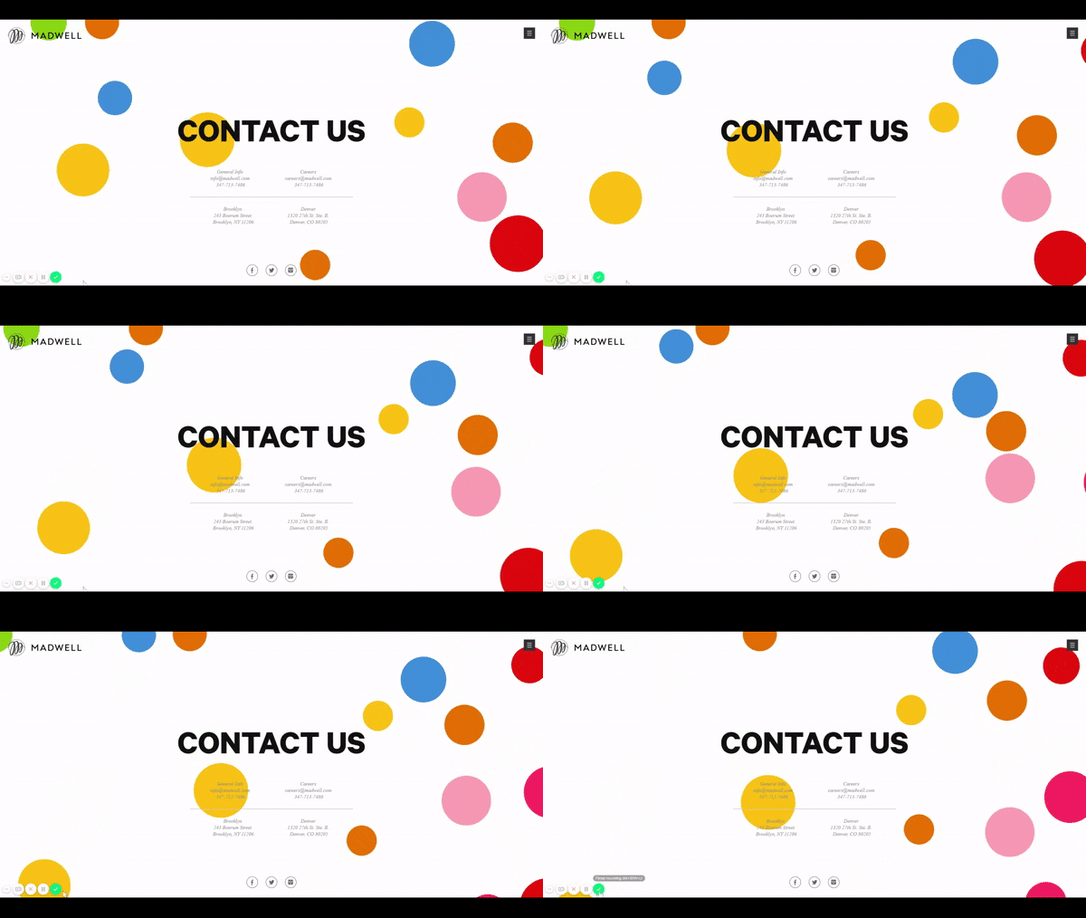
A great example of a site that makes animations a part of its design is Madwell, a creative advertising and marketing agency.
"Good web designers know when to hold back."
Below, you can see how its Contact Us page has colorful bubbles bouncing off each other in the background. It’s simple, it’s bright, and it turns an otherwise bland page into something inviting and engaging.
2. Use directional imagery
Images are an important part of keeping users engaged, but they can also help direct attention and even encourage sales. The following advice will help you use images to achieve that goal.
Use “real” and relevant photos
A study conducted by Jakob Nielson found that users pay close attention to photos, but only if they’re relevant and add information to the page. Meaningless stock photos will be ignored, and represent a huge missed opportunity.
To make the most of your images, use real people. One of the major findings of Nielson’s study was that stock images of models garnered very little attention, whereas “real life” people received a lot more focus.
"One of the major findings of Nielson’s study was that stock images of models garnered very little attention, whereas “real life” people received a lot more focus."
How do pictures of real people add any information to my site? I hear you ask. It’s a valid question, and one that deserves a creative answer.
Play around with photos of people using your product, feature an image of your target audience (whether that’s babies, pets, or businessmen), or take the chance to include real-life testimonials like the example below.
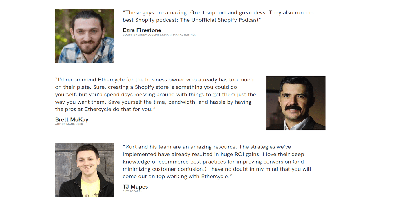
These testimonials appear on the site Ethercycle, which has placed photos alongside its clients’ positive reviews. This helps to engage the user and places extra emphasis on the testimonials.
Take the time to find imagery that works for your style, and which complements the content of your website.
You might also like: Symmetry vs. Asymmetry in Layout Design.
Direct the gaze
Another key tip here is to be mindful about where people in your images are looking. Various heat mapping tests have shown that people follow the gaze of people in photos. If you have a body of text, or a CTA, next to an image of a person, you can direct the user’s attention by employing this tactic.
You don’t even have to be that subtle about it—signs and fingers pointing to the place you want your user to focus on are also effective.
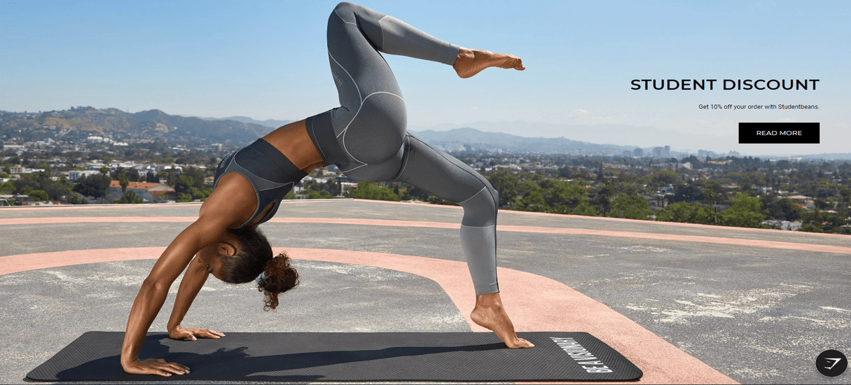
In this example from Gymshark, it’s the woman’s pointing foot that directs your attention to the student discount CTA. Don’t have the person in the image looking directly out at the audience if you have a CTA or important content next to the picture. You’ll likely find that content will get ignored.
Furthermore, always make sure your images are adding something to the page. Otherwise, they’ll get dismissed as “fluffy” or ornamental. For example, don’t just throw in a picture of a pointing salesman if you’re selling pet food. Instead, place a picture of a puppy staring lovingly, dribbling if possible, at the call to action button next to it.
My final tip on using imagery to direct your user is to place pictures to the left of text where possible. People are distracted by images, which you can use to your advantage. However, don’t let these images take over your page—place them carefully, thinking about where they’ll pull user focus. If you always put images to the right hand-side of text, your user’s eyes might skip the written content and go straight to the picture.
You might also like: Microinteractions: The Importance of Micro-Moment Design.
3. Play with contrasting styles
Contrast doesn’t have to mean clashing. Whether you make use of contrasts in color, size, space, shape, or a combination of these things, contrasting styles can help guide the user through your webpage without them even realizing what you’re doing.
White space
One of the unsung heroes of web design is white space. You can use white space to emphasize and draw attention to important parts of your webpage, setting it apart and showing it off. This could be an important bit of text, a call to action, a best-selling product, or a video you want your visitors to watch.
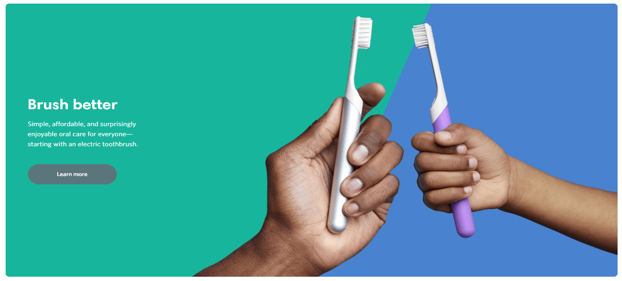
White space doesn’t actually have to be, well, white! Here, on the Quip website, white space shows off the product while giving you a small bit of information. It’s instantly eye-catching, and shows you what the product looks like straight away.
Think about how you pay more attention to a single line on its own than in a block of copy. That’s white space in action!.
White space doesn’t work everywhere, though—otherwise, it wouldn’t contrast with the rest of the page and draw attention. Be sparing and savvy in your use of white space.
"Be sparing and savvy in your use of white space."
Color
Another key player in contrasting styles is, of course, color. This is especially important when designing call to action buttons. Not only should your call to action button contain contrasting colors to make the text easy to read, but it should also contrast with the rest of your page.
For example, say your primary color palette is green and white. Having a bright green CTA may sound great in theory, but it’s not going to pop or stand out to your users. To draw attention, your CTA should be a bright, contrasting color, such as red.
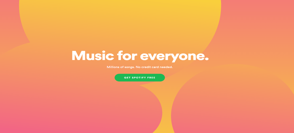
This is pretty much the entirety of Spotify’s homepage. It uses contrasting colors to draw your attention straight to the green call to action in the center of the screen.
4. Establish hierarchy with size
Size can technically be included in contrasting, but it’s such an important factor of controlling your user’s focus that it deserves its own section.
Headings
Size shows users what’s important on a page, drawing attention straight away. The most common method of using size to establish hierarchy on webpages is using headings in text.
Using larger text for headings and subheadings makes it easy for visitors to scan the copy, and immediately feel comfortable following the structure of the page. Endless rows of tiny text will have your users’ attention spans withering up and dying before they’ve finished the first sentence. And that’s if they bother to read the first sentence at all!
"Endless rows of tiny text will have your users’ attention spans withering up and dying before they’ve finished the first sentence."
Visitors want to pick out the most important bits of information instantly. Headings make that job easy for your users.
Large headings (H1s/H2s) followed by smaller subheadings (H3s/H4s), followed by smaller text, make it easy for users to jump down the page, following the structure you’ve laid out for them.
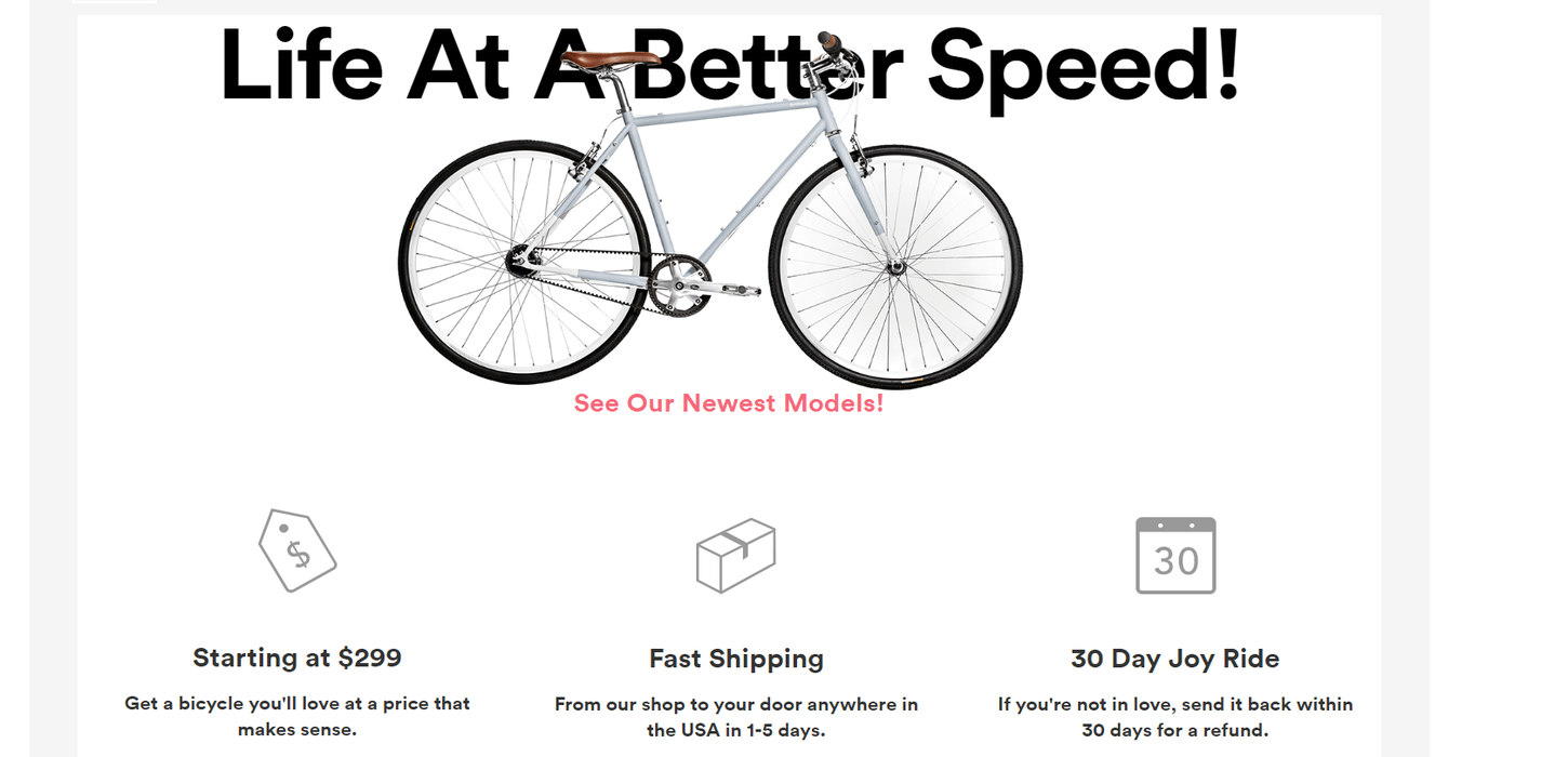
Above is an example from the Brilliant Bicycle Co. website, which makes use of bold and different sized text to create an impact for visitors. The main heading is the largest, and draws your eye immediately. Key information is then picked out in bold and highlighted with icons below, with even further detail in smaller text underneath.
This tells users exactly what they want to know, and is a great example of page hierarchy.
Experiment with element sizing
Another way of establishing hierarchy is by making the key elements of your site larger. Make a list of the most important factors of your site. Why are people visiting your site? What are they looking for? What are the first things they should see?
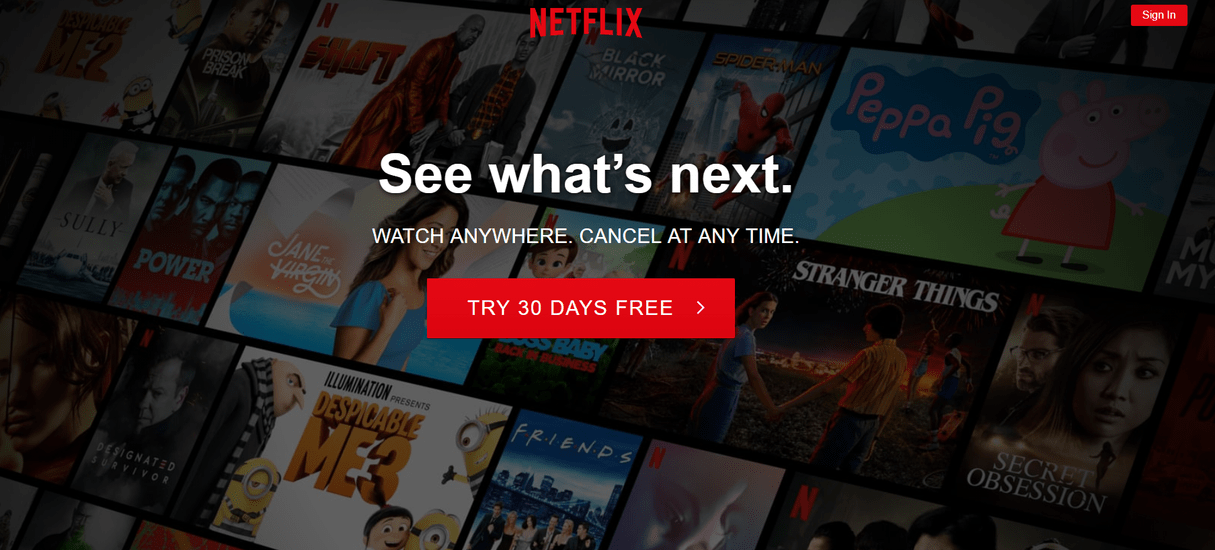
This is a bold example from Netflix. The aim is to get users to sign up, so the commanding “See what’s next” is in large copy, with the large, red CTA sitting beneath it. There’s very little else on the homepage—as browsers, we’re left with no doubt about the action we’re meant to take.
Now look at your web page, and see what jumps out at you first. Elements such as your logo, site title, and calls to action should be large enough to draw attention. These are likely to be the areas your users’ eyes will go to first.
Next, make sure you’ve structured the rest of the page to catch their attention once they’ve finished looking at these areas.
The best ecommerce platforms will give you a layout that automatically emphasizes these important areas, but it's up to you to make sure that the entire design works to keep the visitor's attention on the page.
You can also apply this strategy to your navigation menu. Are all your pages equally important? Probably not. Structure your menu so your most important (and highest converting) pages appear larger than your lower priority pages.
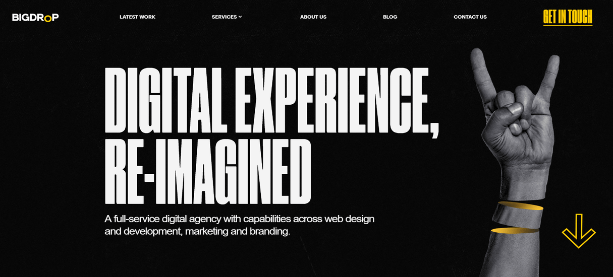
Design agency Big Drop Inc. is a great example of how effective playing with size can be. Big, bold headings combine with large arrows—and notice how the “Get In Touch” button is much larger than the rest of the menu options.
Design for the long term
Size is most effective when you’re weaving it into your web pages to establish a sense of hierarchy. You can use size to blast your visitors with huge pop-ups, calls to action, or adverts, but it’s not going to have long term benefits, because it won’t hold or guide your visitors’ attention.
Instead, use size to guide their gaze down your page, highlighting the most important elements. You can enlarge anything you think will benefit your user or encourage sales, including quotes, sign up forms, testimonial boxes, and call to action buttons.
5. Sprinkle emphasis
I truly believe that every tip in this list is vitally important for web designers hoping to increase engagement and hold their users’ focus. But have you noticed I haven’t bolded every sentence, or “shouted” everything at you?
Eking out emphasis makes it more impactful and memorable—this goes for bolding and italicizing text, but also applies to the design tactics I’ve described above.
"Eking out emphasis makes it more impactful and memorable."
You probably don’t need me to tell you that if you make everything red on your web page, that emphasis is going to be lost. But if you keep your colors neutral and have one bright red banner advertising your summer sale, this will have a much greater effect.
The point here is, don’t get carried away with your contrasts, sizes, animations, and more. Cram them all in together all at once, all over your web page, and it’ll be totally overwhelming. Be stingy, and only use them where you think they’ll have the biggest impact.

Here’s an example from the Informal Tea Co. website, which uses various techniques. Notice how it plays with font size, white space, image size, and CTA contrast.
Hold your user’s attention
Attention spans may be getting shorter, but people aren’t converting any quicker to make up for it. The techniques I’ve outlined above should help you design a site that not only grabs attention in those vital first few seconds, but then holds it and guides the user through your site until they’re ready to convert.
Where do you start with this? The first thing you should do is make a list of the main actions you want people to take when they visit your client’s site. Buy products? Sign up to a mailing list? Fill out a form to get a personalized quote?
Everything you do should then build towards this action. Whether you decide to put a testimonial video on the homepage, or change the colors of the CTAs, you should always have your user in mind.
Every site is different, of course, and I hope you enjoy trying out these tactics to find the ones that work best for you, your client, and their sales.
Read more
- How to Build a Winning Ecommerce Design: An Interview with Vitaly Friedman
- Top Ecommerce Resources for October
- How Understanding a Brand Mission Will Make You a Better Designer
- How to Use Video Footage in Web Design
- Top 5 Features to Include When Building a Successful Fitness Site
- Top Ecommerce Web Design Trends from January
- 14 Image Tools for Web Developers in 2017
- Working With Technology Clients: Strategies, Apps, and Themes to Consider
- 4 Things to Consider When Designing Wholesale Stores for Clients
How do you hold user attention through design? Share your thoughts in the comments below!

