Well-designed products are the barrier to entry. But visual merchandising takes your business to the top. It’s what gets customers into your store and spending money.
Not sure how to get started with visual merchandising? This guide will walk you through the ins and outs of creating effective store displays to catch your customers’ attention and get them to make a purchase.
What is visual merchandising?
Visual merchandising is the process of planning, designing, and displaying products to highlight their features and benefits. Its goal is to attract and motivate customers to buy something.
Understanding visual merchandising
When walking into a typical retail store, you’ll likely notice tidy, curated product displays that visually highlight items for sale. Those products aren’t arranged that way by accident—the merchant is using visual merchandising best practices to help the products sell themselves.
Essentially, your retail space has to be your most productive and most efficient salesperson, and visual merchandising employs the art of optimizing your retail store and visual displays for maximum revenue.
Yes, the discipline requires a sense of aesthetic, but it’s also a science—visual merchandising is a tried-and-true strategy with results you can replicate in your own retail store.
However, it’s also important to recognize that the field of visual merchandising encompasses a lot of distinctive retail design topics. Best practices cover everything from creating effective window displays that draw the eye of prospective customers to the signage you put up to your store layout and much more.
Benefits of visual merchandising (condense into bullets)
Now that you know what visual merchandising is, look at why retailers should think about this retail merchandising process when designing their brick-and-mortar stores.
- Higher sales: Visual merchandising helps show your brand personality and attract the right customers. Once you capture that audience, you can focus on different product exposure strategies that sell for you.
- Customers spend more time in store: Retailers can influence how much time a customer spends in-store and the choices they make. In-store experiences can create “touch moments” where people interact with merchandise. This could be holding a plant pot, sitting in a comfy chair, or trying on and using sample products.
- More social clout: Great visual merchandising inspires shoppers to share photos of your shop online. Shoppers can post Stories or photos of your products and setup on their feeds. This gets your brand in front of a wider audience that’s more likely to buy.

Free Download: Store Layout Templates
Trying to decide which layout is right for your store? Download these free templates to learn which types of layouts work best for different industries and draw inspiration for your own design.
Types of visual merchandising
Window displays
One common and effective form of visual merchandising is the window display. A good display will grab a passerby’s attention and encourage them to enter your store. Retailers use window displays to present new products, highlight promotions, and show off their brand personality.
Creativity in a window display is crucial for a small retail business. You want to show your products clearly. This will let passersby see what you’re selling and attract the right customers.

“Humans have a subconscious attraction to striking visuals. Window displays not only grab their attention, but help them envision how products will look on them or in their homes. These displays inspire would-be customers and make it easier to buy once they are in-store,” José Monsivais, Art Director and Visual Merchandiser for DiMarco.
💡 Window displays are crucial to visual merchandising and often the first interaction with potential customers. Read about these unique window displays to get inspiration for your own store.
Interactive displays
Retailers are always working to create unique in-store experiences. A recent trend has brought the physical and digital worlds together through interactive experiences and digital signage. They work because interactive elements move and change, which draws shoppers in and gets them to interact with your brand.
These displays include big investments such as smart vending machines with large touch screens, smart mirrors, and VR showroom displays, as well as smaller (and equally effective) tactics, such as a customer-controlled store playlist and getting product recommendations from a chatbot.
Mannequins
Mannequins are the classic form of visual merchandising. They are effective because they mimic the human body and can be stylized heavily. Retailers can choose mannequins based on their customer base, through gender, size, and shape.
Mannequins can be bought online for an average of $60 and $600. They are available in exact measurements and various materials, so you can find a set that matches your target customer.
Checkout displays
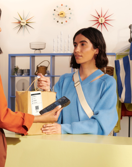
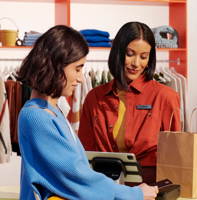
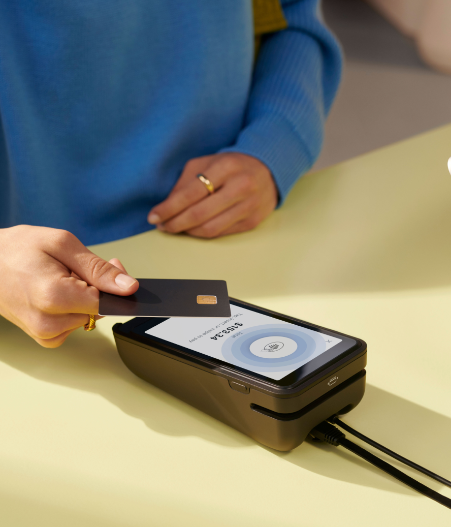
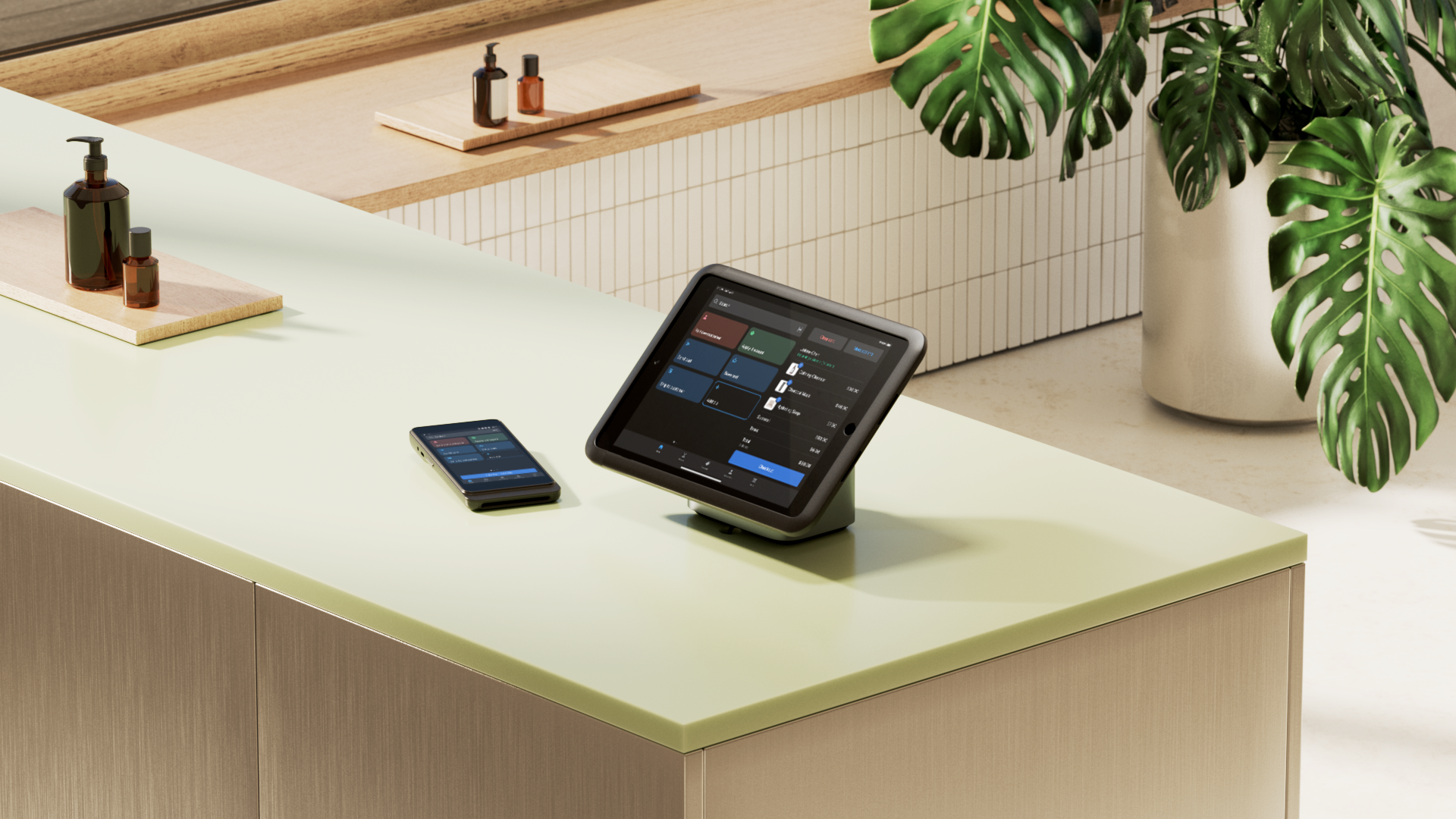
Checkout is often forgotten when thinking about visual merchandising yet it’s the one area every customer interacts with when they go to buy something. Checkout displays are powerful enough to attract new customers from outside and encourage impulse buys.
Create a checkout display like you don’t have any employees. Does it represent your brand? Does it promote small, affordable upsells that benefit shoppers? Treat checkout like any other area of your store and you’ll see higher average order value and revenue.
💡 Planograms are detailed drawings of your store layout with special attention on product placement, and they are an important visual merchandising tool. Read this post to learn more about what planograms are and how to use them.
Outdoor signage
Outdoor signage is any sign placed outside your business. It acts as the first point of contact between you and passersby. Billboards, banners, A-frame signs, and even digital screens are common types of outdoor signage.
Use clear, concise messaging with easy-to-read fonts and high-contrast colors with your signage. Position signage in high-traffic areas so more folks can see them. And, of course, keep them updated with the latest promotions or information.
Seasonal displays
A seasonal display is a temporary arrangement of products or decorations that reflect a particular holiday or season. Themed displays can trigger impulse buys by reminding customers of upcoming events or holidays.

Some examples of seasonal displays include:
- Christmas
- Halloween
- Back-to-school
- Black Friday
- Summer Sales
- Chinese New York
- Fall Fashion
- Mother’s Day
For example, a stationary store may set up a Valentine’s Day window display to sell more greeting cards and chocolates during the holiday. They can showcase new arrivals and encourage customers to buy holiday-related products.
Visual merchandising tips
- Consider the five senses
- Think about color schemes
- Use white space
- Show, don’t tell
- Be smart with lighting
- Follow the rule of three
- Group related products
- Look at the bigger picture
- Promote special offers
1. Consider the five senses
It can be easy to focus on just creating visually stimulating product displays and forget about the other four senses.
But the secret to an engaging and immersive shopping experience is to create a multi-sensory encounter, or what’s known as “sensory branding.” Let's take a closer look at how you could go about doing just that:
- Sight: There are an endless array of visual cues you can play around with to communicate your message. From using colors for their psychological triggers to leveraging lighting, symmetry, balance, contrast, and focus to direct and control where a customer looks and for how long. It’s one of the fascinating components of smart merchandising.
- Sound: The music you play in your retail store has a profound but subtle effect on how your customers behave while shopping. Depending on who you’re targeting, you can slow people down by playing more mellow music, causing them to browse.
- Touch: This one’s probably the easiest to get right. Retailers just need to remember to give customers the ability to touch, feel, and try out whatever it is you’re looking to sell.
- Smell: Believe it or not, there’s an entire science to what’s referred to as “scent marketing,” with several real-world case studies of global brands like Samsung, Sony, and Verizon applying it to their advantage. Smell is a fast-track to the system in your brain that controls both emotion and memory—two very prominent factors behind why we choose one brand over another.
- Taste: This can work magic if you happen to be in the business of selling consumables. Giving customers the ability to sample products before they buy is the equivalent of letting people try on clothes—it’s a highly effective best practice.
2. Think about color schemes
Color is one of the most important elements of visual merchandising. It attracts attention, expresses meaning, unites the environment, and influences buying behavior.
Color palettes are specific to each store and can build emotional connections with shoppers. Aim to use contrasting shades like black and white. Or try monochromatic colors, which are all shades based on one color. An example of this is using pink, red, and maroon for your store.
When deciding on a color palette, ask yourself:
- What’s the image and feeling I want to create? For example, if you’re creating a boho-chic boutique, you’ll want to consider earthy tones to show the brand’s passion for nature and freedom.
- Who’s my target market? Different customer groups have different color preferences. You’ll want to use colors that they are attracted to and avoid colors they won’t enjoy.
- What colors are my competition using? For the sake of standing out, you don’t want to use the same color patterns as your competitors.
3. Use white space
White space refers to areas of your store that don’t include any design elements. The space doesn’t have to be painted white or anything. It’s just empty.
White space serves a purpose for retailers because it gives customers room to breathe. It highlights displays and products while reducing clutter. It also adds different focus points throughout your store.
4. Show, don’t tell
Before people purchase something, they typically want an idea of what it will look and feel like. To accommodate this need, you can set up your product displays so shoppers can envision your items in their own home (or wearing them, in the case of apparel).
For example, the sales floor in furniture stores is set up with product displays that make it easy for people to envision how the same products would look in their own homes. Kitchenware retail stores have their merchandise displayed like it might look in a normal kitchen, and so on.
Another prominent way apparel retailers do this is by creating policies that require their sales staff to wear the clothing they’re selling. And of course, the most tried-and-true example of this would be the mannequin and body form, which you can style with all your latest products.
This tactic gives prospective customers an immediate point of reference. And when customers can envision using your product, they’re more likely to purchase it.
5. Be smart with lighting
This again ties into engaging your customer’s senses (see above) and guiding them to experience different moods and emotions based on your store’s lighting. Whether they feel like they’re in a nightclub, a fashion runway, or right at home will depend largely on how you decide to use lighting.

Using spotlights to highlight certain products is also a surefire way to direct attention and make sure people see your top products. For more information on how to use lighting to highlight your product displays and visual merchandising, read our guide to retail lighting design.
6. Follow the rule of three
Most visual merchandisers often refer to the rule of three when creating displays. This rule states that when creating a product display, try to work in sets of three. Based on your product placement, you’ll want to have three of them side by side instead of just one. For example, if you were arranging things by height, you’d have items that were short, medium, and tall.
Our eyes are most likely to keep moving when we’re looking at something asymmetrical because when we see something symmetrical or balanced our eyes stop dead in their track. The rule of three will keep your customers’ attention on your product displays longer. This also alludes to the pyramid principle, where if you have one item at the top and all other items “one step below,” it forces the eye to look at the focal point and then work its way down.
7. Group related products
Grouping products with other similar items will give your customers additional reasons to buy more products from you. But grouping items also has a more utilitarian justification: it saves shoppers time.
They don’t need to wander around your entire retail store trying to mix and match things or do a price comparison. It’s one of the reasons grocery stores will put dips right beside their chips, or peanut butter with jams.
You can also think of it as creating categories. But you don’t need to limit your creativity there: you can also create “groupings” within categories. That means having merchandise that might be the same color, price, size, or type together.
8. Look at the bigger picture
Visual merchandising is not just about making individual sections of your store attractive. It’s about creating a cohesive experience throughout the entire store.
When designing your store’s layout, consider how each section interacts with the others. Think about the flow of traffic, the visibility of key products, and the overall ambiance you want to create.
Say you run a boutique clothing store. Instead of focusing all your energy on one stunning display for your latest collection, you consider how it fits into your entire store layout.
- Place the new collection near the entrance to catch customers' attention as they walk in.
- Arrange related items, like accessories and shoes, nearby to encourage add-on sales.
- Make the path from this section lead naturally to other areas of the store, like casual wear or sale items.
By looking at the bigger picture, you design a harmonious store that looks good and sells even better.
9. Promote special offers
Promotions are powerful tools for increasing sales. However, simply having offers available isn’t enough. You have to draw attention to them through visual elements.
Make your special promotions stand out with eye-catching visuals like BOGO (Buy One Get One) stickers, banners, and signs. Make offers clearly visible and easy to understand, so customers can immediately see the value of what they're getting. Place these promos in high-traffic areas and near the products they apply to.
Should you hire a visual merchandiser?
Hiring a visual merchandiser can be a valuable investment for retailers. They can help you improve store aesthetics, utilize your space better, and increase sales.
But, they come with a price tag. ZipRecruiter cites the average hourly rate is $21.59 per hour for a freelance visual merchandiser, but that fee can easily reach $100 per hour or more.
Use the following criteria to decide if a visual merchandiser is for you:
- Are sales stagnating or declining? If so, a visual merchandiser might help rejuvenate interest and boost sales.
- Does the store look outdated or cluttered? A fresh, professional look might be needed to attract modern customers.
- Is the store layout maximizing space effectively, or are there underutilized areas?
- Is your store positioned as a premium or trendy brand? High-end or fashion-forward retailers might especially benefit from professional merchandising.
- Do you or your current staff have the skills and creativity needed for effective visual merchandising?
- Do you have the budget to hire a visual merchandiser without compromising other critical areas of your business?
- Is our store size and product range too extensive for us to manage visual merchandising internally?
Evaluate the above criteria to decide if hiring a visual merchandiser is necessary. Balance the benefits with the costs and make sure you’re aligned with your store’s overall strategy.
Getting started with visual merchandising
Knowing your target customer inside and out will help tremendously when creating effective visual merchandising and product displays. We don’t mean just familiarizing yourself with demographic data like customers’ ages, income, and education level, but digging a little deeper into their psychographics and behaviors.
In other words, don’t just target individual customers—also examine their lifestyles. You can begin doing some of this research by combing through customer data on your point-of-sale system (those order histories can reveal so much!).
Thanks to the internet, you no longer have to wait around for a brilliant visual merchandising technique or idea to hit you.
Instead, there are a number of invaluable resources available in the form of blogs, boards, and more. Some of the ones we recommend checking out are the following:
Remember that when trying to optimize your square footage for the most retail sales, a scientific approach of formulating a hypothesis, executing on your idea, and then testing for results will put you in the routine of trying out new ideas and sticking with what works.
With these tips in mind, try these visual merchandising strategies to see for yourself how product displays can increase sales.
Read more
- What Is Inventory Management? How to Manage and Improve Stock Flow
- 12 Retail Window Displays that Drive Sales
- Bundling for Retail: How to Package Products Together for More Sales
- Retail Design Tips and Trends for Your Store
- Product Merchandising: 11 Ideas to Steal (+3 Examples)
- How Retail Signage Works: A Retailer Guide for 2002
- Let There Be Light: Retail Lighting Designs to Encourage Sales
- Retail Product Displays: 19 Popular Types and When To Use
- Slow Shopping: Why Retailers Should Focus on Discoverability In-Store
- What Retailers Can Learn From These 5 Examples of Experimental Store Formats
Visual merchandising FAQ
What does a visual merchandiser do?
Visual merchandisers design and arrange store displays to make shoppers feel comfortable and drive sales. They use layout, lighting, color, and product placement to create effective retail environments.
What is the most important goal of visual merchandising?
A visual merchandiser's main goal is to increase sales by creating visually appealing and engaging displays that attract customers.
What are the 3 most important things in visual merchandising?
Color, product placement, and good lighting are the three most important things in visual merchandising. These elements work together to create a display that's cohesive and draws customers into your store
What is the highest salary for visual merchandising?
In large retail companies and luxury brands, visual merchandising salaries can top $100,000 per year. Location, experience, and the specific company can all affect salaries.
How do I start visual merchandising?
If you want to start in visual merchandising, get a degree in fashion merchandising, retail management, or something similar. You need to gain hands-on experience through internships or entry-level retail positions as well.


