Ecommerce sites live or die by their imagery.
In the blink of an eye, they can communicate values like brand, lifestyle, and attitude — but they can also communicate important details for your client’s customers, such as product features and quality.
As a result, the name of the game when it comes to ecommerce images is consistency and trust.
As a result, the name of the game when it comes to ecommerce images is consistency and trust.
As agency owners, web designers, and developers, you want the sites you build to look great and sell products.
Whether you’re looking for ways to add polish to your client’s product photography, or provide design consistency across lifestyle or collection images, these techniques will help up your post-production game in no time , allowing you to fill a need for your clients and ensure the production value of the sites you build.
1. Background removal
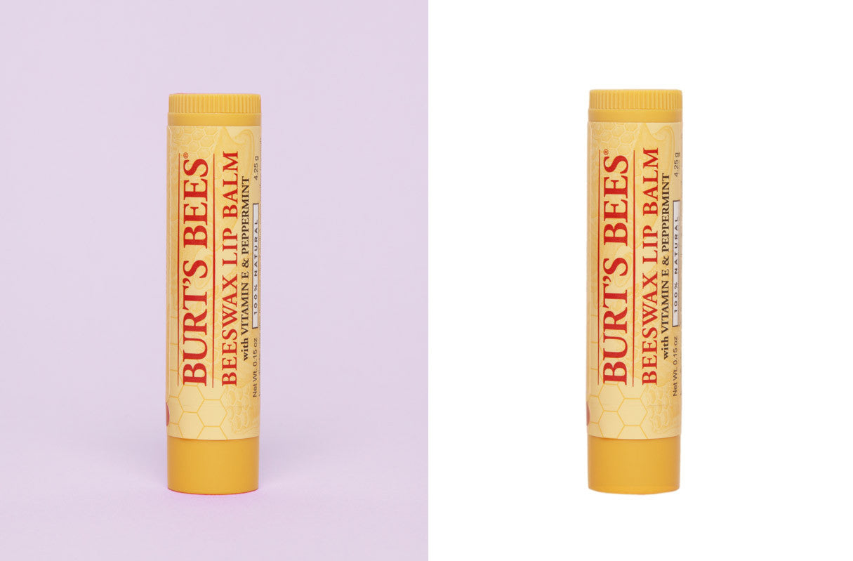
Separating images from their backgrounds is one of the basic skills of Photoshop, and sets you up to explore a range of other editing options. Removing the background of an image keeps the focus on the product by removing any undesirable aspects or distracting elements. It’s an especially useful solution for providing consistency when you’re dealing with imagery from multiple sources or shoots, or you just prefer a minimal look.
Check out the clip below for a Photoshop tutorial on background removal.
You might also like: 22 Awesome T-Shirt Templates and Mockups for Your Clothing Line.
2. Gradients
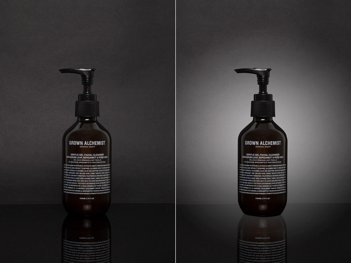
Gradients are a wonderful way to add drama to a product image. A radial gradient that shines out from the product mimics a backlit effect similar to a spotlight on a stage — but without all that expensive lighting equipment. This technique focuses the eye on the details that are important to your client, while creating a sense of mood or atmosphere. If you’re working on other assets, such as collection banners or sliders, you can also use gradients to provide a background for text to pop, but it’s best practice to do this in CSS for responsive design, rather than in Photoshop.
Check out the clip below for a Photoshop tutorial on gradients.
3. Duotone color

Duotone is a halftone reproduction of an image (originally an analog printing technique) that enhances middle-tones and highlights. Despite its retro origins, the duotone effect is a definite trend in web design today. You may have seen this effect used on popular platforms, like Spotify, where it’s been brought back into the modern day with vibrant and complementary colors. This is a visually stunning technique that effectively applies a filter to your client’s images — making it a low-hassle way to provide a sense of consistent branding across editorial assets. Note that it’s not recommended for product photography because of the significant shift in color.
Check out the clip below for a Photoshop tutorial on duotones.
Additional Tools: For a web resource, JQUERY-DUOTONE is a jQuery plugin that will also apply the duotone effect to all the images on a site, when implemented in your custom Shopify theme.
You might also like: 4 Trendy Visual Design Techniques.
4. Blur
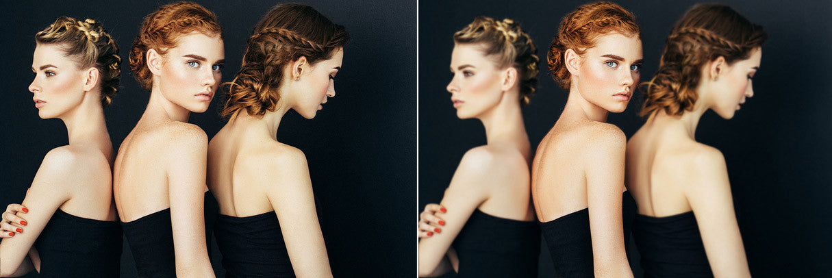
Design trends like this stick around because they’re functional and beautiful. Beautiful bokeh allows you to (literally) keep the focus on the content that matters — whether that’s a text-heavy design in need of a little visual interest, or an aura around products that brings them into crystal clear focus. Used effectively, blur provides a bit of drama, breathing room, and harmony to your designs.
Check out the clip below for a Photoshop tutorial on blur.
Additional Tools: Here’s a great roundup of 9 Photoshop Actions to Blur Background. If the blur effect is something you’re keen on, you could also try playing with a very narrow depth of field, giving your images a miniaturizing effect similar to what you could achieve with a tilt shift lens.
5. Adding shadows and faking laydowns

As UX/UI designers know, shadows are invaluable cues that communicate natural order to viewers. Even though we’re looking at flat photographs on a screen, adding subtle shadows below isolated objects communicates a sense of three-dimensionality and weight to items. Creating the illusion of space connects an intangible product photograph to a world customers can engage with.
Check out the clip below for a Photoshop tutorial on floating “suspended shadow.”
Another way to use shadows is to fake a laydown effect. Drop-shadows or new shape layers make two-dimensional objects “float” off your backdrop, creating an illusion of depth.
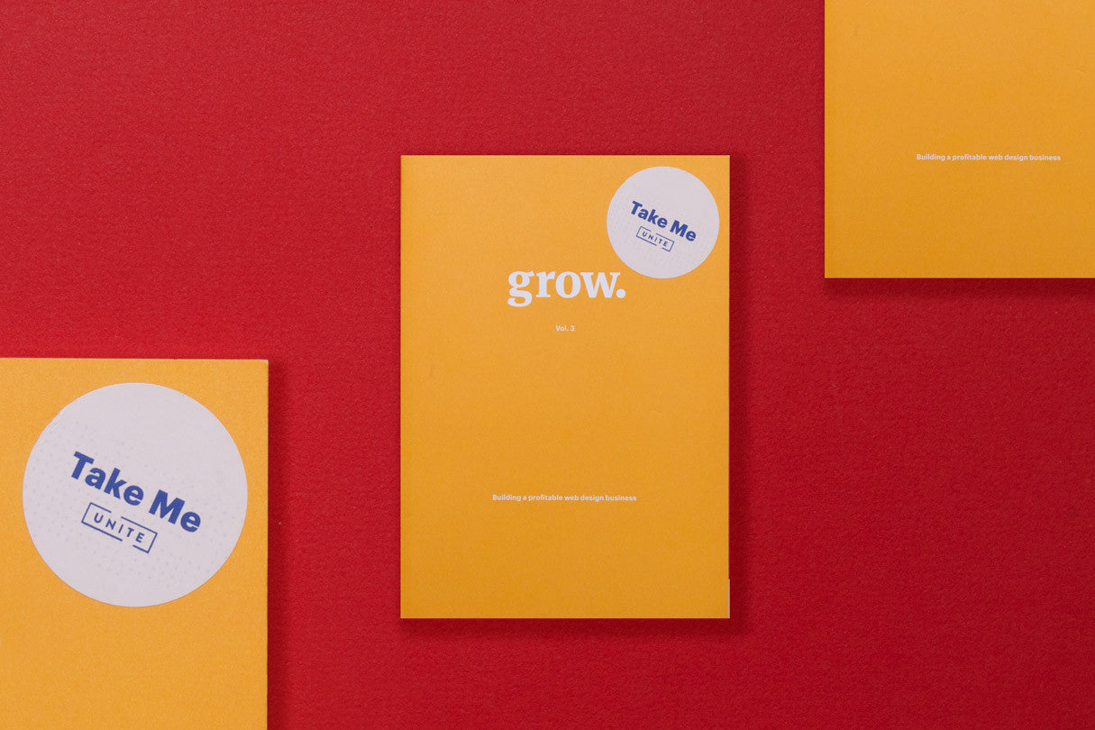
A laydown photograph (sometimes also called a flat lay) is a overhead view of a product that is laid flat against a background. Oftentimes, these items will be arranged or styled on a flat surface such as a seamless or colored paper. You can use laydowns in your product photography, or arrange objects for an eye-catching slider that leaves some room for text.
Check out the clip below for a Photoshop tutorial on the laydown shadow effect.
You might also like: Add Product Photography to Your Service Offerings With These Tips.
6. Reflections
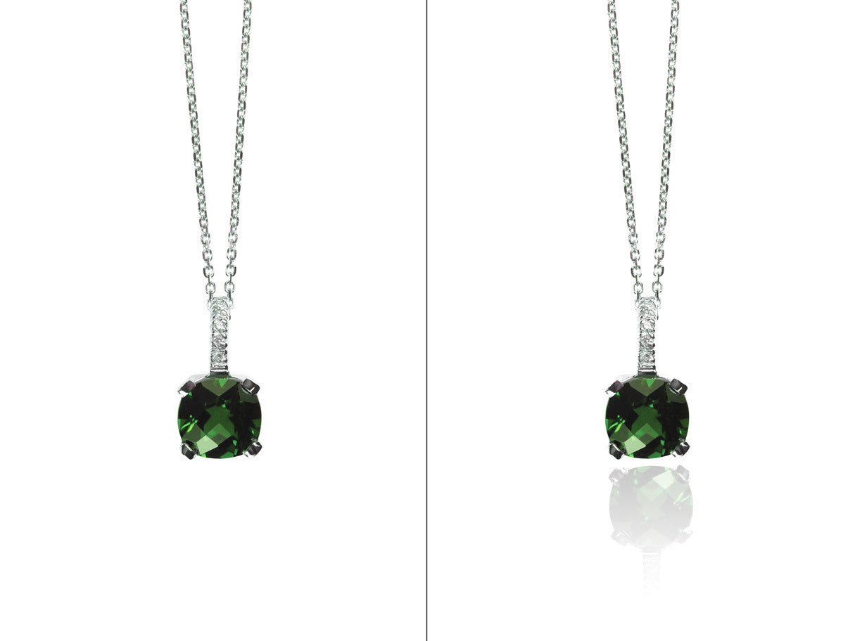
Like shadows, reflections are another way to add a sense of physicality to objects. This works especially well with naturally luminescent objects, such as jewelry, glassware, sunglasses, or technology. The clean, sleek look of a reflection creates a mirrored effect that draws the eye to the element of the product you want customers to focus on. While your client’s products would ideally be shot on a mirrored surface, it’s not hard to create a reflection in Photoshop, if the base of your object is symmetrical or shot straight-on.
Check out the clip below for a Photoshop tutorial on reflections.
That’s it!
Armed with these handy post-production tools, your agency is now ready to delve even deeper into the world of product photography and post-production.
As ecommerce developers and designers, you’re already familiar with responsive images, dimension constraints, and best practices for images on the web. That makes you uniquely positioned to incorporate these services in-house to create beautiful, cohesive designs that present your client’s products in the best light and increase revenue.
Read more
- 6 Email Marketing Campaign Ideas to Stand Out in a Crowded Inbox
- Why You Should Add a Content Strategist to Your Design or Development Team
- How to Use Video Footage in Web Design
- How to Direct, Control, and Hold Focus Through Design
- Top Ecommerce Resources for August
- Designing For Augmented Reality
- Top Ecommerce Resources for September
- 4 Things to Consider When Designing Wholesale Stores for Clients
- How to Win the 2016 Ecommerce Design Awards - Part 2 with Verne Ho
- Creating Memorable User Experiences With Website Layouts
What post-production techniques did we miss? Tell us know in the comments below.

