If you revisit old end-of-year roundup tech trend articles, the ones that predict which technologies will break into the mainstream the upcoming year, you’ll notice two things: 1) most of us are demonstrably bad at predicting the future (myself included), and 2) augmented reality was a ‘hot new tech trend’ in 2018, 2017, and all the way back to 2016.
Augmented reality is not a rising technology anymore. It’s here. You know what it is, you’ve seen it in your everyday life (whether that’s a Snapchat filter or Pokemon Go), and you may even have already been asked to design an application for it. If not, there’s a high chance you will be soon—users of AR technology are expected to hit the billion mark by 2020, and there are currently over 500 AR companies listed on the startup database AngelList.
So how do you design for an application that uses augmented reality? What are the best practices, what obstacles will you face, and most of all, how can you ensure you’re getting the most out of the tech, especially in an ecommerce use case? Let’s dive in.
Why use augmented reality in ecommerce?
In case you’ve missed it, augmented reality describes the combination of real-life input, stimuli, or environs with computer generated ones. Though it’s often bucketed with virtual reality, VR replaces the analog world completely, while AR augments it, melding the real and the digital to create something new. Again, you’ve almost definitely seen it in recreational or gaming applications, but why use it in ecommerce?

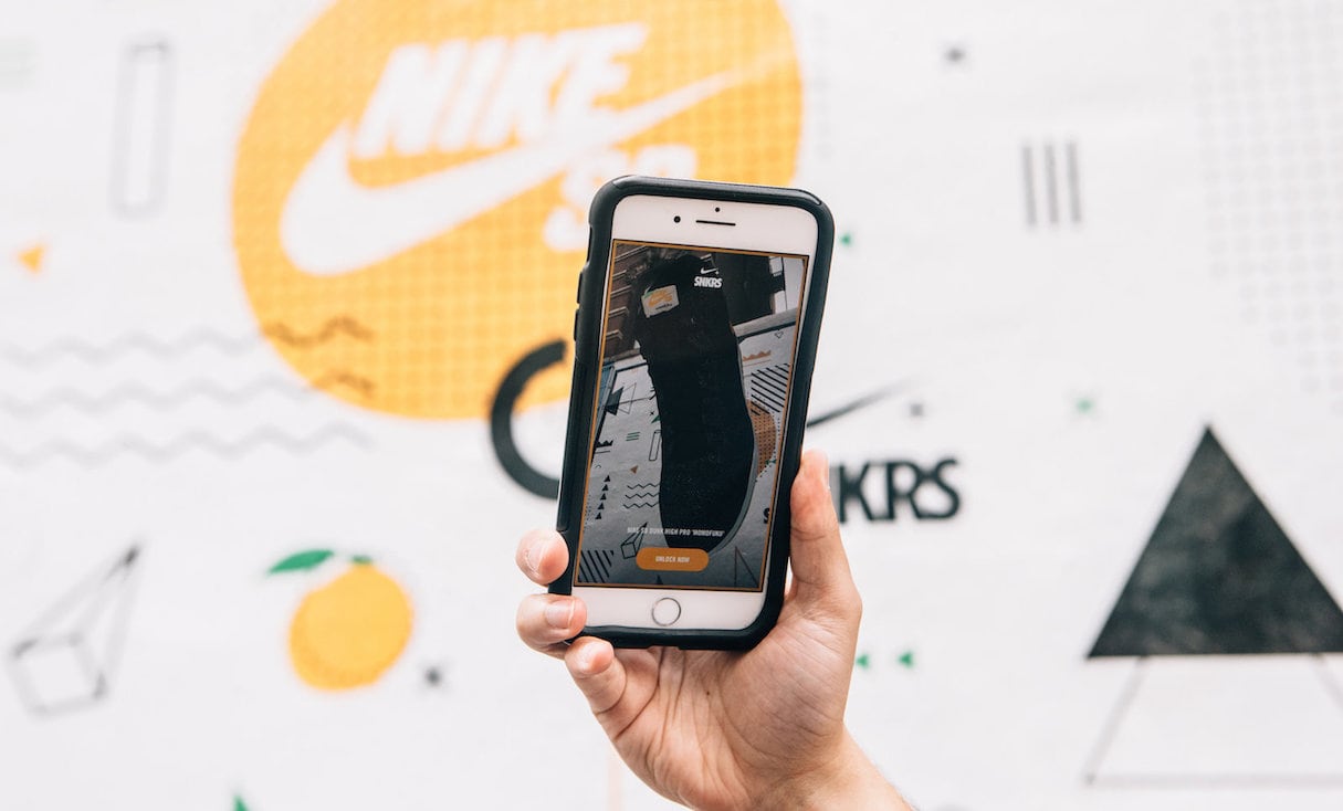
The most common ecommerce application of AR remains remote, real-time product visualization—the ability to try on a pair of shoes without leaving your home, or see how that couch would look in your living room. AR generates a three dimensional model of the product, then overlays it onto your environment in real-time via your phone, tablet, or AR/VR glasses.
This functionality can obviously play a major role in the customer’s purchasing decision, particularly for long-commitment products (like a television set or a painting) or ones that are highly personalized to an individual user (like makeup, nail polish, or even tattoos).
But besides assisting customers in their purchase decisions, AR technology also offers the added benefit of increased customer engagement and brand loyalty. In late 2016, RetailPerceptions surveyed over 1,000 shoppers and found that 71 percent would patron a retailer more often if they offered augmented reality, and that 61 percent would prefer a store that offered AR over one that didn’t.

To make a long story short, AR in ecommerce helps shoppers make more informed purchases , boosts customer engagement, and caters to consumers’ wants and expectations. This is all well and good, but how do we design an AR application?
You might also like: Build the Future of Immersive Shopping Experiences—Introducing New Ways to Work with AR/VR.
AR design guidelines
Designing augmented reality applications can be intimidating to even seasoned UX designers. Many of them balk at the idea of creating an interface with an essentially unlimited, unchained viewport. Whether it’s through your phone, a desktop, or AR glasses, you’re able to move your device to adjust the environment—there’s not really a true analog to that in traditional UI design.
So here’s a broad roadmap, featuring three AR design cornerstones to keep in mind when crafting an augmented reality application.
1. Input and output definition
Though you may have performed a similar exercise when designing for certain traditional UIs, defining the inputs and outputs of the user experience becomes mandatory in the AR environment.
Defining an experience’s inputs and outputs answers the question of what elements a user can and cannot interact with in the interface. It delineates boundaries between the ‘augment’ and the ‘reality’.
You can probably imagine that physical gestures are a common AR input (a swipe of the hand for example, or a change in facial expression), but the device you’re interfacing with will also have its own inputs available to you. For example, if you’re using a mobile phone to see how a certain color of paint looks on the wall, you have access to the tactile buttons, taps, swipes, and other mobile phone inputs.
Outputs are a bit simpler—in an ecommerce application, your output will likely be a three dimensional model of the product, potentially one with a configurable scale, color, orientation, or any combination of the three.
Once you have your inputs and outputs defined, the next step is to assign them functions. How will the user change the color of the product? By voice? Shaking their device? A tap on their mobile phone?
Alexandra Olarnky of Prototypr suggests working through these questions by determining the fidelity of your inputs, or how great the margin of error is when interfacing with it. For example, your mobile phone’s voice recognition is a low fidelity input—Siri often misunderstands our voice commands—but a tactile button on a keyboard or phone has much higher fidelity.
2. Environmental considerations
In both augmented and virtual reality applications, the interface isn’t bound to a physical screen. The viewport moves as the user does, the 3D model shifting its perspective in response. But while there may not be a boundary determined by a screen size, AR apps still have area constraints.

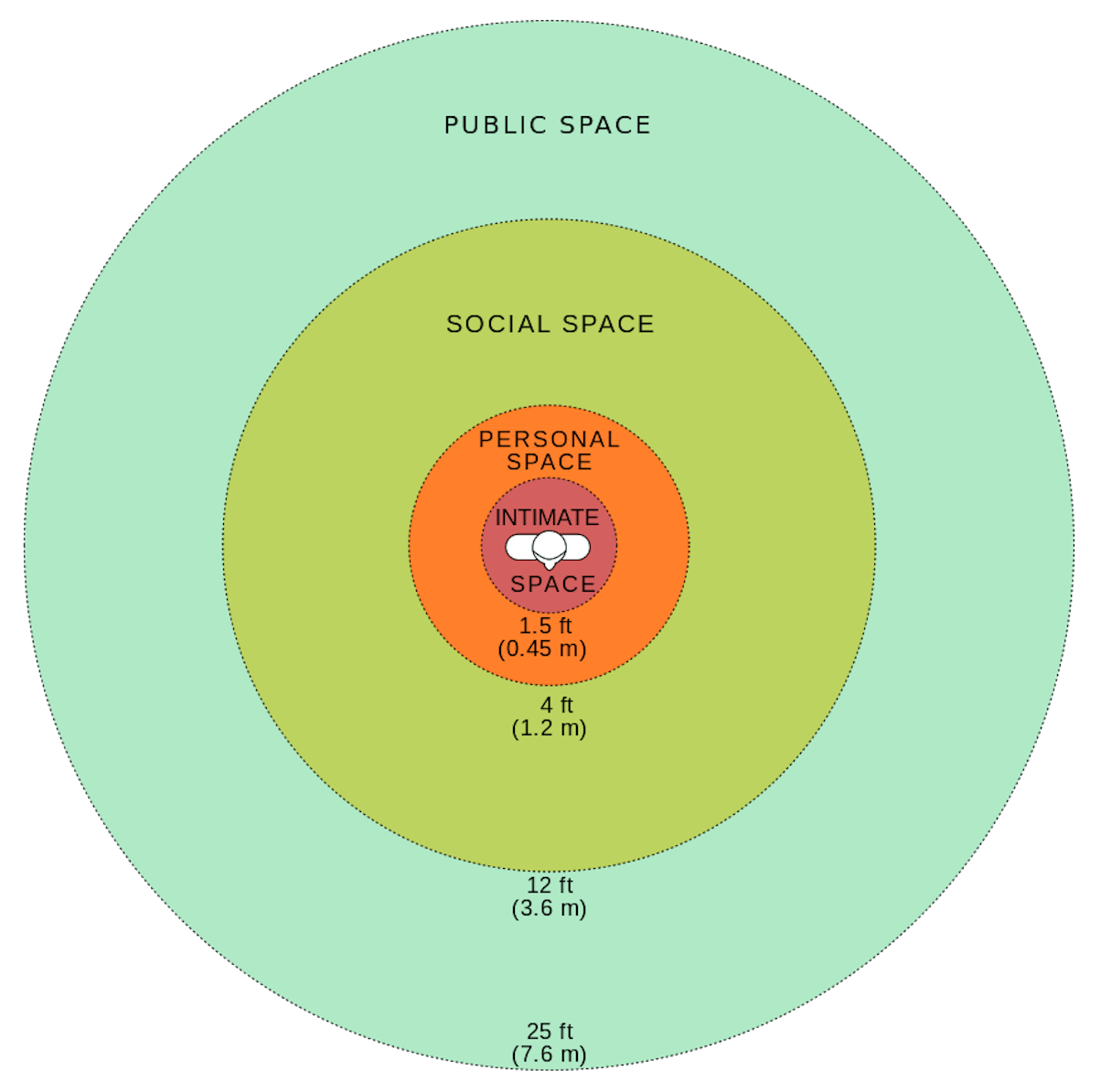
Most AR designers use four different signifiers to describe an AR’s environment: public, social (sometimes called private), personal, and intimate. These descriptors not only signify the areas surrounding the user (as shown in Olarnky’s diagram above), but also the nature of the AR app itself (as shown below).
- Public environment: User's entire body is involved as a controller, such as Nintendo Wii
- Intimate environment: User is likely seated, their body a few feet away from the monitor, such as in any desktop-based AR experience
- Personal environment: Describes an AR on smartphones, tablets, or other mobile devices, such as Pokemon Go
- Private: Entirely private AR environments, such as wearable tech like Google Glass
Both meanings serve useful purposes for the designer. Spatial considerations need to be accounted for when designing how users will interact with distant objects in frame, and the labels in the chart (taken from the Interaction Design Foundation) can provide helpful context on how the experience will fit within the surrounding world.
Check out our list of lorem ipsum generators to help your design process.
You might also like: Building a VR Shopping Experience for the Web: Tips and Takeaways.
3. A more literal user fatigue
Every UX designer should understand the concept of user fatigue, or the result of several high-effort interactions required by the user (or maybe even too many low-effort interaction ones).
And while it’s more common in VR experiences, some AR applications allow the user’s entire body to act as a controller. UXers must be extra cognizant of interaction costs when designing in augmented reality environments, often because those interactions can be literally exhausting.
That means taking extra precautions to avoid repeated, high-effort interactions that will tire out the user—both mentally and physically– and placing frequently accessed functions in easy-to-reach areas (a practice familiar with any user experience designer who’s crafted a mobile app).
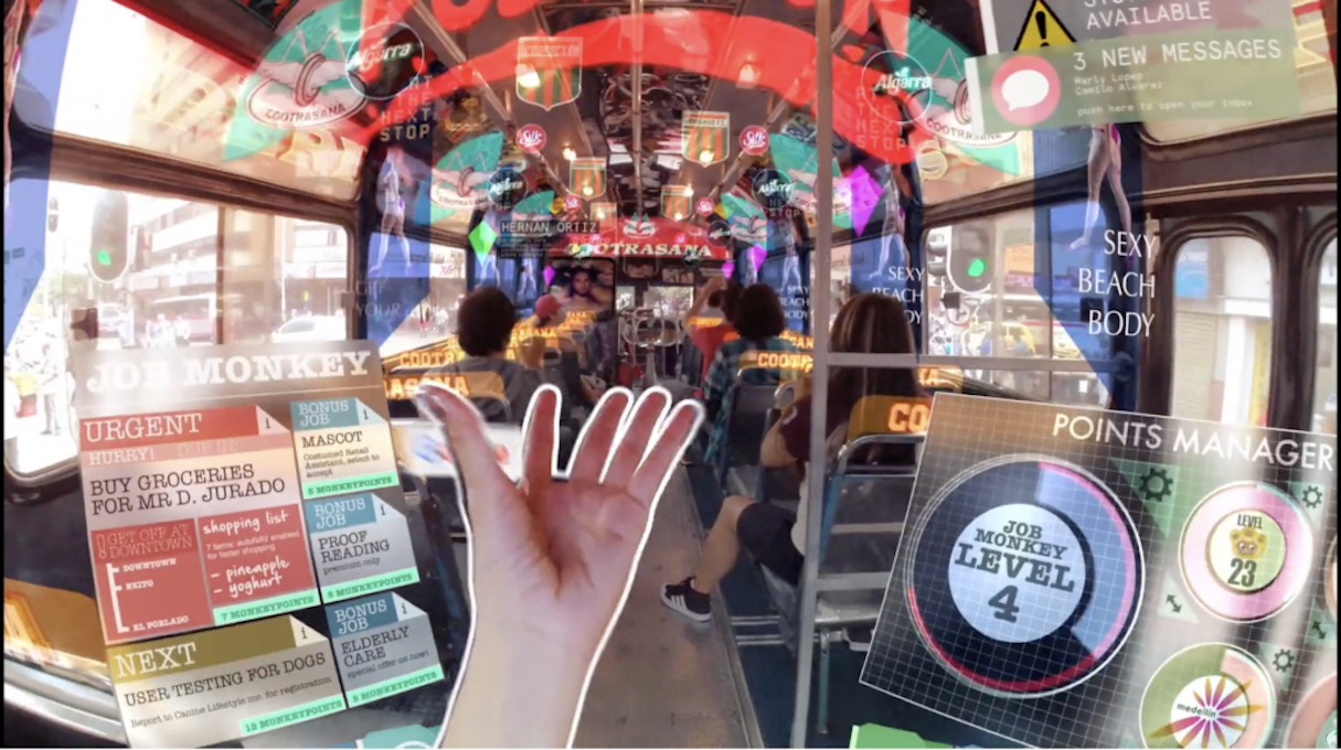
AR design also poses a higher risk of over-stimulating the user; if there’s too many interactable, 3D visual elements on the screen at the same time, your user experience will suffer. Just take a look at Keiichi Matsuda’s Hyper-Reality, an extreme demonstration of AR overstimulation gone awry.

Remember essential design principles
Just because you’re crafting with a relatively new technology, doesn’t mean you have to abandon the basic tenets of user experience design. In fact, you should embrace those time-tested principles even more.
Why? Because despite AR’s prevalence, users still may not be entirely comfortable interacting with this nascent tech. AR applications aren’t the time to get too creative and break from design standards . On the contrary, you’ll need to implement more hand-holding than you would a standard desktop site or mobile app . That could mean a heavier emphasis on visual and audio cues or feedback, or even an in-depth tutorial.
Augment user experience
Take comfort in the fact you already have the tools you need to design beautiful, engaging AR experiences. By combining the guidelines described here with your existing skillset, you’ll be crafting AR apps for ecommerce stores in no time.
Read more
- Top Ecommerce Web Design Trends from January
- How to Integrate Shopify into your Client's WordPress Website with Zillacommerce
- The Web Designer’s Guide to Client Onboarding
- Top Ecommerce Resources for October
- Top Ecommerce Resources for July
- Working With Technology Clients: Strategies, Apps, and Themes to Consider
- Design Psychology: 12 Ways to Convert Users into Buyers
- 7 Inspiring Stores Built by Shopify Partners to Get You Through the Winter
- How to Direct, Control, and Hold Focus Through Design
Have you experimented with designing for augmented reality? Share your experience in the comments below!

