The holidays bring with them a wonderful surge of traffic to ecommerce stores. You’ve already been deep into the process of getting your client's site ready for the holidays, and you’ve got the big stuff taken care of. You’ve tweaked site performance and mobile compatibility to account for an increase in site visits, and you’ve incorporated some holiday-specific design elements into the site to get shoppers in the mood. You’re even thinking about how to “holidize” the client’s logo — that classic ecommerce holiday touch. (A tip: Go for something a little more exciting than the Santa Hat. Been there, done hat.)
So you’ve done the heavy lifting when it comes to holiday prep, and you’re ready to make a few final tweaks that’ll send holiday revenue through the roof. With that in mind, here are five more design opportunities to increase site engagement and conversion during the end-of-year holiday shopping season.
You might also like: 5 Design Tips to Boost Conversions this Holiday Season
1. Design a special holiday-themed product collection page

Encourage your client to curate a special holiday product collection, then jazz up that page with some holiday design elements. A collection could include items with holiday relevance (Rudolph shorts?) or “regular” products with special holiday discounts.
In terms of design, you could keep it simple with a holiday background image and updated color scheme. Use the site design and color scheme as a reference point, but also think about the brand itself in terms of determining how much of a departure the holiday design should be from the rest of the site.
The key in any case is, as always, to make it fit with the brand.
If you’re dealing with a brand that has more of a conservative identity, you may want to keep the holiday design more subtle and organic. For an edgier brand, you could make a bit more of a statement. The key in any case is, as always, to make it fit with the brand.
2. Boost goodwill with graphical reminders of charity tie-ins

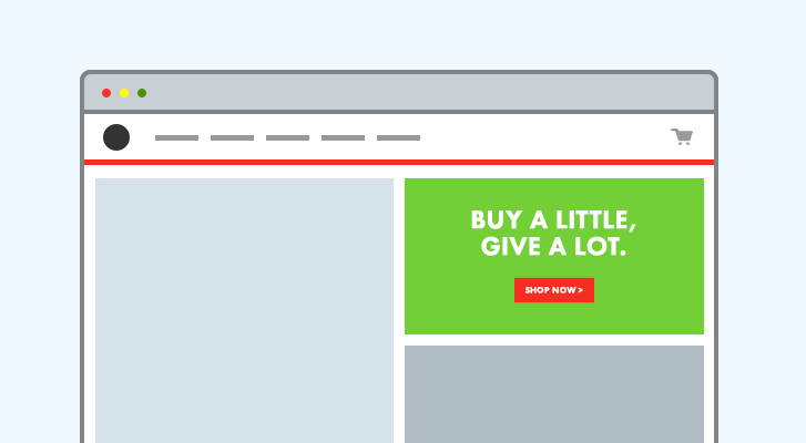
Supporting charities with the proceeds of ecommerce sales is a great way to do good in the world, as well as to build goodwill with customers to encourage conversions. If your client donates a portion of their holiday revenue to a charity, help them build on this opportunity by integrating graphical mentions of the charity tie-in in key places on their site.
You can also incorporate design elements at key points in the shopping funnel to help a client communicate the charity relationship with their customers. This can include a banner image on the home page, and graphical reminders across the rest of the checkout journey. You could also use a promotional bar (see idea #4 below) to reinforce the messaging.
Plus, although it occurs post-conversion, consider adding a thank-you page image that reinforces the store’s holiday charity connection and gives the customer an extra boost of warm and fuzzies for supporting the charity with their purchase. It could be as simple as a picture of someone tastefully holding or wearing one of your client’s products next to a benefactor of the charity’s work.
3. Get festive with the power of social

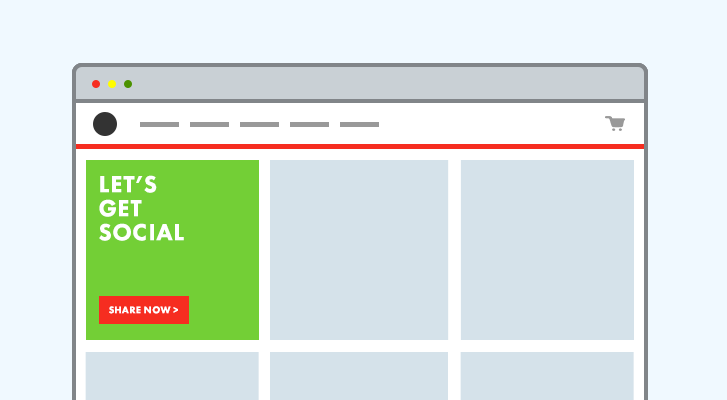
If you have social media content integrated into your client’s store, encourage them to get festive on those social media accounts — especially image-based ones like Instagram — then integrate that dynamic content into the site for some extra holiday flair. You could encourage your clients to have their customers take pictures of their products in a holiday setting and post them to Instagram with a hashtag, perhaps as part of a contest. Then, get clever with how you integrate that customer-produced content into the site.
Check out the Social Media section on Shopify’s app store to find apps that’ll let you maximize your client’s social media integration. Beyond apps that let you simply add social streams to a store, other options include tools that automatically share posts on social media when holiday products or content are added to the store, or that let customers shop a holiday collection directly from social media. An app like Foursixty, for instance, will let customers shop a holiday collection from Instagram posts tagged with a client’s special holiday hashtag.
You might also like: 5 Creative Strategies for Using Overlays to Boost Conversions During the Holidays
4. Integrate holiday messaging and CTAs with a promotional bar

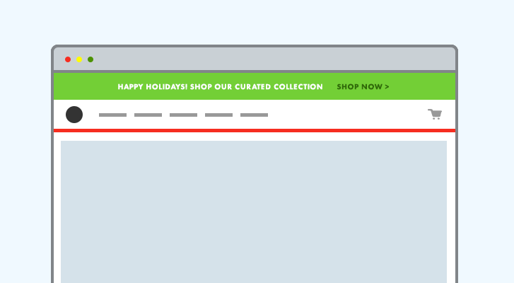
Spread the holiday cheer on your client’s site by adding a promotional bar, like Promotion Bar, to the top of the page, and make it sticky! A promo bar app provides an unintrusive way to tell visitors about a holiday products page, a special holiday charity tie-in, a seasonal contest on Instagram, or any other holiday messaging.
Depending on which promotion bar you use, consider stylizing it to match the spirit of the holidays. Don’t go bonkers with neon greens and reds, but do consider the gentle touches that make the promo bar “pop” and attract attention.
If you want to get extra fancy, you could collaborate with your client on multiple promo bars that either auto-rotate (depending, again, on which promotion bar tool you use) or change manually throughout the holiday season. The classic “12 Days of Christmas” is one way to structure promotions that spark curiosity in the minds of shoppers and keep them coming back to the site each day to discover the next promotional opportunity.
5. Add a shadow box to communicate exclusive holiday offers

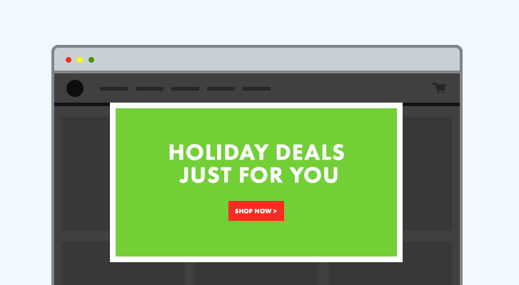
Use a shadow box modal window to communicate exclusive holiday savings offered to email subscribers. The key here is to make sure it’s not too intrusive. Don’t have the shadow box trigger immediately, and don’t have it show up too often during a visitor’s time on site. Instead, configure the modal box so that it only displays once per unique customer, and perhaps only after a certain time on site or at a specific scroll point. And make sure it’s easy to hide, with a visible “X” button.
If you advise your client to go the route of a shadow box, make sure that they fulfill the promise being made in it — namely, that their email subscribers are, in fact, receiving an exclusive holiday season promotion. Depending on your working relationship with your client, you may have the opportunity to help strategize and structure what that holiday offer(s) looks like. That gets into email template design, subject line copy, and all that other fun stuff. For optimal conversion from email subscribers, the whole funnel needs to be carefully thought through, from soup to chestnuts.
Bonus idea: “Holidize” the cart.
As James Corr points out in this great article on Shopify’s ecommerce marketing blog about improving conversion rates during the checkout experience, conversion rates may suffer when it’s not completely obvious to a customer that they’ve added something to their cart.
So add a little flair — holiday themed, of course — to the shopping cart icon to help it stand out when someone adds a product to it. The cart itself could be a stocking, one that becomes visibly “stuffed” as more products are added to it. You could even animate Santa in his sleigh, carrying the newly selected product and “dropping” it in the cart.
From holidays to all-the-days
A few extra design touches like the ones above can help turn first-time holiday shoppers into year-round brand aficionados.
What other holiday-focused design elements have you recently integrated into your clients’ stores to drive conversion? Let us know in the comments below.
Read more
- Introducing Online Store 2.0: What it Means For Developers
- 12 Essential Tips to Get Your Site and App Ready for Black Friday Cyber Monday
- 6 Ways to Help Merchants Make More Sales This Black Friday/Cyber Monday
- Holiday Reading List: The Top 10 Stories of 2015 from Shopify Partners
- Don’t Get Caught With Your App Down on Black Friday & Cyber Monday
- How to Support Your Clients Over the Holidays
- PODCAST: How You & Your Clients Can Make the Most of the Holiday Season
- 3 Steps to Maximize Your Client’s Holiday Revenue Before 2016
You might also like: Holiday Buyer Psychology — 5 Things You and Your Clients Need to Know

