 Psychology is a powerful sales tool. But how can we leverage it on our ecommerce sites, while avoiding the danger of taking things too far?
We all like to believe that we make decisions through logical choice. But nothing could be further from the truth. Those who suffer from damage in the part of the brain that handles emotion, struggle to make decisions. Emotion is a key component in how we make decisions. This even applies when making purchases online.
Understanding exactly what influences our purchasing decisions is an important skill. This is especially true when designing and running ecommerce websites. Yet psychology is an overlooked discipline among digital professionals.
In this post, I want to introduce you to the basics of how to influence a user’s decision to buy. I am hoping it will excite you enough to investigate the subject more.
We begin by looking at how psychology can help us position products in the marketplace.
You might also like: 17 Incredible Ecommerce Trends That Will Boost Your Sales in 2017
Positioning your products using psychology
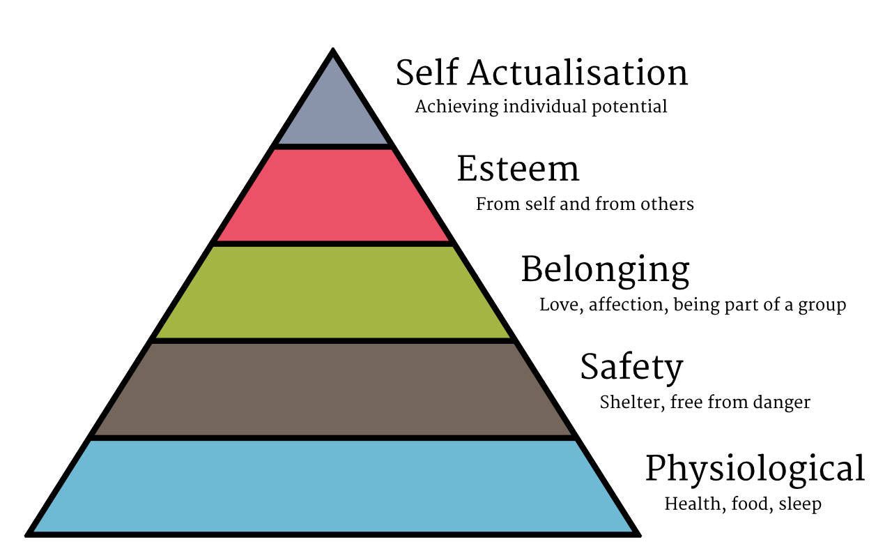
One of the most well-known representations of human psychology is Maslow’s hierarchy of needs. This simple pyramid shows the different motivators that drive decision-making. From basic needs, such as food or shelter, to personal self-esteem and reaching our potential.

This may all seem theoretical. But it does have real world application. It enables us to stop selling on the basis of features, and start appealing to users’ emotions.
Take for example the automobile industry. All cars provide the same thing. They get a user from A, to point B. Admittedly, they achieve this with varying degrees of comfort and speed. But most cars offer a similar set of features.
What sets one car model apart from another is more psychological than physical. For example Volkswagen relies on creating a sense of belonging. But Volvo appeals to our desire for safety. Then of course there are the high-end car manufacturers who target our desire for esteem.

Ask yourself what fundamental need your product addresses. This will allow you to stand out from the competition, even if they offer a similar product. That is because you can make your product feel more appealing.
Of course, persuading users to desire your product is only half the battle. We also need to compel them to buy. Psychology can help us here too.
Encouraging action through psychological triggers
Psychological characteristics also influence our decision to take action. This is true whether buying something or signing up for a newsletter. That is why understanding our psychological triggers will prove invaluable when designing user interfaces.
There are far too many of these triggers to cover here. That is why I would recommend '100 Things Every Designer Needs to Know About People' by Susan Weinschenk. But for now let’s focus on five that I use most when working on ecommerce sites. These are:
- Choice paralysis
- Status quo bias
- Social proof
- Scarcity
- Framing

Let us begin with the most dangerous psychological characteristic. One that if ignored, can undermine sales.
1. Choice paralysis
If you ask anyone of us whether we like choice, we’ll tell you that we do. But our behaviour does not backup this statement up. In fact, we suffer from choice paralysis. In other words, when there is too much choice we feel overwhelmed and cannot make a decision.
This could prove problematic on ecommerce sites with a large range of products. This is not an issue if people come to the site looking for a specific product. But if they are choosing between similar products, it can reduce your conversion rate.
This problem also applies to calls to action. If your site has too many, users will be less likely to complete any of them.
You can mitigate this problem by emphasizing one choice over the others. For example, by featuring a product or emphasizing a single call to action.
The other thing you can do is ensure that each choice is as distinct as possible. Avoid having many products with slight variations.
2. Status quo bias
The second of our five powerful psychological characteristics is the status quo bias. This is our tendency to stick with things that we are familiar with. For example, we tend to order the same thing in restaurants because we know we like it.
We prefer the certainty of what we know, rather than the risk of something new. Also, our inherent laziness often prevents us from making a change.
This is something that many companies leverage. Companies who increase prices for existing customers. They do this because they know we’re unlikely to move elsewhere.
For those of us who run ecommerce websites, this status quo bias has two major implications.
First, it means we need to be careful when making changes to our website. People become familiar with how our site works, and changing them too much can disrupt the status quo. This can encourage people to consider other options.

For example, many people buy from Amazon because they know the site well. If Amazon were to radically change their website this would, in theory, remove that competitive advantage.
Second, we need to make the transition away from competitors as simple as possible. If the move is hard, we will not overcome people's status quo bias. Either that, or we will need to offer significant incentives.
A good example of this is banking. Banks go out of their way to make switching to them as easy as possible, while at the same time hard to move away. A bank will offer to handle the setting up of new direct debits if you switch to them. They will also offer incentives such as cash back or preferential rates to lure you away.
3. Social proof
Next, we come to the most well-known of the psychological characteristics I wish to cover here. That is the concept of social proof.
Social proof is the idea that if all else is equal, we tend to follow the crowd. This makes it important to show that others like the products we offer.
This is why ecommerce websites rely on reviews, testimonials, and ratings. Social shares are also another example of social proof. The more people share a product, the more we are likely to presume it’s good.

Social proof is even more powerful when the recommendation comes from somebody we know. The most powerful example of this is a recommendation from friends or family. But celebrity endorsement or recommendation from a well-known professional body is also good.
You might also like: The Ultimate Guide to Getting Powerful Client Testimonials (With 6 Simple Questions)
4. Scarcity
The most powerful psychological trait on this list is the idea of scarcity. If something has limited supply, it motivates us into action as we fear missing out.
You can utilize this in many different ways. You can limit the stock of a particular product or offer a heavy discount for a limited time.
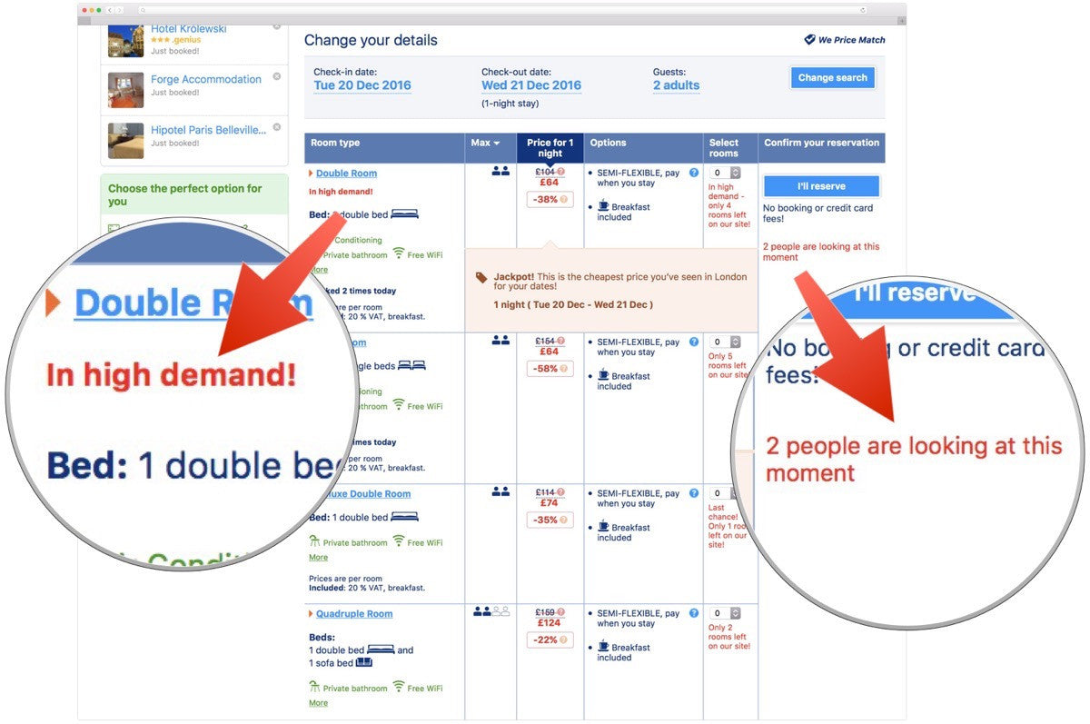
Booking.com uses the idea of scarcity well. They show you how few rooms are still available. Then they tell you how many other people are viewing that hotel. This spurs you into action. You fear that if you do not book the room it will be gone. This is the power of scarcity.

5. Framing
Finally, price framing is another useful tool to those of us who run ecommerce sites. This is the idea that the only way we can establish the value of something, is to compare it to something else.
This means that we are often reluctant to buy until we can compare our products to others. This in turn leads us to look at the competition before purchasing. This is not something we wish to encourage.
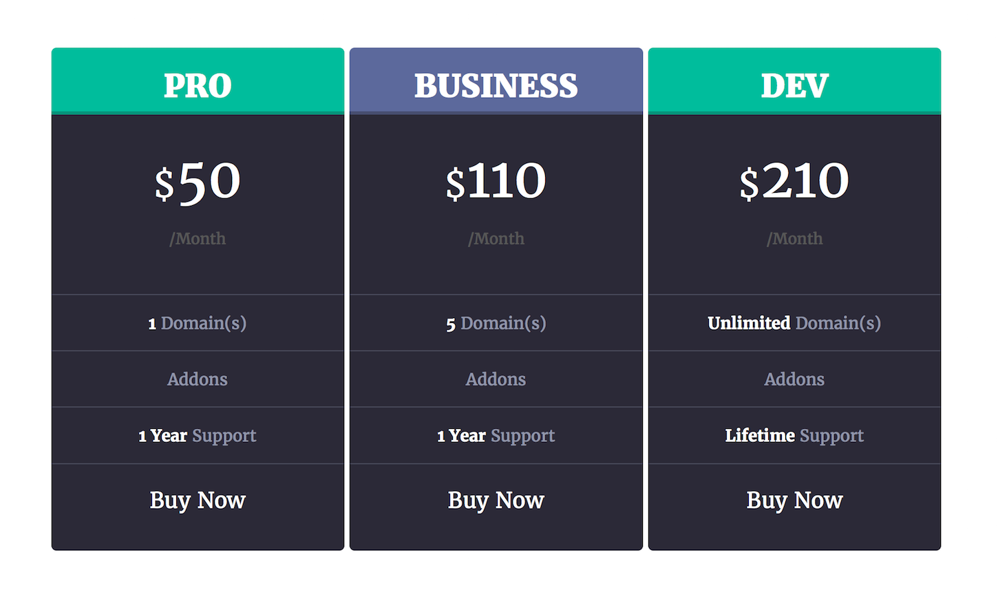
The way we can reduce this problem is frame the value of a product on your client’s website. For example, let’s imagine that your client sold project management software. Visitors will want to compare that software to something else, to judge whether it is worth the money. Don't force them to look at the competition. Instead, frame the value of your client’s software by offering three versions.

As well as a standard version, offer a basic version, and an enterprise level. The basic version will be cheaper but have less features. The enterprise level version will be more expensive but packed with lots of functionality.
The idea is not to sell the basic or enterprise versions. But rather to use them to show that the standard version is of good value. The basic version will be so underpowered that it will fail to meet most people’s needs. Meanwhile the enterprise level will be out of reach of most people’s budget. This will make the standard version look a great option.
The dangers of going too far
You may feel that all this is manipulative. And you would have a point.
In fact, psychological traits are so powerful that you can manipulate people into doing a lot. This has led to what many call dark patterns; unethical design approaches that exist only to trick people into behaving a certain way.

But if you manipulate people into buying they will suffer from buyer’s remorse. This will increase the number of returns you receive and the amount of support queries. This will in turn undermine your profit margin.
But worst of all, it will leave your client with many disgruntled customers. Customers with a significant voice to complain via social media and the web. In the long term, this will damage your client’s reputation and make customer acquisition harder.
You can avoid these problems by following a simple rule. Only ever use psychology to encourage users to do what they have already decided they want to do. The two biggest challenges we face have nothing to do with convincing people to buy. The fact that they are visiting our website shows they already have an interest.
Our challenge is convincing them to buy with us, and not to put off the decision to later. Because if they wait, they might then buy with a competitor. If we focus on this task, we are less likely to stray into the world of dark patterns.
Most of all, we are less likely to end up with disgruntled customers. This is because once they buy, they will be happy with what they’ve bought.
Psychology is powerful
Without a doubt psychology is a powerful factor in running a successful ecommerce site. But as I said earlier, this is just the tip of the iceberg.
There is so much more to learn and I would encourage you to dig into this fascinating area. If you do, I can guarantee it will improve conversion and create a better customer experience.
Do you consider buyer’s psychology when working on client projects? Tell us about it in the comments section below!
Read more
- What Makes or Breaks an Ecommerce Shopping Experience? This Survey has the Answers
- Forget User Experience. Start Thinking About Client Experience.
- Content Strategy: The Principles we Followed to Build the New Shopify App CLI
- 10 Ways to Improve User Engagement for Your App This Valentine's Day
- Delivering Accessible, Usable, and High-Performance Transactional Emails for Clients
- How to Use Eye Tracking in Usability Tests
- Human-Centered Design: An Introduction, Practices, and Principles
- Free Webinar] How to Convert Visitors Through Persuasive Design
You might also like: 3 Strategies for Improving User Experience in Your Ecommerce Designs

