Improving the digital user experience has become increasingly important, especially in ecommerce. Creating a pleasant user journey that can lead users from a state of attention to performing a desired action without hassle is where the battle for customers takes place, especially at a time when prices are being pushed and products are becoming increasingly similar. User experience is where you can create a difference for your clients.
UX designers are constantly on the hunt for new tools that can help them improve that experience. One such tool that has gained interest from the design community is eye tracking.
In this article, we’ll look at how eye tracking can help you understand your users, allowing you to create better experiences for them on your clients’ stores.
What is eye tracking
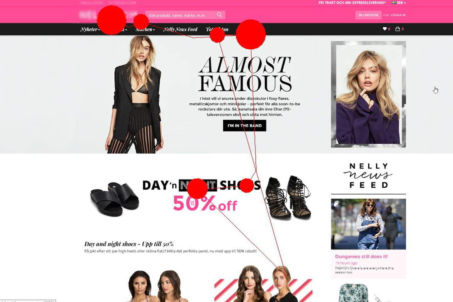
Eye tracking is the process of measuring what area on a website or app someone is looking at, or (more specifically) how the eyes move in relation to the head. This technology provides a layer of insights into your users that used to be out of reach, and allows for a new level of understanding of the interaction between users and interfaces.
Most user interactions take the form of clicking, swiping, or scrolling on devices. These patterns are a valuable source of information about our users. But things become tricky when there is no physical interaction, such as when someone is reading a text or watching content. And, if we think about it, these user patterns are pretty common. Thanks, Netflix!
Eye tracking can also help highlight user behavior in the dreaded situations where users tell you they ‘just don’t get it.’ If no physical interaction has taken place, it can be hard to identify what went wrong. It might be that the user is confused, looking for something, or just stuck. No matter what it is, that “why” can be explained with eye tracking technology that highlights where the user is looking.
"Eye tracking can also help highlight user behavior in the dreaded situations where users tell you they ‘just don’t get it.’"
You might also like: 9 Tools for Website Accessibility Testing.
How eye tracking works
Studies of human eye movement have been around for a very long time. Back in the 1800s, studies of eye movements were made through direct observations of people—for example, as they read books. What was discovered is that the movement of the human eye is not a smooth path; instead, it consists of a series of short stops, which are known as fixations. Our brain then patches together those fixations to create a smooth image. In user research, fixations are what interest us the most.

A fixation occurs when we find something interesting and we look at it. This can happen both consciously (when we’re looking for something specific) or unconsciously (when we’re surprised by something). Regardless, fixation serves as an insight into human behavior, and tells us what what kind of features grab our attention.
People most commonly associate eye tracking studies with understanding what captures user attention, and that is a common outcome of a study. But there’s more to it—eye tracking can provide deeper understandings, too.
You might also like: Why, How, and When to Utilize Usability Testing.
Giving users control
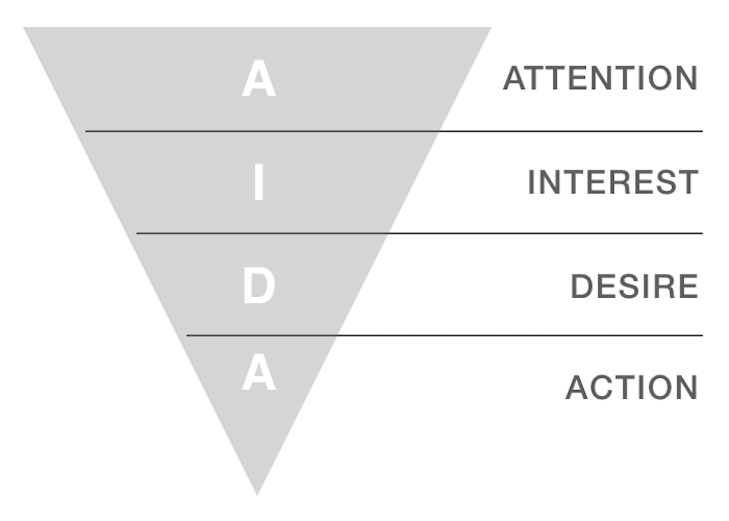
As you might have heard, we’re often said to be living in the attention economy. Marketing models like the AIDA model suggest that attention is the critical entry point to the journey towards buying a product. At the end of the funnel is the action. This is where we commit by purchasing a product or signing up to a newsletter.

In the AIDA model, the steps between attention and action are described as interest and desire. This is where we examine and decide that this is what we want. A more general way of putting it is to say that this is where the users make a choice.
Allowing users freedom of choice means allowing them to be in control. Recent UX trends suggest that allowing this sense of control is something we’ll see more of in the future. People are becoming aware of how digital experiences impact them, and (sometimes unhealthy) digital behavior is being questioned. Tools that limit screen time or snooze functions suggest that users no longer want to be controlled by their devices and digital services. They want to get control back. The same can be applied to UX within ecommerce. Our users want to be in control and want to know what’s going on.
The challenge in ecommerce is that driving users to take action (which typically means buying a product) is directly tied to the success of an ecommerce company. Predictably, business stakeholders want to get their users to take action as quickly as possible. The problem is that if we shorten the distance between attention and action too aggressively, we begin to take away user control. One-click checkout buttons are super smooth and great for business, but they also increase the risk of having your users buy products without being sure, or even worse—buying things by mistake.
So rather than just using eye tracking to optimize for attention, we also want to learn about comprehension—as we shorten the user journey, do users still know what’s going on? Typically, this can be investigated with usability testing.
You might also like: How to Build Usability Testing Into Everything You Do.
Eye tracking in usability testing
The combination of usability testing and eye tracking is a powerful one, giving you an extra layer of insights into the behavior of your users. Still, it’s important to learn when you should use eye tracking, and when you’re fine without it. No matter how great the technology, it should be viewed as a tool in your user research toolbox—not as a UX silver bullet. A good rule of thumb for usability testing is that you should aim to find your answers as simply as possible. Don’t overdo it.
"No matter how great the technology, it should be viewed as a tool in your user research toolbox—not as a UX silver bullet."
Identifying a research question
The best way to start your usability test is with a research question. The term ‘research question’ might sound very much like science, but it’s just a way of framing your test. A research question should essentially identify why you’re doing a usability test, and what it is you want to learn from it. This can be something simple, like finding out what problems people have navigating the menu of your new website.
Framing the research will help you in a number of ways.
1. Scoping the research

Identifying a research question helps scope the usability test to something graspable. A common mistake when conducting usability tests is to not frame the scope at all, and instead learn in general how people ‘behave’ on your site, but this is too broad, and makes the results of your test harder to analyze. Having a research question helps you avoid this.
2. Identifying if you need eye tracking
Second, a research question helps you decide if you need eye tracking or not. If you want to learn about your users’ ability to find something or understand a message, or learn how their attention responds to your design, then eye tracking might be a good fit. It will help you analyze all the moments when users are passive, for example when reading a text or looking for a piece of information.
But if you want to carry out a simple test, and your aim is just to understand if people can complete a task like filling out a form, you might be fine without eye tracking. Eye tracking would likely still give you an extra level of insights, but the key is to discover findings that you can act on in the simplest way. When it comes to simple tasks, you can often get insight with less complicated variants of usability testing. Instead of overdoing your user research, start by grabbing the low hanging fruit.
Facilitating eye tracking tests
There are some additional considerations to keep in mind when running a usability test that includes eye tracking. Specifically, it’s important to consider how the user will communicate during the test, to ensure that you get the best results possible for analysis.
Think-aloud (TA) tests
A common way of facilitating usability tests is a method called Think-Aloud (TA). In this method, the test subject openly verbalizes their thoughts during the test. This could include, for example, talking about where they’re looking for a piece of information, or what kind of difficulties they’re having. The user researcher gets direct insight into problems, making the results easier to analyze.
The problem with TA tests is that the user’s behavior during the test becomes very unnatural, as they need to remember to both think about performing the task, and to speak up about their issues.
Retrospective think-aloud (RTA) tests
To really enhance your usability test with eye tracking, you should instead use an improved method of testing called retrospective think-aloud (RTA) tests. In these tests, users verbalize their thoughts after the test is completed, creating a more natural behavior during the test itself.
After you’ve recorded the usability session, you review the recording with the test participant. The information from the eye tracker, which shows where on the screen the user was looking, serves as a reminder of what problems they had during the test. Your participant then verbalizes the problems retrospectively, instead of having to remember to do it during the test. This gives them a good opportunity to discuss and discover usability issues and their thoughts in general.
Your role here is to lead the conversation, but also take notes on what they say.
Eye tracking helps you make good decisions
Sometimes as a UX designer, you need to support your design decisions. Since the output of your work is visible to all, everyone has an opinion about it. Eye tracking helps to support the reasoning behind your design decisions, and is a powerful way of removing “I” from the equation—the user’s behavior speaks for itself. Demonstrating that the reason you’ve chosen a certain color or UI element is because it improves the user experience will strengthen your position in these situations, and increase empathy for the user’s experience.
When used wisely, adding eye tracking to your usability tests can help you build stronger, more intuitive user experiences.
Read more
- How Smart Design Patterns can Improve Store Conversions
- Five Useful Usability Testing Tools Proven to Convince Clients
- What Makes or Breaks an Ecommerce Shopping Experience? This Survey has the Answers
- 5 Psychological Concepts Web Designers Should Use to Maximize Conversions
- 10 Accounts to Follow on Instagram for UX & Web Design Inspiration
- Tips for Creating Multilingual Digital Products
- 5 Common Digital Content Problems and How to Avoid Them
How have you used eye tracking to improve UX? Tell us your thoughts in the comments below.
