Designing and organizing your retail store involves more than aesthetics—it’s also about creating an exceptional customer experience.
Your ultimate goal is to create an effortless shopping journey that guides customers to what they need, while sparking impulse buys. And that means strategically placing high-demand items and promotional displays to maximize visibility and increase the likelihood of purchases.
In this blog, you’ll learn how to achieve a harmonious balance between a functional and strategic store floor plan that looks good and drives retail success.
Types of store floor plans
The retail store layouts below are known for creating a positive customer experience. Depending on your industry and space, some options will work better than others. Ahead, we’ll explore each one to help you find the best fit for your business.
Racetrack
The racetrack store floor plan, also called loop or forced-path, is ideal for larger stores. It guides shoppers along a predefined main aisle that circles the entire store, passing through different sections in a logical sequence.
This encourages customers to explore more, ensuring they see every merchandise display as they move.
IKEA famously uses the racetrack layout, leading customers through staged rooms and various product categories. As a BBC article explains, “The fact that you can’t see around the next corner creates a subconscious sense of mystery, which draws customers further into IKEA stores.
Pros:
- Maximizes customer exposure to merchandise
- Encourages customers to explore the entire store
- Creates a controlled traffic flow
Cons:
- May be overwhelming for customers in a hurry or those who know exactly what they want
- Forces customers to follow a set path
- Not suited for shops that encourage quick visits or offer products requiring little consideration before purchase
Straight
A straight, or spine, store floor plan runs from the front to the back of the store, using straight lines to create shopping aisles. Merchandise is placed on both sides of the aisle, typically on rows of shelves parallel to the walls, to maximize your retail space.
These floor layouts are ideal for retail stores with limited space, typically between 2,000 and 10,000 square feet. However, their success relies on effective placement strategy, zoning, and navigation.
Convenience stores like 7-Eleven leverage signage, product displays, and strategically placed merchandise to engage and guide customers down the main aisle.
Pros:
- Easy to navigate and shop
- Cost-effective to implement
- Allows for easy stocking and retrieval of products
Cons:
- Can appear monotonous
- Merchandise at the front or sides of your store may go unseen
- Doesn’t encourage impulse buys as effectively as other store designs
Grid
A grid store layout features rows of aisles intersecting at right angles, forming a systematic grid pattern. Wide aisles with shelving on both sides efficiently accommodate shoppers and carts, maximizing product display while minimizing wasted space.
Impulse-purchase items like chocolates and clothing are typically placed at the front, while staple items like milk and bread are located at the back. Endcaps (displays set up on the ends of aisles) and power walls are also used to showcase promotional and seasonal products, enhancing visibility.
The grid layout is ideal for stores with diverse inventory (e.g., selling clothing, gifting items, and toiletries under one roof). It creates natural barriers that group similar products and separate different ones. Many grocery stores like Walmart and Target, pharmacies, and supermarkets like Safeway and Kroger use this floor plan.
Pros:
- Ensures effective store space utilization
- Easy for customers to navigate
- Encourages browsing across multiple aisles, boosting inventory exposure
- Ideal for stores offering varied inventory
Cons:
- May feel sterile or impersonal
- May overwhelm customers by showing continuous merchandise
- Potential for overcrowding in high-traffic areas
Free flow
The free-flow layout is more of a retail design philosophy than a specific floor plan. It avoids forcing customers through predictable traffic patterns, allowing for creativity with fixtures and displays arranged in an open, nonlinear pattern.
This encourages customers to explore at their own pace, often leading to increased time spent in the store and higher impulse purchases.
Without a defined pattern, organizing merchandise in a free-flow store depends on your imagination and available space. That’s also what makes it a bit challenging.
You can look at Urban Outfitters for inspiration. The brand popularly uses eclectic displays and open spaces to create an inviting, leisurely shopping environment.
As Stanford Stein explains in a Forbes article, Urban Outfitters achieves “planned arbitrariness in its layout” by balancing curated product groupings with overall transparency. He writes, “There are always visual cues of what is to come, without completely revealing everything.”
Pros:
- Suitable for smaller stores or higher-end shops with less merchandise
- Encourages exploration at the customer’s own pace
- Flexible and adaptable
- Enhances the store’s visual appeal
Cons:
- Requires more maintenance and reorganization
- May be confusing without proper signage
- Not ideal for high-density product storage
Mixed
The mixed or multiple store floor plan uses elements from two or more layouts to create a store design tailored to your needs. Since you don’t have to commit to a single retail store layout, you can use your available square footage as efficiently as possible—while giving customers a unique in-store experience.
Take Macy’s, for instance. The brand uses mixed layouts, incorporating grid sections for organized product categories and free-flow areas for seasonal or promotional displays.
Note that mixed stores require careful consideration of floor plans, inventory volume, merchandise categories, and the profitability of each item for strategic placement. This makes it more suitable for larger stores with plenty of space and a well-planned business model.
Pros:
- Highly adaptable to different needs
- Creates a dynamic and unique brand experience
- Increases impulse purchasing
Cons:
- Complex and expensive to design and maintain
- Potential for inconsistent customer experiences
- Not suitable for smaller stores
Angular
The angular floor plan uses rounded tables, curved walls, corners, and other curved fixtures to create a visually dynamic shopping space. Separate cases, shelves, and signs further emphasize different product categories or groups.
But why curved? It creates a sense of flow and movement, guiding customers intuitively through the store.
Case in point: Nike stores. The outlets use modified angular floor plans with sleek, minimalist design elements and curved lines to create a futuristic shopping environment that aligns with Nike’s brand image.
These angular/circular elements can limit display space, so you’ll need substantial inventory storage for stocking items and holding additional sizes. High-end boutiques and designer stores with carefully curated collections often use this layout to convey sophistication and luxury.
Pros:
- Enhances the store’s aesthetic appeal
- Creates a sense of luxury and exclusivity
- Guides customers naturally through the space
Cons:
- Expensive to design and implement
- Not efficient for high-density product storage
Diagonal
A variant of the grid layout, the diagonal store layout arranges aisles at an angle. This enhances sightlines across the store, allowing customers to see and access the merchandise from different angles.
Best Buy, for example, uses a diagonal layout in some stores to showcase large electronics and improve visibility.
Diagonal layouts are best suited for retail stores with limited space. Think: beauty and cosmetic retailers and electronics or technology stores. Stores that encourage shoppers to test or sample products can also benefit from this floor plan.
Pros:
- Improves sightlines and visibility
- Creates a dynamic, interesting retail space
- Guides customers through the store faster
Cons:
- May result in narrower aisles
- Requires careful planning to avoid confusion
Herringbone
The herringbone store layout uses angled aisles that resemble a twill weave pattern for maximized merchandise visibility and efficient customer flow.
A central pathway runs across the store floor, with the checkout visible from the far end. From this main pathway, narrow and deep shopping aisles branch off at angles, each organized by product category. Customers can walk down individual aisles but must return to the central pathway to access new aisles, ensuring they pass by a variety of merchandise.
Supermarket chain Aldi is a great example here. The brand uses a modified herringbone layout to maximize space and direct customers through its selection of essential and specialty items.
Pros:
- Maximizes space in narrow areas
- Suitable for small specialty stores
- Enhances product visibility
Cons:
- Can be confusing without proper signage
- Not suitable for larger spaces
- Less flexible for reconfigurations
How to make a store floor plan
- Decide on your layout
- Consider traffic flow
- Position your checkout
- Map out your products
- Consider your store fixtures and displays
- Add customer amenities
- Ensure your store is accessible
Now that you know the types of store floor plans, here are the steps for making a solid retail store layout design.
1. Decide on your layout
Before selecting a store layout, consider the following to align your store plan with your business needs and customer preferences.
Nature of your retail store: Your store type significantly influences the best layout choice. For instance, are you a small specialty store with high-margin items, or a supermarket aiming to sell a wide variety of items at scale?
Target customers: Understand who your customers are: Young singles or families? Middle-income shoppers? Upscale clients? Do they prefer shopping assistance or making their own choices? Are they quick shoppers or do they take their time deciding?
Types of inventory: Categorize your inventory and decide on the best display method. For instance, you might group items by product category or by gender. This helps in organizing the space effectively and enhances the shopping experience.
Commercial and auxiliary equipment: Based on your product assortment, identify the specific display units you need (e.g., freezers for frozen goods). Maybe you want separate testing areas or demo zones? Think it through.
Then, keeping the above factors in mind, weigh the pros and cons of each retail store design we discussed above. Consider how each option aligns with your specific needs and goals before making a decision.
2. Consider traffic flow
Research shows that how customers move within your store has a bigger impact on spending than the number of visitors.
Below are some tips to optimize your retail store’s traffic flow for maximum customer satisfaction:
Add a decompression zone
- Make it close to the entrance: Create a decompression zone (where customers enter and decide where to go) that’s ideally five to 15 feet from the entrance. Ensure it’s clear and uncluttered to avoid overwhelming customers.
- Estimate visitor numbers: Determine the size of this zone based on your foot traffic. Marketing manager Lucy Jordon advises keeping it “a minimum of 4 square feet” and scaling it up based on your store’s size.
Design for shoppers’ natural movement
- The right-side instinct: Shoppers tend to turn right upon entering. Place promotional displays on the right side, just beyond the decompression zone, to catch their attention.
- Counterclockwise flow: Arrange your store so traffic flows from right to left, aligning with natural shopper movement.
- Checkout placement: Position checkouts on the left side of the entrance. This setup reserves the right side for product exposure while aligning with the natural exit path.
Allocate floor space strategically
- Focus on high-traffic zones: Place high-margin items and promotional displays near high-traffic zones: entry points, checkout areas, and popular sections.
- Offer wide aisles: Create aisles that are at least 3.5 feet wide, to allow easy movement and comfortable browsing.
- Provide clear signage: Use clear, informative signs to guide customers through your store.
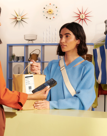
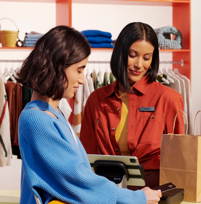
3. Position your checkout
Although it’s the final customer interaction point, your checkout location has a significant role in optimizing the customer journey and boosting sales.
For instance, placing last-minute merchandise like mints and chocolate bars near the register can drive impulse purchases.
Here are the key considerations for positioning your store checkout:
Location: Your store’s front left side is an ideal spot for the checkout counter. Alternatively, you can position the checkout near the exit.
Efficiency: Design checkout areas to minimize wait times and bottlenecks. If appropriate, offer self-checkout options as well. Home Depot uses both traditional and self-checkout lanes with clear signage to improve traffic flow and reduce waiting times.
Aesthetics: Make the checkout area pleasing and fuss-free and add design elements that reflect your branding. Think: Apple’s on-brand minimalistic checkout areas that help create an inviting atmosphere.
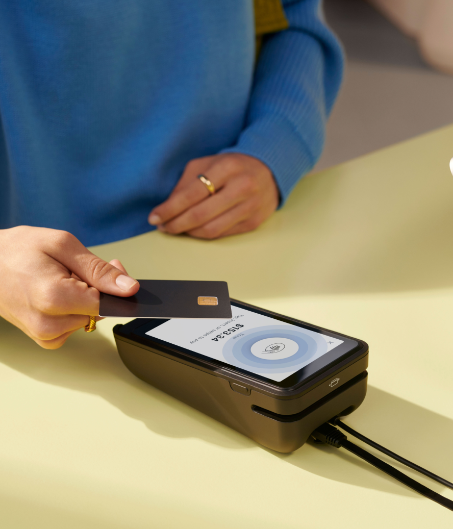
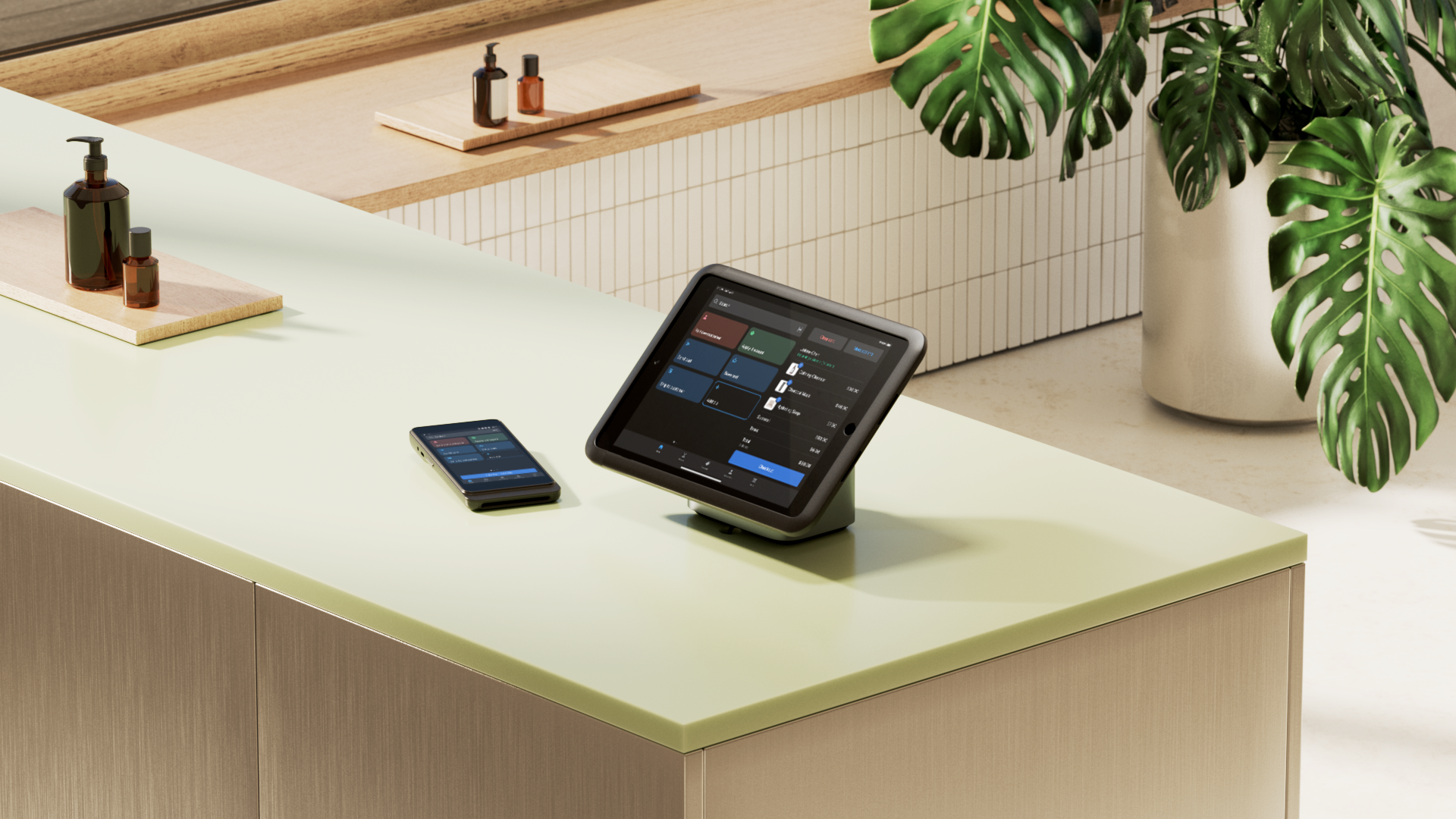
Additionally, consider using technology to streamline and accelerate checkouts.
For example, modern POS systems like Shopify POS help manage inventory, fulfill orders, and deliver personalized customer interactions. Customers can check out anywhere in the store with its mobile and countertop hardware solutions. In fact, triathlon brand Ryzon has increased in-person conversion rates by more than 40% after implementing Shopify POS at its flagship stores and expos.
💡Learn how Ryzon increased store conversion rates by over 40% with Shopify POS
4. Map out your products
When done correctly, strategic and personalized product placement can lead to a 10% to 15% boost in sales conversion rates.
Ideally, you’ll focus on three components:
- High-demand items: Place popular items at the back of the store. As customers walk through, they’ll be tempted by other sections along the way.
- Impulse buys: Position impulse purchase items like snacks and small gadgets near checkout to encourage last-minute sales.
- Themed sections: Group related items together to create themed sections (e.g., “baking aisle” and “workout gear aisle”). In addition to helping customers find what they need, this also encourages the purchase of complementary items.
Effective visual merchandising is crucial here. Display the right amount of product to attract customers and enhance their shopping experience.
The “appropriate product amount” depends on your store’s size, the desired customer experience, and the impression you want to make. For instance, a high-end boutique should curate a limited selection and display only a few items to boost perceived value. Conversely, a discount retailer should maximize floor space to showcase a wide variety of products and encourage bulk purchasing.
Top Tip: Place high-profit margin merchandise at your target customer’s eye level. A study on cereal psychology confirmed this approach helps build brand loyalty with target consumers.
5. Consider your store fixtures and displays
To start, decide between densely filled shelves or sparsely displayed products. You can also use display tables to highlight seasonal or promotional items, and endcaps for showcasing high-margin products, drawing customer attention and boosting sales.
Ensure customers have enough personal space to move comfortably without squeezing or brushing against fixtures.
Next, focus on your retail window displays. Thoughtful window displays differentiate your retail store from competitors, including large retail chains, and boost in-store foot traffic. But you need to be creative—tell your brand story through these displays, capturing the attention of passersby.
Pro tip: Consider hiring an interior designer. You can use their expertise to design a retail space that attracts foot traffic and boosts sales.
6. Add customer amenities
As you create your store layout, consider incorporating amenities to elevate customer comfort. This includes:
Seating areas
Providing comfortable seating arrangements can make a significant difference. This is especially true for elderly customers, families, or those with mobility issues. Moreover, shoppers are likely to spend more time in your store, which can lead to increased purchases.
Dressing rooms
For apparel stores, well-designed dressing rooms are a must. Ensure they are spacious, well lit, and equipped with mirrors and comfortable seating. A pleasant fitting room experience encourages customers to try on and purchase more items.
Online order pickups
Many customers today prefer the convenience of buying online and picking up in-store. Create a designated area for online order pickups that’s easy to locate and efficiently managed to ensure quick service. This will attract online shoppers to your physical store, potentially increasing in-store sales as they browse while picking up their orders.
7. Ensure your store is accessible
Accessible retail stores enable customers to shop comfortably and safely, regardless of their physical abilities. But it’s also smart business—two-thirds of Americans consider social values like diversity and inclusivity when shopping. Plus, with one in four adults living with a disability, making your store more accessible broadens your customer base.
Below are some key aspects to consider.
ADA compliance
Ensure your retail establishment meets the requirements of the Americans with Disabilities Act (ADA). This includes:
- Accessible parking
- Accessible route into and through the business
- Accessible restrooms, fitting rooms, and elevators
- Accessible customer information (keep printed materials in alternative formats like braille)
💡Get the ADA’s compliance checklist.
Wide aisles
Design aisles wide enough to accommodate wheelchairs and mobility aids. According to the ADA, the minimum width for aisles should be 36 inches.
Clear signage
Use large, readable signs with high contrast to assist customers with visual impairments. Signs should be placed at accessible heights and should include braille where possible.
Assistive devices
Consider offering shopping carts or baskets designed for wheelchair users and providing assistance for customers who need help navigating the store. For example, a Sephora store in Europe uses color-coded baskets to indicate customer preferences: a red basket signals a desire for ongoing assistance, while a black basket shows they prefer to shop independently.
Accessible checkout counters
Ensure checkout counters are at a height accessible to wheelchair users, typically between 28 and 34 inches from the ground. You can also offer lower counters or adjustable-height counters to accommodate different needs.
Store layout template
Unsure about the right store layout? Download our free store layout templates to discover the most effective floor plans for various industries and get inspired to design your own.

Free Download: Store Layout Templates
Trying to decide which layout is right for your store? Download these free templates to learn which types of layouts work best for different industries and draw inspiration for your own design.
Store floor plan FAQ
How do I make a shop floor layout?
- Decide on your layout.
- Consider traffic flow.
- Position your checkout.
- Map out your products.
- Consider your store fixtures and displays.
- Add customer amenities.
- Ensure your store is accessible.
What is the most common store layout?
The grid layout is the most common store floor plan, featuring rows of aisles intersecting at right angles. It helps retailers create a structured and organized shopping experience.
What are the 4 main types of store layouts?
- Grid layout
- Racetrack (loop) layout
- Free-flow layout
- Straight (spine) layout


