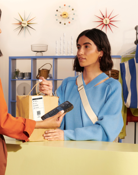
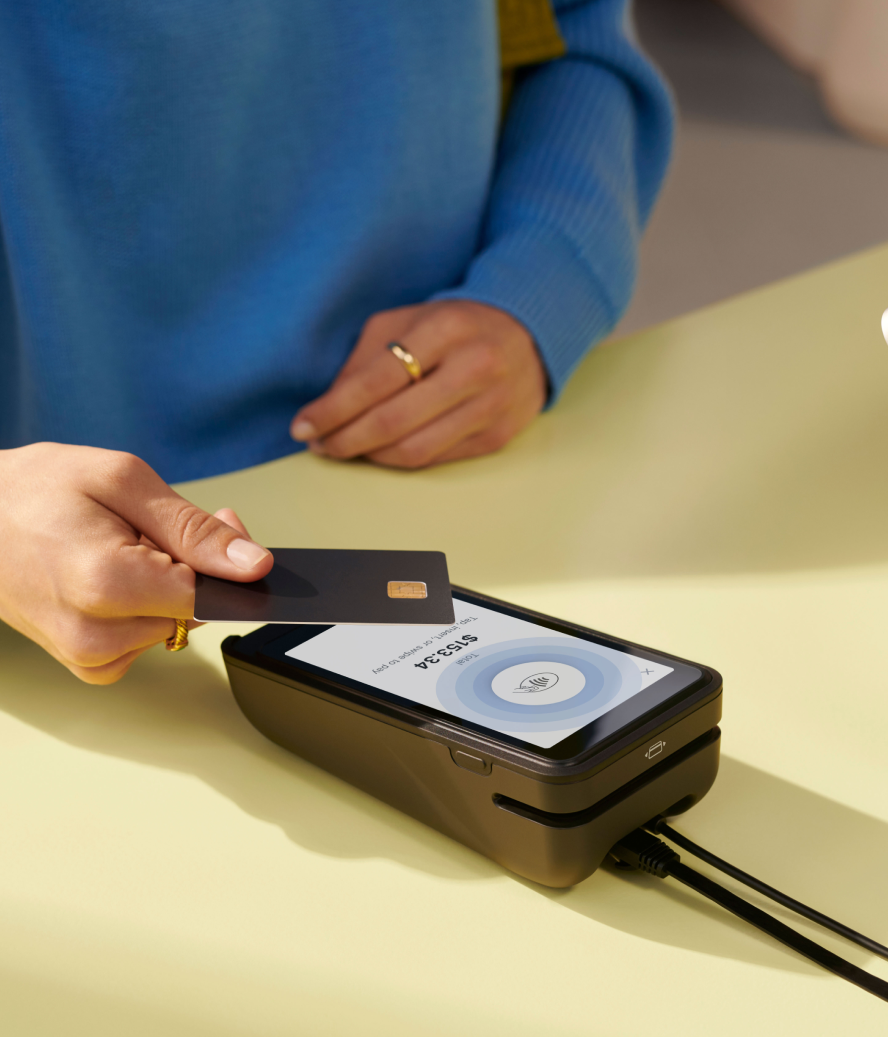
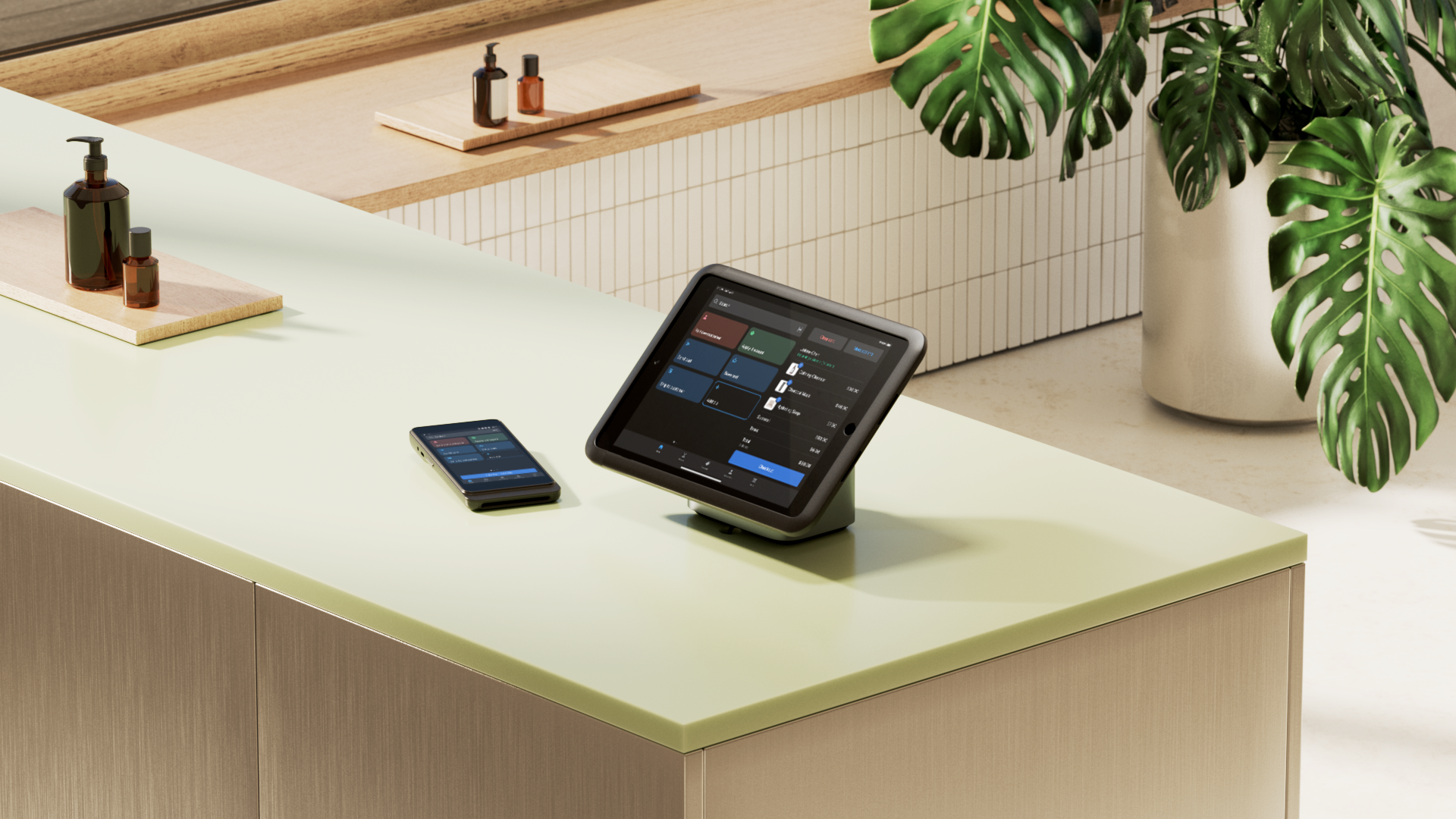
Technology makes our everyday lives easier, more effective, and more enjoyable. This is especially true in retail, where shoppers demand more seamless and flexible omnichannel experiences.
The days of having a simple cash desk and calculator are all but over. Retailers need a point-of-sale (POS) system—technology that enables transactions, tracks inventory, and adapts to keep up with consumer technological demands.
Whether you have a single brick-and-mortar store or a chain of them, you need to train employees of all different skill sets and experiences to use your POS efficiently, which is where POS UI design takes center stage. This blog explores the core elements of an effective POS UI, with design principles to follow when customizing an interface.
What is POS UI?
POS UI stands for “point-of-sale user interface,” though you might also see it referred to as POS UX (user experience). The term refers to the navigational elements on the default POS terminal or mobile app that an employee or store owner uses to conduct shopper transactions, as well as monitor and track inventory and customer data.
Additionally, user interface design ensures that POS interfaces are easy to use, enjoyable, and adhere to usability and interaction design best practices.
What are the core elements of POS UI
The core elements of a POS user interface can be narrowed down to how retail staff navigate the POS app to build carts and completed daily tasks. If the POS UI falls short here, your POS system costs can go up—you’ll have to make up for the shortfall with more software or even proprietary development.
Navigation
With mobile POS apps and in-store POS hardware, software needs to have a navigation system that’s intuitive and customizable to suit your needs.
For example, with Shopify POS, you can personalize the checkout screen of your terminal or customize the smart grid in your mobile app to feature popular products, popular extensions, and important discounts, which can save employees a lot of time and effort, giving them more opportunities to connect with your customers.
Transaction processing
Customers want to make transactions with their preferred payment methods. According to WorldPay, credit, debit, and prepaid cards accounted for 52% of ecommerce and 73% of in-store spending in North America in 2023.
One thing that all payment methods have in common? The need for POS security that keeps financial and customer information safe.
Common types of security threats that may disrupt your ability to conduct transactions include:
- Outdated software
- POS malware
- Physical tampering
- Network threats
- Non-compliance with PCI DSS
- Phishing attacks
- Insider threats
You need to have measures in place that work to protect your system from these kinds of threats—whether that’s choosing a PCI DSS compliant vendor or training retail employees on how to detect and report threats.
Speaking of employees, your POS system houses tons of customer data that must not fall into the wrong hands. Shopify POS’ UI helps you combat this with employee profiles that limit access to certain data or prevent initiating specific actions.

Inventory management
Inventory management can become tricky if you keep your in-store stock counts and online sales data separate. The best approach is to use a unified inventory management POS system that gives you real-time visibility into stock levels across all of your channels, warehouses, and retail locations.
Shopify POS, for example, enables you or your sales associates to access inventory management workflows directly from the POS UI. Enabling direct inventory workflow access provides staff with up-to-date stock levels, giving customers accurate information about inventory levels in-store and online.
Customer management
Great POS UI design includes the ability to capture data-rich information that is easily accessible to staff. With Shopify POS, staff have access to customer profiles that keep track of information such as purchase history, lifetime spend, customer notes, tags, shipping address, taxes, and marketing preferences.
Additionally, through Shopify’s vast selection of POS app integrations, you can also reward loyalty online and in-store with a POS loyalty program. Shopify integrates these apps directly into the POS UI, allowing for seamless access for staff.
For example, with Shopify POS, when you select an existing customer, all their relevant customer information populates on the POS UI, including their loyalty points and redeemable rewards. When their profile loads, both you and the customer can immediately see if there’s a reward offer.
Reporting and analytics
Your POS UI is also a crucial place for you to gather and view important data. You can generate reports on sales, cash tracking, cash flow, products, and discounts, ultimately helping you get actionable insights to make better business decisions.
With Shopify POS, all of this reporting and analytics are available through your POS, which lets you see your entire business online and in-store at a glance. On the Pro plan, your POS can also generate daily reports on sales, products, and staff performance.
POS UI design principles
User-centric design
The cardinal principle of UI design is user-centricity. If retail staff can't make sense of a UI design, you’ve failed. Therefore, any reputable POS company wants to make sure its product/service works for its users by design.
Shopify POS, for example, is customizable to fit your business’ needs. Shopify also has a large community for store owners, merchants, and partners to offer feedback on the product, as well as offer advice for others using it.
“The Shopify interface is just easier to use too,” says Mandalyn Renicker, owner of Offbeat Bikes. “Customers recognize it, especially at checkout where when they see that Shop Pay icon, they know checking out will be a breeze.”
Simplicity
The general rule of thumb for user interfaces is “less is more.” The UI shouldn’t clutter up the screen with every possible action a user can make, but instead be simple enough to navigate and perform frequent tasks.
That’s why Shopify POS uses smart grid tiles with clear labeling, which are also fully dynamic and respond to changes in the cart or customer information updates.

Consistency
Your POS UI should also have a look and feel that is similar to the back-end experience. The last thing you want is to have a huge library of support documentation for each system you’re using, each with their own interface, processes, and ways of working.
The Shopify POS app shares the same type of UI across all devices, including Shopify’s terminals, iPadOS, iOS, and Android.
Accessibility
The POS UI you adopt must be built with accessibility from the ground up. Those who are colorblind or have other sight challenges, for example, need to more than just use the app, they need to build complex carts and navigate the app with confidence. As such, it’s important that all the UI elements have a high degree of contrast between the text and the background.
Designing for different platforms
While every POS UI should abide by the above POS design principles, it’s worth going deeper into how a POS UI should look and behave across, phones, and tablets.
The differences between these platform’s capabilities and screen real estate means the UI should adapt to each platform’s features and limitations.
Unified Android and iOS UI
POS UI should be consistent across native platform applications. Consistent UI elements and patterns across platforms allow users to quickly learn and navigate the system, regardless of the device they're using. This is especially important for global retail brands who may use different devices based on the country their retail stores are in.
Be on the lookout for POS vendors with two different versions of the POS app that do not have POS UI or feature parity, leading to a disjointed experience for retail staff and customers. Shopify POS apps are built on a unified codebase, ensuring the same POS UI and feature set for both Android and iOS.
Mobile POS UI
There are a lot of reasons for retailers to make their POS systems portable, including being able to take payments on store floors, as well as being able to use them at pop-up events or festivals.
Nevertheless, a mobile-based POS UI needs to be even simpler to account for the much smaller screen, as well as offer critical touch-based interactivity. A mobile POS only needs the key components of the POS UI to complete basic tasks on the go.
Tablet POS UI
POS vendors are optimizing their POS UI for tablets, which are becoming a lot more popular, thanks to their larger screen and the POS hardware options you can combine with them.
Similarly to mobile-based POS systems, the tablet-based POS UI also needs to maximize their screen space. With a tablet, however, you have more room to search and display product, cart, and customer information.
Using POS UI extensions
The purpose of UI/UX extensions on your POS is to enhance and improve the overall POS system. They not only help you build POS systems that work uniquely for your business, but also help your store grow when you’re ready.
With Shopify POS UI, you can custom-build POS workflows using UI component building blocks and libraries without sacrificing performance.
POS UI extension types
There’s a range of POS UI extensions that can be embedded into the core elements discussed above. Shopify POS UI extensions also offers a range of extensions targets:
- Smart grid extensions
- Block extensions
- Action extensions
Thanks to the component library, Shopify POS UI extensions build better, faster apps that look and feel like native Shopify apps, which significantly improve the user experience for retail employees and owners alike.

Build a better POS experience for your store with Shopify POS
Shopify POS is designed to help retailers adapt to the increasing technological demands from their customers, supported by a unified commerce solution. The Shopify POS UI is intuitive and user-friendly, and is a perfect option for managing sales and inventory on the go.
By implementing a unified commerce strategy, the Shopify POS UI seamlessly integrates with your Shopify admin account for a smooth operation across all of your sales channels, not just your brick-and-mortar stores.
As Julia Rossi, Retail Operations Manager at Frank And Oak, says: “We actually moved all 15 of our stores to Shopify POS in less than three months, including training the team. Shopify has great training resources, and the POS interface was easy for our store associates to get accustomed to.”
POS UI FAQ
What is a POS interface?
A point-of-sale (POS) interface consists of navigation elements that a retail employee or store owner uses to conduct sales and manage store inventory.
Can I have a POS on my phone?
With the help of a mobile POS app and a card reader device that connects to your phone’s charging port or wirelessly through Bluetooth, you can take sales and track inventory through your mobile device.
What is an example of a POS?
An example of a point of sale is something as simple as a good old-fashioned cash register. The point of a POS is to enable transactions between customers and the business. Current technology, such as Shopify POS, lets you use this opportunity in the customer journey to gather more data, build relationships through loyalty rewards, and more.


