Modern apps and websites are becoming more and more complex. The more content and features we add to our products, the more complicated the interfaces become, and the more effort users have to invest in interactions. An excess of information or choices can easily make people feel dissatisfied with the experience.
When it comes to selecting a product, people often choose the path of least effort. They don’t want to spend time learning how to use the app or website—they have a task to do and want to complete it as quick as possible, without putting too much effort into the process of interacting with a product. That’s why simple products usually win.
Removing content and features seems like an obvious solution to the problem of complexity. But in many cases, this solution is not applicable. For example, if you run a large-scale ecommerce website, you can’t just get rid of some product categories.
Luckily, it is possible to achieve simplicity without removing content or features from your product. Instead, we can expose content and features to users in a progressive, step-by-step way. This is called progressive disclosure.
In this article, we’ll look at common uses of progressive disclosure, and how to use them in your designs to create simpler, more intuitive user experiences.
What is progressive disclosure?
Progressive disclosure is a concept of managing information that dictates that everything in a user interface should progress naturally, from simple to complex. It's a simple yet powerful technique of disclosing information: initially, you show only the most important information or actions, and reveal all further options and actions only upon request.
Why progressive disclosure is so great
Progressive disclosure simplifies the baseline experience by hiding details from users until they ask or need to see them. You might think this means that by initially focusing users' attention on a few core features, they might build a limiting mental model of the product and thus be unable to understand all of its value. However, research by NNGroup makes it evident that this assumption is incorrect. In fact, when you prioritize content and features and help people spend more time on the most important ones, they form a better understanding of your product.

Progressive disclosure brings two significant benefits to interaction design: it helps maintain focus and removes distractions. It builds:
-
A smaller cognitive workload: Humans have limited capacity for processing information. If we were shown all the information or features of a product all at once, we’d get overwhelmed. Progressive disclosure simplifies user interactions by focusing the user’s attention on the most important details first, while revealing additional detail only as needed. As a result, the user focuses on the task at hand with as few distractions as possible.
- A cleaner user interface: By hiding secondary content and features, you remove clutter in the user interface and simplify its appearance. This makes your product easier to learn and less error-prone.
You might also like: Dark Patterns: 12 Tricks You Should Never Use in Your Products.
Progressive disclosure examples
Progressive disclosure can take many shapes. Below, we look at 9 examples of progressive disclosure in products.
1. Truncated content and content previews
Content previews (also known as snippets) are typical examples of progressive disclosure. A snippet is used to provide the user with just enough information to help them decide if they want to dive deeper and read the full content.
This progressive disclosure technique is commonly used on news websites and blogs. Websites show visitors an overview of articles up front, and lets the user decide which ones they want to actually open up and read.

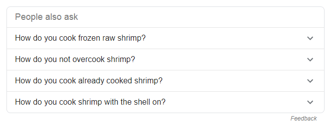
2. Accordion elements
The accordion approach works well when you need to display lots of sections containing information, or provide a number of options in the same category—especially when only some of the information or options will be relevant to the particular user. Frequently asked questions and help centers or support pages are typical places where users interact with accordions.
3. Mega menus
Mega menus are drop-down menus that usually appear on large web sites such as Amazon. By hiding the options by default, websites save more space for other essential elements, such as the search bar.

4. Sliders
Sliders are one of the most expected elements on ecommerce websites. They often help users discover popular or related products.

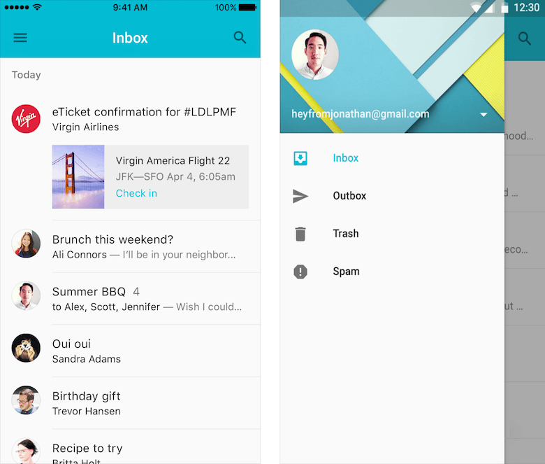
5. Hamburger menu
The now ubiquitous hamburger menu can be found in thousands of mobile apps and adaptive websites. The idea is simple—hide navigation options by default, and show them only when the user wants to navigate to the different sections.
6. Advanced settings
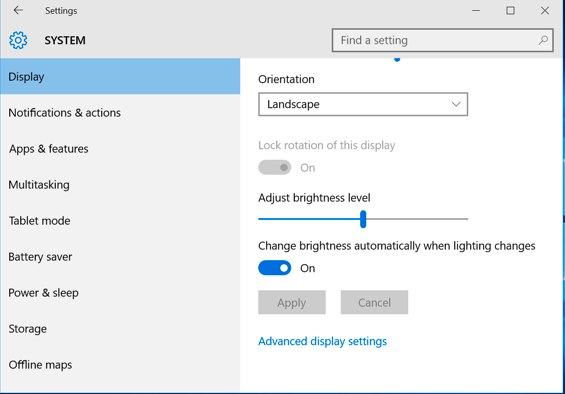
Most apps and online services that support user profiles have dedicated pages for settings. While it’s possible to display all the settings on the same screen, it can easily make the screen more crowded and the process of customization more complex.
Using progressive disclosure, you can instead show the basic settings for all users, and provide a secondary level of settings for experienced users. By hiding the advanced settings, you help inexperienced users avoid mistakes, since it becomes harder to enable or disable something by accident.
7. Lazy loading
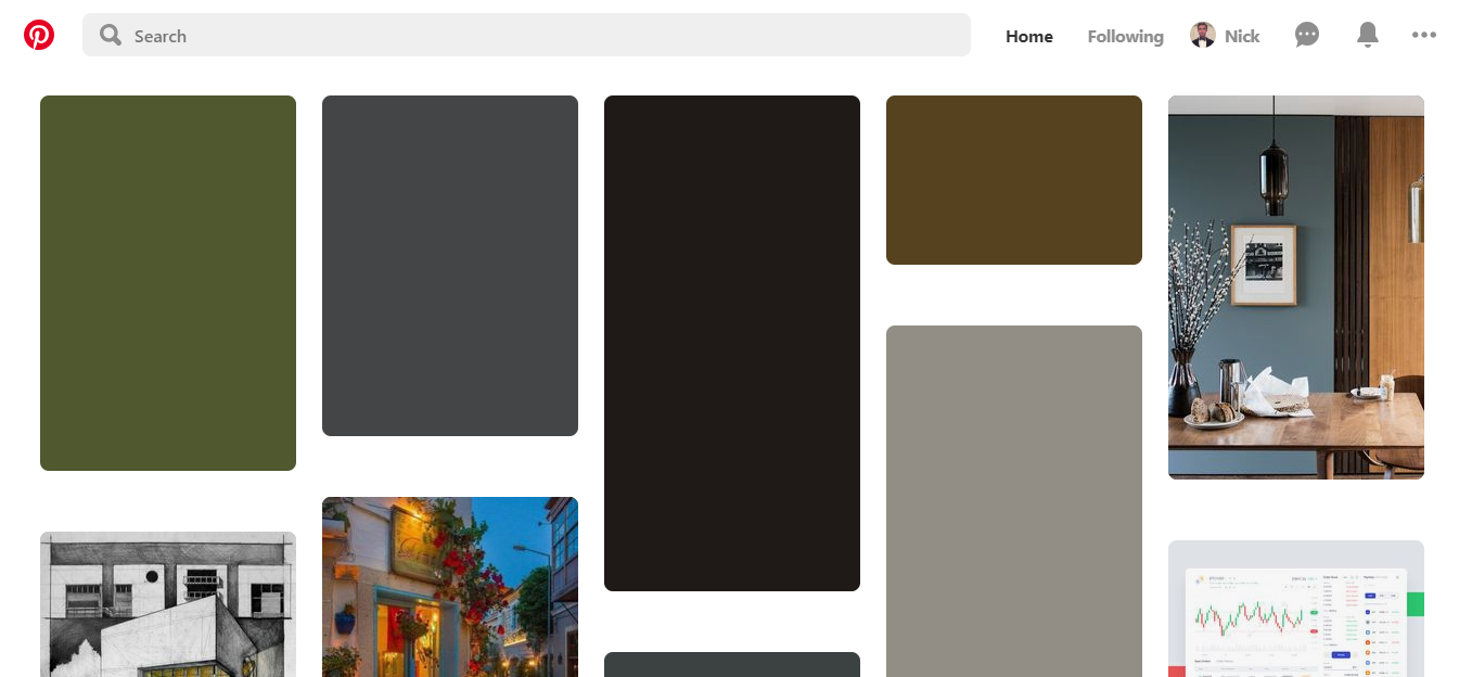
Lazy loading is an extremely useful technique when you have a lot of information to display and want to reduce interaction cost. Scrolling provides a more comfortable experience than clicking—all the user needs to do to get new content is simply scroll down.
8. Step-by-step design
Step-by-design is based on a simple idea—divide and conquer. As the name suggests, step-by-step design reveals the information or actions one step at a time. This approach works really well for complex scenarios like using an ATM. Initially, the user starts with a very minimal UI where they select the option they want to complete, such as making a withdrawal. From there, the system guides the user by showing more and more of the UI as they complete each step.
From first glance, the step-by-step design looks like a wizard pattern, but they aren’t the same thing. Wizard is a linear sequence, while the step-by-step design is branched—the choices the user makes at one step can alter the rest of the task.
You might also like: 15 Myths That Can Ruin Your Mobile UX.
9. Animated hints
Animated hints are commonly used in games. They are an excellent technique for revealing game mechanics as a player moves further into the game. Well-designed hints are context-relevant: they are triggered only when the user reaches the appropriate point in their journey.

Applying progressive disclosure to our UX
The concept of progressive disclosure might sound simple, but to design proper progressive disclosure it’s crucial to consider the following.
1. Know your users
The main danger of progressive disclosure is making incorrect assumptions about your users and ‘optimizing’ experiences based on that assumption. As Jakob Nielsen has said, “One of usability’s most hard-earned lessons is that ‘you are not the user.”
To design a good progressive disclosure, you need to learn about your users (know their wants and needs) and involve them in the design process (interact with them on a regular basis—not only when you’re going to release a product).
You might also like: Conducting User Interviews: How to do it Right.
2. Prioritize features
To create good UX, you need to prioritize all your features and get the right split between critical and secondary features. It’s vital to disclose essential information and actions upfront.
To properly prioritize features:
- Identify and prioritize your user's goals. Use the Jobs to be Done framework to identify key user goals. Map out the entire user flow and conduct task analysis to understand what people need at every step of the journey.
- If your product is live, collect and analyze data about user interactions (how people actually use your product).
3. Solve the problem of discoverability
Discoverability is one of the central challenges of progressive disclosure. When you want to use progressive disclosure, you need to hide content while still providing people enough contextual details to help them find content when they need it.
Thus, you need to ensure it is easy for users to access the secondary layers of information. For example, if you use a button for this purpose, label it in a way that sets clear expectations for what users will find when they progress to the next level.
4. Avoid multiple levels of progressive disclosure
In practice, designs that go beyond two disclosure levels typically have low usability, because it's relatively easy for users to get lost when moving between the levels. If you have so many content or features that you need 3 or more levels, consider simplifying your design.
Reduce noise and increase signal
When we design a new product, we should always try to get the most out of our interfaces and maximize whatever space is made available to us. Progressive disclosure can help us with this goal. Well-applied progressive disclosure will keep the user interface clean and help people deal with product complexity without confusion.
Read more
- 15 Funny Lorem Ipsum Generators to Shake Up Your Design Mockups
- 5 Common Digital Content Problems and How to Avoid Them
- Streamline Your Ecommerce Experience With The Laws of Simplicity
- How to Use Eye Tracking in Usability Tests
- Forget User Experience. Start Thinking About Client Experience.
- Delivering Accessible, Usable, and High-Performance Transactional Emails for Clients
- The Pivotal Role of User Experience Design in Brand Building
- 5 Ways to Improve Your Ecommerce Design for Colourblind Users
- The Top 4 Reasons Users Abandon Their Carts and What to Do About it
- Content Strategy: The Principles we Followed to Build the New Shopify App CLI
How have you used progressive disclosure in your designs? Share your experiences below.

