It’s no secret that email can be an extremely valuable marketing channel. Industry research routinely places email ahead of other channels like social, paid ads, and print, with a remarkable $44 USD returned, on average, for every dollar spent. What you may not realize is that automated and transactional emails can be even more valuable than the typical email marketing campaign.
Campaign Monitor claims that automated emails can generate 320 percent more revenue than non-automated emails, and Experien says that transactional emails result in an 8x increase in opens and clicks and up to 6x more revenue. And, for ecommerce companies, email is the backbone of a successful business strategy.
But what, exactly, are transactional emails? How do they differ from the standard business email format or subscription based email marketing? And how can you use them to ensure that they deliver a better user experience for your clients’ customers?
What are transactional emails?
In short, transactional emails are any emails that result from a transaction. They are emails that are sent when a user or customer takes some action, and contain information that is relevant to that action. Emails like order receipts, shipping confirmations, and password resets are good examples. Shopify actually has a great article on the types of transactional emails every ecommerce site should be sending.
This is in contrast to marketing emails, which subscribers need to opt-in to receive, like email newsletters and product updates. While the definition of a transactional email is fairly clear cut, they can—and often should—contain some elements from marketing campaigns, like logos, styles, and product shots (when needed).
There’s a lot that can go into an email, marketing or transactional, so let’s look at some of the main components of a good transactional email.
Key ingredients of transactional emails
One of the most important things when sending transactional emails is to make clear:
- Who the email is coming from
- Why the recipient is getting the email
The first can be accomplished using a few key elements.
In the inbox view, before an email is even opened, you should use a recognizable from name. While it can be tempting to use a name like, “Jason Rodriguez,” or “Clark from InVision,” the name of your client’s company is a better choice. Customers often don’t recognize the names of individuals, but the company name by itself leaves no doubt as to who the email is from.
Once opened, the visual style is another way to convey that information. Including things like a company logo in the email, as well as brand styles like color, imagery, and typography, reassures customers that you are who you say you are. That being said, transactional emails should be straight to the point, so be careful not to overdo the styling.
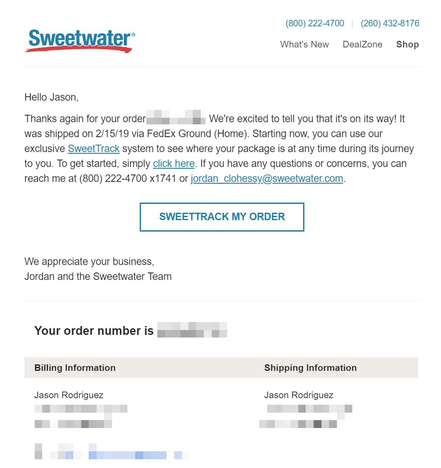
This is something music retailer Sweetwater does well:

The logo and colors are on-brand, but the email isn’t overly designed. It cuts right to the important stuff instead of focusing on style.
The second key ingredient is the reminder of why someone is getting this email. In the inbox, this is where the subject line can be useful. Choose simplicity and clarity over cheekiness. It can be tempting to throw emojis and jokes into the subject line, but transactional emails are not the place to do so. Recipients may confuse it for a marketing email, delete it, and miss out on important information about a recent transaction.
The preview text, which is the copy pulled into the inbox underneath the subject line, can be put to use, too. A good trick is to define the preview text yourself in your HTML instead of letting the inbox grab it from the body of your email. This can be accomplished by inserting a hidden div element after the opening body tag in your email:
<div style="display: none; max-height: 0; overflow: hidden;">
     This text will be pulled into the inbox view as preview text. Use it wisely!
 </div>
If you want to make your email—and preview text—stand out, you can even keep your preview text short, followed by a bunch of white space, which sets it apart in most inboxes. Just follow the preview text div above with another hidden div filled with non-breaking spaces and zero-width non-joiners:
<div style="display: none; max-height: 0px; overflow: hidden;">
‌ ‌ ‌ ‌ ‌ ‌ ‌ ‌ ‌ ‌ ‌ ‌ ‌ ‌ ‌ ‌ ‌ ‌ ‌ ‌ ‌
</div>
Within the email itself, the transaction should be referenced front-and-center, with any supporting information underneath. For example, within an order confirmation email, you can thank your customer for their order in the headline, then follow that up with details of their purchase below. This is something that Allbirds does really well:

Not only do they clearly state why the customer is receiving the email along with the actual order information, but they do it in a way that is fun, on-brand, and memorable without being overwhelming.
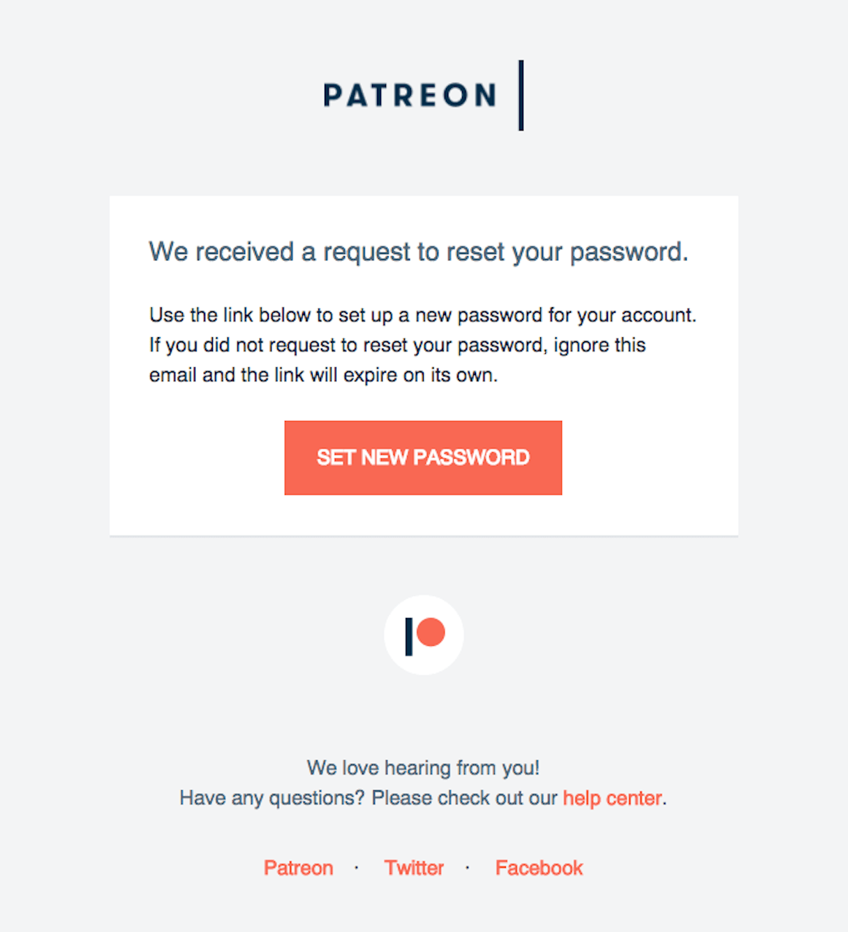
You need to be careful with some types of transactional emails, though. Things like password resets probably shouldn’t be overly branded or humorous. Using a simpler template that is straight to the point is preferred. Patreon does this well in the example below. The template is still branded, but it’s free of marketing cruft and lets customers get to what’s important.

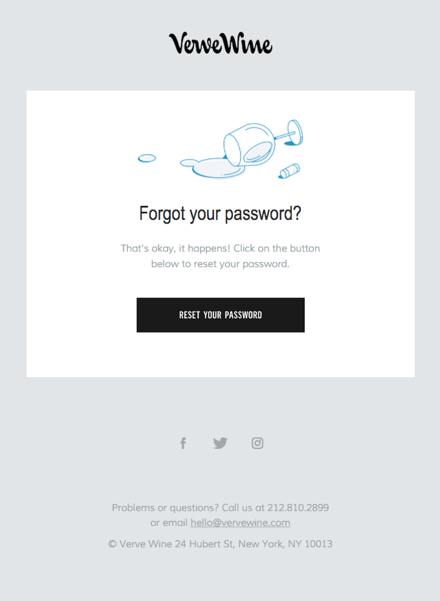
That being said, some brands can get away with more humor in traditionally serious emails. Verve Wine uses imagery to poke fun at the situation and offer an on-brand reason for forgetting a password:

It’s important to remember that transactional emails come in all shapes and sizes. What works in one won’t necessarily work in the other. But by focusing on the key ingredients above, you can instill a sense of trust in all of your customers.
Creating accessible and usable emails
Beyond copy and content, there are a few design principles that should be put to work in transactional emails. These principles will help create more accessible emails for users that need them and, more importantly, usable emails for everyone.
Semantics and text over images
There is a large population of blind and low-vision users. The World Health Organization places that population at 1.3 billion people with vision impairments. A lot of these users rely on assistive technology like screen readers to consume information online. This is where using live text and semantic HTML comes into play.
Screen readers rely on text to speak information to the user. Unfortunately, a lot of emails deliver information solely through images. These all-image emails result in an inaccessible, poor user experience. And, since transactional emails are so vital to businesses and customers alike, all-image emails pose a particular threat.
That’s why it’s so important to favor semantic HTML and live text over all-image emails.
Semantic HTML simply means using HTML tags for their intended purpose. A lot of times, generic HTML tags like divs and spans are applied to text without consideration of the content of that text. By using HTML tags like headings and paragraphs, though, we give users (and screen readers) additional context which can be used to convey information properly.
You should use heading tags (h1, h2, h3, etc.) for actual headings and paragraph tags p for the actual copy in your transactional emails. You can always style that copy as needed, but defining it up front lets assistive technology make sense of it. By using headings especially, you create a table of contents for your email that can be quickly navigated by users.
As a bonus, your emails will be usable for anyone using increasingly popular voice assistants like Siri, Amazon Echo, and Google Assistant.
While more common in marketing emails, stylized text in images can also be desired in transactional emails. I’d recommend still keeping that text as valid HTML, but applying a background image to that text for styling. Litmus has a good guide to using background images in email, with more information on why they’re necessary as well as coding techniques to put them into practice.
When you do need to use images in transactional emails, you should include descriptive alternative text on the image tag. Alternative text is exactly that: it provides an alternative text equivalent for the content of the image which can be used by people employing assistive technology. This is as simple as adding an additional attribute to image tags:
<img alt="Blue sneaker in size 8." src="productimage.jpg">
Finally, when it comes to semantics and email, we need to discuss tables. For a variety of reasons, HTML tables are used to develop the layout and structure of most emails. However, tables have their own inherent semantics and should usually be reserved for tabular information like data. We should keep these semantics when using tables for receipt emails that list product and transaction information. But, for all other purposes, we should remove those semantics to make our emails more accessible for people using assistive technology.
Applying an ARIA role like below removes the table from the document outline in screen readers.
<table cellspacing=”0” cellpadding=”0” border=”0” width=”800” role=”presentation”></table>
The content within (marked up with semantic HTML, naturally) is still understood and read out loud, but the confusing layout is ignored, resulting in more accessible and usable emails for customers.
You might also like: How to Customize Shopify Email Notifications for Clients.
Hierarchy and contrast
For sighted users, there is still a lot we can do to make transactional emails more usable.
Defining a clear hierarchy is a great way to create more scannable and readable emails. This hierarchy should follow the one defined by our semantic HTML. Headings should be larger than body copy, reinforcing key pieces of information and sections in the email. You can style headings inline the way you would on any other web page:
<h1 style=”color: black; font-size: 44px; font-weight: bold; line-height: 44px; margin: 0 0 20px 0;”></h1>
The same can be applied to body copy, too, or the information in a footer. Use size, weight, and color to visually rank information from most important to least. Keep in mind that more emails than ever are being opened on mobile devices, so text should be readable regardless of where the customer is opening.
Color contrast plays a big role in accessibility and usability, too. It doesn’t matter how big the text is in your email when you use too light of a font on a white background. The reverse is all too common in email, unfortunately. In the footer sections of email, which typically include important information like unsubscribe links, business contact info, and legal disclaimers, designers tend to use smaller, low-contrast text. This makes that information unreadable.
Additionally, a lot of email clients, like Apple Mail on iOS, will turn information like links, websites, addresses, dates, and times into blue links. Take this example from a Charvel Guitars email:

The address is auto-linked. On smaller devices or dimmed screens, that information is virtually invisible. While it may not seem like a big deal, for transactional emails and curious users, it creates significant friction and could result in complaints and lost business. Fortunately, you can override this behavior with some CSS in the head of your email template:
/* iOS BLUE LINKS */
a[x-apple-data-detectors] {
  color: inherit !important;
  text-decoration: none !important;
  font-size: inherit !important;
  font-family: inherit !important;
  font-weight: inherit !important;
  line-height: inherit !important;
}
/* GMAIL BLUE LINKS */
u + #body a {
  color: inherit;
  text-decoration: none;
  font-size: inherit;
  font-family: inherit;
  font-weight: inherit;
  line-height: inherit;
}
/* SAMSUNG MAIL BLUE LINKS */
#MessageViewBody a {
  color: inherit;
  text-decoration: none;
  font-size: inherit;
  font-family: inherit;
  font-weight: inherit;
  line-height: inherit;
}
The linked functionality is still there, but your styling is applied. Combined with big enough text and higher-contrast colors, this trick will keep all of the information in your transactional email usable.
Responsiveness
As I mentioned before, more email than ever is being opened on mobile devices. Currently, around half of all email opens happen on phones and tablets. As such, we need to ensure that all of our emails—marketing and transactional—are responsive.
There are a number of ways to make responsive emails, but my preferred method is to use a technique typically called the “hybrid” or “spongy” method. It consists of using fluid elements with a max-width set on a parent container. It’s not far from traditional responsive methods, except that for email we need to add in conditional tables, sometimes called “ghost” tables, that prevent the layout from blowing out in some versions of Microsoft Outlook.
Here’s what an example of that looks like:
<!--[if (gte mso 9)|(IE)]>
<table cellspacing="0" cellpadding="0" border="0" width="720" align="center" role="presentation"><tr><td>
<![endif]-->
  CONTENT GOES IN HERE
<!--[if (gte mso 9)|(IE)]>
</td></tr></table>
<![endif]-->
Depending on the layout needed, the hybrid coding method can get complicated. This classic article on the topic from Nicole Merlin will help you wrap your head around the technique.
One of my favorite tricks for creating responsive emails is to create “responsive-by-default” images. Images in emails require specific widths, especially if you’re using retina images. However, we can easily make sure they adapt to different screen sizes by including a max-width, min-width, and width in an inline style:
<img alt="This image is responsive by default." src="image.jpg" width="600" border="0" style="display: block; max-width: 100%; min-width: 100px; width: 100%;">
While the same can be accomplished in a web-friendly style, by including a rule for all images in the head of your HTML document, some email clients strip out embedded styles. Moving this responsiveness inline ensures that it works across all email clients.
Beyond that, adapting the size of your text and simplifying the layout of your transactional emails can help to keep your emails accessible, usable, and valuable for customers, regardless of where they’re opening.
You might also like: How to Write a Business Email Prospective Clients Will Never Forget.
Improve your clients' transactional emails
Transactional emails are often overlooked. A lot of companies throw their logos into an already designed template, set up some triggers, and forget about them. As we’ve seen, though, well-designed, accessible, and usable transactional emails can help drive business.
By focusing on key pieces of content, aligning your design with the rest of your brand, and following some simple design principles, we can create better transactional emails. And, with better transactional emails comes trust in your client’s brand and happier customers. What’s there to lose?
Read more
- How Accessing the Partner Ecosystem Can Help You Grow Your Business
- Enhancing the On-Screen Reading Experience With Variable Fonts
- Content Strategy: The Principles we Followed to Build the New Shopify App CLI
- How to Conduct a User Interview That Actually Uncovers Valuable Insights
- Streamline Your Ecommerce Experience With The Laws of Simplicity
- The Ultimate Secret to Increasing Your Online Conversion Rate
- 10 Accounts to Follow on Instagram for UX & Web Design Inspiration
- UX Designers: Are You Focusing Too Heavily on Creating a Beautiful UI?
- 5 Common Digital Content Problems and How to Avoid Them
- What Makes or Breaks an Ecommerce Shopping Experience? This Survey has the Answers

