Whether you’ve just started your business or are looking to take it to the next level, putting your small business online with a well-designed website is a major opportunity to grow your customer base and increase profits. When done right, your small business website will be easy to use, attract visitors, and act as an effective marketing tool for your business. Here’s what you need to know about designing a stellar website for your ecommerce business.
5 elements of good website design
Successful websites are aesthetically pleasing and deliver the best user experience (UX) possible. A well-designed, professional website also includes the following five elements:
- Intuitive site navigation and organization
- Responsive design
- Distinct and consistent visuals
- Compelling and valuable content
- High speed and performance
1. Intuitive site navigation and organization
Your website visitors should be able to quickly and easily find what they’re looking for on your site. Each page should be clearly organized, consistent across all pages, and structured in a way that best meets your needs and business goals. A positive experience keeps shoppers engaged with your website, making them more likely to complete tasks and become repeat customers.
2. Responsive design
A responsive and mobile-friendly website automatically adjusts its layout so that it can be viewed across various devices, from desktops to tablets to smartphones. Creating a website with a responsive design approach means you only have to create one flexible website design that shrinks or stretches according to the screen, as opposed to multiple versions of a website for each device size. Having a responsive website that is mobile-friendly is a mobile SEO best practice—meaning it can improve your site rankings on search engines such as Google.
3. Distinct and consistent visuals
Good website design requires clear and consistent visual language, including distinct color schemes, icons, fonts, and images. Additional design principles to follow include:
- Avoid mismatched font styles and sizes, and visual clutter. Instead, create a cohesive theme with easy-to-read fonts and a complementary color palette that reflects your brand image.
- Use design elements that inspire trust. Build credibility and inspire customer trust by avoiding outdated design elements (like frequent pop-ups and clip art) and more prominent opt-in buttons, versus opt-out buttons that can leave customers with negative impressions.
- Include original photography that is unique to your brand and builds brand recognition. Avoid relying too heavily on stock photos, which can often feel generic and don’t fit your overall visual language. Using original photography can help customers connect imagery with your brand.
4. Compelling and valuable content
A well-designed site includes relevant content that your audience values, whether that’s your brand’s story, creative product descriptions, or other insights related to your products or services. Your website’s design, together with compelling and SEO-optimized content, helps attract traffic and convert customers. Once visitors land on your site, they should find clear, concise and compelling language that guides them along the purchase journey through easy-to-use and well-designed pages. Customizable website builders can assist with this.
5. High speed and performance
Visitors expect websites to load quickly and function smoothly. If a site takes too long to load or is slow to respond to user interaction, it can cause visitors to abandon their shopping carts—or worse, abandon your website altogether. One Imperva survey found that 62% of online shoppers will wait no longer than five seconds for a page to load; 13% of shoppers will leave and never come back if a website doesn’t run smoothly.
8 examples of well-designed ecommerce websites
To help inspire the creation of your own small business site, here are eight ecommerce websites that stand out for their creative and conversion-boosting designs.
1. Ruggable
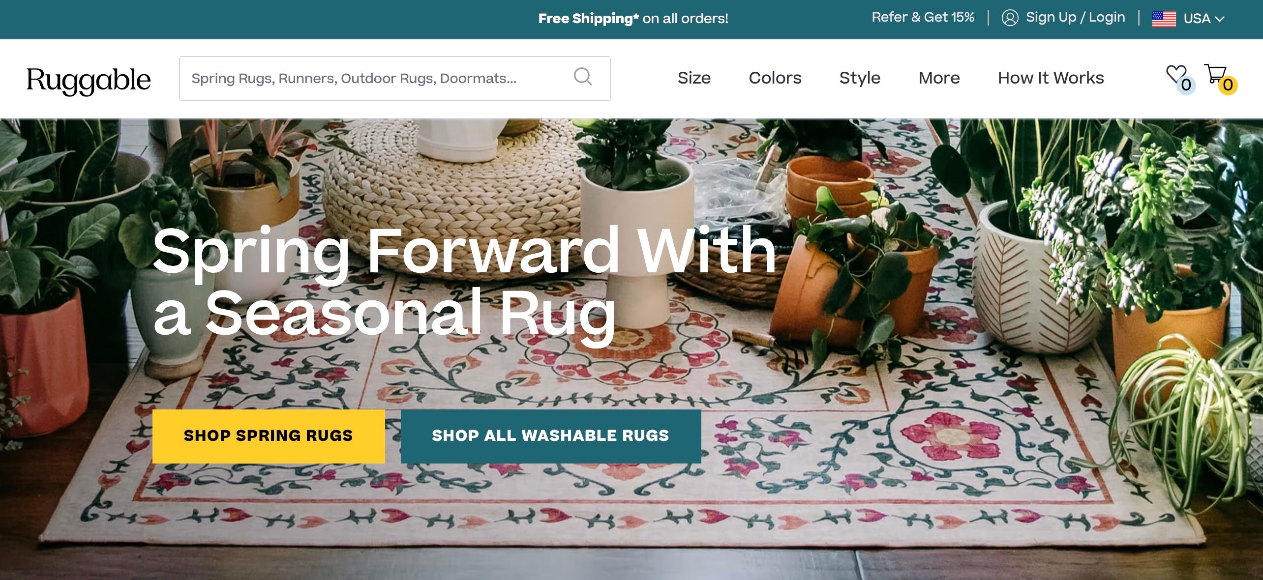
Washable rug retailer Ruggable’s website is designed to help visitors find their perfect rug by shape, color, style, or function. Ruggable also curates its rug collections by theme—such as farmhouse, bohemian, and contemporary rugs—for an easy-to-navigate shopping experience.

2. Glossier
Like the best ecommerce sites, Glossier leverages its homepage to spotlight top products. An Add to Bag button is directly below each item, streamlining the buying experience. The beauty brand’s website also includes hover effects and motion graphics to engage customers.

3. TUSHY
TUSHY’s website uses humor—through images (people riding a bidet stream) and words (100% guarantee booty bliss)—to highlight the benefits of using its bidets and bathroom accessories. An interactive calculator on the home page also shows site visitors how much money a bidet can help them save annually and the environmental impact of reduced toilet paper use, targeting like-minded eco-conscious customers.

4. Brooklinen
Textile and home accessories company Brooklinen includes interactive content like an online quiz on its website, which can help convert customers and help shoppers discover more about the brand. Brooklinen matches visitors that answer a few questions with the products—bedding, bath, loungewear—that best fit their preferences. This improves the user experience by personalizing results—and serving as a shortcut in your potential customers’ path to purchase.

5. Death Wish Coffee
Death Wish Coffee Company’s website reflects its distinct and rebellious brand identity. With a red, black, and white color scheme, in-your-face typography, and bold copy, the site supports its edgy brand image that it notes disrupts the status quo.

6. Outdoor Voices
Activewear brand Outdoor Voices expresses its mission to “get the world moving” by showing on its site how its customers make use of its products. Through its continuous scroll #DoingThings page, the Outdoor Voices website showcases user-generated content from social media and adds pop-up item tags that link right to the product page. The design detail cleverly utilizes social proof to boost conversions while also simplifying the purchasing process.

7. Gymshark
Gymshark speaks the language of its athletic audience. Going beyond basic product types, the workout apparel brand organizes items according to fitness concepts such as conditioning, lifting, and rest days. This helps establish credibility and trust by signaling to website visitors that the brand knows its target customers.

8. Jungalow
The colorful and patternful home decor brand Jungalow has a website that matches its eclectic aesthetic. There are customized, bohemian-style icons for search, login, shopping cart, and wishlist. Standard site elements such as quality product images and a prominently featured logo is also incorporated. Together, these help showcase the brand’s distinct and memorable personality.

4 best practices for small business website design
These four best practices can help you create a successful website for your ecommerce business:
- Design with your target audience in mind
- Follow your industry’s design conventions
- Leverage the power of whitespace
- Design calls to action that standout
1. Design with your target audience in mind
Before you start designing, step into your target audience’s shoes and think about what they would want to see on your website. Effective web design goes beyond aesthetics by considering the practicalities of how the website will be used by your visitors. For example, are impulse purchases characteristic of your customers’ experiences? Consider adding a Buy Now button that makes the buying process even easier. Would bulk purchases be a common occurrence? Ensure that the product design accounts for that as a quantity option.
2. Follow your industry’s design conventions
While it may be tempting to create a completely original design, it’s important to remember that users have developed certain expectations when it comes to small business websites. Following the design conventions, or typical design expectations, of your industry helps to ensure that your customers won’t get confused or frustrated with an unusual site design. Some examples for ecommerce businesses include:
- Putting your business logo at the top of each page and making it link back to the home page
- Having a navigation menu that’s organized by product categories
- Using familiar icons like a shopping cart or bag
3. Leverage the power of white space
White space, or negative space, refers to any empty areas in a design that gives viewers visual breaks. While it may seem like a waste to leave parts of your website blank, white space can be a powerful way to improve the overall effectiveness of your website.
You can use white space to draw attention to particular elements, reduce clutter, and improve readability. Want your visitor to focus on the image of a new product? Remove distractions by increasing the white space around it. Want to boost reader comprehension? Avoid having huge, uninterrupted groups of text and add space between titles, subsections, and paragraphs.
4. Design calls to action that stand out
A call-to-action (CTA) is any element that encourages visitors to take action—from purchasing through your online store to signing up for an email newsletter. Strategically including CTAs throughout your website keeps your audience engaged and brings them closer to a purchase, driving customer conversions.
Ensure that your CTAs have the intended effect by focusing on having one primary call to action on each page, so as to not overwhelm your visitors with countless demands. Make that primary CTA stand out by using a strong and contrasting color, an easy-to-read font, and a button design that is clearly clickable.
Website design for small businesses FAQ
How can I make sure my website is mobile-friendly?
Ensure your site uses responsive design, a web design approach that allows your site to adapt to the size of any screen it’s being viewed on, whether a computer, tablet, or smartphone.
How much does it cost to design a website for a small business?
Web design can range from a few hundred dollars to several thousand dollars, depending on the size and complexity of your website and other key factors (such as choosing a low-cost DIY website builder or hiring a professional web designer).
How long does it take to design a website for a small business?
The process for small businesses may range from a few weeks to several months, depending on the scope of the project. You could have a fully functional website within a week or two if you only need something basic. A more professional-looking website with complex and interactive elements could extend this timeline to several months, depending on the website designer.


