When designing a website or online shop, you’ve probably given plenty of thought to the usual elements and principles of design — the balance of shapes, the hierarchy of text and images, and the harmony of colour. But have you ever thought about the perception of colour, and how it can be perceived differently by different people?
Too many designers, developers, content strategists, project planners, and other people involved in website design take colour perception for granted, but it’s important to remember that a large percentage of people have Colour Vision Deficiencies (CVD), also known as colour blindness.
If your website has problematic colour usage or contrast issues, it can easily affect how customers use your website. If the issues are severe, they may not use your site at all and decide to purchase from your competitor instead. Fortunately, there are some simple points to keep in mind to avoid these issues and ensure that your site is colour-accessible and user-friendly for a wider audience.
First, let’s talk a little bit about what colour blindness actually is.
What is colour blindness?
Colour blindness very rarely means that you can’t see any colour at all, or that people see things in greyscale. It’s actually a decreased ability to see colour, or a decreased ability to tell colours apart from one another.
Cones are a type of photoreceptor cell in the human eye that are responsible for perceiving colour. There are three types of cones—each responsible for detecting red, blue, and green wavelengths in the spectrum. Problems with colour vision occur when these cells are defective or absent entirely. Usually, these conditions are inherited from the parents from birth, but they can also be acquired through trauma, prolonged exposure to ultraviolet light, natural degeneration with age, an effect of diabetes, or other factors.

The two most common types of colour blindness, deuteranopia and protanopia, are sex-linked traits and are much more common in men than in women. Deuteranopia, the most common, occurs in 7% of males, but only 0.5% of females. Just stop and think about it — that’s nearly 8% of the entire population — we simply can’t ignore this demographic.
To help, here are five easy to implement tips that will ensure your designs are colour-accessible and user-friendly for a wider audience.
Tip 1: Use clear colour names
As colour vision deficiencies affect men substantially more than women, one area of the web where it’s extra-important to pay attention to colour choices and design decisions is in online shopping, especially if you sell clothing for men.
One of the most common annoyances from people with colour vision deficiencies is that they may have difficulty understanding the true colour of a piece of clothing and they’ll have to ask another person to confirm the colour for them. While it’s easier to shop online than in a physical store, there are still accessibility issues to consider on shopping websites.
Let’s say that your shop sells t-shirts. If you only show a photograph of the shirt, it may be impossible for a person with a colour vision deficiency to tell which colour the shirt really is.
Here’s a pink t-shirt on the left, and how that might look to someone with deuteranopia in the middle, and protanopia on the right. It’s quite a huge difference.
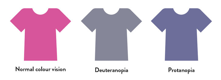
This issue can easily be avoided by clearly stating the colour name in the description of the product. That doesn’t mean using a completely ambiguous name like “mist,” “loganberry,” or “woodrush”— all of which were real names of men’s clothing colours I’ve come across online — it means naming them in the most basic colour terms as possible, like “light blue,” “dark red,” or “dark green.”

The examples below are clear without ambiguity: a “pale blue twill shirt” and a “pink twill shirt” will be understood by anyone who reads them, regardless of the quality of their colour vision.

Tip 2: Use effective colour search filters
Another common problem occurs when a colour filter has been added to a product search. Here’s an example from a clothing website with unlabelled colour swatches, and how that might look to someone with protanopia-type colour blindness.img: colour-filter-bad.jpg
Many websites also take the following approach—removing colour swatches entirely and just using names instead:
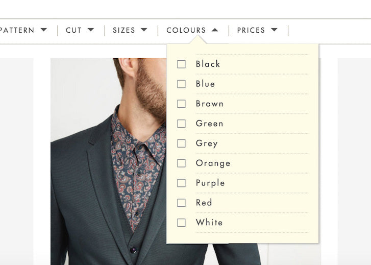
While this might seem like a good idea, it’s important to remember that not all people who have a colour vision deficiency can’t see any colour at all. Not only does removing the colour swatches force colour blind users to read every label to find the colour they’re looking for, but it does the same for people who can see colour clearly as well. This removal of information can slow down the interaction of choosing a colour when customers simply want to see search results as quickly and smoothly as possible.
Yet another common technique displays colour names on hover, but remember, this won’t work on a touchscreen device where hovering isn’t possible.
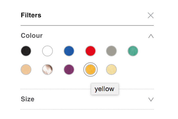
The best solution involves a combination of both colour swatch samples and clearly defined labels. Below is a fantastic example from Warby Parker’s online shop which combines the best of both worlds.

Tip 3: Avoid colour-specific instructions
When designing forms, avoid labelling required fields only with coloured text, like in the example below. These fields can look identical to a person with a colour vision deficiency.
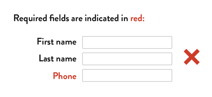
It’s safer to write the text reference right in the form’s label, which has the added bonus of being readable by a screen reader for folks who have severe vision problems.

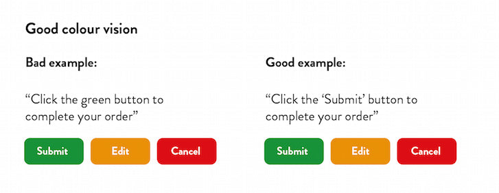
A similar example of a colour-specific instruction would be directing a user to click a green button to complete a task. Label your buttons clearly and reference them in the site copy by function, not colour, to avoid confusion.

Tip 4: Avoid low-contrast design
Just like in painting, illustration, and photography, good use of contrast can create effective hierarchy and focus and draw your eyes toward a certain area of a web page. More importantly, effective contrast is necessary in ensuring that our content and links are legible to our readers.
Unfortunately, many of us designers are guilty of low-contrast design far too often. What we might think of as a subtle text effect could be impossible for other customers to see, not only if they have colour vision deficiencies, but low vision in general. Choosing a low-contrast design means our customers may not be able to read our shop’s information, the details of our products, or even where to find the link to complete a purchase. It doesn’t take much to see how this can easily translate into lost conversions and sales.
The elements of a website where contrast and legibility matter the most are between text colours and background colours. Achieving effective contrast is easy if you follow the Web Content Accessibility Guidelines (WCAG). There are three levels of conformance in WCAG 2.0: A being the lowest, double-A being second best, and triple A being the highest and most strict.
The absolute minimum colour contrast ratio at the double-A level for text and images of text should be 4.5 to 1. In other words, the lighter colour in a pair must have four and a half times as much luminance as the darker colour. The triple A-level compliance requires a contrast ratio of 7 to 1.
The image below is an example of actual text I once found on a popular website. Even for a person with good vision, it's incredibly subtle and hard to read. The contrast ratio works out to be 2.36 which is unacceptably low and meets none of the levels of compliance.

Personally, I would recommend that all body text be triple-A compliant, with headlines and less-important copy meeting double-A compliance. The company responsible for the design of the footer above should aim to make the contrast at least 4.5.
Fortunately, you don’t have to worry too much about how these numbers are calculated — there are plenty of tools out there to help you. Lea Verou’s Contrast Ratio checker is my personal favourite.

Lea’s tool gives you the option to enter a colour code for a background, and a colour code for text, and it’ll tell you if the colour contrast ratio is sufficient. I love this tool because it supports any CSS colour that the browser supports — not just hex codes. It also supports transparencies which can really come in handy.
Tip 5: Test your work
There are many tools out there for simulating different types of colour blindness, and it’s worth checking your design to catch any potential problems up front, as well as running a final check before going live.
My favourite simulator is called Colour Oracle, an app that simulates the most severe forms of colour blindness. It’s a full-screen filter that works throughout the operating system, independent of any software you might use.

You can also proof for the two most-common types of colour blindness right in Photoshop or Illustrator while designing. You can find simulation for Protanopia and Deuteranopia-type colour blindness under the View > Proof Setup menu.

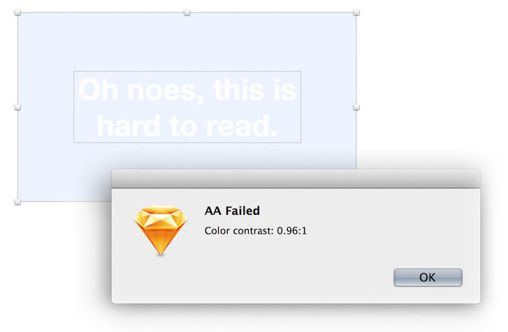
If you prefer to design with Sketch, there’s an extension called Colour Contrast Analyser for Sketch and it’s available for download on Github. Although it isn’t a simulator, it will analyse text colours and background colours in a similar way to Lea Verou’s checker, except it’s built right into Sketch to help you make decisions as you design.
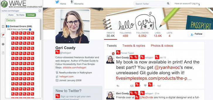
Finally, if you want to check the contrast ratios of a live website, along with other accessibility features, you can use WAVE—the Web Accessibility Evaluation Tool. WAVE has an entire test section dedicated to contrast-checking and shows you in the browser where the offending contrast elements are located. In this test from Twitter.com, you can see just how many contrast issues the profile page has: 248 “Very Low Contrast” errors are listed.
You might also like: 9 Tools for Website Accessibility Testing
Colour accessible design
Ensuring that your website provides a good user experience to customers with a variety of visual deficiencies doesn’t have to be a time-consuming part of a project. The more you familiarise yourself with these guidelines, the more you’ll notice up front if something will cause a potential problem. Hopefully these insights will help you use colour to make your designs more accessible for everyone.Read more
- 10 Ways to Improve User Engagement for Your App This Valentine's Day
- Paul Boag Shares a Favorite Ecommerce Project
- The Pivotal Role of User Experience Design in Brand Building
- Is Your Mental Model a Confusing Mess to Users?
- Building a VR Shopping Experience for the Web: Tips and Takeaways
- 5 Common Digital Content Problems and How to Avoid Them
- The Top UX Elements to Optimize Your Clients’ Product Page Design
- Free Webinar] How to Convert Visitors Through Persuasive Design

