As we start a new year, one thing’s becoming crystal clear: The design and development world is being rocked by new design trends that promise exciting things for designers, their clients, and site visitors. Designers should take note of them because nothing says up-to-date and in-the-know to your future clients like being able to deliver hot designs that don’t just look good, but also provide great utility and, in turn, optimized conversions for clients.
What’s interesting about this year’s crop of killer design trends is their eclectic nature. Some trends are simply souped-up versions of designs we already know and love while others seriously delve into practical problems for designers, solve them, and provide an enhanced user experience for shoppers of all shapes and sizes.
Without further ado, here are the killer design trends for 2016 that will be taking the web by storm and eliciting the requisite “oohs” and “aahs” from site visitors of all types.
Web Design Trend #1: Flat Design 2.0
You’ll be hearing more about flat design 2.0 as 2016 progresses. Based on the original flat design that debuted in 2012, 2.0 corrects one gigantic usability issue that equals a better user experience for your client’s site visitors and customers. Namely, it incorporates signifiers into the design to make it easier for people to use.
Flat design, a response to the now-out-of-favor skeuomorphism, is the approach that stresses:
- Strict 2D (absence of drop shadows, textures, gradients, etc.)
- Minimalism
- Bold and vivid colors
As the years have gone by, so, too, has the evolution of flat design, though. One of the first articles that called attention to the reality of Flat’s evolution into 2.0 was Ryan Allen’s for design firm, The Dapper Gentleman. In it, he noted that designers’ knack for adding their own, personal touches, like ornamentation, to Flat naturally changed the integrity of the design in subtle ways.
2.0 differs from Flat in the following, important ways:
- It isn’t completely flat or 2D anymore
- It uses subtle 3D design elements like shadows, highlights and layers
- It adds a bit more depth into the design
Let’s look at an example of 2.0.

450 GSM’s site, a provider of print products, features 2.0 in the origami-like paper bird on the right side of the homepage. Note the subtly noticeable shading in different folds of the bird, signifying more depth, as well as the actual, faint shadow underneath the bird.
Web Design Trend #2: Perfect Color Scheme Design
Any designer can put a few colors together in one site design and call it a “website,” but few can put colors together in such a way that they harmoniously pop right off the page, delighting site visitors and customers while helping the user experience. In 2016, we predict that designers will start paying more attention to correct color theory than ever before.
It’s high time that designers put a priority on designing with color in mind because colors seriously affect your client’s bottom line in the form of site conversions. This great Kissmetrics infographic makes the point that colors are the number one influencing factor in purchases for almost 93% of people! For example, did you know, according to research, that blue is the color favored by both men and women in purchase decision?
Here’s the bottom line: The way designers arrange colors in their site designs is critical to whether or not your client’s customers buy or leave the site quickly.
Some designers have already taken the lead and are at the forefront of creating visually memorable designs that intelligently use color to help the user experience.

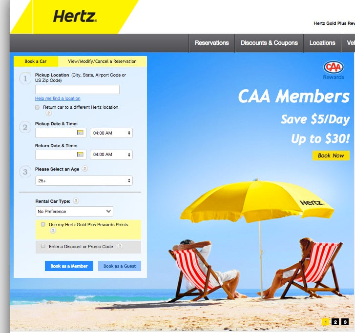
Take Hertz’s homepage. The rental-car company uses the simple-but-effective complementary website color scheme to make its call-to-action and web form pop, due to the presence of high contrast. As a result, customers can quickly find where to enter their info to book a car rental. Note the strong yellow against the blue background, which draws the eye and user attention to specific parts of the homepage for personal-info entry.
We look forward to more designers incorporating such vivid and confident website color schemes throughout 2016!
You might also like: The Ultimate List of Online Color Palette Generators for Web Design
Web Design Trend #3: Humongous Moving Videos
Mega images surfaced more widely a couple of years ago, and they’ve done wonders for the conversion rates of different websites, as illustrated in various case studies. If mega images can have these very favorable results for sites’ conversion rates…then why not mega videos too?
To understand why mega videos will be big in 2016 and why they could also have the same, positive results for sites, we have to understand human psychology. People are visual creatures. Always have been. Always will be.
Numerous studies show that using videos on sites boost conversion rates. Videos are easier to consume, absorb, and understand than reading actual text. Sure, much of the web’s content is the written word, but other studies show that web videos are just more engaging than text.
It makes all the sense if you think about it. Let’s say you’re a shopper navigating your client’s new homepage and are greeted by a humongous mega video right off the bat that immediately captivates your attention. Right then, you’ve already gotten over one hump in the conversion funnel by extending the time you stay on the site to admire the video. This can put you on the fast track to further micro-conversions, all the way down the funnel.

The Born Group’s site exemplifies this trend to a tee. As visitors arrive, they’re immediately taken with the moving video of a majestic silverback gorilla, forcing them to pay attention and extend their site time.
You might also like: How to Use Video Footage in Web Design
Web Design Trend #4: Problem-Solving CSS Layouts Like Flexbox
Not all hot, new design trends have to necessarily impress your client’s customers and visitors on an aesthetic level. Some, like Flexbox, are an impactful new trend because they solve various design and development problems that have piled up over the years. With that said, any site that can solve such problems in a cinch and therefore deliver a much-improved user experience to visitors will automatically be beautiful, too!

Though CSS is the standard for many designers today to create engaging interfaces and pages, it was always lacking easy-to-manage layout features. All that’s solved now, thanks to Flexbox.

Let’s look at some of the problems designers used to face that Flexbox banishes once and for all. Designers can now:
- Use grid systems whose grids can size-to-fit right out of the box, by default
- Get around The Holy Grail (header, footer, three columns) problem and can even pursue a mobile-first design that uses this layout
- Build full-width and fluid input-button pairs with greater ease than ever
- Design media objects that have fixed or different figure sizes without dealing with overflow and clearfixing
- Get their footers to easily stick to the bottoms of pages with thin content
- Finally align page elements vertically or horizontally with no pain at all
Thanks to it opening up new possibilities for designers, Flexbox will be increasingly used by designers across the globe in 2016 to create better sites for their clients.
Web Design Trend #5: Material Design
Google has its hands all over this trend. Material design is a design language the company came up with not too long ago, and it’s already featured in many Google Android products like Gmail, YouTube and Google Maps.
With a huge company like Google behind this trend, you know that it’s going to get a big push this year. You can spot this design on the web and mobile by its unmistakable and eye-catching characteristics like:
- Prominent grid-based layouts
- Minimalism
- Lighting and shadows
- Padding
- Vivid colors
- Responsive animations and transitions
The guiding principles of Material are based on taking the best of classic design principles and melding them with the limitless innovation of tech and science. Sounds like a tall order? If anyone should be able to pull it off, it’s the company that indexes all of the world’s information.
Material is not completely flat by any means, though it’s definitely not aggressively moving toward more physical design principles like the outdated skeuomorphism and realism. Still, as a design movement that’s inspired by analyzing paper and ink, Material retains its dedication to the physical. This is obvious in its use of depth (varying x and y dimensions, but always 1 density pixel thick), casting of shadows, and motion properties.
The best way to illustrate this is to look at Material examples.
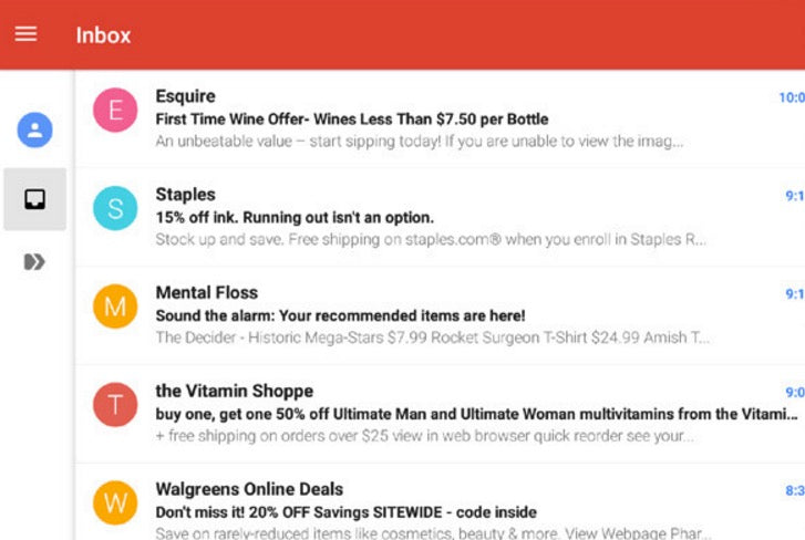
Here is Android Gmail’s user interface:

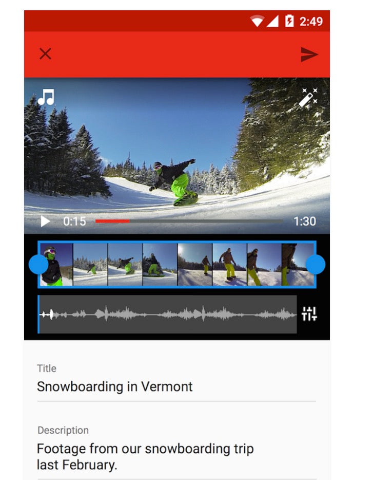
Here is Android YouTube’s user interface:

Designing for the future
As 2016 gets started, these trends are set to rock the design and development world. Part of being an excellent designer is always keeping your eye out for the next best design approach that’s set to make a huge impact. You can only do your career and portfolio a big favor by becoming more familiar with these different design philosophies.
While some design trends are, simply put, just fads, others have staying power, and you can usually determine this by looking at their usefulness to the design community and site visitors or their origins.
In our list, all the design trends fall into these two categories. They’re either something that helps designers design better for site visitors (Flexbox), or they’re offshoots or improvements on past design hits (Flat 2.0 and Material Design).
So keep your eyes peeled throughout the year, as you can bet your bottom dollar that you’ll be seeing more of these design methods creeping into your desktop and mobile sites and apps:
- Flat Design 2.0
- Perfect Website Color Scheme Design.
- Humongous Moving Videos
- Problem-Solving CSS Layouts Like Flexbox
- Material Design
Read more
- 10 Ways to Improve User Engagement for Your App This Valentine's Day
- The Case for Continual Development: The New Way to Approach Ecommerce
- Shopify's Mobile Device Testing Lab Gets Wheels
- Free Webinar] How to Convert Visitors Through Persuasive Design
- Tips for Creating Multilingual Digital Products
- What Makes or Breaks an Ecommerce Shopping Experience? This Survey has the Answers
- How to Use Eye Tracking in Usability Tests
- Human-Centered Design: An Introduction, Practices, and Principles

