An old product design rule says that, “To design a great experience, you need to understand the user's perspective.” To design commercially-successful products, we need to switch from technology-centered design (where we focus on the technology and features a product will provide) to people-centered design (where we focus on the needs and wants of our users). Human-centered design (HCD) is a term product creators use to describe the process of designing products with people in mind, first and foremost.
In this article, we explain what human-centered design is, why it matters, and share key HCD practices and principles designers can use when creating their products.
What is human-centered design?
Essentially, human-centered design is a way of designing products that puts people first. When following the HCD approach, product creators attempt to find solutions to problems by involving the human perspective in all steps of the problem solving process. The approach is focussed on understanding the people who use the products, their needs and behaviors, and their life situations.
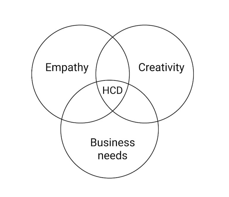
Human-centered design is based on three elements:
- Empathy. We need to genuinely care about the people we design for. Build empathy by immersing yourself in the community that will use your product.
- Creativity. We need to find creative ways to solve users’ problems.
- Business needs. We need to make our product commercially successful.

HCD requires:
- Direct engagement with people who use the product. HCD is designing with the end-user, not only for the end-user. User research and communicating with your users regularly are essential parts of HCD.
- Design with real context of use in mind. Designers often assume that they create products for people who are in a similar situation as they are. In reality, the context of use can vary dramatically. Different contexts of use means different requirements for a product.
- Prototyping. Make ideas tangible by creating prototypes (or consider rapid prototyping). Make sure you validate your prototypes with real users to ensure that your ideas work for your target audience.
Keep these ideas in mind as you follow the human-centered design process.
User-centered design vs. human-centered design
“What is the difference between user-centered design and human-centered design?” This is a fairly common question among product designers. Both user-centered design and human-centered design have the same goal—focus on the needs of the person who will use the product and design the best possible experience for them. However, there is also a difference between the two.
As was mentioned by William Hudson, the word “user” in “user-centered design” can make people sound like a component in a system, dehumanizing the design process. User-centered design tends to focus on splitting an audience into different segments and how they will use the product. The segmentation can be based on the user group’s age (millennials, users in their 30s, etc.), geographic location, how much they are paying/what tier they have registered for in a product, and more. On the other hand, human-centered design focuses on a user’s emotions and feelings as they interact with a product, and this helps bring empathy to the product design process.
You might also like: The 10 Best Product Design Books.
The 4 phases of the human-centered design process
The human-centered design process typically consists of 4 phases.
1. Inspiration
The goal of human-centered design is to find the right solution for the problem that people experience, and inspiration plays a vital role in this process. Inspiration is learning about people, their needs and wants, and finding problems that you need to solve to make their lives better. As a phase of the design process, inspiration implies discovery—finding people you want to build a product for and asking them questions in an attempt to find out what problems they face (typically, by observing the problem within its context of use).
As product designers immerse themselves in the problem and community of users, this helps them identify the opportunities for their future products. Note that immersion of yourself within the problem and community should be done while being safe and respecting any governing laws related to COVID-19, though all that might be required is immersing yourself within an online community.
You might also like: Redesigning the Design Process: How to Work More Efficiently in 2020.
2. Ideation
This phase involves an in-depth analysis of a problem space. Product design teams conduct a series of brainstorming sessions in which they come up with ideas on how to solve the problems and conceptualize the ideas (create models of the designs). They evaluate every idea together and select the most promising ideas that later will be prototyped and tested. A mind map can be very useful during ideation sessions because it helps to quickly visualize a system or a process.
3. Implementation
Implementation is the process of turning ideas into tangible solutions. At this step, product teams invest time in prototyping. Depending on the level of maturity of the ideas, the prototypes can be anything from low-fidelity clickable wireframes, to fully-functioning high-fidelity solutions that look and work almost like finished products. The key idea of prototyping is to simulate the interaction with the design and this simulation helps to evaluate the design overall..
4. Validation
Validation is where a product team tests their prototypes with real users. Validation will help a team close the gap between what people say they need versus what people really need. Testing prototypes in real life (namely, giving a prototype to your users, and asking them to complete some of the tasks as they naturally would if they owned the product) will help you see what works for your users as well as what challenges they face while interacting with a product. In this way, you’ll be able to identify points of friction).
A user experience is a combination of three factors:
- Usability. Usability is the cornerstone of user experience. If a product isn’t usable, the users won’t have a positive experience and the product won’t succeed.
- Look. A visually appealing product creates a positive impression on users, and makes it more likely that others will use it.
- Feel. Users won’t like using a product that makes them feel bad when they engage with it. How users feel when they interact with a product is essential to creating good UX.
That’s why when evaluating prototypes, product designers who practice HCD seek to answer the following questions:
- Is the product useful and usable (does it solve a real problem/usability)?
- Does the product look good (look)?
- Do users enjoy using it (feel)?
Many ideas fail during the validation phase, and this is fine. Failure is an incredibly powerful tool for learning. As Tim Brown, the founder of IDEO, says, "Don't think of it as failure, think of it as designing experiments through which you’re going to learn."
"Don't think of it as failure, think of it as designing experiments through which you’re going to learn."
Think of your failures as opportunities to discover what works and what doesn’t to create better products for your users.
4 human-centered design principles to keep in mind
The principles of human-centered design were perfectly summarized by Don Norman in his quick talk, Practical Human-Centered Design. Below, I will list the principles Don mentioned, expand on the list with one more principle, and provide more details for each point.
1. Focus on the people
HCD puts people at the core of the design process. Whatever you design, always think about the people who will use your product. These people are not abstract “users”, they are real human beings who will use your product to accomplish their goals. In many cases, a product is just a tool that helps people reach their goal more efficiently. Theodore Levitt perfectly summarized this idea in his famous quote: “People don’t want to buy a quarter-inch drill. They want a quarter-inch hole!”
“People don’t want to buy a quarter-inch drill. They want a quarter-inch hole!”
That’s why it’s crucial to start product design by identifying the reason why people want to use your product. Unless you’re building a product for yourself, you have to start by thinking about your audience. The process of identifying your target audience starts with a few simple questions:
- Who am I building this for (the audience)?
- Why will they use the product (the goal)?
- How will they use it (the context of use)?
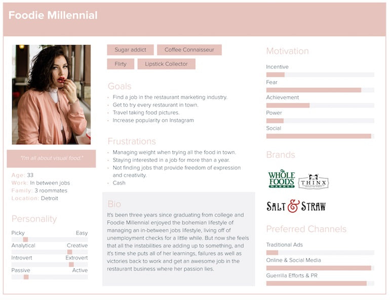
When you find answers to these questions, you can create a user persona (an archetype of your ideal user) and an empathy map (a visualization tool used to articulate what a product team knows about its users). You can rely on both tools to evaluate your product design decisions.

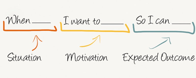
After you define your target users and create a user persona, you’ll need to figure out key user journeys. The job to be done (JTBD) technique can help you with that. This framework uses a simple model that is an excellent way to identify critical user journeys and map them to possible solutions:

Products should not be designed for their designers, they should be design for their users. By using tools like the user persona, empathy map, and JTBD technique, you focus on the needs of your target audience, and create more valuable products for them.
2. Find the right problem to solve
Not all problems that product designers list are worth solving. Don Norman identifies two types of problems—fundamental problems and symptoms of the problem. He argues that it’s essential to identify and solve a fundamental problem first because, by doing that, you’ll solve the root cause of other problems.
In other words, when we solve underlying problems, the symptoms can go away. The only way to identify fundamental problems is to invest in user research. During the research, it’s essential to separate the “user needs” from the “user wants”, and focus primarily on fulfilling the “user needs” because they are the reason why people use a product. It’s possible to achieve this goal by identifying issues and asking “why?” at each issue. By asking a series of “why?” questions, you can uncover the underlying problem that users have and want to solve by using your product. The problem might not be clear at the beginning, so you might want to use something like the 5-Whys technique to help uncover it.
You might also like: How to Create an Efficient Product Strategy.
Conducting research and identifying fundamental problems requires time, and product teams often argue that they don’t have enough time. It might be tempting to skip or at least minimize the user research phase and invest time in the ideation and prototyping phases. But it’s better to resist this temptation. When designers skip the user research part, it could easily lead to a situation where designers attempt to solve the wrong problem. Do not think that the time you spend on user research is wasted time, think of it as an investment. The more robust your research process is, the more energy you save down the road.
"The more robust your research process is, the more energy you save down the road."
Competitor analysis is also a beneficial activity for understanding the fundamental problems. Observing how people use your competitors’ products will help you know what parts of the products are more relevant to your users’ needs, and what you might be able to improve on to gain a competitive edge.
3. Think of everything as a system
All too often, product designers think of a product as a collection of individual features, which are supposed to deliver value to the user. This way of thinking might be useful from a technical perspective (thinking in “features” makes it easier to plan design and code activities), but it’s wrong to think in this way when you evaluate a product from a user perspective.
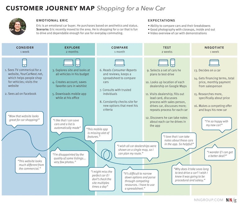
People think of a product as an entire experience, not as a collection of individual features. That’s why when you design a product it’s essential to think about it holistically: everything in a product you design is interconnected, and the optimization of the individual parts can have a tremendous impact on the overall user experience. Creating a user journey map can help you to understand how users interact with your product at different stages and optimize the parts within these different stages.

When designing a product, don’t focus solely only on one part of the user journey (the local experience) while forgetting about the rest. UX design encompasses all aspects of interaction with a product and service, and it’s important to provide a good user experience throughout all steps of the journey. Imagine an ecommerce app that has a smooth user flow for product purchase, but when customers who bought something want to return the product, they face terrible customer support service (i.e., slow response rates or a lot of paperwork). No matter how good the product purchase flow was, the overall user experience from using it due to this portion of the journey may be negative.
Think about every single part of the user experience, from start to finish, and how they all interact with each other.
4. Iterate on solutions
It’s almost impossible to create a perfect solution on your first attempt. That’s why it’s important to invest time into rapid prototyping—quickly build something and validate it with real users. “Test early, test often” is what experienced designers often say.
Seeing how people interact with products will help us identify problems, and the feedback received from the users will help product creators refine the prototype. The feedback should be looped into product design—when a product team receives feedback, it needs to evaluate it, fix problems in the design, create a new prototype, and test it again. By completing this cycle over and over again, we can reach the state where we end up with a good product.
On the importance of testing with real users
“You are not your user” is an essential rule that many product designers skip when they work on a product. In cognitive science, this phenomenon is known as the false consensus effect. Designers, developers, and product managers—all of them suffer from this effect because they tend to project their behaviors and reactions onto their product’s users. But,assuming that you are your user is a fallacy, and it's important to be mindful of this state of mind so you are not swayed by it.
"'You are not your user' is an essential rule that many product designers skip when they work on a product."
How can you avoid the false consensus effect? You need to do two things:
- Be open-minded. Think about each of your product design decisions as a hypothesisInvest time into validating hypotheses with users. No matter how much time you spend ideating and prototyping your design solution, you should always test it with real people. The feedback from real users will help you understand what part of your design requires improvements.
- Do not replace testing with users with testing with friends and family. Like you, your family/team members/stakeholders are not your users, and testing with them won’t be representative of your users’ realities. It doesn’t mean that you should never test with friends/family/stakeholders, but you should not replace testing with real users with them only.
Promote human-centered design in your organization
“The user comes first” is the most fundamental rule for product design. If you want to create suitable solutions for real people, it’s important to adapt the way of thinking that allows us to solve problems for people.
Human-centered design is an excellent approach that helps you make your user’s life better by putting their needs into the heart of the design process. And when it comes to creating design culture within your organization, you need to create a culture of focusing on the user when creating products. Seek the perspectives of your customers and you’ll be able to design first-class experiences for them.
Read more
- What Makes or Breaks an Ecommerce Shopping Experience? This Survey has the Answers
- Content Strategy: The Principles we Followed to Build the New Shopify App CLI
- How to Use Eye Tracking in Usability Tests
- Shopify's Mobile Device Testing Lab Gets Wheels
- Typography in UI Design
- 10 Ways to Improve User Engagement for Your App This Valentine's Day
Have you integrated human-centered design principles into your design process before? Let us know in the comments below.

