A number of factors have contributed to the rise of video in web design. An abundance of video editing software, faster internet connections, and improved browser performance have allowed web designers everywhere to integrate video into their designs. In addition, the increasing number of free stock videos and decreasing video production costs has meant that quality motion content is much more accessible now than it ever was before. But most importantly, designers have begun to recognize the power video has on the viewer. Motion, movement, animation — all are guaranteed to keep a digital audience transfixed much more effectively than static elements.
Of course, using video in web design goes far beyond making a simple YouTube window appear on a web-page. With the rise of video’s popularity, designers are constantly inventing new and creative footage embedding techniques. These techniques have become powerful tools to produce compelling websites, influence conversion paths and navigation scenarios, or communicate a brand and its products.
Here are 5 popular video embedding techniques to start incorporating into your website designs today.
You might also like: How to Use Video in Ecommerce Web Design to Boost Conversions
1. Extensive brand video integration
Many brands have started building fully integrated videos into their websites, including multiple clips. Some videos provide in-depth tutorials of particular products, while others might demonstrate the particular lifestyle associated with the brand. Extensive brand videos are great for creating highly immersive experiences that invite viewers to establish an emotional connection with a product or the brand.
A6 Beoplay’s website is a great example of effective extensive brand video integration. Here the designer has integrated high quality video content not only above the fold, but as the viewer scrolls down too. The more you scroll the more videos you see, and the more the visitor learns about the product.

This design presents the product in the best way possible. It starts with a beautiful parallax effect with a subtle video texture, making the user pause and read the introductory text. As a result, the visual aesthetics of the website pair well with the aesthetics of the product itself.
2. Welcoming background videos
By far one of the most widely used techniques, background videos with overlaid text are a popular way of adding a little motion to a website. Background videos can be purely decorative, or they can communicate strong elements of a company’s brand. And the more original or beautiful the footage is, the more likely your audience will be intrigued and want to explore your site. Just make sure that your background video is muted for a a non-intrusive visit.
AirBnB was one of the pioneers in background video and it’s still a great example of an effective use of the background video technique. The initially still clips on the site’s homepage ‘trick’ the user into thinking they are looking at fixed images until the motion picture suddenly comes to life. Presenting the audience with vacation moments, AirBnB has used video integration to successfully express the promise of unique and authentic accommodation experiences.
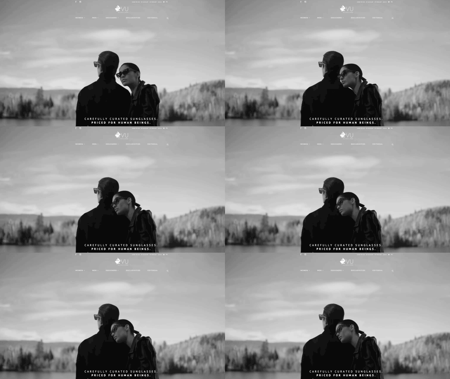
VU Sunglass also makes excellent use of the background video technique. This online store offers a relatively high-end yet affordable selection of glasses from the most prestigious and hard-to-find designers. Here, the slow-mo video footage with its chic, high fashion finish creates a strong brand impression. The website uses a Vimeo account to host the video, creating a storefront that captures and holds the consumer's attention.

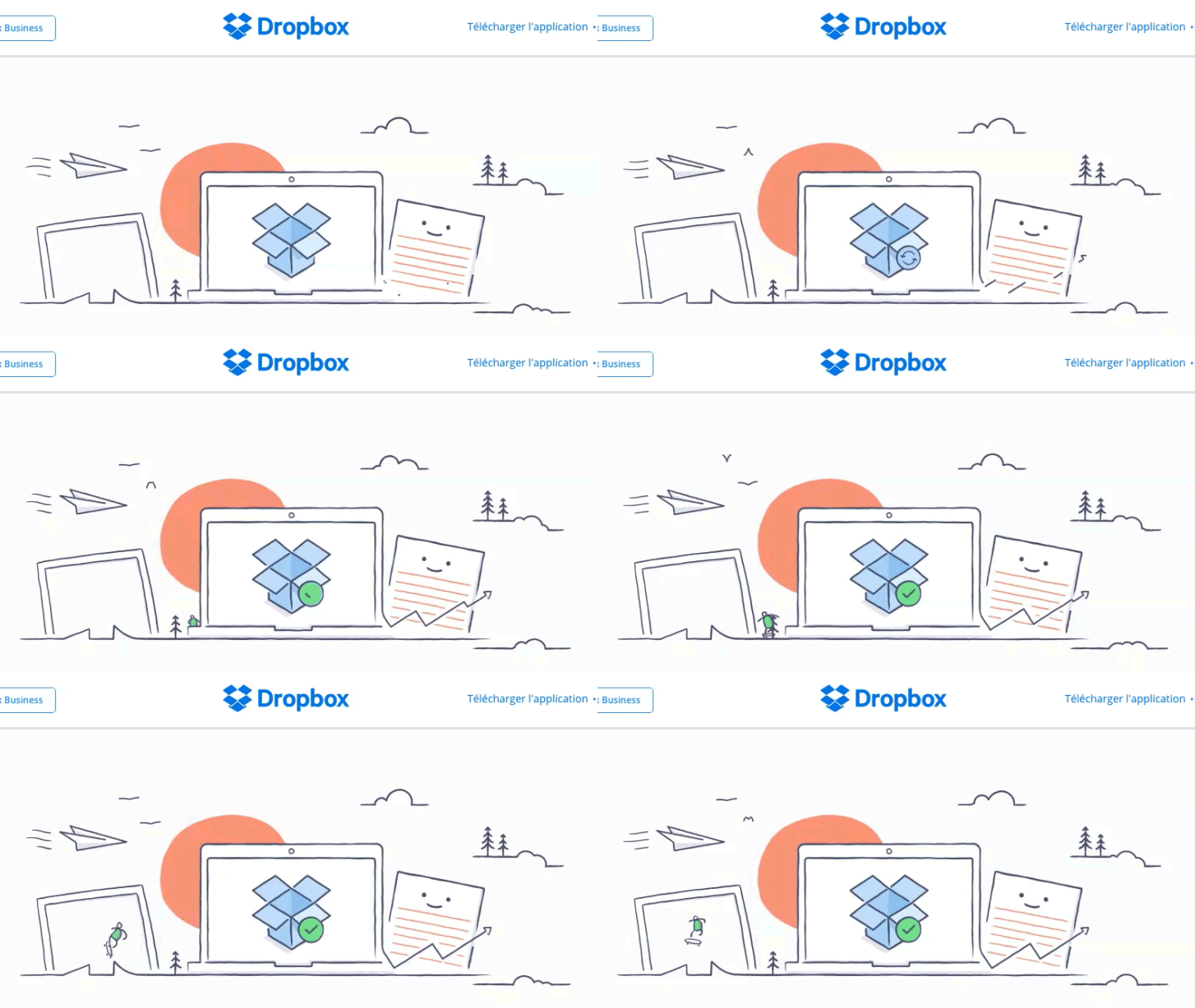
Although the use of background videos is a highly effective users retention strategy, not all motion content needs to be film. Animation is still commonly used in web design and can achieve similar goals. Dropbox is an excellent example of a website that uses animation instead of background video. When you first arrive to the site, a small cartoon animation plays through and then becomes a still image. It shows some of the technology you can use in combination with Dropbox — a computer, a tablet — as well as the brand logo syncing on the laptop screen. It is a good summary of the company’s service, and it visually stimulates the visitors.

You might also like: Best Practices for Designing High Converting Landing Pages
3. Video mouse-over effect
The mouse-over effect has been used for years in drop down menus and star ratings, encouraging users to click on these features of a webpage. Nowadays, many sites are also using the mouse-over effect to activate videos. This technique attracts the visitor’s attention, catching them by surprise when a previously static image begins to move. It forces the viewer to pay attention to the video, and encourages them to continue watching. With traditional click-to-play videos, users can choose to opt out, as the choice of playing video is up to them. In contrast, the hover effect gives brands a few more seconds to capture the audience’s interest before visitors make the decision to stick around or move away. Moreover, the effect allows for a more seamless integration of video into the webpage, rather than clunky YouTube embedded videos. The only downside of the mouse over effect is that it doesn’t translate well to mobile sites, so keep that in mind if you’re building a mobile version for a client.
A great example of the mouse-over effect is this IT job placement platform. The video displaying people walking into work in the morning only begins when the mouse hovers above it.

4. Interactive storytelling
Storytelling is a great way for brands to establish emotional connections with their target audience, and interactive videos are creating new opportunities to tell a tale. Users may come to website for the products, or simply out of curiosity, but they stay and return because of the adventure the story takes them on.
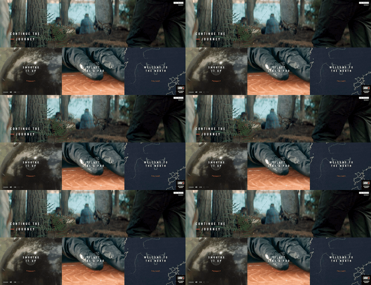
A great example of interactive story telling is Weber’s BBQ Community. Here video is used to present the viewer with several different barbecuing scenarios — fishing in the Nordic woods, a rooftop party in London, the beach in Sicily, a sports game in Germany, and a garden wedding in Provence. Much like a choose-your-own-adventure storybook, each video ends with several different navigation options where the viewer can choose to learn more about the culture, products, techniques, or recipes featured in the video.

Each section of the story ties in Weber’s products with the larger culture of barbecuing. The series of clips are relatable to avid barbequers, enticing them to “Continue the Journey” to learn more about the products and brand. When an audience member relates to an experience depicted in the videos, they begin to feel a part of the barbecue culture Weber is creating with this site.
5. Interactive product exploration
One final common use of video in web design is to allow users to get up close and explore products in depth. Whereas interactive storytelling wins over the consumer’s heart, interactive product exploration wins over the consumer’s mind. When combined, these two techniques are an incredibly effective way of encouraging visitors to make a purchase!
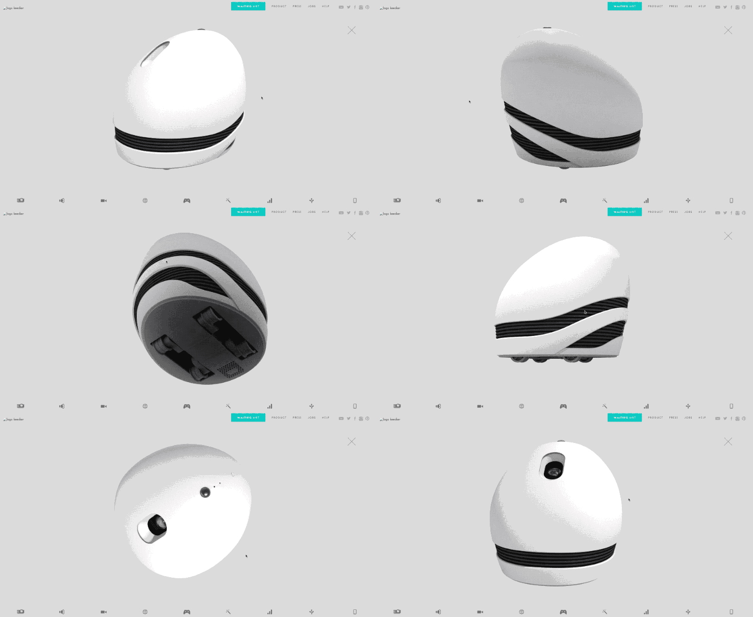
Keecker is a good example of how interactive product exploration can be used to influence a purchase. As consumers may not be able to see the product in person, Keecker’s website allows you to see it in action through a series of clips. Website viewers can choose to watch all the clips at once, or click through the various product features to read more and see the related clip.
Read more
- Top 5 Features to Include When Building a Successful Fitness Site
- Top Ecommerce Web Design Trends from January
- Top Ecommerce Resources for July
- Top Ecommerce Resources for August
- Pitching Animation: How to Talk About Motion in a Design-Centric Way
- Top Ecommerce Resources for September
- How to Win the 2016 Ecommerce Design Awards - Part 2 with Verne Ho
- 13 Web Design Trends to Watch in 2020
- Top Ecommerce Web Design Trends for March

This style of video interaction allows for excellent display of the product and its benefits. It also demonstrates the advantage of web-based videos over TV commercials. The audience are left with the impression they experienced the product themselves, rather than watching an infomercial.
Not just a trend
With so many brands using video footage in various ways on their websites, it is evident that video in web design will be around for a while. Video integration means websites have almost no bounds; however mobile devices, especially those powered by iOS, still have some catching up to do. Nevertheless, web designers are pushing the boundaries of video everyday, so implementing videos in the mobile world — with animated gifs, cinemagraphs, WebGL technology and other interactive elements — can’t be far off. The rapid progress we’ve seen so far is only a glimpse of all the future possibilities of video content.

