As a designer or developer, you always have to optimize your clients’ websites so that they have the best possible conversion rate. In ecommerce, the only point of any online store is to sell, sell, sell — so your design needs to be focused on driving conversions for your clients. Considerations like how nice the site looks or whether it features the latest design trends are definitely less important because they’re subjective.
Making more money for your clients due to a killer, conversion-rich design is not subjective. It’ll increase your reputation and referrals among clients and make you more money, too!
Forbes doesn’t even care about how many site visitors websites get; they want you to focus primarily on getting conversions because they realize how that’s the most vital metric for any business owner. In turn, it should be the most important aspect for designers as well because you want to please your clients. If site owners are happy and in business, they will keep designers like you in demand.
For some inspiration on how designers can incorporate conversion-centric design best practices into their projects, let’s look at some of the most well-known brands and how they’re celebrating the Christmas shopping season by designing their websites to be ultra-conversion friendly!
You might also like: 6 Tricks to Increase Your Clients' Conversion Before Christmas
White space
White space, also called negative space, is a design technique that makes the subject in the frame, in the foreground, pop and really stand out. A hallmark of great visual design, it acts as “empty” space in the background that highlights what a designer wants to be obvious on a webpage.
In the case of e-commerce stores during the Christmas season, that would be great deals and huge markdowns!
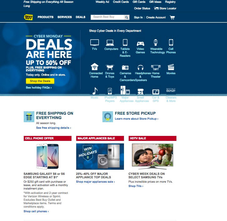
Best Buy understands this very well, which is why its Cyber Monday homepage is bursting with a lot of white space. Note how the white space — present under the “Cyber Monday” banner announcing the great sales — makes the shopping occasion and huge savings stand out by directing buyers’ attention to the blue area that contains the all-important shopping message?

This is no accident. Using white space is a mega conversion-goal driver.
The color red
During the holidays, and especially when there are sales involved, red is a fantastic thing. Red is a loud color that grabs a person’s attention because of its strong, bold personality.
Translated to marketing and shopping, red is an ideal choice for call to action buy buttons on account of the sense of urgency and energy it creates. Since it’s the color of passion, it also increases one’s heart rate, which explains why North American online shoppers respond to it and why it’s the color of choice for clearance sales.

Speaking of clearance sales, discounts are a favoured retail strategy that retailers use to get more sales on their websites during the Christmas shopping season.
Take Target, for instance. This huge retailer is getting into the Christmas spirit by decking out its homepage in red, which is appropriate not just because it’s a traditional Christmas color, but also since red is associated with the urgency that stores want to see when they have clearance sales.
On the Target homepage, note how red isn’t just the predominant color, but also the color of key call to action buttons and the header.
You might also like: Everything You Need to Know About Whitespace
Video
Though you generally think of written content when we talk about content on the Internet, video content is increasingly getting more popular in its own right. In fact, video will account for nearly 70% of all web consumer traffic by 2017. That’s a very short time from now!
When you also throw in how much time the average person spends on video sites like YouTube per viewing session (yikes, it’s quite a good chunk of your day!), it’s no surprise that another design conversion tactic is to incorporate more video into sites. According to Crazy Egg, video content can make people as much as 85% likelier to convert.
With this much buzz surrounding video, it’s no surprise, then, that one of the most successful brands of our time is prominently featuring video on its homepage to celebrate the Christmas season.

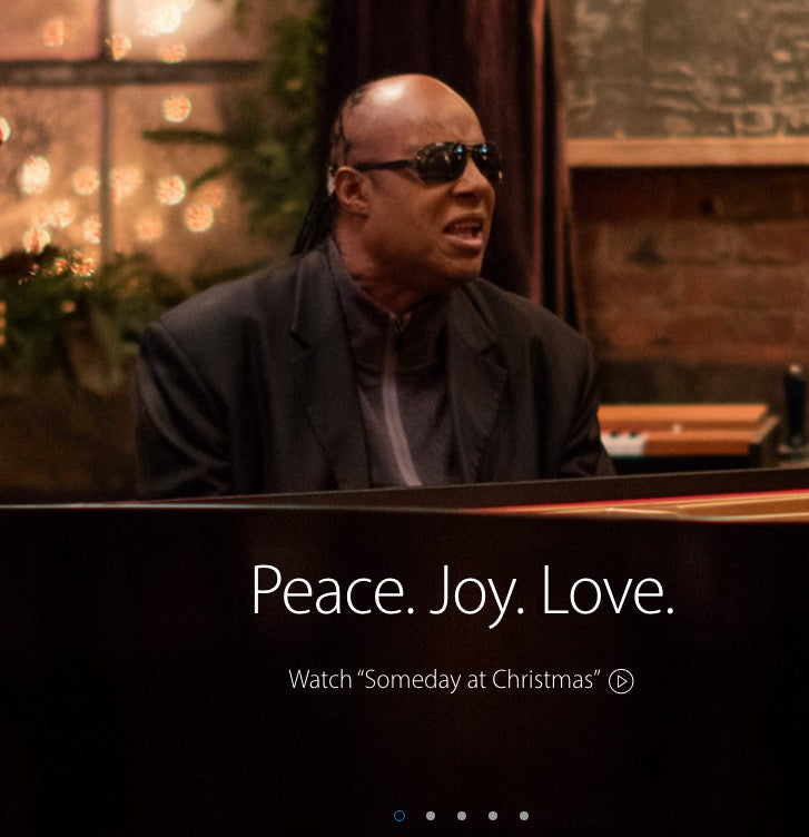
Apple has snagged none other than Stevie Wonder to star in its holiday video that’s featured on the company’s rotating carousel on its homepage. A short video like this successfully conveys Apple’s image as a brand that people form an emotional attachment to, especially during Christmas, when you can expect that many Apple products likely find themselves under Christmas trees the world over.
Card-based design
Card-based design is a nifty design philosophy that you’ve probably seen on Pinterest for the most part, but it has been gaining traction on other websites over the last couple of years. The beauty of card-based is that it greatly helps the user experience because it empowers your users to quickly and efficiently make sense of the information presented to them on a webpage. It accomplishes this by sorting content into different categories, based on a common theme.
The Next Web reports that card-based allows people to scan and click your pages with greater ease, upping usability, which has a positive impact for anyone who wants to buy something from an ecommerce store. Interestingly, card-based design’s popularity is owed to the rise of mobile, which we also talked about in a previous article.
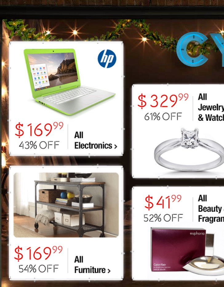
Overstock’s Cyber Monday page has exploded in card-based design, and it most definitely helps the user experience of shoppers, which in turn will have a positive effect on conversion rates, as shoppers can find exactly what they want due to the straightforward organization.

As shoppers peruse this page boasting holiday sales galore, their eyes can effortlessly scan the page and then land on any area of interest with ease. That’s because each card guides their eyes to fixate on a specific deal and product category.

See how all major shopping categories have a specific card devoted to them? Whether it’s electronics, furniture or clothing & shoes — each category can be accessed with a simple click, thanks to the easy structure of card-based design.

Striking color contrast
Site visitors’ eyes are drawn to bold bursts of color since they’re very noticeable. This makes color contrast one of the most ideal tactics to use to drum up conversions in Christmas shopping season sales.
The thing about contrast — and especially color contrast — is that it guides your shoppers’ eyes to what’s most important on a webpage you’ve designed for your client’s online store. Much of the time, this is the call to action button, but during holiday sales that are all the rage on the web after Thanksgiving, the most important element on the webpage becomes the announcement of the sale that’s going on.
Color contrast is also an in-your face design strategy to ensure that site visitors simply can’t miss what you want them to notice…because you’re basically making it pop right off the whole page. And when there’s very little friction standing in the way of them noticing your sale, they’re going to be that much more likely to check it out and buy something.
An inspiring example of using color contrast to draw attention to a Cyber Monday sale in a huge way is found on Nordstrom’s site. It is pretty much the epitome of making your sale stand out by framing it with different colors that make it jump off the page.

The blue background makes the Cyber Monday headline stand right out, and the red clearance sale notice below that and the white Nordstrom header above that also work to further reinforce the pop effect of the Cyber Monday headline.
Conversions and the holidays go together like eggnog and rum
Taking a look at ecommerce websites during the Christmas shopping season is a great opportunity for designers to gain some inspiration on what designs are particularly useful in helping conversions. All of these big online stores simply wouldn’t be using the conversion designs outlined above if they didn’t help to optimize the process of attracting leads and then sending them through the page’s conversion funnel.
Conversion-boosting designs shouldn’t just be a part of your client’s sites during the holidays; they should be in use the whole year round.
Though the holidays provide a boost to retailers’ bottom lines, it’s important to remember the most vital lesson here. Conversion-boosting designs shouldn’t just be a part of your client’s sites during the holidays; they should be in use the whole year round. It's the best way to maximize sales and conversions for your clients’ sites, and will make you a very in-demand designer at any time of the year.
So to recap, we highlighted these five online stores’ designs because they epitomize CRO. To boost your clients’ CRO, remember to always:
- Use a generous amount of white space
- Make call to action buttons red, especially for sales
- Incorporate video into your page
- Try card-based design for easier sorting of info
- Use color contrast to highlight importance
Read more
- 7 Ways to Spice Up Your Website for Halloween
- 7 Steps to Get More Shopify Clients This Holiday Season
- Holiday Reading List: The Top 10 Stories of 2015 from Shopify Partners
- PODCAST: How You & Your Clients Can Make the Most of the Holiday Season
- Don’t Get Caught With Your App Down on Black Friday & Cyber Monday
You might also like: 4 Ways to Give Some Holiday Flair to an Ecommerce Store

