There are so many important elements in ecommerce design. Many of these elements, such as the cart, navigation bar, and CTAs, are critical to the success of an ecommerce store, and for obvious reasons. Each element has a specific job, and does that job rather well.
Whitespace is a page element in its own right — a beautiful one that can be used to great effect. But did you know that whitespace is just as critical and powerful as it is beautiful?

Whitespace can be used to control how a user interacts with the content on a page — an ability that is perhaps most important in the ecommerce context.
You may be thinking, how can whitespace possibly control user interaction?
Well, it is done through three basic principles: focus, organization, and emphasis.
By utilizing these three tenets of whitespace, designers can have a massive impact on the success of their ecommerce brand (or that of their clientele), by directing where users look, scroll, and click.
Read on and learn how to use the three tenets of whitespace to aide in the staging of user interaction.
You might also like: How to Persuade Any Client to Choose Your Design
1. Whitespace can bring focus to your ecommerce page
Whitespace provides subconscious direction for the eyes of your user by liberating the senses from clutter and ambiguity. Ambiguity is the antithesis of focus, and it occurs when there is no way of knowing which element to look at.
Clutter breeds ambiguity.
Photographers and graphic designers have historically used the power of whitespace to sell brands and products by highlighting the most important element on page.
Consider the way in which Audio Technica uses photography and web design to take away any ambiguity on its studio headphones product page.
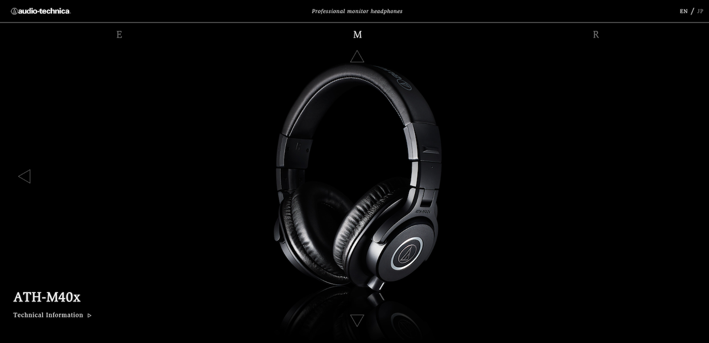
The lack of color and text on this page make it an excellent example of focus.
At any given moment, there is only one thing to focus on: the beautiful headphones in the middle of the page. There are simply no other elements to compete for attention, meaning there is no ambiguity.
On the other hand, you have sites like the one below.

In the above example, there isn’t one clear focus on the page. Instead, users who arrive here may be confused as to where they should look or click. That’s because rather than providing one strong message, the site presents users with numerous weak messages.
As a result, users may simply click on the most visually dominant element on the page, rather than the most important (or relevant) one.
Designers of every kind know how important it is that users leave with the right message (or having completed the desired action). Design is, above all else, a platform for communicating ideas and influencing behavior.
Whitespace allows users to receive one “loud and clear” message.
2. Whitespace is a powerful organization tool
Most sites aren’t designed to showcase one single element, but rather a sequenceof elements. This is especially true in ecommerce, where users must be convinced not only to scroll through a list of products, but also to sometimes interact with product collections and categories.
More often than not, ecommerce sites use uninspired tactics to organize content on their product pages. Look no further than Amazon and ebay to see those tactics in action.
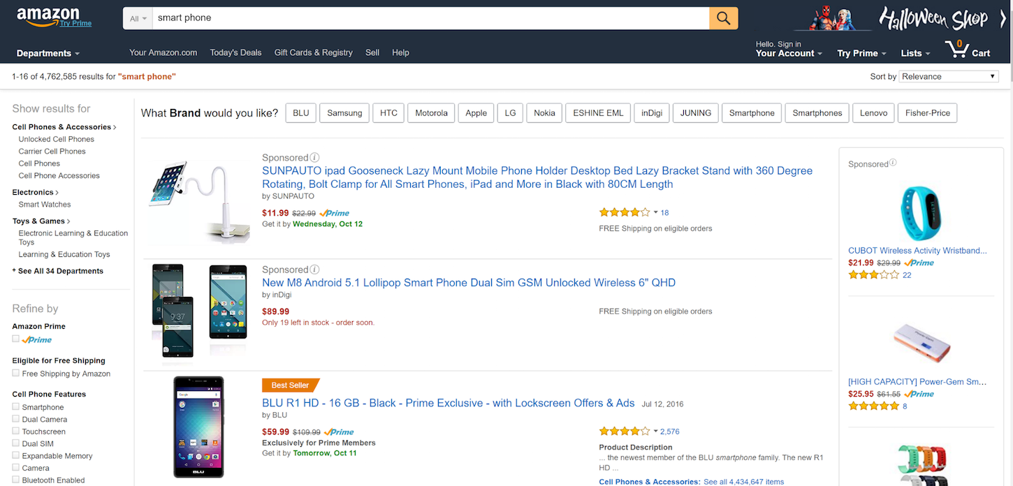
Mark my words, the day will come when a beautifully designed, upstart ecommerce company will snatch the audience out from under Amazon and eBay, and they won’t understand how it happened.
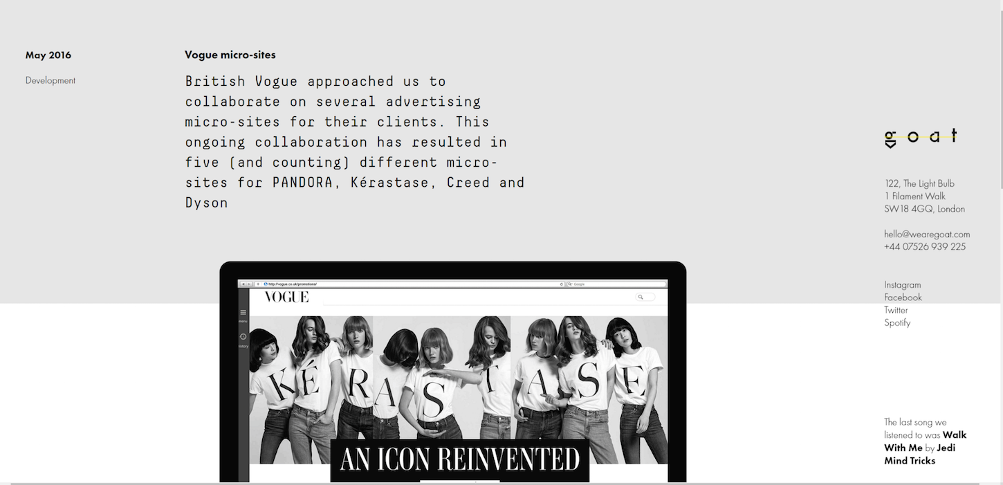
In the above image, whitespace has been used to group ideas and concepts in a meaningful way. The user is presented with three very clear, very distinct elements. The introductory text, the contact details, and the beginning of the case study, which hangs off the page.
Notice the lack of clutter, and the clear-as-day intentions of the designer.
This powerful combination of whitespace and partially exposed content works not only to organize the information, but also to convince the user to scroll down and view the rest of the case study, by directly avoiding the pitfalls of the illusion of completeness.
The oft-overlooked power of whitespace is one of the many keys to this power. Whitespace is an agent of psychological dictatorship that can easily be used to convince users to perform certain actions, such as scrolling or interacting with the page.
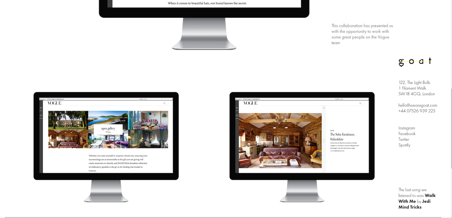
Once the user has scrolled down, the amount of whitespace shown is reduced, as is evident in the above image. By doing so, the contact details no longer command the attention of the user as much. Instead, the dominant imagery of the case study has taken hold of the user’s focus.
You might also like: Basic Elements of Ecommerce Website Design
3. Whitespace can be used to emphasize important elements
As if that weren’t enough, whitespace can also add emphasis to particularly important elements. By placing an “island” of content in a “sea” of whitespace, the user’s eyes have no choice but to focus on the emphasized element.
Consider trippen, a stunning example of whitespace used for emphasis on an ecommerce page.
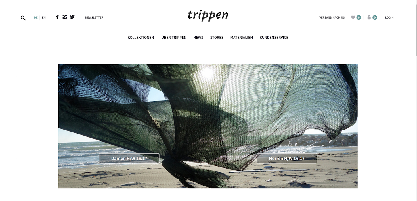
In the above image, whitespace has been used to clearly emphasize the product featured in the hero section. No other element competes for the focus of the user, because every other element has been subdued in terms of size, color, and prominence.
Color and proportion, when used in conjunction with abundant whitespace, can be used to great effect. By adding merely a splash of color, and the right amount of visual weight, whitespace can be used to ensure that the user does not look in a particular direction.
Consider the following site.

By adding a vibrant streak of color at the bottom of the page, in addition to a significant amount visual weight, the designers at goat have managed to create a hero section that compels the user to stay captivated by the sparse hero message.
The substantial whitespace at the top of the page creates a visual vacuum, which when used in combination with the aforementioned visually dominant elements, creates a very convincing recipe for user engagement.
Use whitespace to control your users
Whitespace is both powerful and elegant. When used in conjunction with visually dominant elements, such as vibrant colors or intuitive organization, it becomes your secret weapon — users won’t know what hit them!
Although we don’t typically see whitespace used to great effect in the ecommerce world, we shouldn’t forget about it. It’s only natural to model your ecommerce experience after the success of giants like Amazon and ebay, but you’d be foolish to think there are no alternatives.
The design industry is ripe with innovation, and whitespace is not a new concept — but it could be used to revolutionize the ecommerce experience. The behavior controlling effects of whitespace are boundless, and so are the ways in which it can be used to stimulate purchases.
Read more
- Building a Clickable Call-to-Action Button for Your Shopify Theme
- Free Webinar] How to Convert Visitors Through Persuasive Design
- Why and How to Improve Ecommerce Website Accessibility
- How to Use Eye Tracking in Usability Tests
- Content Strategy: The Principles we Followed to Build the New Shopify App CLI
- 10 Ways to Improve User Engagement for Your App This Valentine's Day
- 5 Common Digital Content Problems and How to Avoid Them
- What to Consider When Planning a Website Redesign
- Five Useful Usability Testing Tools Proven to Convince Clients
You might also like: 10 Beautiful Ecommerce Website Color Schemes

