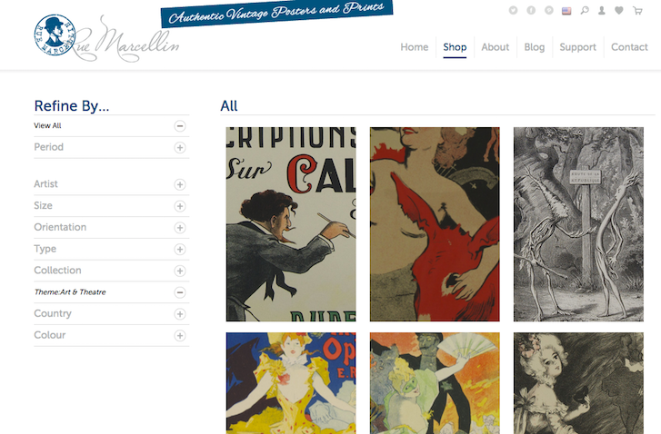
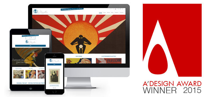
Squashed Pixel has been working on the Shopify platform since they began their business in 2009. When vintage poster seller Rue Marcellin needed an online store, Squashed Pixel created a beautiful design to showcase the company's collection of authentic vintage prints. Their design caught the attention of the A' Design Awards Committee and earned them a prestigious Iron A' Design Award.
We caught up with Squashed Pixel's Claire Gatenby to talk about their success.
You might also like: How Pixel Union Diversified Their Service Offerings and 10x’d Their Business
What is Squashed Pixel?
We're an easy-going web design and marketing company from Bradford in West Yorkshire, England. We're a design-focused business with a passion for getting businesses online and performing well. We're proud to be a Yorkshire company, as well as being a hub of talent in the North of England — the clean air definitely aids the creative process and helps drive that passion for a proper brew.
We've grown quickly and built a very respectable list of worldwide clients. We work long and hard to make sure that we're always at the top of our game and that we foster meaningful relationships with our clients that are based on transparency and our straightforward, no nonsense approach to our work (you'll find no buzzwords or erroneous acronyms here).
We squash the very best hand-picked pixels, producing 100% awesome design juice!
Congratulations on winning the Iron A’ Design Award! Tell us about the winning design.
Founded by Paul Budny, Rue Marcellin is a new ecommerce store and online gallery offering a beautiful and unique form of vintage fine art for interior decor. They're based in Paris, France and Vancouver, Canada.

They specialize in authentic vintage posters, prints, lithographs and other printed antique art. This includes advertising and propaganda posters, collector prints, magazine advertisements and illustrations, and fashion prints. Their target audience ranges from collectors to interior designers and people looking for a unique, original piece for their environment.
Where did the inspiration for the shop’s design come from?
Being based in Canada and Paris with a focus on original, vintage French, the inspiration for the brand and site was rooted in a 1900s Parisian vintage feel but with a modern approach.
The key objectives for the project were to create a clean, simple, user-friendly site. We also wanted to establish a brand that, whilst retaining a vintage feel, is modern and really lets the artwork be the heroes of the site.
What changed along the way?
Whilst generating sales is the ultimate purpose of any ecommerce site, we also understood that this type of artwork isn't an impulse buy. We were keen to ensure that the site had an art gallery-type feel to it. By encouraging people to peruse the site, they remain engaged and are provided with as much information as possible. This really helps guide them down the path to an informed sale.
The biggest iterations were in its complexity. The more we grew to understand the Rue Marcellin team, the more insight we had in the way they wanted to do business. The very first designs were significantly more French and quite ornate. As the site developed, the simplification of it really helped the art pieces to become the main focus of the site, as they deserve to be.
What were some unique features you implemented?
In order to create a searchable online art gallery, we developed a clean, precise filtering system within the shop page. This allows the users to refine products down to their exact requirements.
We achieved this without the visitor leaving the shop page. By selecting a product, customers are shown additional information and have the ability to zoom into the image to view the finer details. To ensure responsiveness, a simple menu structure was created, with a hidden side bar menu for mobile devices.

What tools did you find most useful when creating the website?
We have a very free-flowing design process at Squashed Pixel. Everything is wire-framed and mapped out using pen and paper. It allows us to quickly try many different ideas and move through quick iterations of the design without getting too precious. When we move to a digital environment, we use Adobe Illustrator as it allows us to keep everything flat and is easy to work with.
With respect to Shopify and the dev process specifically, the Shopify template editor was a great help when combined with Sublime and Chrome.
What integrations did you use?
The majority of the functionality on the site is built using jquery and Shopify's Liquid templating language. With the exception of the Yotpo social reviews app, the majority of apps on the site are focused on reporting — from understanding what people are doing on the site to which social networks they've come from and how.
What makes this shop unique?
We had to really showcase the quality and detail of the prints, whilst maintaining a fully responsive and user-friendly experience. Using elements like the easy zoom on the product pages lets you see every detail at a glance. The hover effects on collection pages keep the interest piqued without abstracting the beauty of the prints.
The site also contains a powerful search and indexing facility for the prints and an easy way to narrow down your selections. The innovative zoom functionality on the collection pages has been well received by customers, and showing the artwork in this level of detail has helped seal many sales.
You might also like: Partner Spotlight: Disco Brings Useful Gifts to Shopify Plus
What’s your favourite feature on the site?
We love the reverse zoom functionality from within the collections view. It really plays on the intricate details of these pieces to create what initially appears to be quite an abstract view, but still lets customers see the whole piece at the hover of a mouse.
What did you learn while creating this website?
One of the nicest things we took away from this site was that it's ok to be understated sometimes. With the rate at which technology is progressing at the moment, and the number of design methodologies out there, it's easy to get carried away and make customers experience more about the site than the products. For this site in particular, it was great to work with a client that was willing to let us strip away all the noise to create a beautifully simple and incredibly effective website for them.
What has winning the award meant for your business so far?

We’ve worked with the Shopify platform from the very beginning of Squashed Pixel’s story — over six years now — and it is so great to get global recognition for our work.
We truly love what we do. Great design and a passion to help businesses grow is at the heart of what we do, so it is amazing for this to be recognized.
From our point of view, the immediate effect has been an increase in exposure through social media, and we are expecting this to increase again dramatically now that results have formally been announced (as of April 15). A number of articles are planned for publication within the U.K. press.
Following the announcement, we jetted off to Milan to collect our award on April 18 at Villa Gallia located on Lake Como in Italy. Our winning design was also exhibited in the MOOD Museum between the dates April 18-25.
Want more amazing insights into customized Shopify designs created by our Partners? Check out our complete Case Study collection.
Read more
- Developing Customer Centric Solutions: How Yoast scoped, built and launched their Shopify App
- How Shopify Plus Partner Maestrooo Balances Building Themes and Apps, with Client Work
- How Shopify Partner Endear Empowers Omnichannel Sales with Shopify and Shopify POS
- Partner Spotlight: SplitMango Gets Flexible With Namaste TV
- Determination and Devotion: How Two Entrepreneurs Changed the Ecommerce Industry in Mexico
- How We Built a Global Empire from a Small Island in the Pacific Ocean
- Partner Spotlight: Helium Development Helps Rhino Gear Switch from Magento to Shopify
You might also like: Partner Spotlight: Pointer Creative Integrates Shopify into Lassie Co.'s Wordpress Site
