The Vancouver yoga scene is full of competition. When Omnifilm’s Namaste TV needed a new ecommerce website that would allow them to build on the popularity of their television series, and also stand out from their competition, they turned to SplitMango and Shopify.
We had the opportunity to speak with designer/developers Willie, Amber, and owner David Miller about SplitMango's experience building Namaste’s Yoga website.
Tell us about SplitMango.
David: In 2006, I arrived in Canada and founded SplitMango. We started out focusing on web design, development, and ecommerce for small to large businesses. We incorporated in 2009 and have been partners with Shopify since your early days. Aligning with Shopify gave us the opportunity to better serve our clients and scale with the growing ecommerce demand in the marketplace. Our North Vancouver, BC office is at the foot of the local mountains which provides some inspiring views for our team.
You might also like: How Bold Commerce Built an App Development Company From the Basement Up [Part I]
What makes you unique?
David: We’re a cultural mosaic of designers, developers, programmers, and online marketers — half of which immigrated to Canada. Our different backgrounds help give us the ability to relate to and adapt to our clients' varying expectations and communication styles. At the same time, many of us have experience in more than one technical area, providing a well-rounded view of each project at every stage, and helping us create the best solution possible for our clients. We’re also a fully-integrated agency that doesn’t rely on outsourcing, giving us a higher level of quality control. As an added bonus, we have a carpentry aficionado that built our desks, some elevated flooring, shelves, and laptop stands to make sure we have the amenities we need in the office.
You might also like: Partner Spotlight: DBNY Builds a Product Customization App
Where did the inspiration for the shop’s design come from?
Amber: The inspiration for the store came from websites like Kinfolk, Old Faithful Shop, AG Jeans, and Storq.
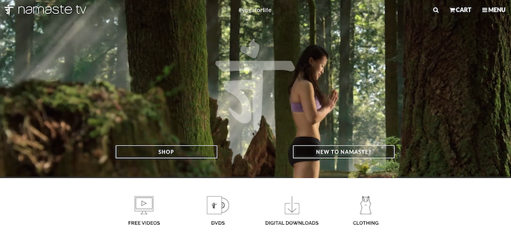
Namaste expressed that they wanted an image heavy website that was simple, elegant and minimalistic, much like Kinfolk and Old Faithful Shop. She used Leonardo Da Vinci's quote, "Simplicity is the ultimate sophistication" to describe the feeling of the website. They also provided a lot of beautiful images that made the decision easy to let the content speak for itself and use a simple layout with soft colours that did not distract from the content.

She also wanted to use large videos like on the website Storq to encourage people to begin or advance in a yoga practice. This was the inspiration for the home page video.
They wanted to create awareness about Namaste.tv and showcase content that people wanted to share. This was how the idea to create a feed on the bottom of the homepage using the hashtag #yogaforlife came about.
The idea for the image navigation came from AG Jeans.
What changed along the way?
Amber: After getting familiar with Namaste's vision for their website and receiving their content (which consisted of beautiful images showcasing Vancouver’s landscape and yoga), it seemed best to create a simple and minimalistic layout that was fully responsive and also editable.
A lot of features that were originally put in the design were dropped or simplified to make the website as clean and user friendly as possible. The grid was also modified to reduce the gutter width and to make the website fullscreen.

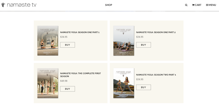
They wanted a unique shop layout that had to be inline with the capabilities of Shopify and also had a familiar UI for the user. The shop pages also had to be easily editable by the client which required a lot of back and forth with the designer and developer to figure out what could work.
What were some of the unique features you implemented into the Namaste site?
Willie: Since the shop is part of the main website, the look and feel needs to appear seamless. As a result, we started by finishing up everything else before working on the shop, and then ported the stylesheet over to help us jump start on the shop development. We used one stylesheet to control both the main site and the shop. We used product variants to build video trailers. We also used different queries to extract product images and place the images in different sections of the product page.
What tools did you find most useful when creating the website?
Willie: During the design stage, Photoshop is our go-to tool for creating the design mockup. InVision helps us build website prototypes and it makes interaction with clients so much easier.
We love developing with Sublime Text and Chrome DevTools. Their intuitive and super useful features just puts a big smile on the developer’s face.
What integrations did you use with the site?
Willie: We used FetchApp to create digital download copies for each Namaste season. When a customer chooses to purchase a digital version of the show, a unique download link is sent out by email upon checkout.
What makes this shop unique?
Willie: Namaste’s product page is the shopping experience we believe a digital online store should provide to its customers. With a beautiful landscape banner, a video gallery that gives a sneak peak to each episode (not to mention super quick to load!), an introduction to all Namaste instructors and product reviews, this website helps the customer make a purchase decision much more easily.

What’s your favourite feature on the site?
Willie: Our favourite feature has to be the video trailers on the product page. It's easy to use and customers get to have a sneak peak of each season before making a purchase.
It's easy to manage from the Shopify backend as well since we used product variants to build episode videos.
What was the most difficult part about creating this shop?
Willie: Upon finalizing the design, we knew it would be a challenge to stretch Shopify to its limit developing the Namaste product page. As it turned out, with some creative programming, it was not as difficult as we initially thought.
What did you learn while creating this website?
David: The Namaste project taught us even more about upgrading a website that already had a strong customer base familiar with their existing layout. We had to be careful to make sure the user experience would be familiar enough not to frustrate the end user while maintaining the design goals of the client. We also learned how far we can go with video embeds and Shopify’s ability to integrate into Wordpress, which will no doubt come in handy on future projects.
Read more
- Major Gains and Growing Pains — How Bold Scaled Their Team Sustainably [Part II
- How We Built a Global Empire from a Small Island in the Pacific Ocean
- How an India-Based Web Developer Quit His Day Job and Built an Agency
- Developing Customer Centric Solutions: How Yoast scoped, built and launched their Shopify App
- How Bold Commerce is Innovating in the Present, and Dreaming Big for the Future [Part III
- How Shopify Plus Partner Maestrooo Balances Building Themes and Apps, with Client Work
- How Bold Commerce Built an App Development Company From the Basement Up [Part I
- Partner Spotlight: Pointer Creative Integrates Shopify into Lassie Co.'s Wordpress Site
- 2 Guys. 6 Months. 7 Apps.
You might also like: Partner Spotlight: Pointer Creative Integrates Shopify into Lassie Co.'s Wordpress Site

