Every day is different in the life of a user experience designer, because no two projects are alike. A design that’s practical for one user type may be disastrous for another, and even clients in the same industry may have project goals that call for completely disparate design strategies.
It’s easy for designers to recognize and account for these differences when crafting experiences in stark contrast with each other—you obviously wouldn’t use the same design approach for a fintech platform as you would for a dating app—but when the variations are more subtle, it can be easy to overlook the nuances.
This is often the case when designing for wholesale ecommerce platforms. It’s tempting to craft an experience for this particular strain of online retail the same way you would any ‘standard’ ecommerce site, but in reality it calls for a unique approach.
In this article, we’ll not only identify the differentiators of designing wholesale ecommerce experiences, but also how these distinctions translate into actionable UX design strategy. And remember, while some of the factors may seem minor, they aren’t inconsequential. As any UX designer will tell you, even the smallest of details can make or break a user experience.
What makes designing for wholesale retailers different?
Short answer: the path-to-purchase. An absolutely crucial process of any ecommerce experience, the path-to-purchase for wholesale retailers is a completely different beast to slay than its B2C counterpart.
The largest distinction is perhaps the lack of ‘impulse buying’ in the B2B space. Online retailers selling directly to consumers typically want to make their path-to-purchase and checkout as streamlined as possible, making for quick transactions and taking advantage of customers shopping on a whim, before that buying impulse fades.

The wholesale retailer space is typically B2B, meaning that it’s extremely unlikely their targets will be impulse buying. Wholesalers often traffic in transactions that can be highly consequential for the buyer, which means there are usually several decision makers involved in the purchase process.
This doesn’t mean the path-to-purchase shouldn’t be seamless, but designers should keep in mind that there’s going to be much more research conducted on the buyer’s side before pulling the trigger. Knowing this allows us to design a path-to-purchase that mirrors their process—one that helps them in their decision (more on this later).
Another important factor to note is how the typical KPIs differ in the wholesale space. The B2B channel usually has a higher conversion rate than its B2C retail counterpart, and a higher average order value as well. If your client is defining the project’s success based on these key performance indicators, it’s important to remember where they should roughly be registering at.
You might also like: Winning Wholesale Business: Leading B2B Clients into the Digital World.
How do these differentiators translate into action?
A unique path-to-purchase, different weighting for ecommerce KPIs—these are all good things to keep in mind, but simply identifying them isn’t enough. In order to actually improve the experience, we need to expertly use them to inform our design strategy.
1. Buttressing the path to purchase
Let’s start with the buyer’s path-to-purchase. We’ve already established that their decision to patron your client’s wholesale site is likely going to be a lengthy process, one that involves rigorous research and product comparison.
Knowing this as a designer, you can inject instant value for the user into your experience by emphasizing white papers, case studies, and other literature to help them make a decision. By prioritizing these materials in the experience, you immediately demonstrate value to the user.
2. Pricing variants
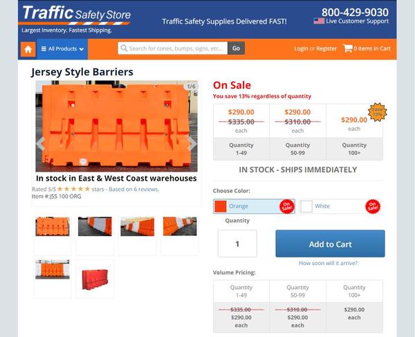
Another wrinkle in the UX design of wholesale sites is the pricing display. While typically straightforward in B2C applications, many wholesalers offer several different pricing variants for their products, including base cost, retail price, sale, and wholesale. Designers need to ensure these variants are clearly conveyed to the user without confusion.
On top of these variants, wholesalers may offer price quoting as well. This presents an interesting challenge to designers—how can the user quickly and efficiently get a quote, without disrupting their browsing experience? Is it a pop-up form that can be easily closed to return to the product page? Or a wizard-style mechanic?
Here’s how Traffic Safety Store does it:

3. Superior product organization
While an indispensible facet of any ecommerce experience, smart product organization is especially crucial in the wholesale space. Many wholesalers have an enormous catalog of products, and the amount of SKUs they need to manage can sometimes number in the thousands.
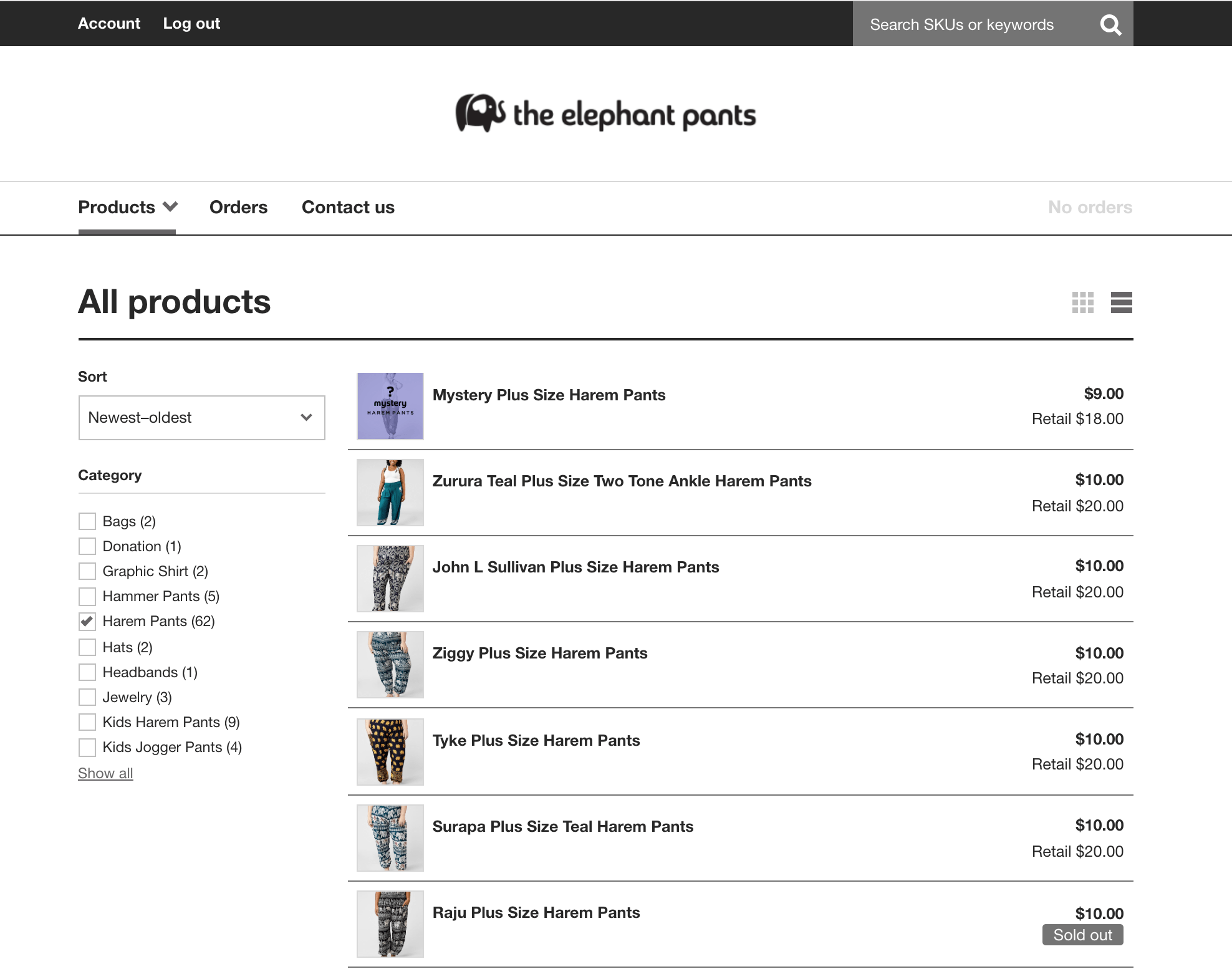
Because of this, options like a product comparison feature or a robust search function are no longer ‘options’—they’re must-haves in the experience. Don’t forget to account for this when building out the information architecture of the website.
Just take a look at the tools The Elephant Pants offers on their site:

The Elephant Pants employ several different product organization mechanics to make navigating their expansive catalog seamless. Not only do they have sorting, category filtering, and a list vs. grid viewing options (all functions you’d likely find in a robust B2C retail site), but they also allow their users to search by keyword or SKU number.
4. Integrate with the digital ecosystem
And speaking of an enormous product catalog, it’s important that the experience you design can easily integrate with your client’s inventory management software, as well as the rest of its existing digital infrastructure.
This typically means a seamless interfacing with your client’s ERP and CRM, with the latter being especially important, as most B2B sales are ongoing relationships.
No half measures in wholesale
While sharing many similarities with its B2C counterpart, crafting wholesale retail experiences is an entirely different breed of ecommerce web design. Its unique path-to-purchase, high SKU amount, and pricing complications are just a few of the challenges UX designers will need to address when crafting these experiences for their wholesale clients.
Read more
- Working With Technology Clients: Strategies, Apps, and Themes to Consider
- 6 Design Conferences to Last You 'Til The End of 2016
- Top Ecommerce Web Design Trends for March
- Top Ecommerce Web Design Trends from January
- Building Apps: 3 Things we Learned in Making Design Consistent and Scalable
- How to Direct, Control, and Hold Focus Through Design
- How to Integrate Shopify into your Client's WordPress Website with Zillacommerce
- Top 5 Features to Include When Building a Successful Fitness Site
- 13 Web Design Trends to Watch in 2020
What sort of design practices do you implement for your wholesale clients? Tell us about it in the comments below!

