Feature creep is a common problem that comes up in many projects. When it comes to product design, it's easy to assume you’ll create a better product if you include more features. More features will translate into more value for your users, right?
Actually, in most cases, the answer is no—it will not.
In this article, we’ll discuss what feature creep is, and the steps you can take to prevent it from happening on your project. This way, you have a better chance of staying on budget, finishing by your deadline, and making your end users happy.
What is scope creep (or feature creep)?
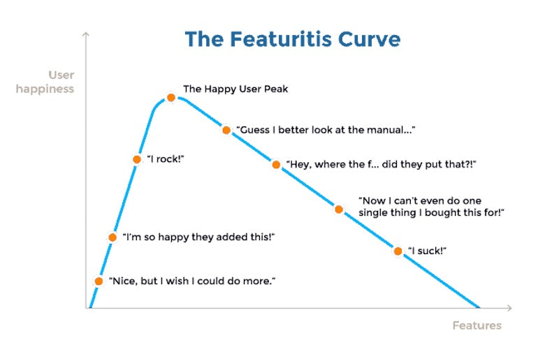
Feature creep, more commonly known as scope creep, refers to when you add excessive features to a product that make it too complicated or difficult to use. Any additional features you introduce into your product add to the complexity of your design. In turn, this can diminish the usability of your product.

Here’s where it gets even worse:
Feature creep is also a real problem when it comes to project management. It’s relatively easy to go over budget or miss deadlines when the team and/or the stakeholders don’t understand the impact that changes in product backlog can have on available resources and schedule. This can continue indefinitely when someone requests more and more changes to a product that ultimately never ends up being launched.
Other terms you may hear of referring to feature creep
While feature creep and scope creep are the most common terms describing this issue, you may also hear it described as:
- Concept creep
- Project creep
- Project scope creep
- Feature bloat
- Featurism
- Featuritis
These all refer to the same concept that you should work to avoid in your project.
What causes feature creep?
Feature creep is typically the result of poor planning, insufficient product strategy, and misaligned priorities. Typically, requests for new features are added after the project has started, are out of scope, and the changes are not properly reviewed.
If you’re building a product for your own business, such as an app, it’s important to stay focused on creating a strong minimum viable product (MVP) and ship it. You can always add features later on after you get feedback from your merchants and/or users.
You might also like: 4 Project Management Tips Shopify Partners Learned During BFCM.
How to manage feature creep
It’s important to follow some guidelines to prevent feature creep from overtaking your project. Here are a few simple techniques that will help you:
1. Focus on the core features
The golden rule of product design is simple:
“Ship the right features to the right people.”
"The golden rule of product design is simple: 'Ship the right features to the right people.'"
Although this rule is simple, it can be tough to achieve in practice. You need to identify the parts of your product (the core features) that provide the maximum value to your target audience.
Dan Olsen, author of The Lean Product Playbook, stresses the importance of focusing on core features in his book:
“Swiss Army knives are incredibly useful, providing a set of tools to address a wide range of needs all in one convenient package. But at some point, as you add more and more tools, a Swiss Army knife gets wider, heavier, less usable, and less valuable. Focus is critical when defining a new product.”
To help focus your project on core features, you need to:
- Start with user and market research. Identify your target audience, their needs, and their wants. Know what problem you are solving, and for what user.
- Prioritize all features in your product according to the needs of your users. You should have a strong rationale for every feature that you want to introduce to your product. It’s recommended to use the jobs-to-be-done framework to identify the key features that offer the most value to your target audience.
- Ensure that your target audience is willing to pay money for the solution. If your potential customers won’t buy your product, all of your work might be wasted. Do some upfront research to ensure that once the product is launched, people will actually buy it!
Even after going through these steps, the total number of features that you may want to include in your product might be overwhelming. So, the next step is to apply a Pareto analysis. The Pareto Principle states that, for many events, roughly 80 percent of the outputs come from 20 percent of the inputs. It’s important to note that the 80/20 ratio is not exact.
Now:
You might find that the numbers change slightly, but there are many examples of this ratio coming up in a variety of fields, including marketing, science, and economics. This principle can also work for product design: you need to find 20 percent of the features that bring 80 percent of the value for users and businesses.
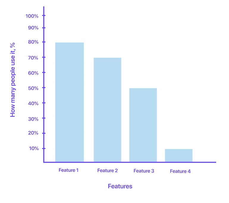
For example, if you have an MVP or fully realized product, you can measure the adoption per feature. Create a simple 2-axis chart to analyze the adoption per feature, where the X-axis shows each feature in your product, and the Y-axis shows the percentage of customers using the feature. You can then easily see which features are the most important to your users.

The logical question then is what to do with the features that have a low adoption rate? If a large percentage of your users aren’t using a certain feature, get rid of it. This decision might be hard for products that have already shipped on the market—some users may already be using those features, and removing them from an existing product can be painful. However, keeping features and bloating the product is not a good practice.
"If a large percentage of your users aren’t using a certain feature, get rid of it."
You might also like: Data Visualization: Interpreting Uncertainty in Product Design.
It’s important to note that the process of removing (aka “sunsetting”) a feature with a low adoption rate from a product can take many forms, but no matter what form you choose, do not tear it out from the user interface (UI) without sending a message to the users who actually use it.
Send a message to your current users letting them know that you’re going to sunset the feature, and give them time to prepare. Offer an alternative feature or tool if possible. Otherwise, you could create a large backlash from your current users, and lose a lot of trust in the process.
2. Create a roadmap and follow it
It might be hard to prevent feature creep when you don’t even realize that it’s happening. The chances of feature creep are much higher when product design teams don't have a clear roadmap. Not having a roadmap means that every problem that a team faces along the way will be solved reactively, rather than proactively.
The universal law of product management is simple:
“To end well, you need to start well.”
Planning ahead is vital to your project’s success. Here are a few simple things that will help you to create a roadmap:
- Formalize the scope. It’s vital that before a team begins to work on a project that it has a written scope of work. This should have also been approved by any stakeholders.
- Review our article on writing a product roadmap. This will give you a solid base to start from.
- Identify the major and minor milestones of the project and put them on a timeline. Review milestones when scope changes are requested to ensure that the project won’t suffer from delays.
- Introduce a clear protocol for change implementation. Define rules on how changes are reviewed, approved, or rejected.
- Use zero-sum game for incoming feature requests. When stakeholders ask to introduce a new feature into the scope, project managers need to make sure that some features come out of the scope to meet the product design deadlines. This may make stakeholders reconsider the value of the feature that was requested, or give a team an extension of time and project budget.
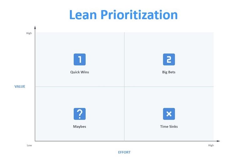
- Create an Impact vs. Effort Matrix. The Impact vs. Effort Matrix is a useful tool mapping features against two factors: the potential value and the effort required to implement them. The matrix can serve as a reference point for your team—you should show the history of product decisions as well as the rationale behind them.

3. Stay away from gold plating
Gold plating is the tendency of the product team to over-deliver on the scope and add features. When this happens, product teams introduce features that stakeholders didn’t ask for just to try and make them happier.
Gold plating requires extra effort from the product team, and in many cases, the work is unnecessary. You might even upset your stakeholders when you add complexity that wasn’t originally requested, so be mindful and put a stop to it before it starts.
You might also like: 7 Essential Digital Project Management Best Practices.
4. Learn to say “no” to feature requests
The ability to say no is one of the most critical skills a project manager can have because it helps prevent scope creep.
Yet, for many people, it’s one of the hardest things to do.
"The ability to say no is one of the most critical skills a project manager can have because it helps prevent scope creep. Yet, for many people, it’s one of the hardest things to do."
All too often, product designers follow the idea that because stakeholders want this feature, and we want to make our stakeholders happy, we should include this feature. This introduces unnecessary features into the product roadmap.

Steve Jobs once said, “Innovation is saying no to 1,000 things.” It’s tough to say no to your boss or colleagues, but you need to learn how to do it.
"Always remember to back your decision with good reasoning."
Always remember to back your decision with good reasoning. For example, whenever stakeholders propose a new feature, evaluate it in accordance with the product vision, value for users and businesses, and the resources required to build it. Use this reasoning to explain to them why it does not make sense to add the feature, and the associated costs that come along with trying to add it.
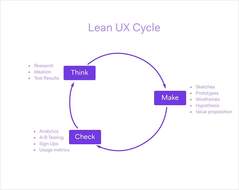
5. Establish a quick build-measure-learn cycle
An old adage in carpentry says, “Measure thrice, check twice, and cut once.”
When it comes to product design, it’s essential to validate your ideas before investing the time and effort in building them. When adding features, always test them with real users. Ensure that the features are linked to the users’ needs and they deliver value to your target audience.
Eric Ries, author of The Lean Startup, perfectly summarizes the importance of validating design ideas:
“What if we found ourselves building something that nobody wanted? In that case, what did it matter if we did it on time and on budget?”
The simple task of validating your design ideas may save your team wasted hours and expenses down the road. Jeff Gothelf, author of Lean UX, describes how to apply lean principles to improve user experience.
Lean UX design is both a mindset and a process that embraces lean-agile methods. Teams that follow Lean UX implement functionality in minimum viable increments and determine success by measuring the results with their users.

Focus on simple design
Product teams that suffer from feature creep usually have good intentions—to turn a good product into a great product. Unfortunately, quite often, this good intention leads to bad UX. Additional features add to the complexity of a product, which in turn leads to overly complex products that can be expensive, delayed, or in the worst case, not what the users want.

There aren’t any magic bullets for feature creep. But it’s possible to embed proactive defense mechanisms in your product ideation and building processes.
The main goal of these mechanisms revolves around the KISS principle ("keep it simple, stupid"): every product team’s number one goal should be to maintain product simplicity.
"Simple solutions have better usability."
Simplicity should be a key goal in design and function because simple solutions have better usability. People love simple products because they don’t have to invest a lot of time in learning how to use them.
That’s why, in most cases, designing a product with a limited number of features to prevent feature creep is the best approach. In the end, you should carefully select the product’s features, and all of the features should work exceptionally well to provide value for your users.
Have you ever worked on a project that suffered from feature creep? Let us know what happened in the comments below!
Have you ever worked on a project that suffered from feature creep? Let us know what happened in the comments below!
Read more
- How to Build a Shopify App: The Complete Guide
- Speed Things Up: Designing a Fast Experience for Better Mobile UX
- Free Webinar] How to Convert Visitors Through Persuasive Design
- Five Useful Usability Testing Tools Proven to Convince Clients
- Shopify's Mobile Device Testing Lab Gets Wheels
- 5 Common Digital Content Problems and How to Avoid Them
- Agile Design: An Introduction
- Content Strategy: The Principles we Followed to Build the New Shopify App CLI
- The Top 4 Reasons Users Abandon Their Carts and What to Do About it
- Typography in UI Design

