Imagine arriving at your small design agency, and one of the largest film production studios in North America is on the phone asking if you can build them an online store. That's what happened to Pointer Creative when Dreamworks called and asked if they could create a Shopify store integration for their existing Lassie Co. Wordpress site.
We caught up with Chris Pointer, Creative Director of Pointer Creative, to get the details behind the design.
You might also like: 2 Guys. 6 Months. 7 Apps.
Tell me about Pointer Creative.
Pointer Creative is one of the top Shopify Experts in Canada. As a multidisciplinary design shop, we have vast experience in all areas of creative service, but as a result of Shopify’s success, and the subsequent inbound referrals, we felt it best to focus on Shopify exclusively. Working with Shopify has given us the opportunity to make connections that are impossible to get as a design generalist. As a top Shopify expert, we work with everyone from CEOs of exciting startups to marketing managers from Fortune 500 companies.
What makes you unique?
We’re a tight group of creatives and everyone has input and autonomy on all projects. This provides a unique approach and allows us to harness many different opinions on design, development, and general user experience.
What’s one of your favorite Shopify projects you’ve worked on and why?
Shop Lassie Dog Co. certainly was an interesting project of late. When Dreamworks approached us, we initially looked at it as a standard merchandise site. But as the project unfolded, we realized there was more to the story, especially with regards to the greater Lassie brand. They had the existing Lassie brand that was already established by one design agency, and they had the base Lassie website that was created by another one, but they needed the ecommerce component and neither of those firms could support them in that regard. In the end, they hired us to seamlessly integrate their existing web presence on to the Shopify platform.

Where did the inspiration for the store’s design come from?
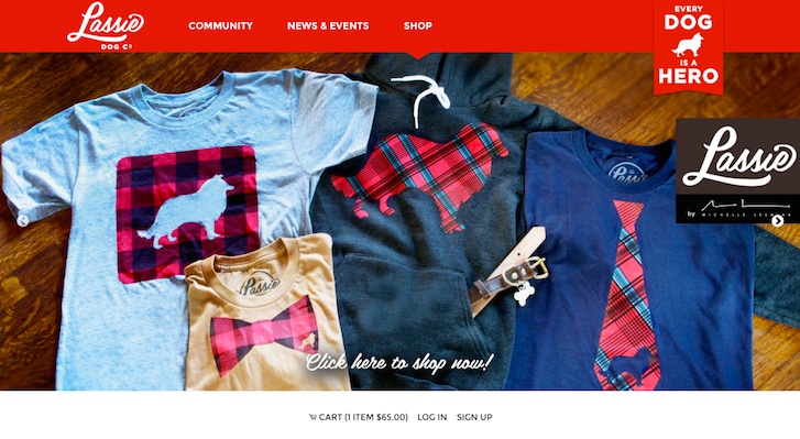
The new Lassie brand is very strong and it was easy to work with with. The brand had high level assets including solid typography and graphics. The photography was also phenomenal. It is a big, bold lifestyle brand with bright colours, friendly typography, and, of course, lots of dog pictures.

How did the products influence the design?
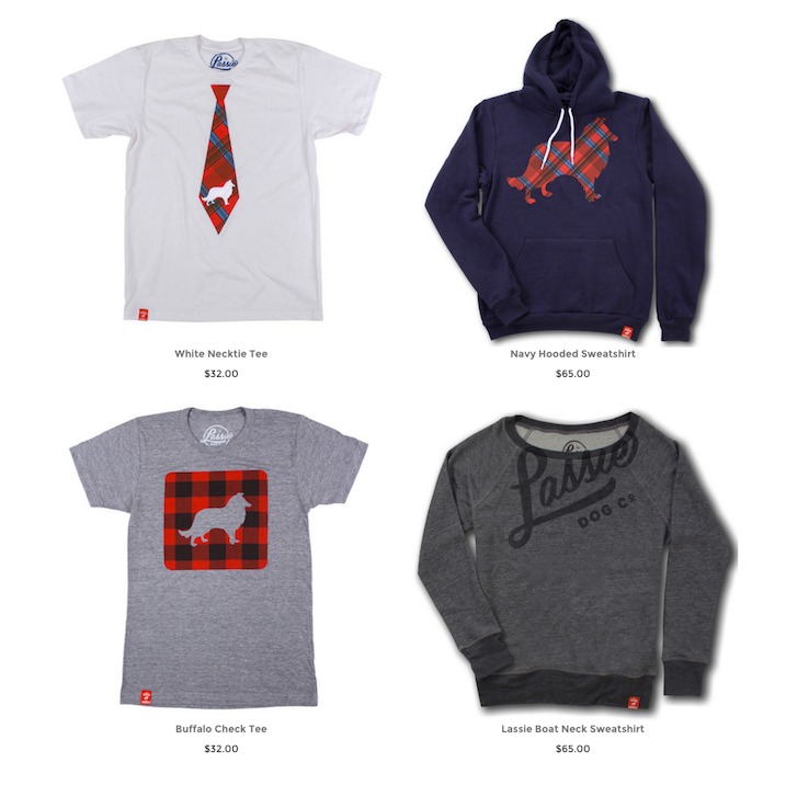
The products for the Lassie store were really nice but pretty standard (tees & hoodies, etc.). So we didn’t want to do a super elaborate design that overshadowed the products. The products are lifestyle clothing as opposed to high fashion, so we took a very straight forward approach to the design that reflected the wholesome and storied feel of the Lassie brand.

It is very much a minimalistic design, focused on giving maximum exposure to the apparel, and then obviously having the most streamlined user experience possible once you hit the product page. There weren’t a lot of bells and whistles like some of our other projects.
Was there anything in particular you did to improve the user experience of the site?
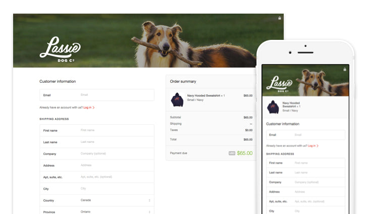
Their current website was well executed and had a strong, responsive, user experience, so our goal was to create an ecommerce experience that was a seamless transition between to two. The beauty of Timber is that it’s a very malleable framework — flexible but robust. There was a huge advantage to be able to get assets from Lassie’s current website and make ours reflect that same inspiration, but then also port over those same responsive functionalities throughout. Even a couple years ago, the norm for many web-based businesses was to have an ‘embedded’ ecommerce component. So while the majority of the normal site elements were responsive, you’d have this clunky ecommerce tool that wouldn’t lend itself well to mobile browsing at all.

Our goal is always to design and build web stores that don’t look or feel like stores. Instead we try to make attractive and engaging website that guides customers to the products they are looking for and brings them through to the checkout with as few clicks as possible. We were fortunately able to transfer this design philosophy on to the new Lassie store with the support and enthusiasm of our client.
You might also like: How Pixel Union Diversified Their Service Offerings and 10x’d Their Business
Was it difficult to integrate Wordpress with Shopify?
Not at all, it was just some simple navigation linking. Their Wordpress site has a link to the Shopify domain name and then we just had to make the navigation consistent. We originally approached them and suggested they move everything to Shopify, but that was going to take a bit more time, so they decided to keep it simple.
From time to time clients to approach us about building in a Shopify component to their existing website hosted on some third-party platform. They’re often surprised when we explain the flexibility of Shopify and how it can be used to accommodate pretty much any need. Shopify stacks up on most fronts as a prospective all-in-one solution.
What tools did you find most useful when creating the site?
We used Timber because it allowed us to start the design from scratch, but leverage it’s native ecommerce functionality. Using existing, developed themes, you often find yourself tearing down design components and rebuilding them as necessary. With Timber, that kind of house cleaning is not necessary and you can build a custom shop at your own pace. It’s a lot easier to work with that kind of bare bones, responsive framework to make it match your design rather than trying to take an existing theme and heavily modify it. Clients often approach projects expecting there to be economies in starting with an existing theme, but this is rarely the case — especially if they have any element of originality in the designs they’re working with. We build almost all of our shops with Timber now — it’s an incredibly robust and effective framework.
With existing themes, we often find ourselves tearing down design components and rebuilding them as necessary. With Timber, that kind of house cleaning isn't necessary.
What was the most difficult part about creating this shop?
It was actually a pretty smooth project. Dreamworks were a great client to work with. It’s so rare to work with a merchant who gives you everything you need to get the job done. I’d say 70% of Shopify merchants rely on the Expert to provide the assets, or guidance on how to put them together. In this case, they furnished us with high quality images and awesome branding elements, which always makes our jobs that much easier. They knew exactly what they wanted and what their goals were, they were organized and focused, and that really allowed us to wrap this so quickly.
What’s your favourite feature on the site?
The site has a great mobile experience and it super clean and easy to navigate. It also has an expanding cart feature which is great for UX. You’re able to view your order without navigating away from any particular item you’re currently on.

We’re hoping to continue to evolve the shop with some great Shopify apps like the Upsell app and social media sharing.
What did you learn from creating this site?
We learned, as always, Shopify is the best solution of putting together a great ecommerce solution.
Want more amazing insights into customized Shopify designs created by our Partners? Check out our complete Case Study collection.
Read more
- From Reddit to Redesign: How Fuel Made Increased One Merchant's Revenue by 30%
- How Shopify Plus Partner Maestrooo Balances Building Themes and Apps, with Client Work
- Partner Spotlight: Disco Brings Useful Gifts to Shopify Plus
- Partner Spotlight: ReCharge Launches 5-Hour ENERGY Subscriptions
- Partner Spotlight: Helium Development Helps Rhino Gear Switch from Magento to Shopify
- Partner Spotlight: Squashed Pixel's Award-Winning Site for Rue Marcellin
- How We Built a Global Empire from a Small Island in the Pacific Ocean
- Partner Spotlight: Jivaldi Builds American Sniper Store
- Determination and Devotion: How Two Entrepreneurs Changed the Ecommerce Industry in Mexico
You might also like: How a Partner Team of Two Introduced an Old-World Antique Shop to New-World POS

