Anyone in Ottawa, Canada can tell you that the best doughnuts in town come from a small independent shop called SuzyQ.
Jackpine Digital Inc. got the opportunity to work with them on their online store, adding some unique functionality to give the doughnut shop the aesthetic and shopping experience they were looking for.
We caught up with Jackpine CEO Liam Mooney to ask about his experience working with SuzyQ.
This will be the first in a series of posts where we take an in-depth look at Shopify stores our partners have built. Stay tuned for insights into design inspiration, client collaboration, and stretching the limits of Shopify’s platform.
For now, here’s Liam from Jackpine.
You might also like: How Bold Commerce Built an App Development Company From the Basement Up [Part I]
Q: Tell us about Jackpine.
We’re a design studio that does a bit of everything. We're very multidisciplinary, which means our work ranges from urban design, retail design, spatial design, graphic design, GR/PR, marketing, advertising and strategy.
We started two years ago in a bedroom and have grown to a team of 12 full-time and a bunch of part-timers, collaborators and partners. We come from all types of fields: fine arts, technology, philosophy, design, urban planning, architecture, visual arts, creative writing and economics. Seems like an odd mix, and it is, but that’s totally done on purpose.
Our studio is in Chinatown and we love visitors. Drop by sometime.
What makes you guys unique?
I think it’s our team. We don’t necessarily have designers or developers or account managers. We have a group of interested, weird and talented people. The most important thing we look for in people is that they fit well with the rest of the team. It doesn’t matter how good you are at design if you don’t have good ideas, and we have a team that is very collaborative, where ideas and concepts can come from anywhere. After that, once we agree on the idea, then people fall into their expert roles.
What’s your favourite Shopify project you’ve worked on?
The SuzyQ project was a lot of fun. We knew right off the bat that this was an opportunity to do something special. You don’t really think of doughnuts as something that people buy online, so what we wanted to do was take as much as we could of the experience of buying doughnuts in person, and transfer that to the online experience. It was also a chance for our artists to let loose.
SuzyQ’s doughnuts are works of art, so we knew we wanted to create an artistic experience. This really came out in the design, the drawings and the writing for this site. If you take a look through it, you’ll see that we took every opportunity we could to create custom artwork and design.
Where did the inspiration from the shop’s design come from?
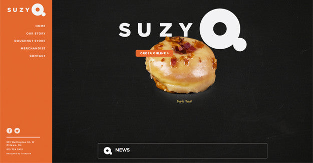
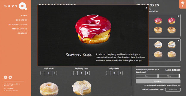
Inspiration for the design came from the products themselves. The orange represents the playful and vibrant qualities that are reflective of the SuzyQ brand and doughnut varieties. Black was chosen as a common background colour since it essentially lacks presence in the mind of the viewer. By compositing the doughnut photography over a dark background, the viewer’s primary focus is on the product. To make the doughnuts an even more prominent feature, we used dynamic lighting techniques to give them a mouthwatering look.
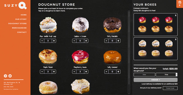
We gathered usability inspiration by researching and examining the design of other websites. We broke down what each design offered and what it did not. We looked at what SuzyQ visitors needed, and built the design around those requirements. Practicality and usability were our highest priority, so we simplified the menu and ordering systems to make it easy to navigate the website. An example of this is the breakdown of products on the cart checkout page.
Tell us about the design process. What changed along the way?
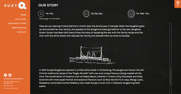
In regards to the food photography, we repetitively tweaked our shooting style and post-production processes. We took every effort to make those doughnuts look as good on screen as they do on the store. We also added an "Our Story" section which saw a lot of changes. We wrote three different versions – titled "The Story," "The Real Story," and "The Realer Story" – each one longer than the next, so people could choose how much they felt like reading. But we still felt something was missing. This is when we decided to add in the sketches that really bring the story to life. You can only think of so much at the beginning of the process. The more the website was built, the more we saw opportunities to add to and compliment what was there. A lot of the minor details were added later on in the later stages.
Tell us about the various ways you integrated the doughnut into your design.
With SuzyQ we’ve always said that the doughnut is the brand, so it has to be front and centre in everything we do. This has worked its way into the website in many ways. The store section simulates the action of selecting the doughnuts and putting them in the box, and the cart icon has a little doughnut inside of it. On the "Our Story" page, you’ll see that each of the three versions are represented by a plain doughnut, a glazed doughnut and a glazed doughnut with toppings. Basically, we came up with as many reasons as we could to draw doughnuts.
You’ve said, “Design is a destructive process.” Can you explain what you mean by that?
Good design isn’t about how technical or complicated your designs are. Often the solution to a design challenge is something that looks really simple, but getting to “simple” requires exploring a lot of options. So when we talk about a “destructive process,” we are talking about all of the options we considered, all of the paths we took that led us to a dead end. You have to try everything to see what doesn’t work before you ultimately arrive at what does work.
What tools did you find most useful when creating the website?
Creating a wireframe that outlined the layout and usability of the site was essential. From a technical design perspective, Adobe Photoshop. Being able to use a prototyping tool to show the site to the client and receiving feedback was important too. We also benefitted from having a team that could own various aspects of the project.
What integrations did you use with the site?
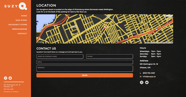
We created a custom Google Maps API that was in sync with the brand aesthetic.
What makes this shop unique?
A: The SuzyQ shop is unique in a few ways. The first is simply that you can buy doughnuts online. There is a certain novelty in this that people really get behind. The other, I would say, is the level of customization that we have incorporated into the Shopify site. When we first started this project, we immediately started thinking of the limitations that we might face and how to work within those, but our developer told us not to worry about that, that he would figure out how to do whatever we came up with. So we just started throwing out all of these ideas: the store, the boxes, the different stories, and he made it all work.
You might also like: Partner Spotlight: ReCharge Launches 5-Hour ENERGY Subscriptions
What’s your favourite feature on the site?
The core of the website is the ordering/product builder. It was really important to us to make this a human experience. Ordering online is a very impersonal experience and we wanted to bring as much humanity into this process as possible. I am really happy with the way it turned out.
What was the most difficult part about creating this shop?
The most challenging part of the project from a design aspect was establishing the interface and visual representation of the checkout boxes. We wanted to make adding and removing doughnuts a simple and natural function. This was resolved by creating a preview of the doughnut boxes within the store, with options to remove doughnuts directly from the boxes. Along with a simple add/subtract interface for each doughnut, we included an editable numerical field that not only displays how many of each doughnut has been ordered, but also allows the user to enter a large numerical value when ordering large quantities.
What did you learn while creating this website?
We learned that brand characteristics can influence much more than simple the visual imagery of a website. For SuzyQ, we really feel that the entire website was created from the ground up with its brand in mind. We also learned the extent to which we were able to customize on the Shopify platform. Had we begun the process with perceived limitations in mind, we never would have arrived where we did on this project.
Want more amazing insights into customized Shopify designs created by our Partners? Check out our complete Case Study collection.
Read more
- Developing Customer Centric Solutions: How Yoast scoped, built and launched their Shopify App
- Partner Spotlight: Jivaldi Builds American Sniper Store
- How Singapore’s Jumpstart Commerce is Taking Over the World
- Determination and Devotion: How Two Entrepreneurs Changed the Ecommerce Industry in Mexico
- Major Gains and Growing Pains — How Bold Scaled Their Team Sustainably [Part II
- How Bold Commerce is Innovating in the Present, and Dreaming Big for the Future [Part III
- How Shopify Plus Partner Maestrooo Balances Building Themes and Apps, with Client Work
- From Bookmarks to a Marketplace: Aveste Built a Custom Marketplace Serving Both Customers and Small Brands
You might also like: Partner Spotlight: Squashed Pixel's Award-Winning Site for Rue Marcellin

