Any seasoned retailer with an ecommerce store knows a full cart doesn’t guarantee a sale. A well-designed checkout page design ensures your customers can easily follow through on their intentions, rather than leave behind an abandoned cart because of clunky forms or a complex layout.
With Shopify, you're already a step ahead. Backed by Shopify’s vast identity network, unparalleled scale, consumer trust, and rapid pace of innovation, our checkout stands as the best in the world. In fact, our overall conversion rate outperforms the competition by up to 36%—and on average by 15%. This is the Shopify advantage.
With a great foundation in place, here are more tips on how to optimize your checkout page to help increase sales.
What is a checkout page?
On an online store, the checkout page is the final step in the online shopping process, where customers review the items in their shopping carts and enter shipping and payment details. After filling out these form fields, the customer can submit the order to complete the transaction.
Why is it important to optimize your checkout page?
A shopper reaching your payment gateway with a filled cart doesn't guarantee a completed transaction. Baymard Institute analyzed cart abandonment in online stores and found 70% of potential customers chose to leave rather than complete their purchase.
In short, checkout page design matters. A short and easy checkout flow gives customers one less reason to jump ship.
Therefore, improved conversion rates—the percentage of visitors who complete checkout—is the primary benefit of an optimized checkout page. A seamless payment process can also impact how customers view your brand. A great checkout experience can increase customer confidence and leave a more favorable impression.
Checkout page design at Shopify has been meticulously crafted with a singular focus: boosting conversions. Every pixel and every interaction has been fine-tuned to seamlessly guide buyers toward completing their purchase. The one-page checkout, inspired by the high-converting Shop Pay checkout, is designed to minimize friction and enhance the user experience.
Tips for optimizing your checkout page
Many ecommerce platforms offer simple templates for checkout pages that drive customers toward the checkout button, but it can be easy to complicate the process with available add-ons and call-outs.
Here are a few ways to streamline your entire checkout process:
Keep the checkout process simple.
Offer an express checkout option.
Accept multiple payment methods.
Enable guest checkout.
Reassure with a secure checkout.
Send abandoned cart notifications.
Add upsells, loyalty programs, or customized delivery options.
Keep the checkout process simple
Replace a multipage process with a one-page checkout, where customers can enter their information and complete their purchase in a single window. A single-page checkout is standard for speed and efficiency. A multipage checkout risks losing your customer, who may grow impatient or second-guess their purchase.
Offer an express checkout option
Some of the most successful ecommerce checkout pages feature express payment options—Shop Pay, Google Pay, Apple Pay, and Paypal Express checkouts—as the first step on a single-page checkout. These links preload shipping and payment information for near-instantaneous order completion. Shop Pay, our accelerated checkout offering, in particular can boost conversion by as much as 50% compared to guest checkout, outperforming other accelerated checkouts by at least 10%.
Accept multiple payment methods
While most customers may still choose to enter their credit card information for online transactions, alternative or digital payment methods—PayPal or buy now, pay later financing options like Klarna or Afterpay—are increasingly popular.
Giving customers the choice covers your bases. The easier it is for them to find their preferred method, the quicker (and more willing) they’ll be to proceed with their order. Consider adding a field for discount or promo codes and easy gift card redemption.
Enable guest checkout
While customer logins may be helpful for members of a loyalty program or repeat customers, requiring an account for checkout may deter new visitors who are either unsure about creating an account or unwilling to take the extra steps to complete their purchase. Offering guest checkout capabilities helps make the buying process more convenient.
Reassure with a secure checkout
To reassure customers so that they feel safer providing their personal information, display security or trust badges. Top ecommerce platforms include a free SSL certificate (indicated by the padlock in your address bar), which helps instill trust.
Send abandoned cart notifications
Text alerts or email notifications are a great way to remind customers about abandoned carts. They’re also an opportunity to incentivize the conversion with a discount, free shipping, or a gift with purchase. You can also set up an exit intent pop-up, which prompts the customer with a cart reminder before they leave your site.
Add upsells, loyalty programs, or customized delivery options
Incorporating upsells, loyalty programs, and customized delivery options into the checkout page design can significantly enhance the user experience and boost conversions. Upsells provide customers with additional purchase options that complement their current selection, potentially increasing order value. Loyalty programs incentivize repeat purchases by rewarding customers for their loyalty and future repeated business. And customized delivery options offer flexibility, catering to the diverse needs of customers. All of these features can be easily added through apps. Shopify's community of app developers has launched over 400 extensibility-powered checkout apps with a wide range of capabilities. These apps further enrich the checkout experience, offering merchants a multitude of ways to customize their checkout process.
Checkout page examples
The best checkout page examples are straightforward and meet a customer’s expectations. If there’s confusion about what they must fill out or if important information is easy to miss, the risk of cart abandonment increases. Here are three different checkout flows:
Allbirds
Glossier
Happy Socks
Allbirds

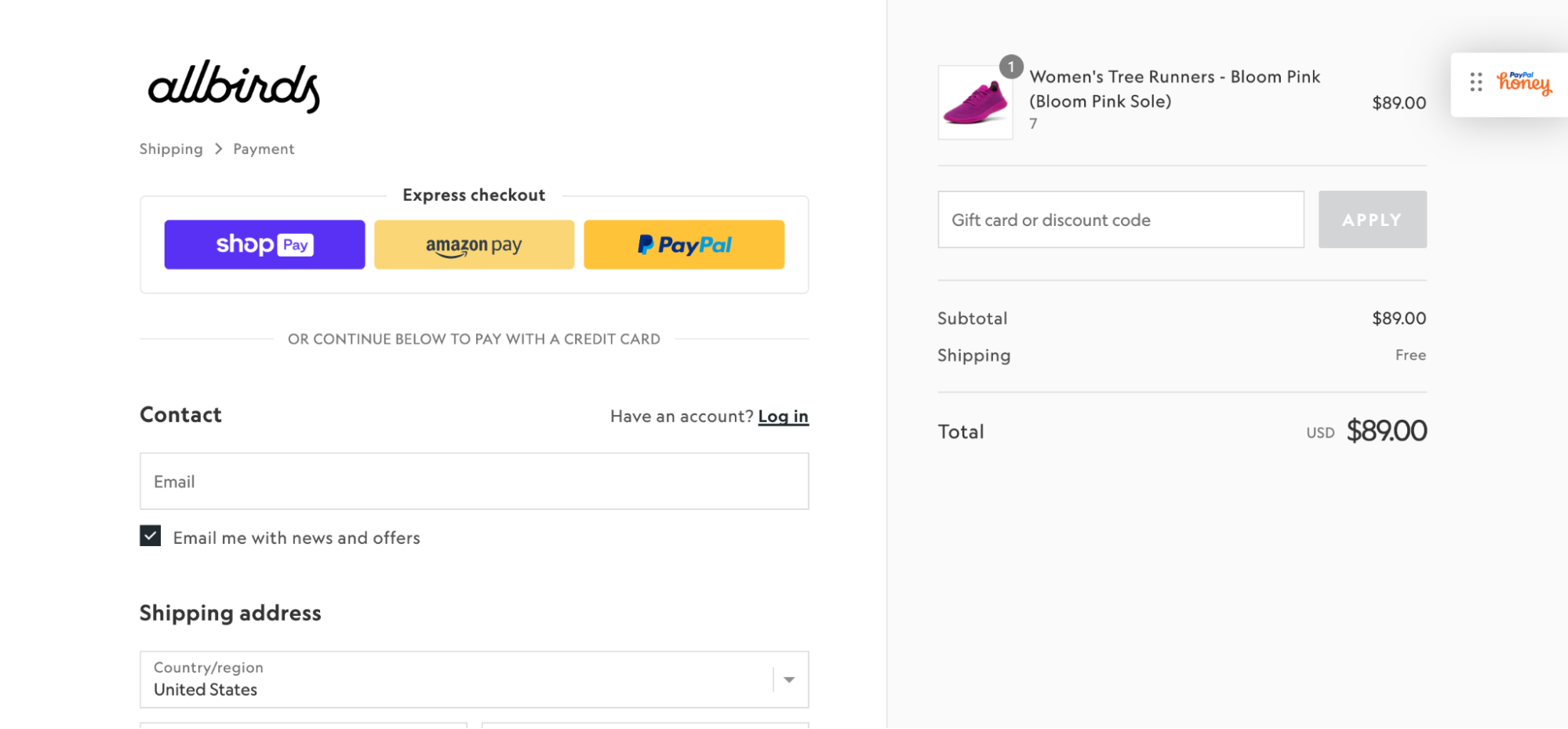
Alt text: Allbirds checkout page showing express checkout options, order total, and shipping amount.
Shoe company Allbirds uses a Shopify checkout page layout, which features an express checkout option to encourage quick conversions. On the right, the order summary offers a transparent breakdown of shipping costs and leaves space for promo codes or gift card redemption. Guest checkout is the default, but there’s an option for Allbirds members to log in.
Glossier

Like Allbirds, the Glossier checkout page features a simple multipage checkout flow. There’s also an option for pickup. If customers select this option, a drop-down of available locations appears before prompting them for payment information on a new page.
Happy Socks

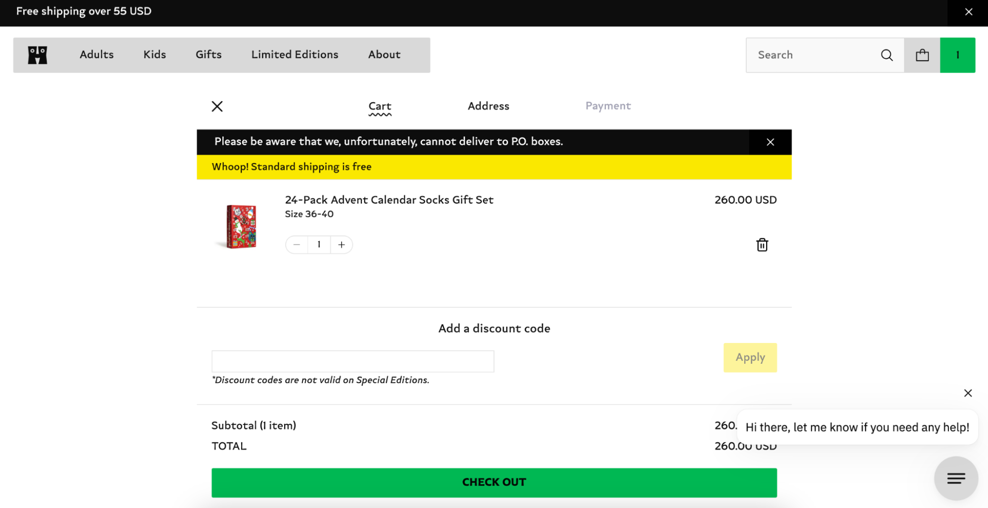
The Happy Socks checkout is on a single page, with the necessary steps broken down into tabs at the top of the page. The checkout button automatically moves the customer along the tabs, or they can navigate to the next section independently. The payment tab remains grayed out until the customer completes all the informational fields in the address section. This helps lead customers along the path to purchase, increasing the likelihood they will complete the checkout.
Checkout page design FAQ
What makes a good checkout page design?
A good checkout page design encourages a seamless checkout process. For example, presenting form fields to gather all the relevant information on a single page. Great checkout pages also show an order summary, allowing customers to double-check their order details and prevent errors before submission.
What are the types of checkout pages?
The ecommerce checkout experience adheres either to a one-page checkout or a multipage checkout process. There are notable variations with one-page checkouts, including an accordion-style checkout page where form fields collapse once filled in. Other single-page checkouts use drop-down menus to similar effect.
What’s the difference between a checkout page and a cart?
While a cart functions as an order summary, a checkout page finalizes the transaction by presenting order details alongside billing, shipping (including shipping fees and shipping options with delivery timelines), and payment information.


