
We can add more features to our websites and have more tools and technologies at our disposal than ever before. The downside, however, is that our choices can significantly slow down our sites, much to the frustration of customers (in a 2018 survey, 80 percent of users said a slow loading website was more frustrating than one that’s temporarily down). When sites become inaccessible or unresponsive on slow network conditions or low end devices, it can even exclude potential customers altogether.
The business impact of web performance optimization is well documented. Fashion retailer Missguided, for example, reduced median page load time by four seconds and increased revenue by 26 percent. Watch a talk on this below:
A lot of it is about raising awareness, and so we invited seven experts to suggest a few tips that can help improve the performance of your sites.
1. Build for mobile first
Customers are becoming increasingly mobile, and the proportion of mobile-only customers is rising. Conversion rates, however, tend to be lower on mobile. Independent web performance consultant Andy Davies, who worked on the fashion retailer’s site mentioned above, says it’s time to change that, and finally treat mobile as a first class citizen.
“Responsive Web Design gave us the ability to build sites that, in theory, could work equally well on both desktop and mobile,” he explains. “Unfortunately, we often seem to design and build for desktop first, and then try to shrink our sites to fit the constraints of mobile. This leads to a slow, laggy mobile experiences, particularly for visitors using Android, whose devices are often unable to cope with the desktop quantities of JavaScript and other content we throw at them.”
To create fast mobile-first experiences, Andy recommends building sites that are usable on low cost Android phones, such as the Alcatel 1x, and then enhance them at runtime to deliver a richer experience to visitors with more powerful devices and larger screens.
You might also like: Designing for the Next Billion Users.
2. Stop using carousels and sliders
Carousels, slideshows, and sliders might sound like a great idea on paper, but Shopify speed optimization expert Alexander Lam, CEO of Rvere, which is behind Shopify app Hyperspeed, warns they have two major flaws that we need to make our clients aware of.
“They don't convert visitors into customers, and they slow your site down,” he warns. “A usability test by the Nielsen Norman Group found that carousels are essentially ignored by visitors. Even more damning, a test done on the Notre Dame University site found that only one percent of visitors clicked on the first slide. The rest of the slides had even less clicks.”
Carousels not only suck at converting, they also bog down the site. Alexander cautions that fancy sliders require extra JavaScript and are often made of several large images.
“Getting rid of a carousel can make a page load much faster since the total page size will see a significant reduction,” he advises. “Consider a well-placed hero image with a compelling call to action instead of a carousel. It'll load much faster, and you'll get more visitors clicking on what you want them to click on.”
3. Optimize your images
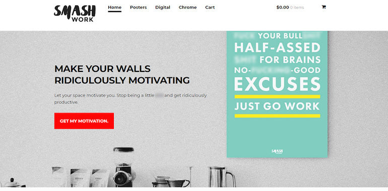
Images are an essential part of any ecommerce store, and they often make up the biggest part of it. Large images, however, can slow a site down to a crawl since larger pages take longer to load.
If you or your client wants to keep all of the images, Alexander Lam recommends at least compressing them.
“Before uploading any image to the store, run it through a free image compressor like tinyjpg.com or shortpixel.com,” he suggests. “These services will make your image smaller in terms of data size, without sacrificing quality or changing their actual dimensions. Raw images can often get over 70% smaller without any noticeable quality changes.”
Making sure you're using the right file format is also important. PNG images are really useful if you want transparent pixels in your picture, but they usually take up more space than JPEGs.
“If you have a PNG that has no transparent pixels, consider converting it into a JPEG before uploading it,” Alexander advises. “Use Photoshop or a service like PNG2JPG to change your file's format.”

4. Lazy load images
Anna Migas, a conference speaker and software engineer at Castle, a startup helping businesses keep their customers’ online accounts safe, agrees that images are one of the biggest culprits when it comes to web performance.
“A picture can say more than a thousand words but it can also take a thousand milliseconds or more to load and, what’s worse, delay loading other content,” she warns. “Imagine what can happen if your website has 20 images and they all compete to be downloaded!”
Anna explains that it’s best practice to not download all images on a page by default and use a technique called lazy loading instead. It means to initially only provide images from the top part of the page and start fetching the rest of them when the user scrolls down and gets closer to a place on a page where more images can be found.
“Lazy loading is usually done with JavaScript, and you can find plenty of small libraries to help you achieve this effect,” Anna advises. “My personal favorites are LazyLoad and yall.js. In Chrome it’s possible to use a native function to lazy load selected images by adding the loading=“lazy” property to the <img> tag, but it will not solve the problem for other browsers.”
You might also like: How Lazy Loading can Optimize Your Shopify Theme Images.
5. Load web fonts with font swapping
While images are undeniably a huge part of the selling agenda on an ecommerce site, users also want to see the price and product description quickly. That’s why it’s crucial to have text visible as fast as possible—but it doesn’t always load fast enough, due to web fonts.
“One reason why text might be invisible is a usage of external fonts that are not supported by default on the user’s computer,” Anna Migas explains. “In that case the website needs to download the fonts first before they can be shown on the screen. Sometimes it might take some time, and it’s a good idea to provide a fallback font that will show without any delay and then get swapped out for your desired font.”
To do so, Anna suggests, you can either add a font-display: swap property in your @font-face declaration or, if you are using Google Fonts, a &display=swap URL parameter (for example: <link href="https://fonts.googleapis.com/css?family=Roboto&display=swap" rel=“stylesheet”>).
More details can be found in this CSS-Tricks article by Chris Coyier (note that it was written before the URL parameter option was possible).

6. Create smooth animations
Animations—when done right—seamlessly and subtly improve the user experience on a website. When done wrong, however, they can confuse and distract your visitors.
Senior software engineer Tyler Childs, currently at Netflix, recommends a few techniques to improve web animations created with CSS or JavaScript.
CSS
“There’s a little secret to nailing smooth CSS animations, and that’s to use properties that don’t force your layout to change or pixels to be repainted,” Tyler explains. “The rule of thumb is to only use opacity and transform, but if you want to go deeper, check out CSS Triggers.”
Opacity and transform both only affect the content they are styling. The styled content effectively stays in place as far as the rest of the page is concerned, but as Tyler demonstrates, magic will happen for the user:
Other properties like padding, margin, width, height, top, bottom, left, and right will force your layout to change, which trickles down to all the content and can cause thrashing or reflow.
All CSS properties are fine to use for layouts, but be careful when animating content.
JavaScript
JavaScript animations are tricky, Tyler cautions, because they share the same set of resources as all of the other JavaScript on your webpage.
“The secret to smooth animations with JavaScript is a method called requestAnimationFrame,” he advises. “When done correctly, animations with this approach can achieve 60 FPS!”
Practical use cases for requestAnimationFrame include throttling user interactions such as scroll or drag events. These events can fire many times per second, which is why debouncing them to control how many times they fire is a very common approach.
The downside of many debounce implementations is that they are not optimized for animations or any changes to the DOM. The browser with requestAnimationFrame will be best as your debounce function since it is optimized specifically with animations in mind.
“Next time you’re reaching to throttle an event, consider trying out requestAnimationFrame as your debounce,” Tyler recommends. “One final benefit is that requestAnimationFrame will use less system resources by pausing callbacks when a webpage is not in use.”
You might also like: Reactive UI Animations with CSS Variables.
7. Minimize third-party impact
With the ever-increasing pace of innovation in ecommerce, businesses simply can’t build everything in-house, so naturally, we rely on more and more third-party services to support us.
Many of these services are focused on making user onboarding easy, not the quality of the implementation, however, so performance often suffers as a result, warns web performance expert Ryan Townsend.
“My first recommendation is to get as much off the critical rendering path as possible,” he advises. “Ensuring your site paints fast minimizes the bounce rate of those hard-earned visitors, so watch out for any synchronous scripts, stylesheets, or fonts loaded from third parties within your <head> tag. Even if you only make minor changes, this can have an enormous impact—one of my clients reduced their First Meaningful Paint time by a third on 3G connections simply by changing a single script tag to asynchronous!”
Solving the paint times is only one step to addressing performance. Another one is JavaScript execution, which Ryan calls a huge bottleneck for the web today.
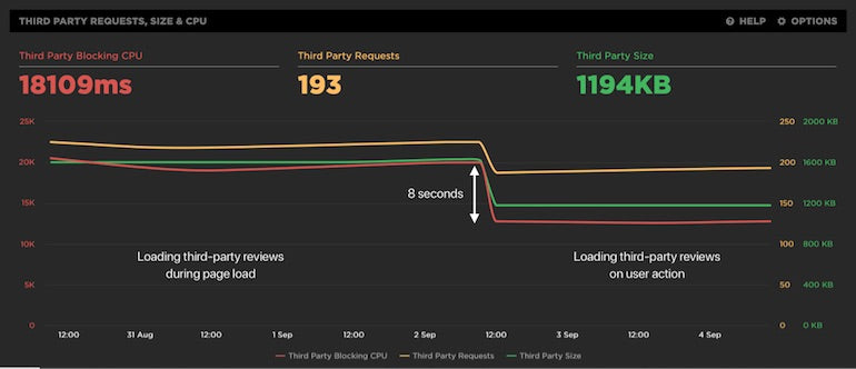
“My tip here is to consider when you need a third-party script to download and execute,” he recommends. “Another one of my clients shaved 40 percent off blocking CPU execution on low-end mobile devices by loading their customer reviews service when visitors expand the review tab on product pages, rather than loading it on every single page regardless.”
This technique often works well with live chat, Ryan suggests: rather than having it pop up on every page, consider providing a button within product descriptions or FAQs that loads it when the visitor indicates their desire to chat.
8. Preconnect to key third-party domains
Browsers do a great job of discovering and downloading content in an order that makes our pages faster, but sometimes they need a little help, as independent web performance consultant Andy Davies points out.
“Some resources are discovered late,” he explains. “Fonts and background images are only discovered when the browser starts applying styles to a page, and other resources may rely on a script to insert them—Google Analytics, or Tag Manager, for example. If these resources come from a third-party domain name, then there’ll be a delay while a new connection is made and secured.”
Andy recommends using the Preconnect Resource Hint, which can help overcome this delay by suggesting that the browser warms up a new connection to the third-party domain.
For example, if the resources were hosted on example.com:
<link rel=”preconnect” href=”example.com”>
The crossorigin attribute needed to be added if fonts are being fetched from example.com:
<link rel=”preconnect” href=”example.com” crossorigin>
A single preconnect can sometimes make a large difference, but Andy advises you might need to experiment to see what works best for your site.
You might also like: 5 Ways to Improve Store Loading Times with Minification.
9. Wrangle your apps
Third-party apps can also have a significant impact when you use Shopify themes. No matter how much time and energy you put into optimizing your theme, it can all be undone in five trigger-happy minutes on the Shopify App Store, cautions Gavin Ballard, founder and CEO of Shopify Plus partner agency Disco.
“The wide range of third-party apps available is one of Shopify’s strengths,” he explains, “but many app developers don’t have theme performance top of mind—and even those that do have to build their apps to work with the 1,000,000+ ecommerce stores across the Shopify platform, not just your client’s.”
To minimize the performance impact on a Shopify store, there are a couple of steps Gavin recommends.
Do you need an app?
First, consider whether you actually need an app in the first place.
“Many Shopify App Store applications are there for merchants without any HTML/CSS/JavaScript skills who just want a one-click install solve for a need they have,” Gavin points out. “Things like countdown timers, announcement bars, or exit intent popups can all be built into a theme using nothing more than a light sprinkling of Liquid, CSS, and JavaScript. Building these features directly into your theme gives you much more control over the performance impact (for example, avoiding loading 30 versions of jQuery) and allows you to apply the other techniques discussed here and elsewhere on the web to optimize the delivery of your code to the browser.”
Does the app give you control?
Second, if you decide you do need an application backing the functionality you need, investigate whether the app gives you control over how it interacts with your theme.
“The popular Back in Stock app, for example, gives customers the ability to register for notifications via email and SMS when a product comes back into stock—something that wouldn’t be achievable through a theme alone,” Gavin explains. “However, it gives front end developers a range of options in terms of how to integrate its functionality into a Shopify theme—via an automated installer, through a copy-and-paste Liquid snippet, or by building a completely custom integration using their JavaScript API.”
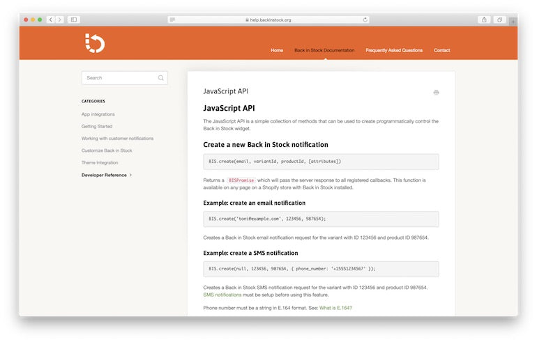
In a couple of real-world cases, Gavin has been able to integrate the Back in Stock app into a theme’s product page with no noticeable impact on initial page size or customer load times. He simply rendered a “Notify Me” button instead of an “Add to Cart” button on the product page if a variant is out of stock, and then asynchronously loaded the Back in Stock JavaScript library together with some glue code once the page has been presented to the user.
“If the developer of an application doesn’t offer these sorts of integration options, it may be worth reaching out to them to see if there’s anything they could do,” Gavin suggests. “At the very least, it will help remind app developers that performance is a vital part of their customers’ stores!”
You might also like: An Insider's Look at the Technology That Powers Shopify.
10. Monitor the number of requests per subdomain
Browsers have become speedier by leaps and bounds since Emily Nakashima, director of engineering at Honeycomb.io, first started writing code for the web in the early 2000s, but for those of us who still need to support http 1.1, one thing hasn't changed—there’s still a limit on the number of concurrent requests a browser will make to any one subdomain, usually six.
“The goal of this limit is to prevent accidentally launching a DOS attack on some nice little web server somewhere when you try to load an entire catalog page of images—or other resources—at once,” Emily explains. “But on today’s web, where many of us use highly scalable cloud services and serve our images off a CDN, the limit may unnecessarily slow down your experience.”
To work around it, Emily recommends a technique known as domain sharding, which loads a set of resources from multiple domains or subdomains to increase the number of concurrent requests. For example, you might use multiple subdomains (cdn1.example.com, cdn2.example.com, etc.) with your same CDN to be able to load more images at once. But there’s some overhead to using multiple domains—you’ll need to make another DNS request for each new domain before you can start downloading our resource.
If you want to know if our domain sharding is configured optimally, or if you should add more, analyze the number of concurrent requests per domain.
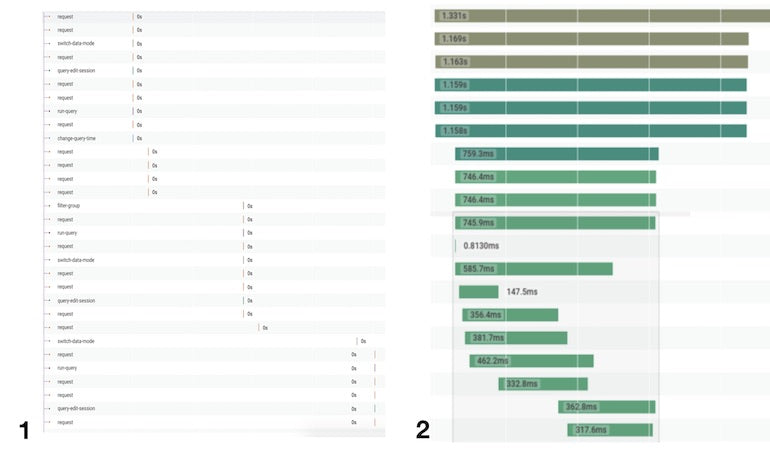
“When you look at either your client-side distributed tracing or your browser’s network waterfall in the browser developer tools, look at the pattern of requests,” Emily advises. “If the waterfall is relatively narrow, and requests are mostly happening concurrently, you likely have enough shards. If you see sequential blocks of requests to the same domain in a stair-step pattern, you likely should configure more shards.”
Figure 1 in the below image shows a website making requests to a single domain—you see many sequential blocks of requests in a telltale stair-step pattern. Figure 2, on the other hand, demonstrates that, when making requests to many different domains, higher concurrency is possible (in this case, the x axis is zoomed in, so the individual spans appear wider).
“We like to be able to get automated alerts when these kinds of issues are happening,” Emily explains, “so we use the Resource Timing API to collect a list of sub-resources loaded on a particular page and alert if the number of total requests or requests to a particular subdomain climb above a certain number.”
11. Use performance budgets
To many developers, performance optimization is one of the most interesting types of engineering work there is, so it’s easy to go down a rabbit hole and spend days optimizing something slow—even if it’s something that might not be that important to their customers. Emily Nakashima therefore recommends making sure you’re optimizing what really matters.
“At Honeycomb we’re big fans of the Service Level Objective (SLO) approach to prevent rabbit-hole optimizations,” she reveals. “When you use SLOs, you set targets ahead of time for the performance and reliability of your site that are based on what your customers expect and will tolerate (for example, ‘my customers use our site all day at work, so they need it to feel snappy—home page requests should complete within one second’).”
“You also set a budget for how often you can exceed the target (for example, ‘the 95th percentile latency for home page requests should be under one second, 99.9% of the time’). When you’re over budget, that's your signal to spend time optimizing things that will bring you under budget, so you can make sure you’re working on what customers care about most. The rest of the time you can feel good about doing non-performance work, like investing in new features or cleaning up tech debt.”
In the web performance world, Emily points out, performance budgets are a specific type of SLO intended to make sure your site loads quickly. There are lots of great tools that make tracking performance budgets easier than tracking the average SLO.
At Honeycomb, where Emily works on a real-time developer tool that helps software engineers understand what’s happening in their production systems, the team measures their performance budget by tracking page load times in production. For teams that don’t make extensive use of Real User Monitoring (RUM) data, however, Emily says the easiest way to track and enforce a performance budget is by building it into their build tooling (for example, webpack) and making sure their HTML, CSS, and JavaScript are limited to a certain file size and number of files.
Check out Google’s Lighthouse auditing tool and MDN Web Docs, which both have good suggestions on how to set up your own performance budget.
Put it all together
As our experts’ tips have shown, images and third-party services remain one of the main reasons for a slow site. Invest time and resources in image optimization and minimize third-party impact as much as you can, and chances are you’ll make a significant difference to the performance of the site you’re working on. Also ditch carousels and optimize your fonts and animations, and you’ll shave off even more seconds.
Couple that with a mobile-first approach and performance budget, and you’ll have a solid web performance strategy in place the result of which will delight your clients and their customers alike. Now speed up that site!
What are your best tips for improving web performance? Share them in the comments below!
Read more
- Top 5 Features to Include When Building a Successful Fitness Site
- How to Build a Shopify App: The Complete Guide
- Introducing Online Store 2.0: What it Means For Developers
- 10 Beautiful Ecommerce Website Color Schemes
- How to Add a Social Media Marketing Icon to Your Theme
- How to Create a Customizable Logo Bar Section
- How to Refactor a Shopify Site for Javascript Performance
- Free Webinar] Getting Started with Sass and Shopify
- 5 Easy-to-Implement Website Maintenance Tips for Your Client's Ecommerce Business
Web Performance FAQ
What is the meaning of web performance?
What is good web performance?
How can I improve my web performance?
- Use a content delivery network (CDN).
- Minimize HTTP requests.
- Enable browser caching.
- Optimize images.
- Minify HTML, CSS, and JavaScript.
- Reduce server response time.
- Use a faster web hosting provider. Use lazy loading.
- Use GZIP compression.
- Use browser caching.

