Your clients could have a beautiful ecommerce store, with awesome products to sell to their target audience. But they could still have visitors landing on their site and not converting. What’s going on?
This is an issue many ecommerce businesses run into. In some cases, users will go as far as to fill up a cart with items and then leave, causing abandoned cart rates to soar. As of 2017, abandoned cart rates were nearly 70 percent worldwide.
Thankfully, you can use popups to help solve this problem for your clients. By showing popups at the right time (and with the right message), you can potentially stop visitors from leaving before checking out.
But there’s a right way and a wrong way to use popups. Unfortunately, some ecommerce sites still struggle with sales even after implementing popups. Why? Because their popups aren’t user-friendly or not tailored to the mobile user. And since roughly 85 percent of abandoned carts come from mobile devices, it makes to create the best user experience possible for this giant market.
In this article, we’re going to discuss how you can use popups that are both desktop and mobile-friendly. We’ll look at the different kinds of popups you can use, and the proper way of leveraging them to boost sales for your clients’ stores.
1. Exit-intent popups
As a Shopify Partner, you may be in control of managing the performance of your clients’ stores. If you keep track of bounce and cart abandonment rates, then you can easily check to see how well customers are converting.

If these numbers are less than impressive, then it may be time to intervene. You can improve this with exit-intent popups. You’ve likely seen these pop-ups while browsing the internet—they show up right when you’re about to leave a certain page or click away from the website.
They’re powerful tools that can potentially recapture the attention of site visitors and see them through to the purchase. With the right offer or discount, you can improve cart abandonment rates and increase conversions .
.
When to use exit-intent popups
Timing is everything for any popup you use—and this especially holds true for exit-intent popups. If they show up at the too early or too late, then it could turn off visitors.

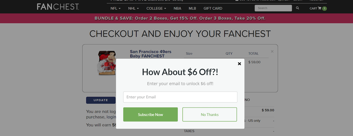
Popup with $6 off offer fanchest.com.
One way you can successfully use this popup is when a visitor is in the shopping cart or the checkout page. Once they start to move the cursor away from the website, you can trigger the popup to show up, and offer an incentive to continue browsing the store. Some options include:
- Offering an exclusive deal
- Offering free estimates, depending on your client’s business
- Asking users to sign up to a newsletter (see newsletter popups, below)
- Offering free downloads and reports
- Providing an in-store coupon, to capture those uncomfortable with shopping online
- Reminding users about items they have in their cart
Exit-intent popups work best for visitors who are very interested in your client’s products, since they’re already engaged with what’s on offer. In this case, you can set it up so the popup shows up for visitors who click on several pages, or who scroll more than halfway down a landing page. The best visitors to target are those who have actually added items to the cart.
"Exit-intent popups work best for visitors who are very interested in your client’s products. The best visitors to target are those who have actually added items to the cart."
When not to use exit-intent popups
Popups can easily become a nuisance, especially if they’re triggered at the wrong time. This is especially true if a visitor is about to leave the site and a popup appears that’s difficult to close, due, for example, to a non-existent exit button.
This seems like a clever tactic to get users to convert, but it’ll only cause frustration. If the popup is irrelevant to what they’re looking for, this can turn customers away from your client’s site.
Having the right strategy in place will allow you to more accurately target customers with more personalized popups. For example, use UTM codes in your source links, so that an appropriate popup appears based on where the user came from.
Another thing to keep in mind is your timing. If a user has items in their cart and is still actively shopping around, don’t remind them of the items in their cart. Instead, wait until they become idle or are about to click away from the site, to incite them with the appropriate popup.
You might also like: How to Use Psychology to Shape Your Ecommerce Success.
2. Up-sale and cross-sales popups
What makes a store profitable? It’s all about the sales techniques it implements . With popups, you can enhance your clients’ revenue (and your chance of getting hired for more work) by upselling and cross-selling their products or services.
These popups are for directing shoppers to other products or services they’re likely interested in.

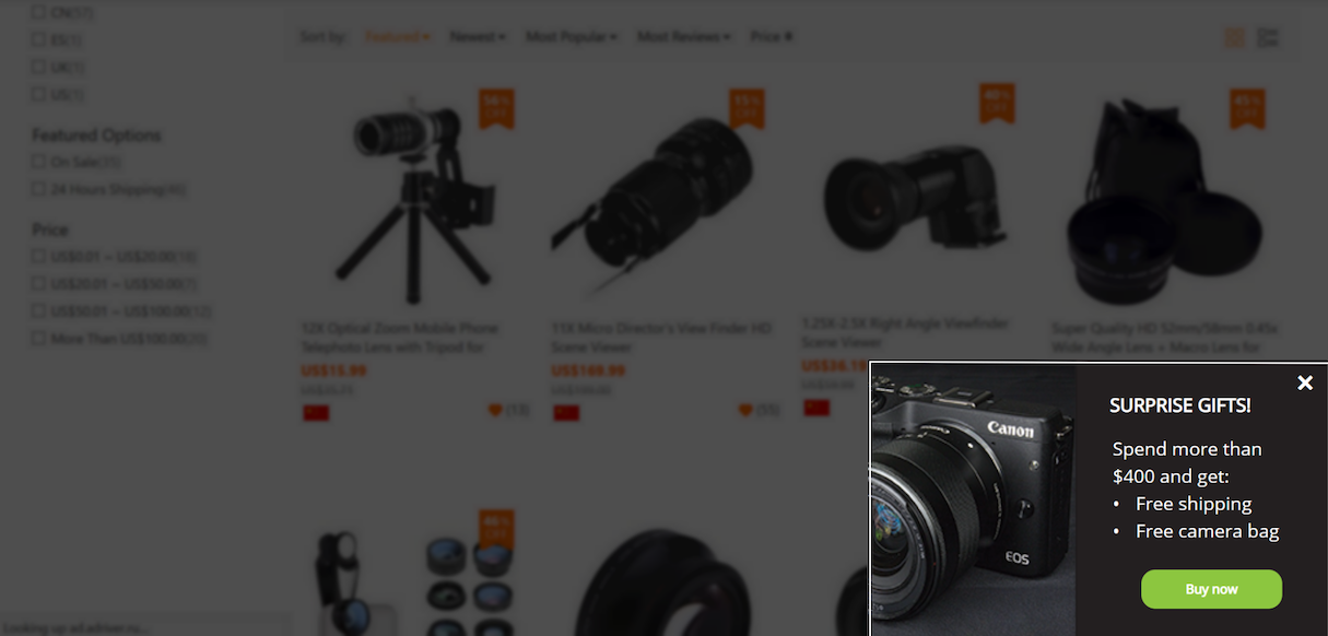
Popup offering free shipping and camera bag.
How to use up-sale and cross-sale popups
As with any popup, relevance is everything when it comes to using up-sale and cross-sale popups. Popups should appeal to that particular user and their interests. For example, if a user is on the shoe section of your client’s site, then the popup should relate to shoes somehow.
Placement of your popups is also key. Google has standards you must abide by to ensure a good user experience. For example, your popup screen should only take up 50 percent or less of the screen.
"Placement of your popups is key. Google has standards you must abide by to ensure a good user experience."
These rules are intended to ensure your popups aren’t disruptive or obtrusive. If you end up breaking any of these rules as of January 2017, your site can be penalized.
Losing the ranking for your client’s site is bad for business (both theirs and yours). Luckily, there are some handy tips to comply with Google’s rules, while still maximizing the benefits of using popups (also known as ‘interstitial ads’):
- Don’t put popups on the homepage when users load or exit an app. Instead, put them in between content or pages.
- Don’t place popups in background apps or outside the app environment.
- Don’t use repeated or recurring popups (i.e. after each click/action, including back button pushes).
- Don’t use unexpected popups while the user is viewing content (prevent latency issues by pre-loading popups for Android and iOS).
The only time you can override this rule is if you have adult content or products. In this case, you have to display a large popup that prevents access to the content and asks for age verification.
Otherwise, you should consider using slide-in popup boxes and top bars. These allow the user to still view the content freely, and they’re not as annoying.

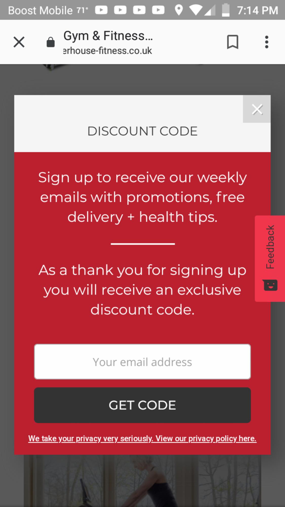
But what about mobile devices? These screens are sometimes rather small, and having a tiny popup screen may not suffice. In this instance, it’s better to have a larger popup that fills up the majority of the screen. The exit button should be visible and easy to press with a thumb or finger as well.
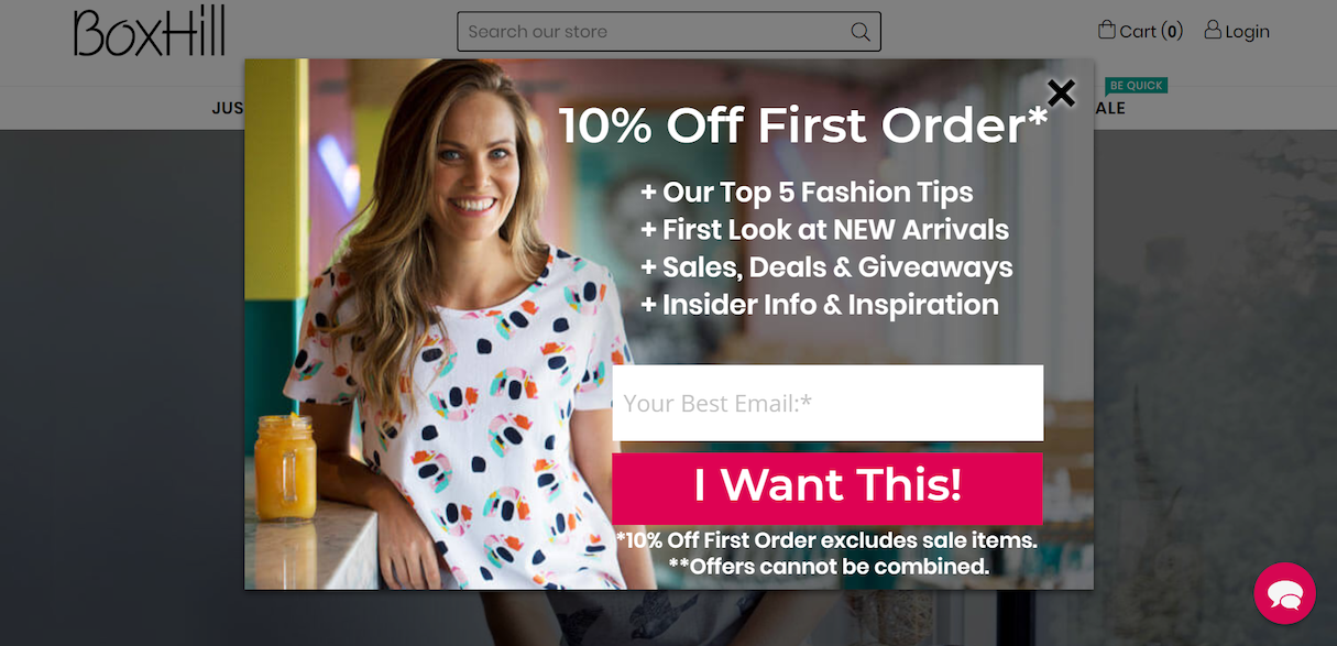
Here's an example of how a popup looks on a desktop:

And then how the same popup looks on a mobile device:

You might also like: Finding a Balance Between SEO and Amazing Website Design.
3. Newsletter popups
Next, we have one of the most powerful popups you can use to boost your clients’ sales—newsletter subscription popups.
If they’re not already growing their subscriber list, then they’re missing out on the opportunity to sell to more of their customers. The beauty of newsletter signups is that they capture leads from those interested in your client’s product or service, and they’re opting in to receive communications from your client’s brand—which presents a great opportunity for you to start an email marketing campaign for your client.
Let’s review what you can do to ensure your email newsletter popups show up at the right time and with the right message.
When and how to show newsletter popups
Ideally, you want to ask visitors to subscribe to your client’s newsletter on several occasions:
- When they’re about to leave the site
- When they scroll down 60 percent of a blog post
- When they spend a certain amount of time on a product page
The idea is to target visitors who seem to have an interest in your client’s brand. Therefore, targeting users who have stayed on the site for awhile, visited multiple pages, or are reading your client’s blog, is the best way to increase signups this way.
It also always helps to offer them something more. A lead magnet like a discount code or giveaway, or 5 exclusive tips related to your client’s products, will do the job.
Within your popup, be sure to ask for the right kind of information. In this case, all you need is a first name and an email address. If you decide to segment the email list, you can ask what topics they’re interested in receiving content about.

Whatever’s decided, use checkboxes and only offer several options so you don’t overwhelm the visitor. The idea is to keep your popups short and simple so visitors are more likely to fill out the form.
You might also like: 6 Email Marketing Campaign Ideas to Stand Out in a Crowded Inbox.
Tips to making your popups convert
Now you know what kind of popups you can use to meet certain goals. You also have an idea of what not to do with popups. But to ensure your popups are really impactful, keep the following in mind:
- Don’t add too many elements that clutter the popup
- Include a clear call-to-action (buy now, click here, download today, etc.) with a clear contrast to the background
- Give an option to decline your offer (that closes the popup)
- Use a design and colors that resonate with the site’s overall look
- Ensure the text is easy to read on a mobile device
- Create a desktop and mobile version of your popups
- Add relevant images to make them more appealing
By following the aforementioned Google guidelines and these tips, you should be well on your way to boosting conversion rates.
Creating popups that convert
Hopefully, you find these three styles of popups to be useful for your clients’ stores. However you decide to use these popups, be sure to perform A/B split testing regularly. Use analytics tools to keep track of your goals and results, and see the impact cleverly-used popups can have on your clients’ conversions.
Read more
- How to Build Powerful In-App Surveys: Put the User First
- How to work with Metafields when building Shopify themes
- Why Every Shopify Store Needs a Marketing & Sales Funnel
- What Are the Most Important Website Metrics You Should Track?
- Indexable PWAs: Making Progressive Web Apps Perform for Users and Search Engines
How have you used popups to help your clients? Let us know in the comments below!

