Seeing your app’s uninstall number increase is always a disheartening experience. When you believe in your app and know it could be helpful to merchants, the experience is even more heart wrenching.
There are several reasons why merchants may decide that an app isn’t for them, but if you’ve confirmed it works well and that there’s demand for its functions, it’s likely that your app’s users interface is what’s causing customer churn. In fact, 38 percent of people will stop engaging with a website if they find the content and layout to be unattractive.
The good news is that even if front-end development and design are not your strong suits, there are simple fixes that can be applied to your app’s user interface, that’ll keep them from clicking that dreaded trash bin icon. After testing many apps and taking merchant experiences into account, here are some of the biggest app interface issues that can be fixed today.
You might also like: How to Build a Shopify App in One Week.
1. Problem — Painful loading experiences
Even the most patient person hates waiting . Depending on how your app is setup, and the user’s internet connection, sometimes a long page load time is inevitable. Staring at a loading bar while it fills up is not a very entertaining experience, and there’s a reason that Mac’s wait cursor is more commonly known as the spinning wheel of death.
In fact, users hate loading times so much, it’s enough to make them give up . When asked about expectations and abandonment, 47 percent of consumers expect a webpage to load in two seconds or less, and 40 percent abandon a web site if loading is greater than three seconds.
The fix — Use interesting text to keep them engaged
Similar to how real life waiting rooms are filled with newspapers and magazine, filling wait times with interesting words and visuals can alleviate impatience.
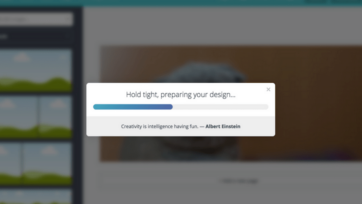
You can see this strategy applied in popular web apps, such as Canva and Slack. The first displays inspiring quotes related to creativity during the image download process, and the latter allows organizations to input sayings or inside jokes from users on the loading screens.
If you add a little bit of fun or information to the text on your loading screen, your app users will be less likely to lose their patience and opt to uninstall.

2. Problem — Context switching
Making users jump between seemingly unrelated screens can throw a visual and mental wrench into your users’ onboarding flow. Not only does having users jump to screens outside of the Shopify Admin cause the feeling of the app being disconnected from the Shopify experience, it also brings up associations to spam pop-ups, and no app developer wants to be associated with that!
The fix — Use the Shopify App Bridge and Polaris
By having your app appear directly within the Shopify Admin, in the same colors and style as the rest of Shopify, users will gain a sense of familiarity with your app. The Shopify App Bridge allows you to embed your app in the admin. Our design system and user interface kit, Polaris, allows you to build your app in the same style that Shopify merchants know and trust.
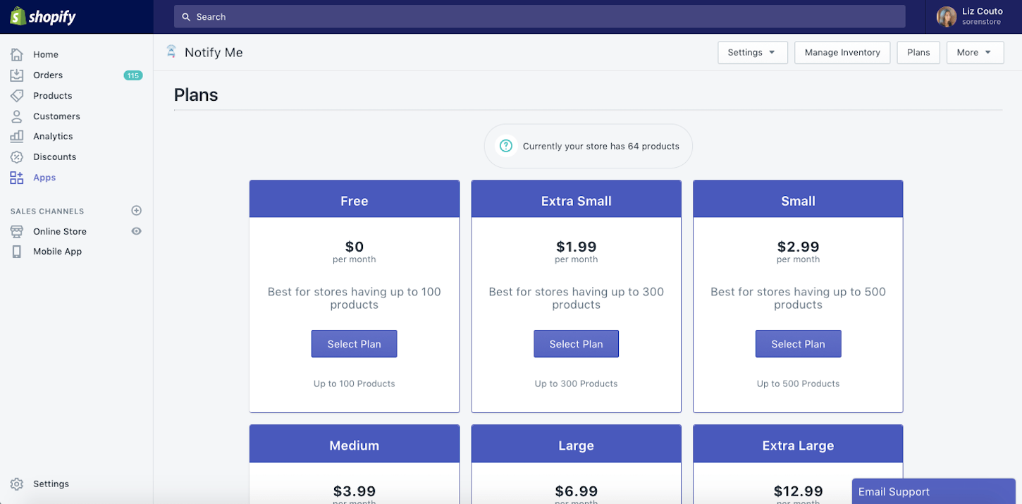
A great example of an app that’s used both of these tools to create a familiar UI feeling for merchants, is the app Notify Me. Their app surfaces to users within the admin, and they’ve utilized Polaris elements to dictate the style of the app UI. Furthermore, they even assist merchants in determining which inventory-based plan to use, by reminder the merchant of how many products they have, at the top of the screen.

3. Problem — Too many setup options
As an app developer, you appreciate systems that allow you to start building in as few steps as possible. Your app users are no different. They’ve opted to install because your app sounds appealing, but if they perceive the setup process as being too much work, they’re likely to lose their enthusiasm and uninstall.
The fix — Simplify onboarding
This solution is literally as easy as 1-2-3! Instead of listing all the setup steps on a single page, break complex tasks into easy steps, and serve up each step on a different page. This will make the setup process feel more manageable for merchants.
An example of an app that does this well is Printify. By being transparent about the number of set-up steps at the very beginning of the process, merchants know what to expect. They also make setup more engaging through use of cute visuals, and even add a personal touch by including the store’s name in the text around setup.

4. Problem — Information overload
Perhaps your app is quite robust, and can do all sorts of interesting things. While you certainly want to showcase your app’s features and educate merchants on how to use them, as we covered above regarding setup, too much text can overwhelm merchants and scare them away.
The fix — Display the basics, link out to further info
While merchants will likely want to eventually take advantage of the customizations your app offers, when they’re first getting started, knowing the basics of how your app functions is enough. Within the app, you can include clear and brief instructions for getting started, and below, include links to pages where they can learn more.
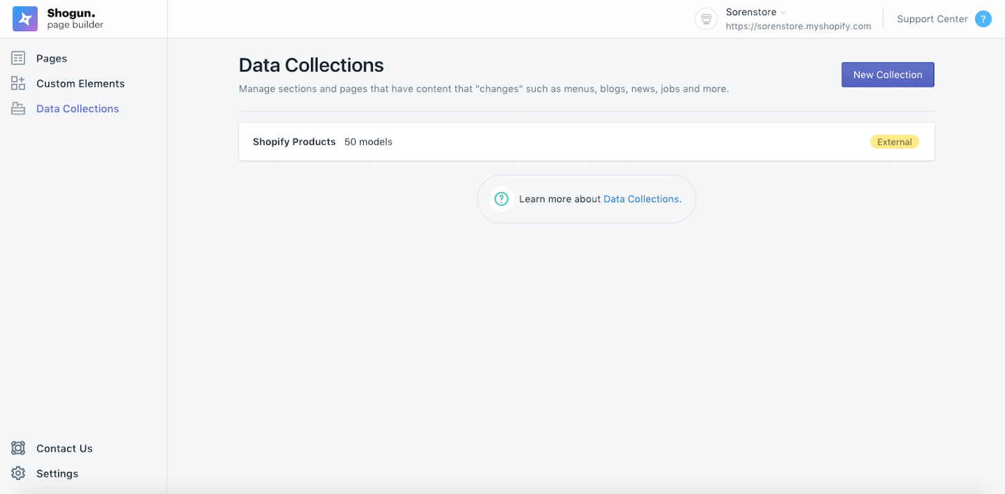
An app that does a great job of this is Shogun. Their page for creating Data Collections is very basic and straightforward. If merchants want to learn more about how to use this, the app includes a link on the page where you can click to learn more about that feature.

5. Problem — No progress signals for actions
This issue is on the opposite spectrum of the loading bar issue, and a growing culprit in the realm of bad UX. Although people get frustrated when they see a task taking a long time to complete, they get equally frustrated when they don’t have visibility into a task occurring.
We know that an action equals a reaction, but now that computer processing has gotten faster, many loading, bar-worthy actions, now occur in seconds.
No more waiting may sound great, but unfortunately user perceptions haven’t caught up with this trend. When merchants do work in the front end, they want a signal that an equal amount of work is being done in the backend. For this reason, companies like Facebook have created artificial loading bars for instant backend actions like running security checks. Users still need a signal that an action is taking place.
The fix — Action signals
Merchants want to feel like their actions have an impact, even if there’s no front end visibility into what’s happened. For these instant or backend actions, it’s helpful to include modules like pop-ups that communicate that although the change isn’t visible, it has indeed occurred.
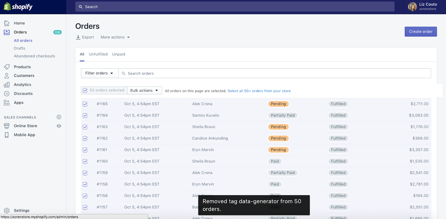
One example of this is directly within the Shopify Admin. When you remove tags from orders, this change isn’t instantly visible on the screen. To communicate that the task has been completed, merchants are served a pop-up saying that the tags have been removed from the specified orders.

You might also like: 5 Reasons Why App Integrations Benefit Ecommerce Websites.
Keep it simple and engaging
One key theme that you can take from these issues and their fixes, is that app user interfaces that are simple, familiar, and enjoyable to consume, keep merchants feeling good about their choice to install your app. When apps are familiar, useful, and headache-free, merchants won’t want to churn away from them.
Read more
- How to Make the Most of Shopify's New Price Rules API
- How to Build Powerful In-App Surveys: Put the User First
- Persistence Matters: 6 Lessons From My First 6 Months on the Shopify App Store
- Introducing new app billing capabilities: discounts, trial extensions, pro-rating and more
- Three Types of Trending Apps in 2017 and What You Can Learn for 2018
- Effective App Onboarding: How to Convert Free Trial Users to Paying Customers
- Upgrade to Shopify Polaris : The Nuts and Bolts of our Implementation
- Ensuring trust and quality in the Shopify App Store
- Shopify App Challenge Past Participants: Where Are They Now?
- How to Use Future Scenario Planning in App Development
Do you have any other simple fixes to the UI problems shared in this article? Let us know in the comments below!

