


We live in a world full of data. Two and a half quintillion bytes of data are created every day, and as our world becomes more and more connected, the volume of data will only continue to grow. It’s predicted that we will have163 zettabytes (163 trillion gigabytes) of data by 2025. But as the human brain has limited capabilities, it’s becoming harder and harder to comprehend all this data.
Communicating information through visual representations is a great way to make data engaging and easy to understand. Data visualization plays an essential role in everything from science and technology to healthcare and economics.
At the same time, data visualizations are one of the most complex tasks for designers, requiring designers to consider many different factors. In this article, we’ll look at the benefits that data visualization brings to product designers, and how to do it properly.
What is data visualization?
Simply put, data visualization is creating visuals based on data. Data can be represented in various visual formats, such as charts or graphs. Designers create data visualizations to convey a message or help observers deduct insights based on the visuals.
Why visuals are so powerful
Humans receive information from five senses—sight, touch, hearing, smell, and taste. But sight provides much more information than any of the other four. About fifty percent of our brain is dedicated to visual stimuli, and images are processed by our brains faster than their textual counterparts. Specifically, visuals are powerful for four main reasons.
1. Visuals work better than text
The problem with text is that written information is harder for us to interpret. When information is provided as a text, people are less able to remember it. However, if the same information is provided as an image, the level of information retention goes up to 80 percent.
2. Visuals engage viewers
The rapid development of the internet has changed the way we consume content. When people browse websites, they don’t read—they scan. Visitors scan a page looking for headings and media content, and based on those factors, decide whether they’re willing to dig deeper into the content or not. Visuals engage users by grabbing their attention and increasing the chances that they will stay on a page.
3. Visuals add an emotional layer to data
Data is inherently quantitative, and is rarely associated with emotion and feeling. However, well-designed visuals can add an emotional layer to data. Data visualization can turn cold numbers into real stories with real weight, the kind of stories that provoke emotion.
"Data visualization can turn cold numbers into real stories with real weight, the kind of stories that provoke emotion."
4. Visuals help communicate complex concepts
Once data become visual, its impact grows stronger. Remember the old saying; a picture is worth a thousand words. Good visuals can convey a relatively complex concept in an instant.
How to use data visualization
Data visualization is a powerful tool. For one thing, data visualization can benefit product development teams by setting the direction for the design—it’s much easier to communicate ideas when other people can see what you mean.
A problem visualized is a problem halved.
One of the uses of data visualization during product development is in the user research phase. For example, it’s possible to visualize the user journey by creating a user journey map—a visual interpretation of the overall story of an individual’s relationship with the product, from that individual’s perspective.

Data visualization can provide even more value when it’s used in real products. It can help users find answers to the most important questions, such as:
“How active was I today?”

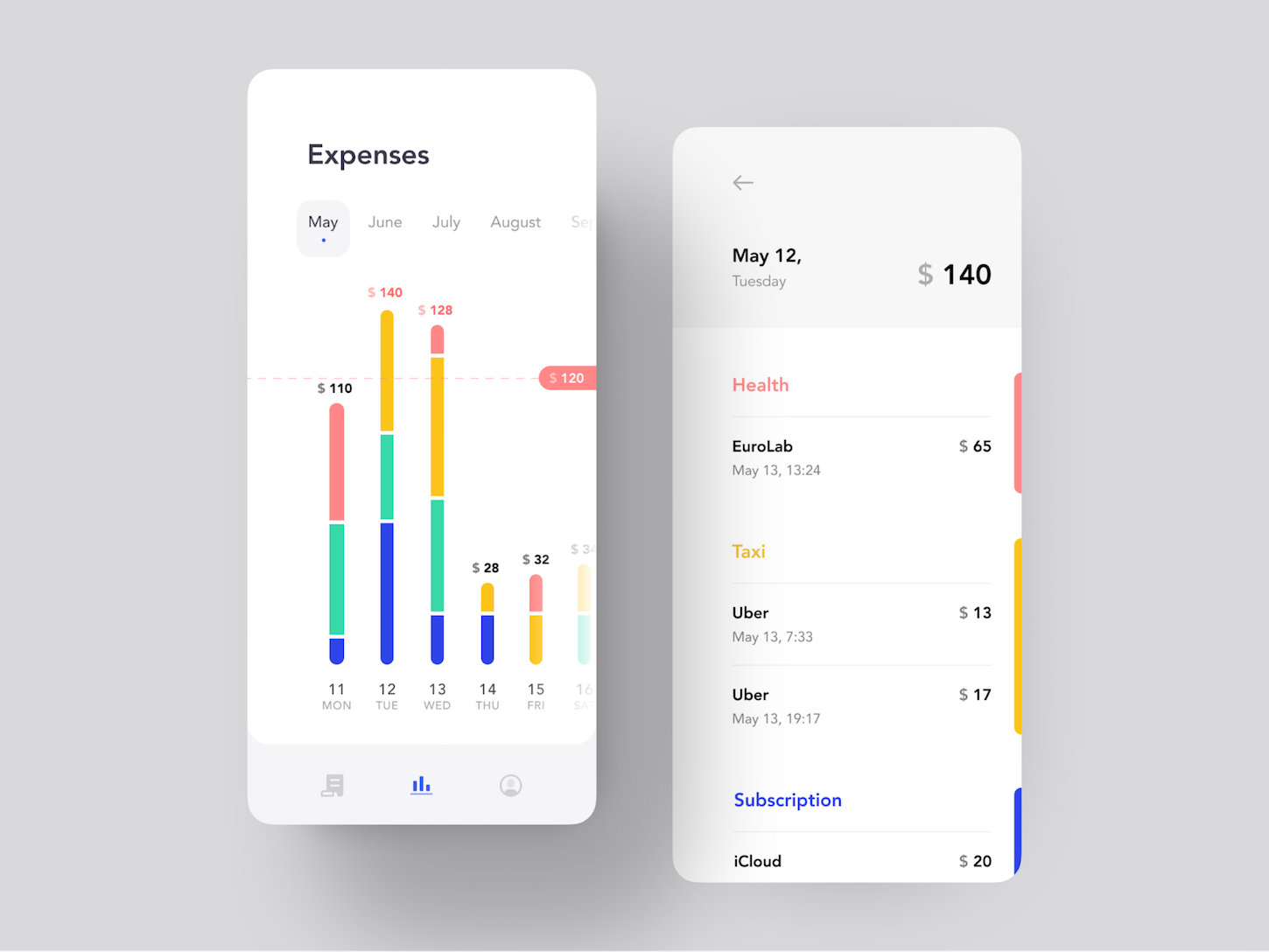
“Where and how I spend my money?”
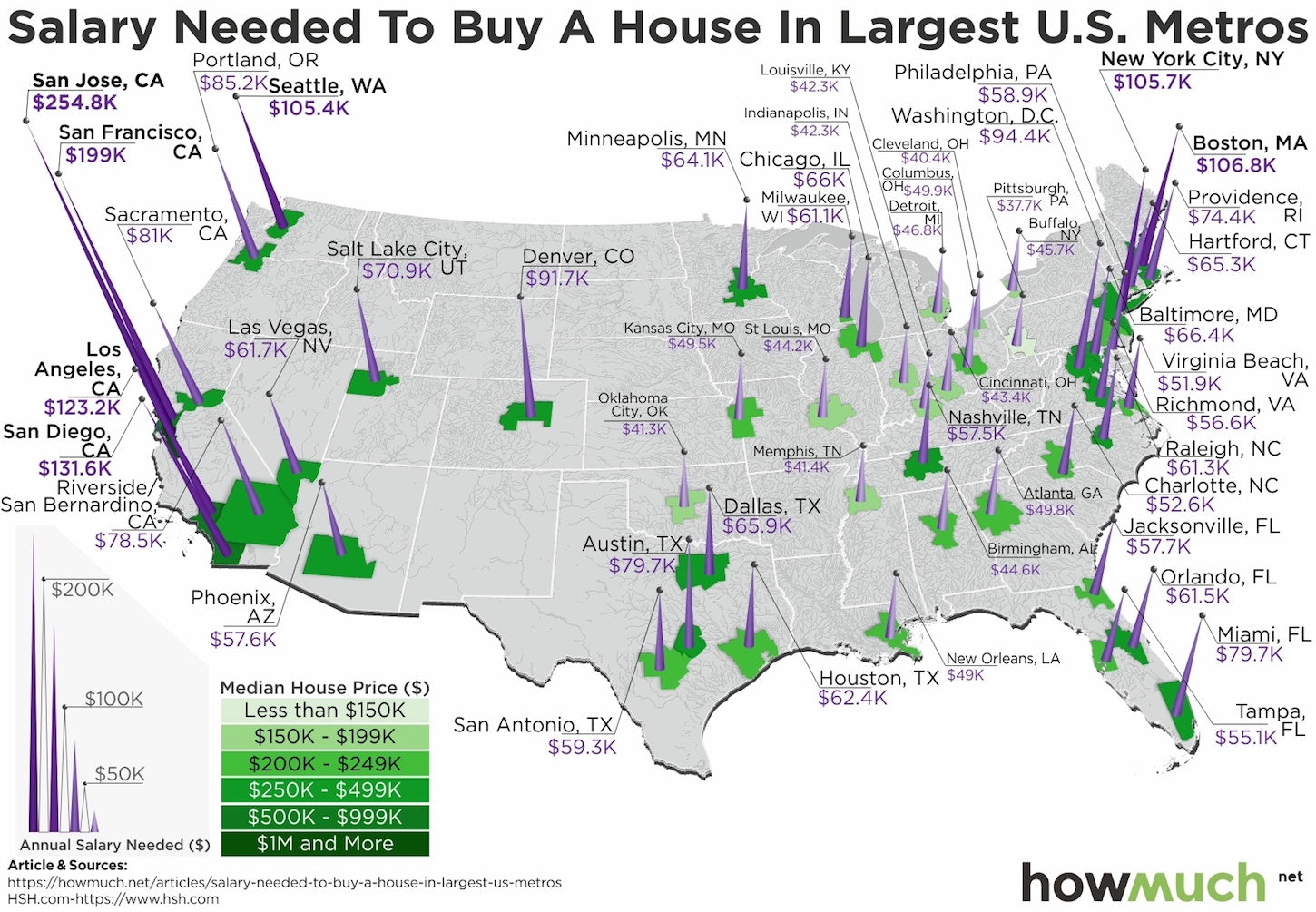
“Can I buy a house?”
You might also like: Progressive Disclosure: Simplifying the Complexity.
Data visualization best practices
Data visualization is one of the most complex design challenges, as designers have to consider a lot of factors to create a data visualization that conveys information clearly and efficiently.
Below are seven practical tips that will help you to create great data visualizations.
1. Know the audience and their goals
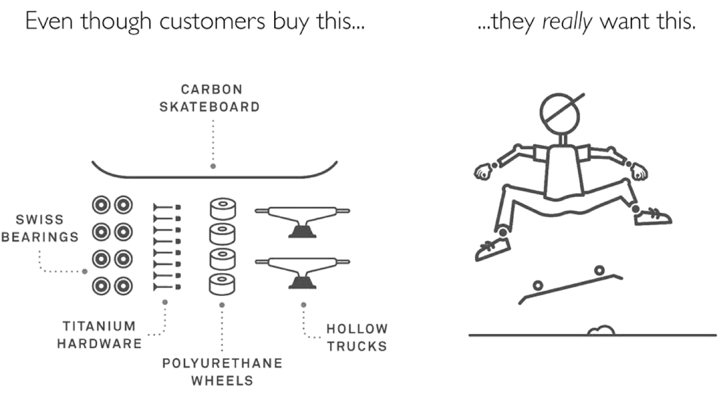
One of the typical mistakes that designers make when working on data visualizations is focusing too much on creating beautiful visuals, instead of concentrating on communicating the message. Data visualization is a lot more than beautiful visuals; it’s about a thorough understanding of the target audience and their needs, and finding the best way to communicate valuable information to them.
"Data visualization is a lot more than beautiful visuals; it’s about a thorough understanding of the target audience and their needs, and finding the best way to communicate valuable information to them."
It’s impossible to create useful data visualizations without knowing the context of use. Who is this visualization for, and how will they use it are two fundamental questions you need to answer before starting work on data visualization. Always begin with an understanding of the purpose of the visualization, and create a list of questions from users that your visualization will answer. What data does your user need to make a more informed decision?
Protip: The Jobs to Be Done (JTBD) framework can help you find your target audience’s goals. With JTBD, you can think of data as something that helps people accomplish tasks.
2. Choose the right representation for the data
The choice of visualization type depends on the type of data to be shown. This is one step where so many designers mess up.
When we talk about data visualization, we usually mean charts. Choosing the wrong chart type can confuse viewers or lead to misinterpretation.
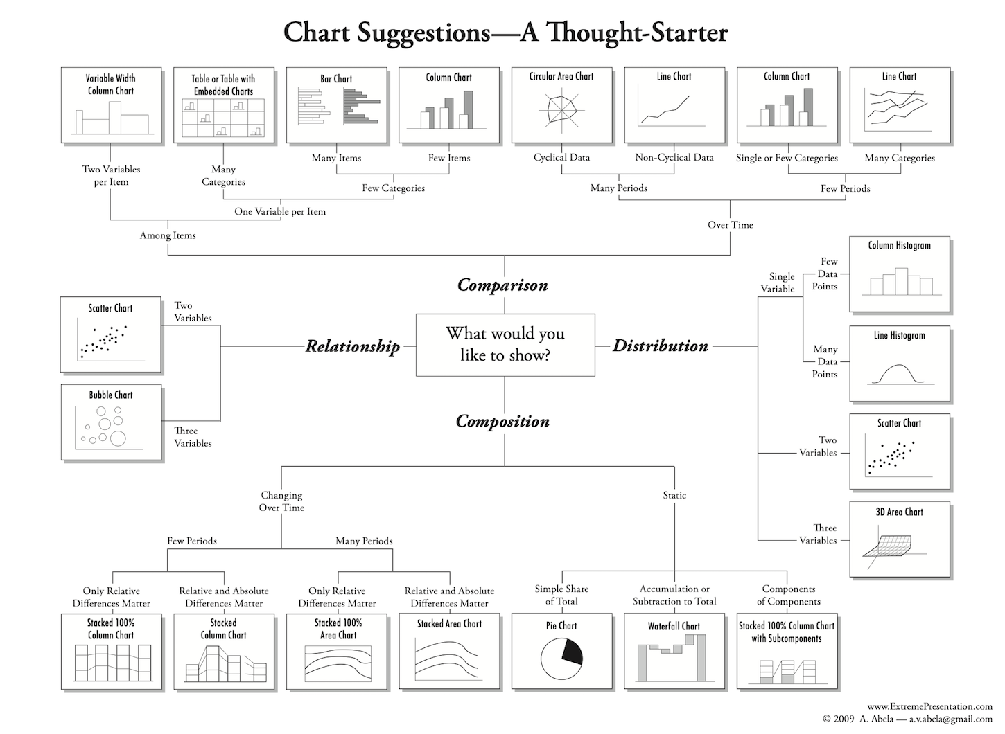
To make things simple, Andrew Abela created a diagram called the Chart Chooser that can help you decide which chart is a better fit for your data.
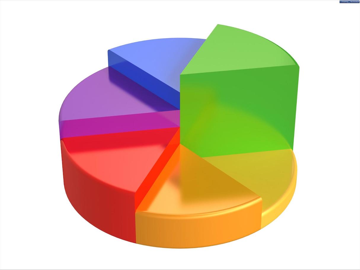
Protip: Be wary of the pie chart. They’ve developed a bad reputation as the most frequently misused chart. Pie charts are challenging to read when they have too many components, so if you do use one, don’t add more than five slices.
You might also like: 10 Myths About Prototyping, Busted.
3. Ensure it’s easy to squeeze the signal out of the data
Designers love to experiment with different visual representations for data. Such experiments are fun, but they often end up creating chart types that are hard for users to interpret. No matter how great a data visualization looks, it’s useless if not designed to communicate clearly with the target audience.
The viewer should be able to comprehend and intuitively understand the visualization, so you should use visual concepts that are familiar with your target audience. When viewers see concepts that are compatible with their expertise, it reduces cognitive load and allows them to process data efficiently.
The purpose of visualization is insight, not pictures.
Protip: Use the five second test. The purpose of the data visualization has to be evident within the first five seconds that a viewer sees it.
4. Ensure data is not overloaded
People can process an incredible amount of data in the blink of an eye, but there are limits to the amount of information they can efficiently extract from a graphic. The more data they have, the harder the task becomes. Humans are bad at keeping track of multiple things at once.
Information overload is a common problem in data visualization. Data overload happens when designers put more and more datasets into the visualization. As a result, the visualization becomes not only hard to design but also hard to comprehend.
Information overload is often caused by a lack of focus and prioritization. If you see that you’ve fallen into the trap of data overload, you need to step back and evaluate each data set according to the goals of your users.
5. Beat visual clutter
Visual clutter introduces visual noise. Every additional element you add to the visualization makes it more complex for the user. Decluttering means removing all unnecessary elements from the visualization. It’s vital to minimize or remove anything that is not essential (both unnecessary data sets and decorative elements).
In his book The Visual Display of Quantitative Information, Edward Tufte refers to unnecessary elements as “chartjunk.” Designers usually introduce chartjunk to make the graphic more appealing to viewers. But viewers should not focus on design; they should focus on data. The visual design should fade into the background, enabling viewers to process the information easily.
Every bit of ink on a graphic requires a reason. And nearly always that reason should be that the ink presents new information. Clutter and confusion are not attributes of data—they are shortcomings of design.
Protips: Be careful with bright colors. Bright colors in data visualizations cause an effect similar to the one that ALL CAPS causes for text. They make your message hard to read. It’s much safer to use duller colors because they don’t overwhelm viewers, and allow them to comprehend the data without distractions. Use bright colors as highlights to emphasize specific data.

In addition, avoid 3D charts. 3D charts serve absolutely no practical purpose and make it harder for the viewer to comprehend the data. For example, 3D pie charts make it hard to visualize the proportions of each slice.
6. Minimize the interaction cost
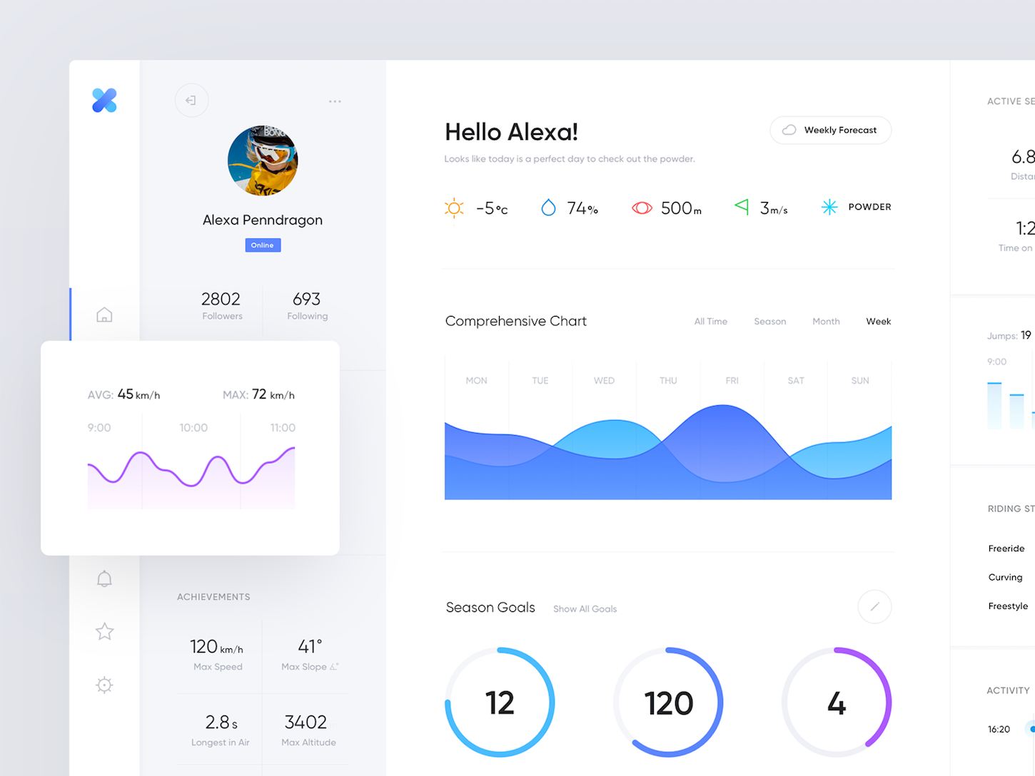
The foundational rule of information architecture says that the organization of information should be guided by a hierarchy of what information is most important to the viewer. This rule is applicable for any information, including visuals. When it comes to data visualization, it’s vital to surface important information at a glance. Let’s see how this rule works in the context of the dashboard design.
"The foundational rule of information architecture says that the organization of information should be guided by a hierarchy of what information is most important to the viewer."
Designing long scrollable dashboards is one of the most frequent mistakes that designers make. The user has to scroll to get to the valuable part of the dashboard. There is a simple solution for the problem of the long scroll—data prioritization. Evaluate all data sets you have and put the most important above the fold (everything that is above the fold is visible without scrolling).
7. Don’t visualize fake data
Designers tend to create user interfaces using fake data. UIs designed with fake data look beautiful, but as soon as they are populated with real data, it becomes evident that such UIs suffer from many data-related issues. The tendency is especially harmful when designers work on data visualization. Charts and other visual objects created without any regard to the real data often suffer from content overload and visual clutter.
To minimize the risk of potential overwork, you should use real data right from the beginning.
Protip: Designers are often asked to create a nice-looking visualization for demo sessions. The problem with real data is that it rarely helps you achieve this goal. In this case, you can design two versions of your data visualization—one for your stakeholders and one for developers. The first version will show the visualization in a state where the data is perfect.
You might also like: How to Build and Maintain a Visual Language.
Communicate clearly with data visualization
Data visualization is both art and science, and so you might not create a great visualization on your first try. Don't use data visualization just for the sake of creating beautiful visuals. Data visualization should always provide real value and help solve real problems. The ultimate goal is to create visualizations that are both useful and appealing.
Read more
- How to Improve Custom Search in Your Clients' Storefronts
- 8 Best Practices for Designing an Ecommerce Site that Converts
- How to Integrate Shopify into your Client's WordPress Website with Zillacommerce
- Top Ecommerce Web Design Trends from January
- Product Photography Tutorials — Master Ecommerce Images with These 6 Post-Production Techniques
- Minimalist Web Design: How To Achieve More With Less
- 13 Web Design Trends to Watch in 2020
- Design Psychology: 12 Ways to Convert Users into Buyers
Have you faced the challenge of creating great data visualizations? Share your experience below.

