Applying psychology to design is a powerful tool. Companies are increasingly studying how customers think and behave, and are tailoring their services accordingly.
However, with great power comes great responsibility. You need to really understand the effects of the psychological techniques you apply to your designs, otherwise you can end up frustrating users and inadvertently send them to the competition.
It’s a vast subject, especially in the context of ecommerce. To get you started, we interviewed 10 experts, who approach psychology from different angles—user experience, content design, web performance, email marketing, and more.
1. Consider the ethics of what you’re doing
Before we start diving into specific psychological principles, here’s a word of warning from user experience consultant Paul Boag, who runs a video course on encouraging clicks without alienating users.
“When people start using psychology to convert users, you can quickly find yourself in a world of manipulation,” he cautioned. “That is a dangerous road to go down.”
“Although psychological techniques such as dark patterns work, they also alienate users. That leads to buyer’s remorse and bad reviews. Ultimately, that is going to cost the business in more returns, more support calls, and negative PR.”
The scarcity effect, for example, is used on sites like Booking.com and Expedia, who often make claims such as ‘one room left at this price’. But they could soon be forced to stop, according to the UK’s competition regulator, which has been investigating whether they are misleading consumers. The Competition and Markets Authority said details about how many people are looking at a room, how many are left, and how long a price is available could create a false impression of availability or rush customers into making a booking decision.
Instead, Paul recommended focusing on reducing cognitive load (the amount users have to think), and better matching people's mental models. These will make using your site easier to use, which will encourage conversion and repeat sales.
2. Reduce cognitive load
It’s essential for UX designers to understand the behavior of their users.
“During the processing of information we use schemas, which provide a mental framework for understanding and completing tasks,” explained Norbi Gaal, product design lead at collaboration tool Intellyo and founder at UX psychology publication Cognitive UXD. “Use existing schemas to reduce the amount of mental effort during the user journey. Human attention is a limited cognitive resource, so we need to keep the cognitive load at a minimum in the design process.”
These schemas include the classic log-in, search, and checkout flows. We immediately recognize the forms, and—without too much cognitive effort—we can easily fill them out. Also organize items into logical groups and use information ‘chunks’. We scan rather than read online, so ensure you make headings, keywords, and category labels as simple and intuitive as possible.
Norbi described two main patterns of activity in our brain:
- The task-positive network: the user comes to a site with a specific goal
- The task-negative network: the user doesn't have a specific goal, and are just surfing and exploring interesting information
On ecommerce sites, the user tends to be in a task-positive network, as they have a specific goal—buying an item—and are intensively focused on a task. To improve the user experience, highlight the features that serve these tasks, for example the search field, and don’t change the functionality of the input field or the order of the steps in the flow.
"On ecommerce sites, the user tends to be in a task-positive network, as they have a specific goal—buying an item—and are intensively focused on a task. To improve the user experience, highlight the features that serve these tasks."
You might also like: What Led us to Consider Polaris, Shopify’s Design System
3. Don’t mess with the user’s expectations
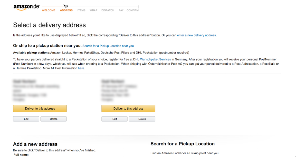
Perhaps the most important psychological principle to consider when it comes to ecommerce is Jakob’s Law, found interactive design lead Jon Yablonski, creator of Laws of UX.
Jakob’s Law of Internet User Experience states:
“Users spend most of their time on other sites, and they prefer your site to work the same way as all the other sites they already know.”
Jon elaborated on this point. “When applied to ecommerce, the resulting guideline is clear: don’t break from how users will expect the product browsing, product selection, and checkout flow to work,” he advised. “Users already have an expectation for this process, and changing it could result in confusion or possibly even abandonment.”
Design around this expectation, so users can apply the knowledge gathered from previous ecommerce experiences. The resulting familiarity ensures they can stay focused on the important stuff—finding and purchasing your product.
4. Keep things simple
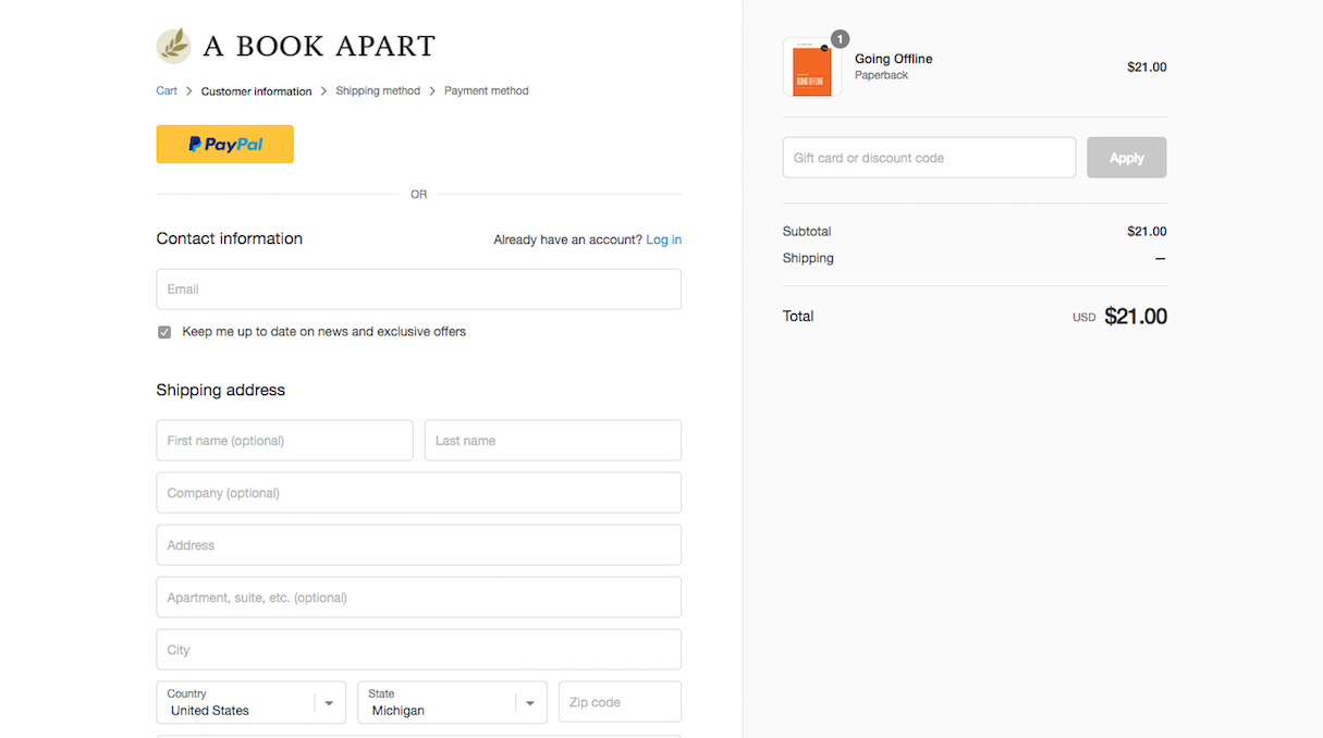
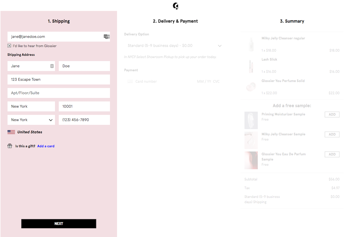
Don't make your buyers jump through hoops to make a purchase . Amanda Loftis, digital content creator, copywriter, and graphic designer, warned: “People naturally prefer simpler options to complex ones, so keep this in mind when designing your checkout flow.”
“For example, how many steps does a buyer currently have to go through to make a purchase on your site? Are you asking for the same information more than once?”
Amanda quoted research by Vouchercloud, which found that ecommerce sites should have no more than five steps to complete checkout, otherwise buyers might give up before completing their purchase. “Rethink your checkout process and double check that you're not wasting your buyers' time,” she cautioned.
Asking users to register for an account may seem like a great way to hook buyers in, but adding in that extra step may actually be hurting your business. Similarly, putting shipping, billing, and final cart review on separate pages can dissuade a buyer from following through with checkout since it adds an extra two steps to the process.
5. Put your best products first
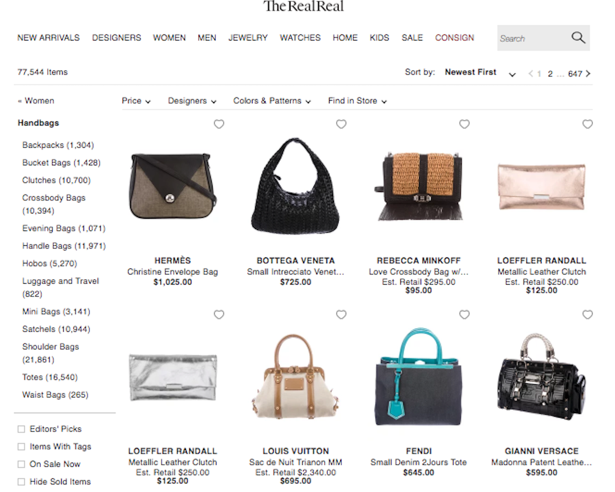
Online shops can carry hundreds (and even thousands!) of products, which is what makes the digital marketplace so appealing to both retailers and buyers. As digital content manager Amanda Loftis pointed out, however, buyers aren't going to scroll through dozens of pages of products to find the one thing they want, especially if they're just browsing around.
She suggested to consider the serial-position effect, which states that people are most likely to notice and remember items at the very top and very bottom of a list, and that middle items are essentially forgotten.
So how does that relate to an online store? “Use the serial-position effect to your advantage by curating your pages to showcase great products that you think your buyers would love at the top of each page,” Amanda recommended. “For example, if you're a vintage clothing retailer, be sure to show off your prized Chanel and Louis Vuitton items first, so potential buyers know right away that your store has something special and continue to browse your store looking for more hidden gems.”
6. Restrict the user’s choice
We’re absolutely spoiled for choice online, and that’s part of the consumer’s (and designer’s) dilemma.
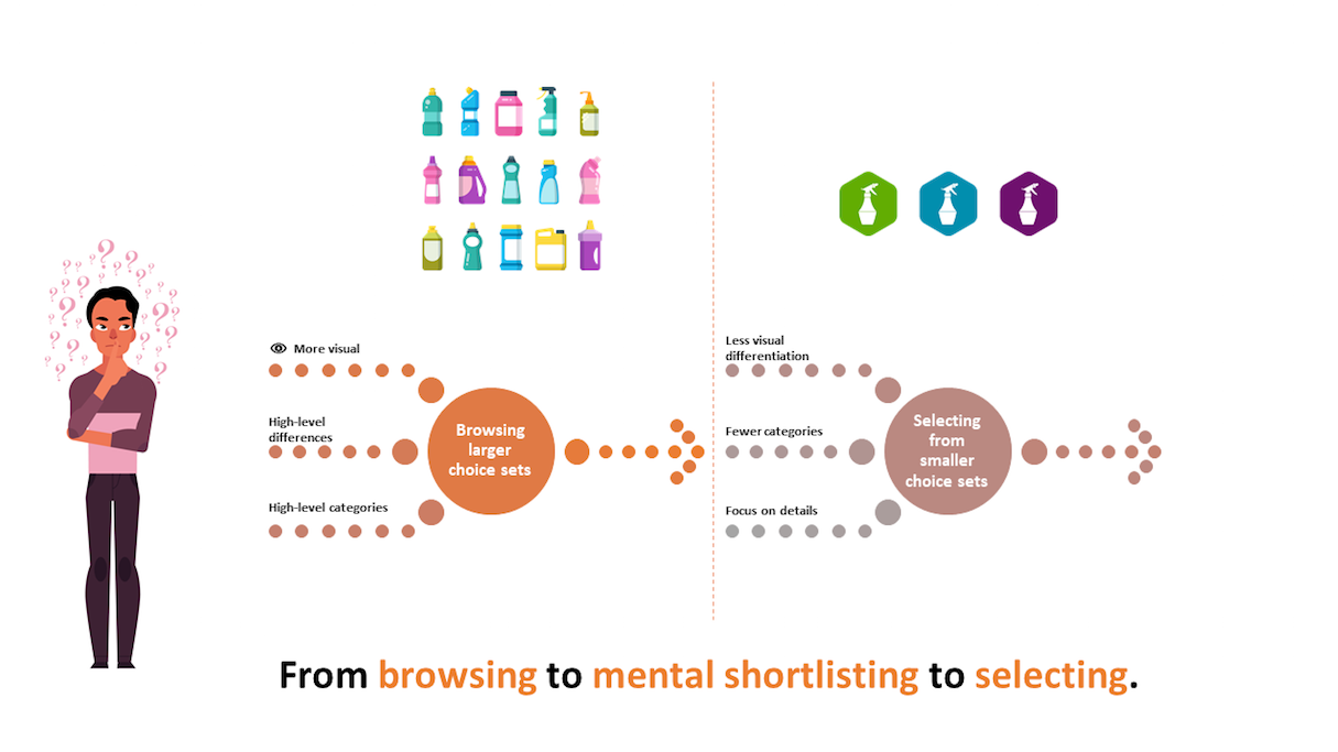
Alberto Ferreira, UX and communication researcher and author of Universal UX Design, explained: “The push and pull of the e-retailer dilemma works thus: you may have everything the potential customer could ever want, yet you can’t drown the user in options, as this is distracting. The user is only turned into consumer when they focus their attention on a single discrete set of item or items.”
Less choice almost always means it’s easier to decide, especially if the user is looking for something specific.
“When browsing, users are looking for distinctive factors in large sets—search results, or catalogues, for example. The browsing experience should have big, distinctive pictures and a wide assortment of options. But if your site or app is focused on short-term conversion, the best way to facilitate the choice is actually to restrict the number of options and use visuals strategically. Avoid the item-surfing effect and keep the user’s attention focused. This will guarantee an easier decision and is a powerful trigger.”
7. Animate relevant choices
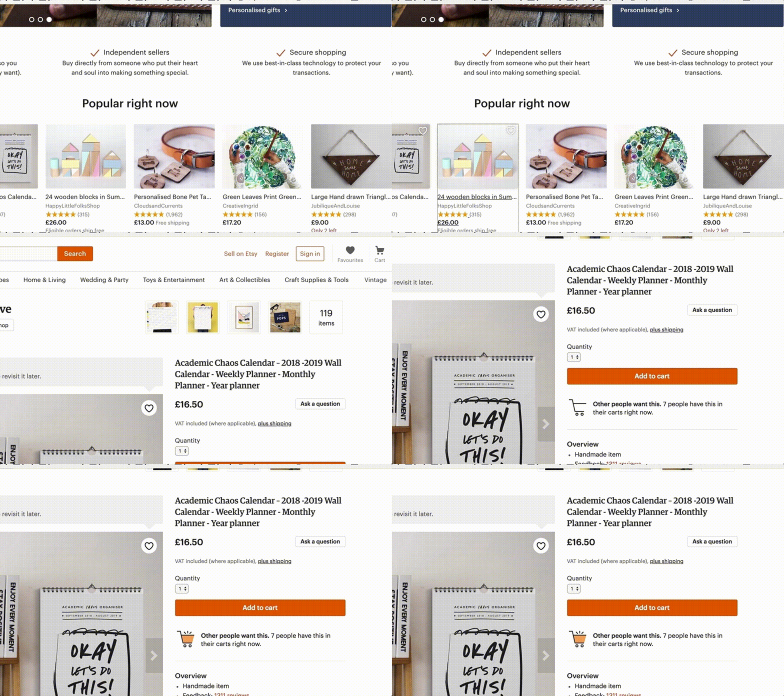
Another way to attract users’ attention is the use of motion.
“But hold off on adding HD videos everywhere in your designs,” Alberto Ferreira cautioned. “On a well-designed interface, animated elements should be functional and focus on feedback. They are there to improve usability and the overall user experience, not to get in the way of the interaction.”
Micro interactions are widespread these days, and users expect features such as animated toggle switches or pull-to-update gestures. Some animations can also trigger very subtle and urgent mechanisms in our mind. For example, a soft glide can soothe, while a jerky and sudden movement alarms us.
We also instinctively respond to colors, and Alberto points out that several experiments have sought to prove that up to 90 percent of our judgement on a brand is based on color alone. “Color indicates mood and attitude. A combination of the right set of colors and the appropriate motion will ensure your designs—and your brand—stands out from the pack.”
You might also like: How to Upload and Animate SVG Icons in 3 Simple Steps.
8. Provide frequent and varied add-to-cart and checkout options
Present users with the option to make a purchase at the right time in their decision making process.
“Instead of guessing when that time is,” explained Victor Yocco, UX researcher and author of Design for the Mind, “you can allow for users to add an item to their cart or enter the checkout flow from multiple points in the experience.”
Victor pointed to aztecasoccer.com, which allows users to add an item to their cart directly from the homepage:
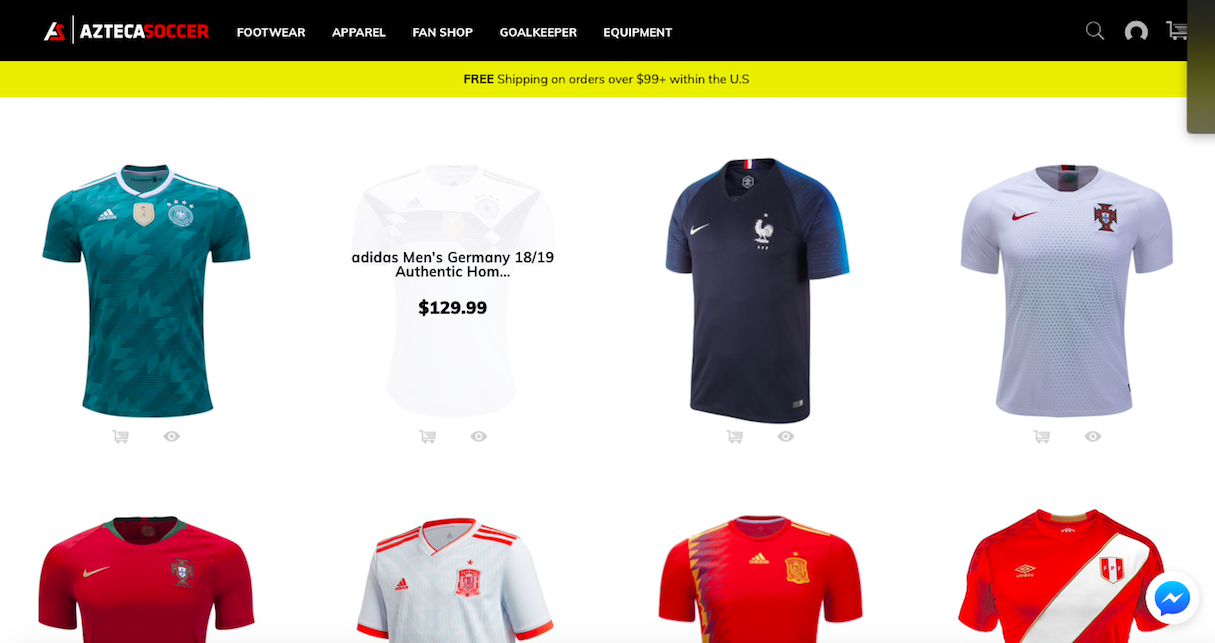
Other areas to allow users to add to cart include directly from search results, recommendations
within product pages, and recommendations within the shopping cart itself.
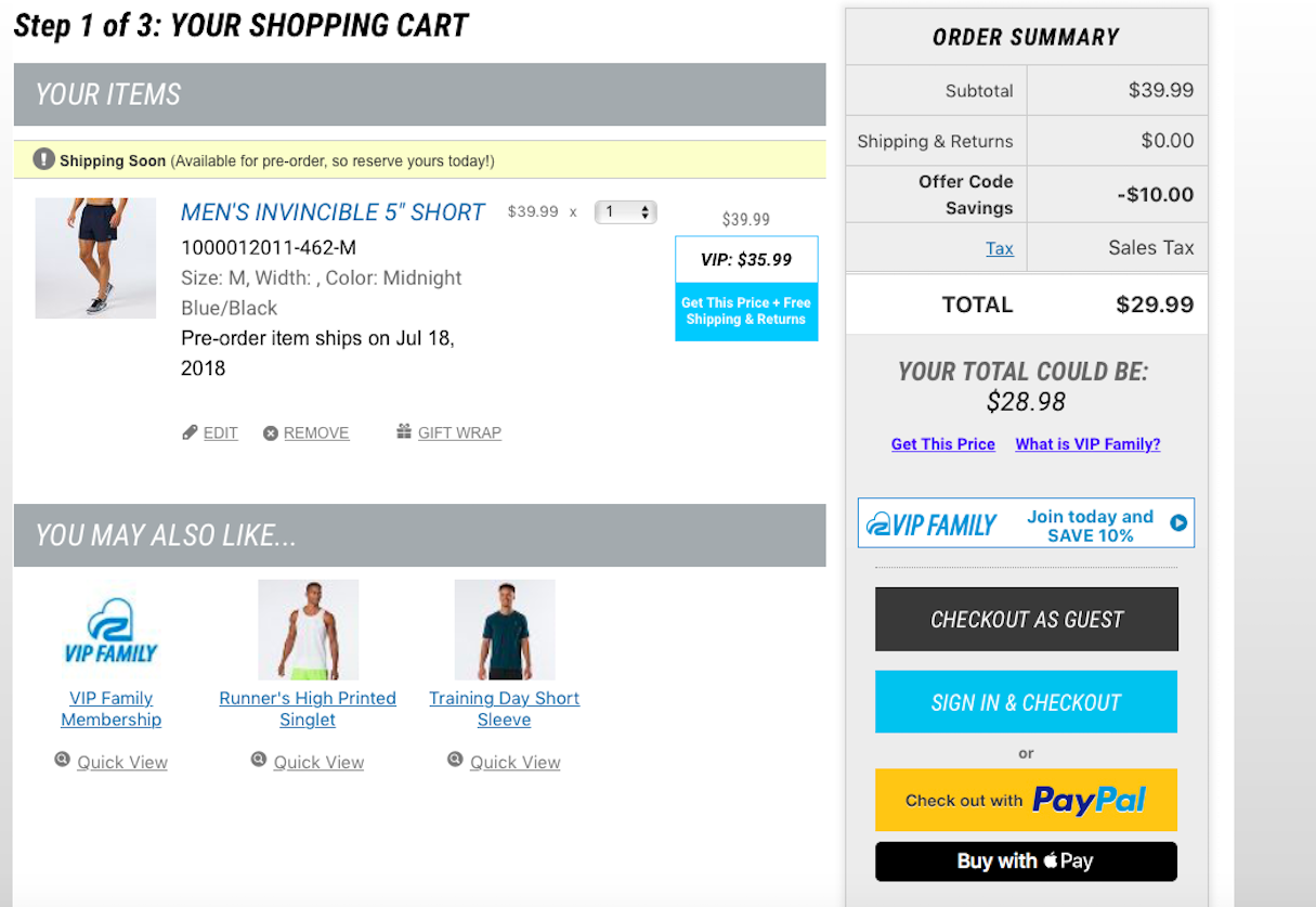
“We know adding barriers to check out is the quickest way to lose a sale,” Victor pointed out. “Not all users will want to create an account or log in to complete a purchase. You can address this by including the option to check out as a guest, and including a one-click checkout experience.”
Roadrunnersports.com highlights the effective use of multiple checkout options, including the use of authenticated credentials, PayPal or Apple Pay, or checking out as a guest:
9. Understand the science of reading
Language is the easiest way to make or break an experience, argued Sarah Richards, content strategist and author of Content Design.
“Apostrophes can save lives, and contractions can confuse. Choose your words wisely,” she advised. Sarah recommended keeping these three tips in mind:
- Use the vocabulary your audience uses: Don’t teach them new language. You’ll lose them or bore them (or both). Use SEO tools to find out how they are talking about your product.
- Your audience will have priorities, so reflect them: They will care about the price or the customer service first. We humans tend to think we are all terribly special, but we’re not. There are always patterns to human behavior. Find the pattern of priority, and structure your content that way.
- Decide if you want to be clever or successful: Making your content engaging, easy to follow and clear makes a good experience. Verbose, turgid, terribly-clever-but-not-easy-to-follow language is not going to get you very far.
Ready to build an amazing Shopify theme? Sign up to the Shopify Partners program and start building a theme today. Join now.
10. Address the audience
If you want to create high performance newsletters and sell your products and services to your subscribers, you shouldn’t see it as an ‘us vs. them’ scenario. Instead, look at it as a team sport, advised Jonathan Pay, email marketing consultant with Holistic Email Marketing.
“Your goal is a sale, and guess what? That's their goal too!” he said. “There are three basic steps to increase conversion: open, click, and convert. First, you need your subscribers to open the email, then click through, and finally convert.”
When writing your subject lines, Jonathan suggested, write for your audience, not yourself. Change ‘we’ and ‘our’ to ‘you’ and ‘your’. Address what's in it for them, not you.
Jonathan also recommended keeping the CURVE principle in mind—curiosity, urgency, relevance, value, and emotion.
“Using at least two of those, but not all, will increase your open rates,” he said. “Engage your subscribers' curiosity and emotion, or highlight the value and urgency, for example. Use, and front load, persuasive verbs in your subject line.”
You might also like: 6 Email Marketing Campaign Ideas to Stand Out in a Crowded Inbox.
11. Improve the perceived performance
There are all kinds of techniques you can use to improve the performance of your site or app, but this can be pricey and your users may not be able to tell the difference.
However, even with a small budget, you can make your site appear faster than it actually is. Perceived performance—what users feel and experience while using your site or app—is what truly matters.
“Web performance is all about how we perceive the passage of time, which is extremely vulnerable to manipulation or management by the experiences we create,” explained Eli Fitch, front-end developer and senior web application engineer at Mapbox. “Humans' perception of time is governed by our mental state. Keep the mind active, and your app will appear faster than it actually is.”
Eli suggests tricking users by preloading resources before they ask for them, by predicting their actions before they happen. “This is easier than you might think,” he pointed out. “With linear flows, always assume that the user's goal is to progress to the next stage.”
12. Analyze your users
Eli also recommended employing real user monitoring and analytics, which can shed a great deal of insight on your users' patterns and allow you to accurately extrapolate future actions from current behaviour.
SEO consultant and trainer Danny Richman agreed, and suggested using the Limbic Map to better understand what really drives your online visitors.
“Online visitors are driven more by emotion than logic,” he explained. “Be aware that the products or services your client sells are never the visitors’ emotional goal. For example, a fashion shopper’s emotional goal is not to buy a dress, a shirt, or a skirt, but to ‘turn heads’, ‘make an impression’, or ‘stand out from the crowd’.”
Once you understand your customers’ goals, use images and copy with strong implicit signals that resonate with those goals, Danny advised.
And when designing call-to-action buttons, your copy should always complete the sentence, ‘I want to…’. For example, ‘[I want to…] View Swimwear’.
The button’s wording should always reflect the action the visitor most wants to take on that page. Understand where they are in their buying journey and avoid pushing them in a direction they may not be ready to go.
A win-win situation
There’s a lot more to learn when it comes to UX psychology, especially in ecommerce. Treat the tips outlined in this article as a starting point before digging deeper. Check out the numerous articles on the web, read a book, sign up for an online course or conference workshop, and apply the knowledge to product and user interface design.
If you do it right (keeping in mind the ethics involved), you’ll improve your sites’ conversions and create a better customer experience at the same time.
Read more
- The Power of the Dark Side: Dark User Interfaces
- How to Convince Others of Your Design Direction
- 7 Inspiring Stores Built by Shopify Partners to Get You Through the Winter
- 4 Things to Consider When Designing Wholesale Stores for Clients
- 6 Design Conferences to Last You 'Til The End of 2016
- Top Ecommerce Resources for July
- How to Integrate Shopify into your Client's WordPress Website with Zillacommerce
- Top Ecommerce Resources for November
- Top 13 Web Design Conferences You Should Attend in 2016
How will you use design psychology in your work? Let us know in the comments below!

