As an ecommerce business evolves with new technology, redesigning their websites is a common occurrence. It’s important to recognize the difference between an aesthetic lift and a necessary update to the site’s backend platform and design to best support your client and to help drive consistent revenue.
As the direct to consumer market rapidly expands, your client’s site is ultimately the best and most effective tool their audience has to learn who they are as a company, and plays a significant role in deciding whether users will commit to purchasing their product.
Below, we break down specific points to consider when redesigning an ecommerce website to help support your client’s long-term growth goals. This breakdown includes when a client should redesign their website, and how to plan the most effective ecommerce website upgrade. Let’s dive in.
When to redesign a website
One question that comes up regularly with clients is when they should redesign their site. The obvious answer is to do so when the technology is so outdated that support is no longer provided for the framework it was built on. However, you can help your client before they get to that point.
Something to consider each year when reviewing business goals with your client is to ask, “Is the site helping you achieve your goals?” You will need to understand how your client's site is impacting revenue and sales.
For example, consider site speed. According to a recent study done by Unbounce, nearly 70 percent of consumers say page speed impacts whether they buy from an online store. Site speed can have a drastic impact on sales and revenue, since customers expect a site to load quickly.
Since Javascript frameworks tend to have a large impact on a site’s speed, your clients should expect to update their website every two to four years to remain current and ensure they don’t keep developing their site on outdated technology. Building their site on the latest framework will ensure they stay current as technology changes.
You might also like: Universal Design: 11 Practical Tips to Make Your Sites and Apps More Accessible.
How to plan a website redesign
Take a moment to consider the tools you may need and the future technology integrations that will best help your client achieve an optimum site. This can be extremely challenging to plan ahead since JavaScript frameworks are constantly changing and you can’t predict what technology will exist or what technology your client’s site may need a year or two from now.
In this section, we’ll look at every aspect of your client’s site you should consider for possible improvement.
Critical features
To help you during this initial analysis, consider the critical parts of your client’s site. Take the time to identify the various marketing channels you will use to drive sales, how they all play a role in your client’s business, and how a website redesign could provide an opportunity to improve on them. Some of these potential improvements include:
1. Advanced site search features
Consumers are using site search to navigate to the products they are most interested in. According to Comprend, 59 percent of web visitors use the internal search engine to navigate a web page, and 15 percent would rather use the search feature instead of the hierarchical menu set in place.

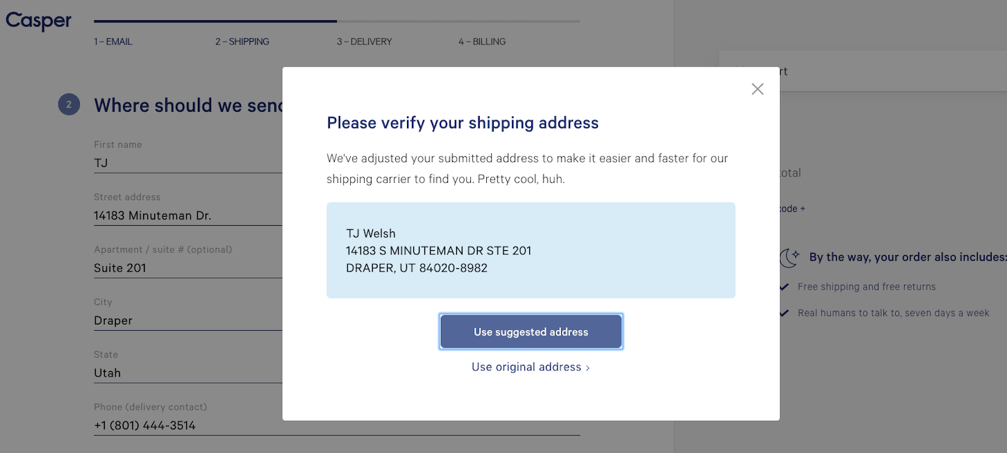
2. Smart forms
You can improve user experience on your client’s site by installing a service that allows previous customer information to pre-populate in forms.
3. Consumer reviews
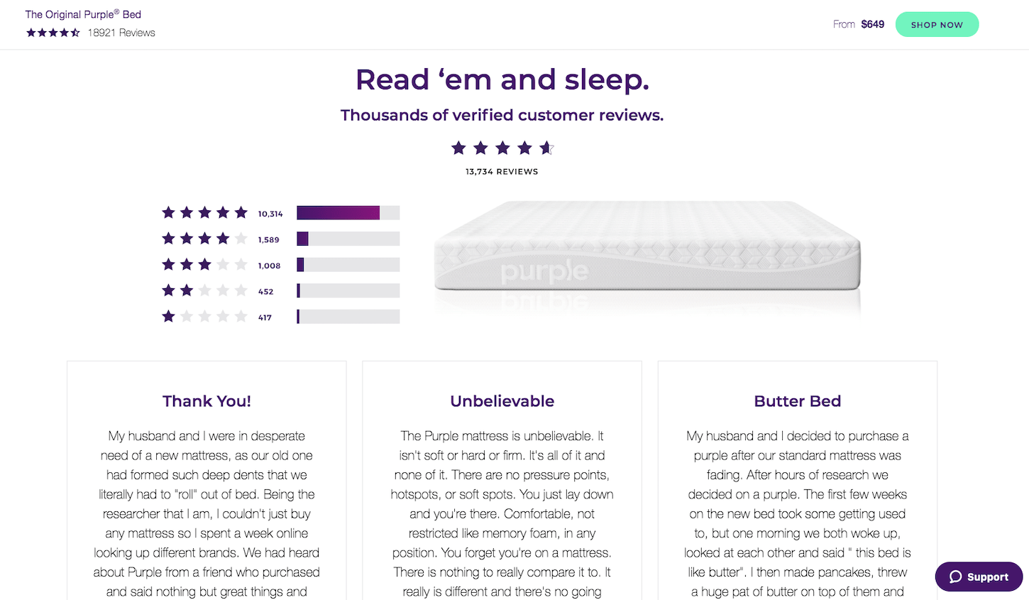
Believe it or not, nearly 95 percent of buyers will read online reviews about your client’s product before they make a purchase. Social proof is a critical step in the buying funnel. Help your clients by ensuring they have a way to generate reviews for their products, and have those readily available through Google search or on their webpage.
If your client’s site is on Shopify, there are several affordable plugins that can assist with review generation and publication.
4. Wishlist and favorites
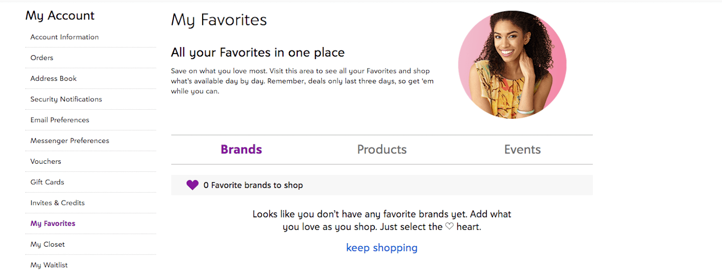
Make it easier for your client’s customers to save what they love or mark the type of products they are most interested in, so they have a reference point to come back to when they are ready to buy. In a webinar presented by Brendan Witcher on Forrester, it’s shown that wishlists can drive open rates as high as 80 percent and can have five to 10 times higher return to purchase. Ecommerce sites that do not have a wishlist function are leaving revenue on the table, so consider if adding a wishlist function will help increase your client’s bottom line.
5. Related items
Pique customer interest by displaying a curated “You Might Like This” section. A related items feature can have a desirable stickiness effect that can help upsell consumers once they look at products on your client’s site.
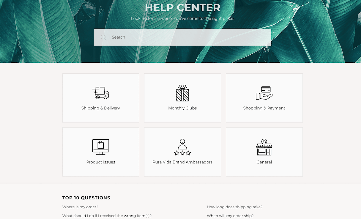
6. FAQ page
Consumers love to know they are purchasing something high quality, and one way to instill this trust is by having an in-depth frequently asked questions page. Additional information establishes trust, credibility, and knowledge that what they are getting is what they expect.
7. Social Content
Integrate your client’s social media and outreach efforts in their site to help build an emotional appeal to their brand. Consumers want to hear your client’s brand story. The content from your client’s social media channels is perfect to be added to visually share the client’s brand.
- Help your clients strengthen their brand by linking their social profiles and all user generated content to their site—this will help create a more authentic appeal through their social media efforts.

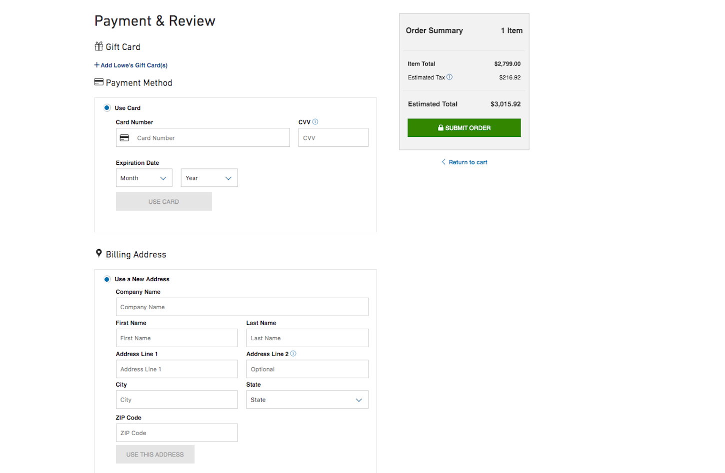
8. Customizable checkout process
To help improve the user experience on your client’s store, consider ways to make their checkout process as simple and efficient as possible, such as a single page checkout.
9. Loyalty or rewards program
Encourage clients to create an enticing and rewarding loyalty program. Businesses can plan to implement a loyalty program that provides a wealth of data, practical insight, gifts, exclusives, and points for redemption.
Once you add the critical features to the website, you have to look at specific technical features that could impact your client’s marketing strategies and sales.
Site architecture and URL structure
Most people forget about building a website structure, but it’s integral to running a successful website redesign for your client. Having a strong and well thought-out structure will positively impact their Google Shopping and Amazon data feeds, since you need to appropriately categorize your products to keep your feeds from getting disapproved. Additionally, a logical website architecture will help your client’s organic search visibility in search engines.
Start with mapping out your client’s site’s architecture. Consider the collections, products assigned to each collection, and how you’ve named them. Take a look at the pages included in the main navigation—are these the most important pages your client’s customers need to access?
Once the site architecture is in place, you need to define the URL structure. As the building blocks of the site hierarchy, URL structure can assist with passing link equity through your client’s domain name and guiding users to specific locations with ease.
Create URLs that provide a simple indication of what the page is about, so the final destination is not confusing for the end-user.
Another best practice to help your client rank is to use keywords in their site and URL structure to help improve clickthrough rate. A strong URL with strong keywords helps buyers recognize immediately that this store is what they’re looking for, and that high clickthrough rate will help the store rank highly.

Balancing website design with SEO
Design and SEO should work together to improve the online visibility of your client’s site and provide a good user experience. In July 2018, Google announced a shift in how they planned to index pages. Moving forward, they would rank pages based on mobile performance rather than desktop. This requires SEO strategists and developers to shift their focus to creating a consistent and effective experience across different platforms and devices.
Here is a breakdown of things to consider:
1. Flexible design elements
Whether you are online shopping using your mobile device, tablet, or desktop, you want to digest content that is crisp, fits to your screen, and is easy to navigate. No one enjoys large images that cover the screen and make you scroll 10 times just to see two more products. Focusing on dynamic designs that can adjust with multiple screens will improve your user’s overall experience.
2. Design change breakpoints
Using CSS media queries, you can set defined breakpoints that indicate design changes. These breakpoints are set to adjust your web content to respond to the device you are using, enabling the most user-friendly layout to be shown to the user.
3. Landscape and portrait-friendly
Design your site to have a similar experience when viewed in portrait and landscape mode. Maintaining a consistent site across all views will ensure all features are visible and all buttons will work properly.
You might also like: Finding a Balance Between SEO and Amazing Website Design.
Content migration
Once a client decides to redesign their site, they often want to also overhaul the content on the site so that it works well with the new design. This often has a large impact on the site’s organic rankings, especially if the client has a substantial number of keywords they are ranking for with the current version of their website.
Whenever possible, you should try to keep the existing content on the site the same and migrate the content over from the old site to the new one. Here are things to audit when determining what content to migrate over to the new site:
- Determine the core pages on the site that are driving traffic and make sure the content is copied over
- Optimize the images on the new page
- Optimize the title, description, and header tags for the same keywords that were used to optimize the content
Data and tech integrations
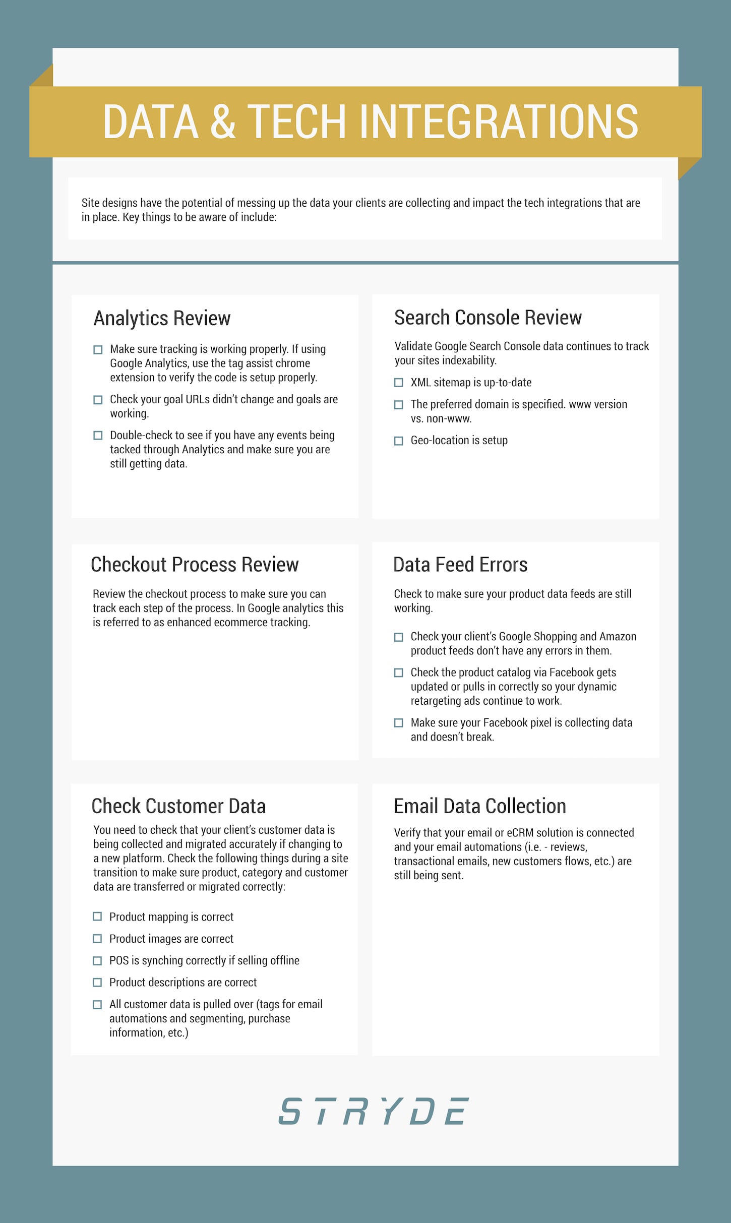
Site redesigns can potentially mess up the data your clients are collecting and impact the tech integrations that are in place, so make sure you are aware of any rules in place that could skew their data as you migrate to a new CMS and shopping cart. Below, we look at key actions you should be sure to take.
1. Review your client’s analytics setup
Review your client’s analytics setup and make sure tracking is on every page of the site. If your client uses Google Analytics, you can use the Tag Assist chrome extension to verify that analytics are working. Other things to check include:
- Analytics for any goals that are set up. These are tied to specific URLs, so if the URL changes then it can break the goals being tracked.
- Events tracking. Events are triggered when an action is performed, like a video click to start and stop. Double-check to see if you have any events being tracked through analytics and make sure you are still getting data.
2. Validate Google Search Console data
You will want to validate that Google Search Console data continues to track the site’s indexability. Double check that:
- The XML sitemap is up to date
- The preferred domain is set up correctly, if you move to a non-www version of the site
- Geo-location is set up
3. Review checkout
Review checkout to make sure you can track each step of the process. In Google Analytics, this is referred to as enhanced ecommerce tracking.
4. Check product data feeds
Check to make sure your product data feeds are still working. Pay special attention to:
- Checking that your client’s Google Shopping and Amazon product feeds don’t have any errors in them
- Checking that the product catalog via Facebook gets updated or pulls in correctly so your dynamic retargeting ads continue to work
- Making sure your Facebook pixel is collecting data and doesn’t break
5. Double-check customer data
Ensure you check your client’s customer data is being collected and migrated accurately if changing to a new platform. Check the following things during a site transition to make sure product, category, and customer data are transferred or migrated correctly:
- Product mapping
- Product images
- POS synching if selling offline
- Product descriptions
- All customer data (tags for email automations and segmenting, purchase information, etc.)
6. Verify that email is working
Verifying that your client’s email or eCRM solution is connected and that their email automations (such as reviews, transactional emails, new customers flows, etc.) are still being sent.
Working with your team
After you have taken into account the specific marketing efforts that will contribute to your redesign plan, it is important to begin mapping out how you plan to distribute the information and ways to encourage collaboration. Team collaboration is a critical role in the redesign process if you have multiple teams managing different parts of your marketing efforts.
For example, external and internal teams need to be able to keep track of the technical changes happening, especially if a lot of the technical elements of the site are changing. This typically happens when upgrading to a more robust platform like switching from Shopify to Shopify Plus, since more custom code is needed for your client to continue growing the business. Critical pieces of information that everyone on your team needs to know include any CSS and JavaScript changes are happening. It can be very difficult to figure out how many scripts are running on the site post-launch, so understanding and communicating that information now will make life easier down the road.
Establish specific tasks that each team will complete with a specific date in mind. Reaffirm how each task contributes to the overall goal of creating a more efficient and conversion-focused website for your client. Hold weekly meetings to ascertain how tasks are coming along and if there are any roadblocks. In these meetings, the agency and client can bounce ideas off of one another and continue to push the project forward.
You might also like: 0 Ways to Set and Manage Client Expectations During Onboarding.
Using checklists in the redesign process
For tips and tricks on how to plan and execute a website redesign, this is a really extensive resource by CrazyEgg. The key is to make sure everyone stays on track and organized to move things forward. One of the best ways to do this is to create a checklist for yourself and for everyone working on the site.
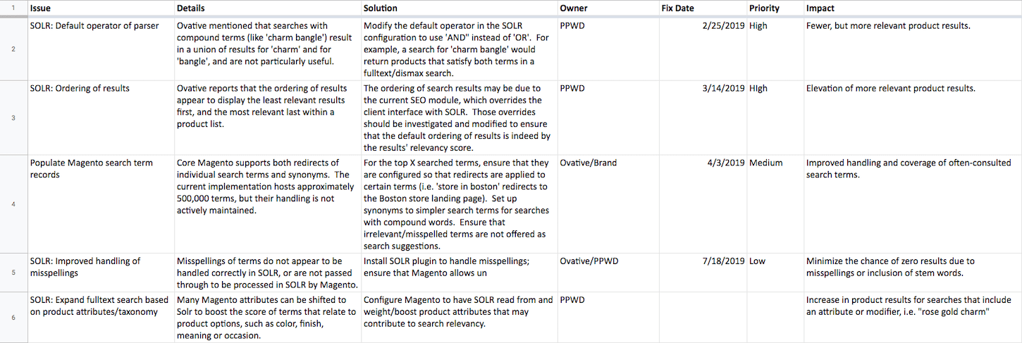
A successful checklist should include all the information needed for pre- and post-launch items, including the priority of each item and who is responsible for marking each item as complete. This will help ensure the whole team knows what their priorities are.
Your checklist could include the following:
- URL redirects (high priority for SEO).
- Metadata for each page (high priority for SEO) such as title tags, meta description tags, header tags, alt text, etc.
- Page content optimizations (high priority for SEO).
- Canonical tags.
- Schema markup.
- XML sitemaps.
- Tracking code didn't break (high priority): Google Analytics, Google Ads conversion data, Facebook pixel and event data, etc. Need to check all of your tracking code to make sure it is still reporting correct data.
- Checkout process: Make sure the checkout process is working properly post-launch. If you have enhanced ecommerce data enabled on Google Analytics, you can see where individuals are dropping off in the checkout before and after the new redesign to see if conversions take a hit.
- Forms: Ensure all forms are active and correctly reporting information back to the proper source.
- Email automation links are updated and working.
- Shopping, Facebook, and other data feeds are still working.
- Use Google Analytics Annotations for the changes that are made post-launch so you have a record of what has been done and the changes made for future reference.
Stay organized for a successful redesign
Going through a site redesign with your client is often complex and it takes months or years to get everything planned and built. It becomes even more challenging when upgrading the site to a new platform because the old framework is outdated and not supported anymore.
Try simplifying the process by focusing on the core features that will help your clients reach their revenue goals. Make sure you account for both the user experience along with technical aspects of the site when thinking about a website redesign with your clients. Additionally, leverage shared documents and checklists as outlined above in order to keep everyone on track and updated with how things are progressing. You and your client will appreciate the effort and the final results after the website redesign.
Read more
- Your Network is Your Net Worth: The Basics of Networking as a Shopify Partner
- User Research Methods: 13 Expert Tips to Master the Process
- How to Use Eye Tracking in Usability Tests
- Selling a UX Design Process That Ensures Results
- The Top UX Elements to Optimize Your Clients’ Product Page Design
- UX Writing: 10 Tips for Crafting Effective Content
- Typography in UI Design
- How Smart Design Patterns can Improve Store Conversions
- 5 Common Digital Content Problems and How to Avoid Them
What are your best practices for running a website redesign? Share your thoughts below.

