It isn't often that designers have the opportunity to build a design that is directly inspired by a great artist of the past. Digital agency DBNY got to do just that when they were asked to create an online store to sell reprints of artwork by Ugo Mochi, a famous Italian artist from the early 20th century.
We caught up with Amlan Das, Director of Design at DBNY, to find out about his experience working with the acclaimed "Poet of Shadows."
You might also like: 2 Guys. 6 Months. 7 Apps.
Tell us about DBNY.
DBNY is a digital agency based in NYC. We help fashion, lifestyle, and retail brands connect with their audience by creating engaging ecommerce solutions.
Our design philosophy revolves around increasing the performance of our clients’ business. We take pride in being more than just another creative agency — we strive to create profitable solutions that meets our clients’ business goals.
What is the story behind the Ugo Mochi site?
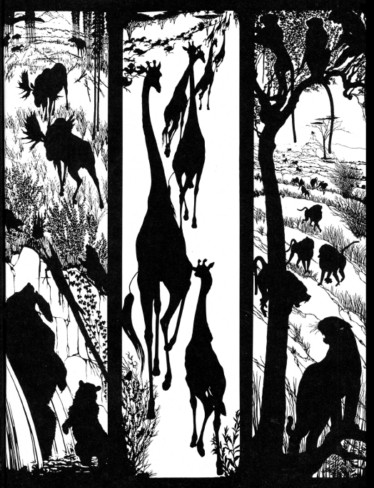
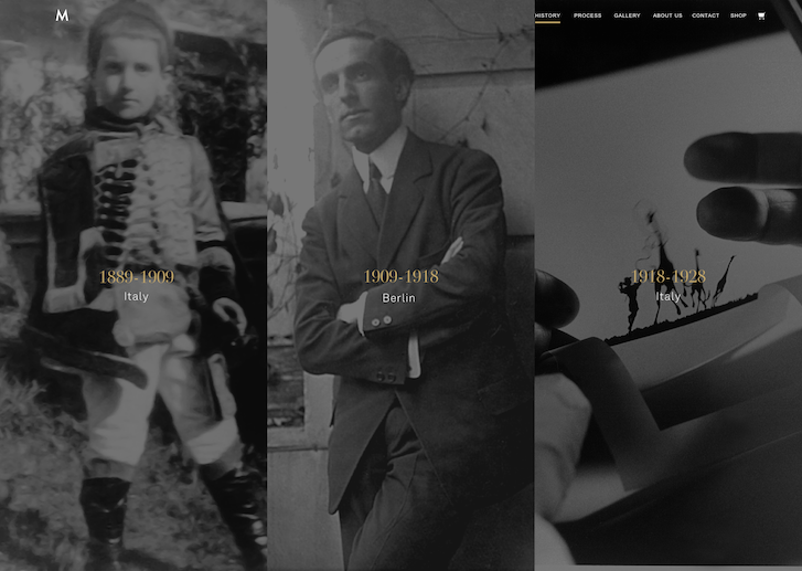
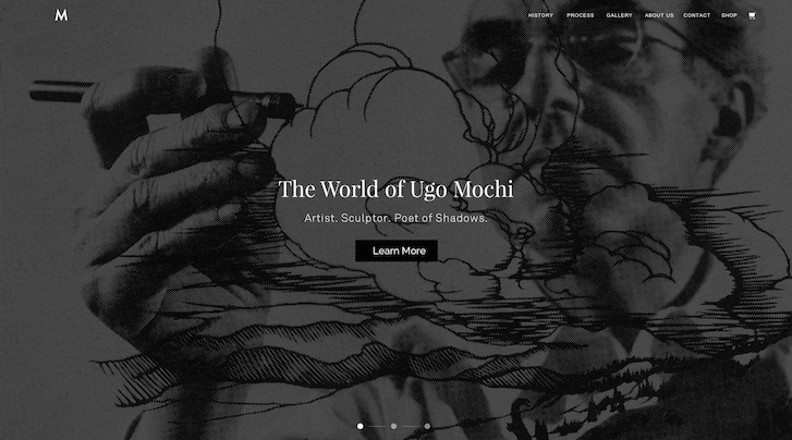
A past client approached us to work on a personal project for his family. His grandfather, Ugo Mochi, was an acclaimed Italian stencil and outline artist from the early 20th century. Otherwise known as the "Poet of Shadows," Ugo Mochi adapted the idea of the traditional silhouette and evolved it into intricate pieces of outlined art that went well beyond what was considered simple stencil outlines.
His breathtaking work has been recognized by The White House, The Metropolitan Museum of Art, The St. Regis Hotel, and has been featured in countless books and magazine publications.

With the legacy of Ugo Mochi’s professional career, our client shared with us what his vision and primary goals of creating an online experience would be. In addition to educating users on the prolific career of Ugo Mochi, he wanted to create a shopping experience that was just as unique as Mochi’s work. This experience also had to appeal to a targeted audience ranging from interior designers, art curators, and individuals who appreciate historical artwork.
What unique requirements did your client have for their store?
In order for users and visitors to truly appreciate the level of detail and skill it took to create these amazing pieces of artwork, our team had to encourage visitors to explore all aspects of the website.
We decided the best approach would be to tell a story through an immersive visual experience full of vivid imagery, thoughtful copy, and user-focused interactions.

This storytelling approach educates and converts first-time visitors into well-informed prospective buyers. Once the customer has reached the shopping section of the website, our requirement was clear: provide a very distinct purchasing experience that is intuitive, comprehensive, and highly customizable.
This storytelling approach educates and converts first-time visitors into well-informed prospective buyers.
How did you go about giving them the product customization they needed?
Establishing a unique shopping experience for users was our primary focus. Our team brainstormed, conceptualized, and experimented with several iterations of what we thought the ideal order process should be.
Our research presented us with a detailed customer profile. We found that the targeted consumer of Ugo Mochi’s work is not typically an impulsive buyer. Instead, their purchasing behavior is more intentional and sophisticated.
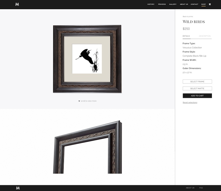
To create an experience around this type of purchasing behavior, our team felt it was important to offer users the ability to highly customize their order to their own preferences and requirements. while ensuring important information (frame dimensions, materials, sizes) was all collected.
We took a three-step approach:
- Selecting a print
- Choosing from a wide variety of frames and mattes
- Selecting/modifying different sizing options
This step-by-step process allows users to have an almost endless ability to customize. In turn, the customer is given a sense of personalization to a product they are about to purchase.
The end result was a streamlined and robust product customization process that allows users to visualize exactly how their custom creation will look when they receive it in the mail.
Where did the inspiration for the shop’s design come from?
Given that a majority of Ugo Mochi's career took place around the early 1900's, the inspiration for the website stemmed from an era-specific vintage appeal. The ‘vintage’ feeling was combined with up-to-date design elements that users and customers expect from a modern ecommerce store. The direction our team took was based around creating a site that allowed content to be viewed without distractions through simple design elements that aligned with the identity of the Ugo Mochi brand.

You might also like: Partner Spotlight: How Skyrocket Created a Brand-Based UX for Enerex
What changed along the way?
From the interactive storytelling experience to the product customization ability, the overall build of this project was extensive and complex. The scope changed dramatically due to the expansion of product offerings. A shop that started off intending to sell 15 prints with a handful of framing and matting options grew into a shop that now offers over 50 unique prints with over 40 frames and mattes to choose from.
Creating a shopping experience for a few products varies tremendously from creating a shopping experience for an abundance of products. With the expansion of the shop's product offerings, our team had to rethink the shopping experience and made optimizations along the way.
Creating a shopping experience for a few products varies tremendously from creating a shopping experience for an abundance of products.
What tools did you find most useful when creating the website?
We have a unique workflow in place in terms of how we execute our projects. This results in focused UX design and rapid prototyping using pen and paper. You would be surprised how quickly you can iterate designs with pen and paper; they still rule, folks! We wireframed several models of the product customizer until we were satisfied with a version that met the needs of the shop.
Our designers are huge fans of Sketch. It allows us to quickly sketch out (pun intended) ideas with minimal effort and makes our workflow faster so we can move on to other phases of design. It’s important to be flexible in the design phase, especially with a large scope.
What’s your favourite feature on the site?
Our team is proud of the product customization functionality of the website. Not only does the catered shopping experience guide users through the customization process, it also invites users to take a very detailed look at every piece that is involved in their custom combination. This provides the users with a highly accurate visual representation of what the final product will look like.

Growth is very important to us, so we took into consideration future product and collection additions. This app is built to scale and can handle hundreds of thousands of possible product combinations with ease.
What was the most difficult part about creating this shop?
The technical restrictions and limited customization options from current product apps motivated our team to get creative and build a customizable and streamlined solution.
In the case of Ugo Mochi, there are a total of nine size and shape combinations for each product. The complexity and sheer size of all the possible product combinations, along with asset allocation, was a challenge. We solved this by customizing the naming conventions for each variation and coded conditions for any possible product combination. When each customization step is completed (adding frame, adding matte), the combination is stored in the memory.
What did you learn while creating this website?
It's important to understand scope requirements in order to anticipate technical limitations and what can be done to resolve them. This was a very large and complex build so we planned accordingly and broke it down into multiple components, giving us the freedom to be more flexible with the build.
We exhausted all options for the product customizer and ultimately decided that building our own for the client was the best way to go. Sometimes, pre-made apps will not solve the goals of the project, and it's worth exploring building your own solutions, especially if it's within the scope and budget. We were fortunate that Shopify is an extremely flexible platform, one on which our developers pushed the limits with this build.
Sometimes, pre-made apps will not solve the goals of the project, and it's worth exploring building your own solutions.
Are there plans for making your product customizer into a stand-alone Shopify app?
Absolutely. We haven’t seen many apps in the Shopify App Store that offer this level of specificity for shop owners. We think it’s important to provide a level of flexibility and customization for stores that offer a unique product, or a highly customizable product. For that, we’re currently exploring various options and features while building out this app for the App Store and we’d love to hear any suggestions or feature requests from those who are interested. Feel free to give us a shout!
Read more
- How Shopify Plus Partner Createur Helped Migrate One of Australia’s Top Online Retailers
- How Shopify Plus Partner Maestrooo Balances Building Themes and Apps, with Client Work
- How We Built a Global Empire from a Small Island in the Pacific Ocean
- Partner Spotlight: Disco Brings Useful Gifts to Shopify Plus
- How Singapore’s Jumpstart Commerce is Taking Over the World
You might also like: How a Partner Team of Two Introduced an Old-World Antique Shop to New-World POS

