When we launched our playoff with Dribbble last month, we asked designers to share what design means to them.
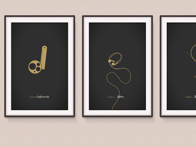
The end result was 238 rebounds from vastly different perspectives. Our entrants played around with type, icons and illustrations. Some graphics were self-explanatory. Some required a detailed explanation. All showed the passion designers have for what they do.
It was a difficult task, but our judges evaluated each entry based on multiple factors: how well it answered our prompt; creativity and originality; demonstration of technical skill; and popular vote. Our judging panel included Dribbble’s co-founder Dan Cederholm, Shopify’s Director of Design Verne Ho, and Shopify’s Director of Product Design Greg Beldam.
Without further ado, let’s announce the grand prize winner, followed by our two runner-ups and 10 honourable mentions.
You might also like: Why Hack Days Are Great For Designers
Grand Prize Winner
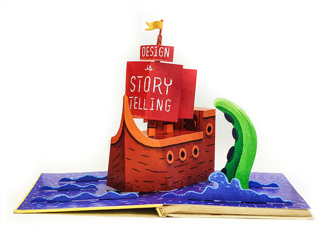
Design is Storytelling, by James Graves

Here's what James had to say about the inspiration behind his entry:
First off, I don't claim to be a "storyteller" as a designer but I am a strong believer that the things we make tell a story to their audience. The type of fonts, colors, illustrations, and textures set the scene in the type of story the piece is telling.
I personally don't care for written word stories. I was diagnosed with dyslexia at a fairly young age and this led to me having a really hard time reading and ultimately learning traditionally. Words lost their meaning and I gained extra appreciation for visually-depicted stories.
Why make it a random scene? Growing up I would spend hours drawing elaborate scenes with my brothers. I remember one such drawing that consisted of 20 or 30 animals getting ready for a race. There were lions wearing short shirts, snakes applying Vaseline to their underbellies, and sneaker-wearing rhinos. Every character had a name and a backstory even though no one but us would know it. We had hundreds of such drawings. It was like we were making stills from movies that we had all, somehow, played in our head. Pretty wild. I love this part of my past and really wanted to tap in to it for this piece.
I took a lot of style inspiration from Zelda Wind Waker and a vintage Peter Pan pop-up book. I wanted the scene to have a certain adventurous feel to it and eventually landed on a nautical theme. So while this direction is abstract, the overall intentional story I am trying to convey is one of happy, adventurous, childhood nostalgia.
James also shared some additional photos of his incredible pop-up scene:

Runner Ups
Design is a Sense of Childlike Wonder, by Shauna Lynn Panczyszyn

Design is a Journey, by Zachary Smith

Honourable Mentions
Design is Everywhere, by Sebastiano Guerriero

Design is Natural, by Matthew Smith

Design is Mind Control, by Jeff Ross

Design is Equal Parts Idea & Craft, by Allan Peters

Design is Where I Found My People, by Ryan Hamrick

Design is a Lie, by Jason Bowman

Design is _________, by Mo Mozafarian

Design is Creation, by Leah Ray

Design is Finding Solutions, by Nathan Roberts

Design is Solving Problems by Dekker Slade

Thanks to all who entered! Feel free to share what design means to you in the comments below.
Read more
- New York, Mexico City...Where Will the Shopify Partner Studio Go Next?
- What’s New at Shopify: February 22, 2019
- A Day with Shopify 2017: Announcing Speakers and Sessions
- Introducing the Shopify Shipping Toolkit: A Sales Resource for Shopify Partners
- Developer Digest: March 13, 2019
- What’s New at Shopify: April 6, 2018
- Meet the New Freelancers in the NYC Shopify Partner Studio
- What’s New at Shopify: March 9, 2018
- Level Up Your Shopify POS Knowledge to Support Your Clients
You might also like: 20 Web Designers and Developers You Should be Following on Twitter

