First impressions happen within seconds, and an attractive display can make the difference between a passerby and a paying customer.
Strategically set up boutique displays can help dictate the entire customer journey, from the moment customers pass your front window to when they bring their purchase up to the cash register. The layout, choice of materials, lighting, and even height of your retail displays can influence purchasing decisions by offering an inviting atmosphere that encourages customers to explore and purchase.
Ahead, learn how to create a boutique display that is both visually intriguing and functional.
Why is an appealing boutique display important for retailers?
An appealing boutique display serves as a silent salesperson. Instead of talking up a product or suggesting similar items, a boutique display captivates a customer’s attention through a visually appealing arrangement. Beyond aesthetics, an effective display can also facilitate more straightforward navigation, enhancing the overall shopping experience. Eye-catching arrangements also encourage longer store visits, which can increase the likelihood of sales.
Tips for creating an eye-catching boutique display
- Choose a focal point for each display
- Use color psychology to your advantage
- Opt for varying display heights and dimensions
- Incorporate effective lighting techniques
- Keep displays uncluttered and easy to navigate
- Rotate displays regularly to maintain interest
From strategic focal points to effective lighting, dazzling boutique displays can help you design an intriguing shopping environment. Discover how to captivate your customers and elevate your retail space with these essential tips.
Choose a focal point for each display
Create a focal point in your retail displays to help guide the customer’s eye to a particular product or area. This technique, typically employed in visual merchandising, highlights new arrivals, special offers, or high-margin items.
Use color psychology to your advantage
Colors evoke emotions and can subtly influence customer behavior. Using color psychology in your boutique display can make them feel a certain way. For example, if you want customers to associate your apparel store’s display with joy and optimism, you can create an arrangement full of orange clothing. Playing with color can increase foot traffic and resonate with your target audience.
Opt for varying display heights and dimensions
A flat, one-dimensional display is less likely to engage customers. And positioning items at the same height means not everyone will have a good view of the products. Add depth and visual interest to your retail space by varying heights and dimensions. This concept applies to wall display units, wall décor, art pieces, tables, and freestanding floor displays.
Incorporate effective lighting techniques
Lighting plays a crucial role in creating an eye-catching display. Effective lighting illuminates products, generates mood, and makes colors pop. While overhead lights are standard, consider adding spotlights or under-shelf lighting to spotlight specific clothing items or other materials.
Keep displays uncluttered and easy to navigate
A clean, organized boutique display feels welcoming, whereas overcrowded clothes and accessories can overwhelm customers and make it difficult to focus on individual products. Simple, uncluttered arrangements facilitate better navigation and contribute to a positive shopping experience.
Rotate displays regularly to maintain interest
Refreshing your boutique display can help maintain foot traffic over time. Regularly rotating products and themes can pique customer interest and provide opportunities for showcasing a more comprehensive range of inventory. Consider seasons, holidays, or special events as timely occasions for an update. For example, if you run a toy store, you can display pumpkins and ghosts in the lead-up to Halloween, with additional Halloween candy located by the cash register to encourage last-minute purchase additions. By November, you can switch to displaying turkeys and fall-themed items.
14 creative boutique display ideas for your retail store
- Embrace a minimalist layout
- Design a tiered wall display
- Achieve balance with symmetrical arrangements
- Go for relaxed product placements
- Experiment with diverse textures
- Highlight your merchandise with strategic lighting
- Introduce unexpected focal elements
- Use a thematic backdrop
- Craft a floating wall arrangement
- Elevate your merchandise literally and figuratively
- Build a luxury showroom wall
- Cross-promote complementary products
- Curate a show home ambiance
- Combine simplicity with an element of surprise
Elevate the look of your retail store with these 14 creative boutique display ideas:
Embrace a minimalist layout
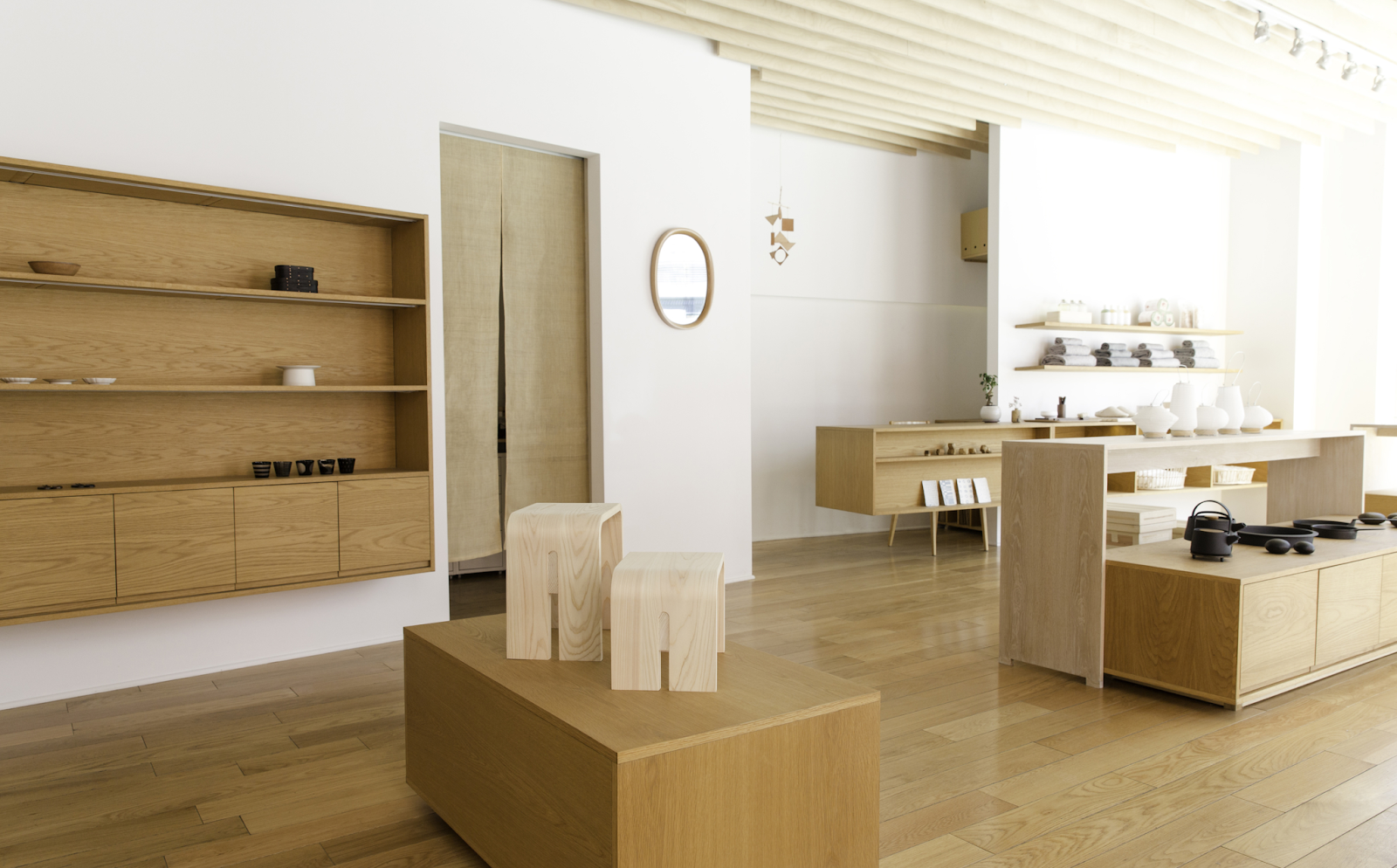
A minimalist layout places your items at the center of attention. Keep your shelving and display units simple, using neutral colors and clean lines to avoid distractions. This approach makes it easier for customers to focus on individual items.
Nalata Nalata, a lifestyle goods store, employs a minimalist layout featuring wood materials in an airy, open white boutique space.
Design a tiered wall display
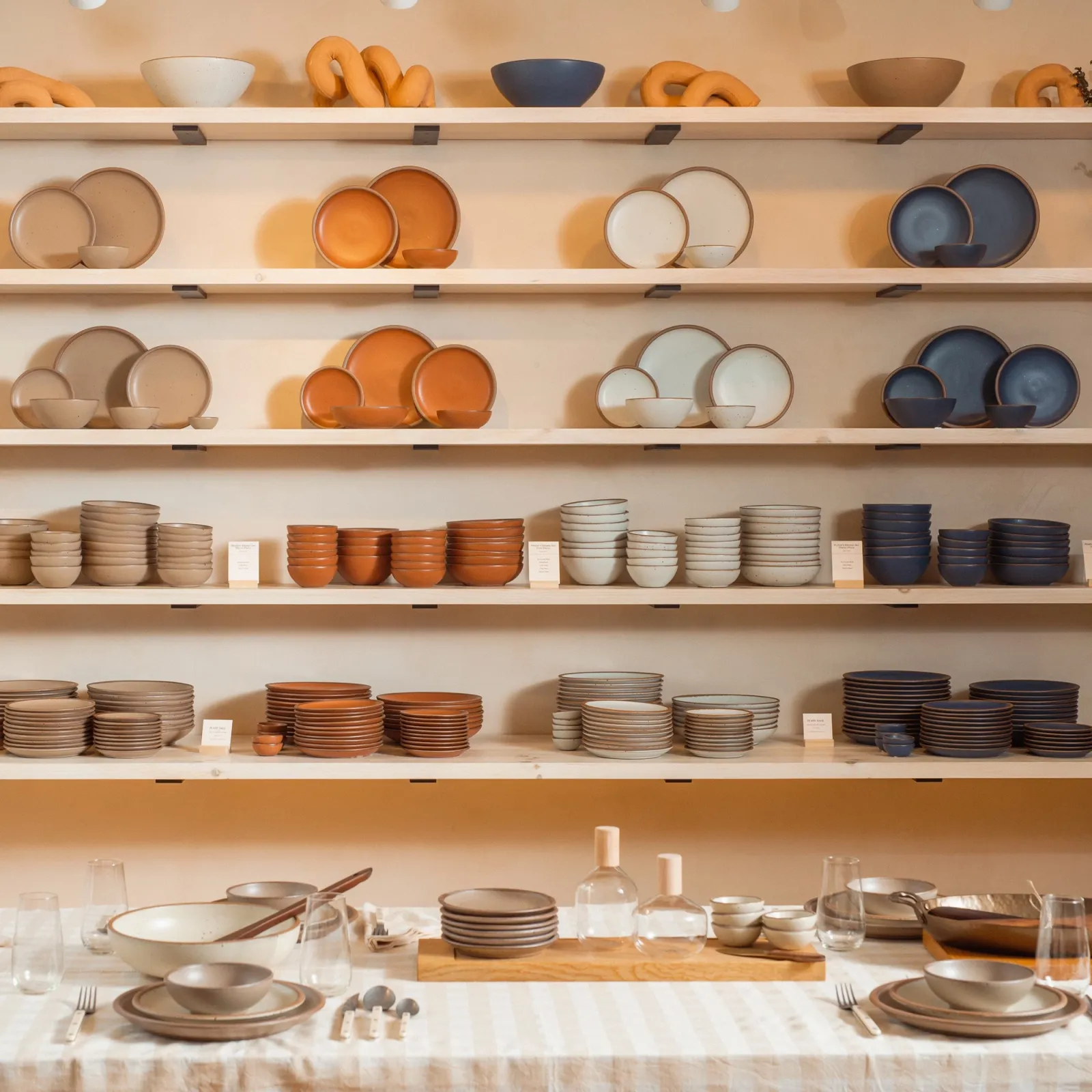
Tiered wall displays effectively use vertical space, showcasing more items without crowding them. Use ladder shelves at varying heights to display different types of merchandise. Pair smaller items with larger ones to create visual interest.
East Fork, a contemporary ceramic dinnerware seller, arranges its plates and bowls in a vertical, tiered wall display. Spanning wall to wall, the display gave East Fork a lot of room to play with, and the brand chose to separate the items by color, making for a visually impactful arrangement that shows the different types of plates it sells.
Achieve balance with symmetrical arrangements
Symmetry can be pleasing to the eye and make your boutique look organized. Choose a central focal point and arrange items uniformly around it. This works well for window displays or central display tables.
Thursday Boots, a footwear retailer, achieves symmetry by placing two shelving units on either side of a full-length mirror.

Go for relaxed product placements
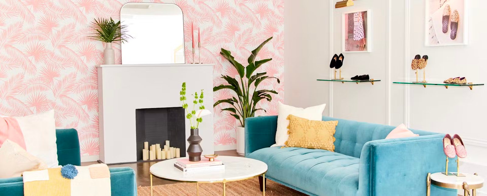
Relaxed product placement emulates a more casual, approachable environment. Scatter items in a less structured way, as if they were naturally part of the scene. This tactic can make the shopping experience feel more organic and less sales-driven.
For example, Birdies, a shoe store, positions its footwear around plush velvet couches, offering a relaxed area for customers to try on shoes.
Experiment with diverse textures
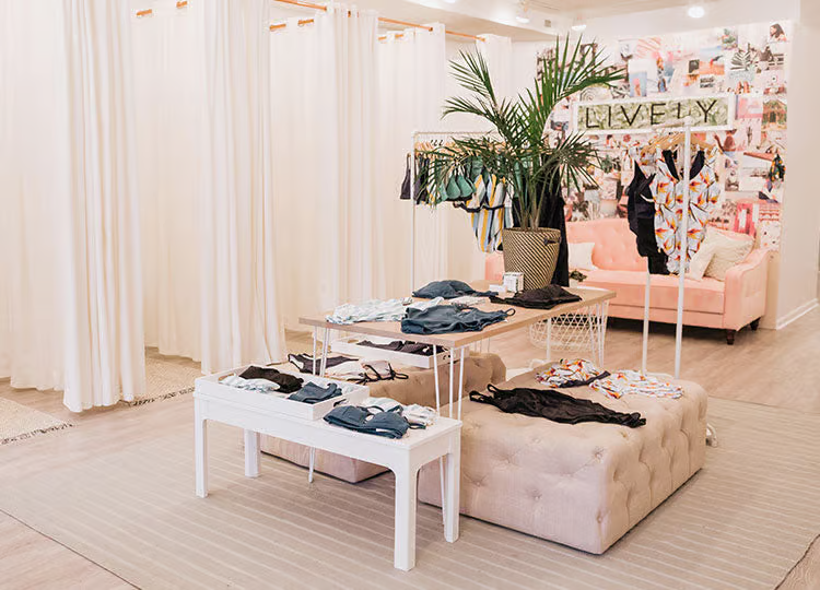
Different textures add visual depth and interest to your display. Using contrasting materials—like metal, wood, and fabric—breaks the monotony. Place textured items next to smoother ones for maximum impact.
Lively, an intimate apparel store, displays bras and underwear on wood tables and velvet ottomans to add textural variety.
Highlight your merchandise with strategic lighting
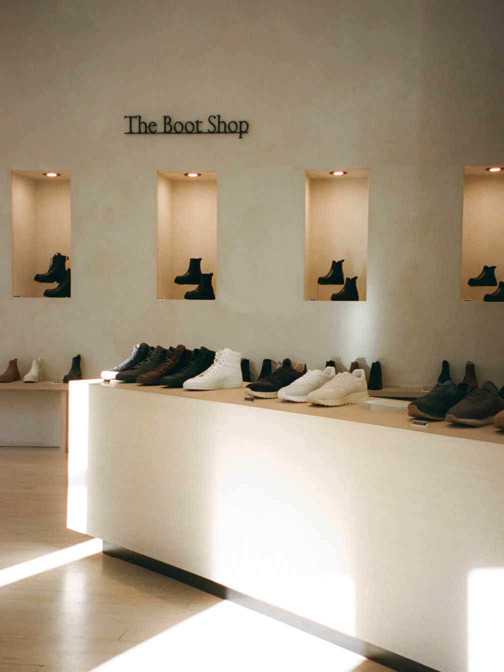
Strategic lighting draws attention to specific products or areas within your boutique. Use spotlights, under-shelf lighting, or backlit panels to make your merchandise stand out. Experiment with light temperature and intensity to set the mood.
KOIO, a luxury footwear brand, positions its boots in a wall cutout with warm overhead lighting that makes the leather glisten.
Introduce unexpected focal elements
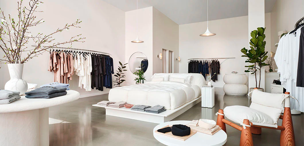
Surprising focal points grab attention and make your store memorable. Introduce unconventional items like large art installations or antique furniture as focal points. Choose elements that work with the overall theme and don’t overshadow the products.
In the middle of its Boston boutique, Lunya, a sleepwear retailer, places a bed—a natural prop for its product range—in the center of its store.
Use a thematic backdrop
A thematic backdrop can tell a story or evoke a mood, which can be powerful in selling a lifestyle along with the product. Whether it’s a beach scene or a city skyline, ensure it aligns with the products you’re showcasing.
Mejuri, a fine jewelry brand, situates its pieces in a setting resembling a long, curved bar island, mimicking a speakeasy.

Craft a floating wall arrangement
Floating wall arrangements create a modern and airy feel, giving the illusion that the items suspend in space. You can achieve this by using transparent shelves or hidden mounting systems. It’s an effective way to highlight lighter, smaller items.
Troubadour, a bag and accessory brand, floats its backpacks on hooks against a neutral background, allowing customers to focus on each item.

Elevate your merchandise literally and figuratively
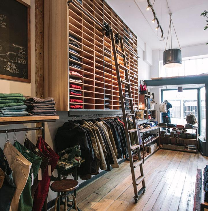
Raising certain products higher than others can emphasize their importance. It can also be an excellent tactic for increasing inventory storage. Use podiums, elevated shelves, or hanging systems to lift items off the ground. This helps diversify your display heights and adds visual interest.
Taylor Stitch, a men’s clothing brand, uses high wooden cubbies accessible via a sliding ladder to elevate the merchandise and the eye.
Build a luxury showroom wall
A showroom wall brings an upscale retail experience into your boutique. Use high-quality materials like marble or wood and custom lighting to create a section that showcases premium items. This works particularly well for high-margin or exclusive merchandise.
Kith, a streetwear and footwear store, places its elegant shoe collection on a well-lit back wall, making it the room’s focal point.

Cross-promote complementary products
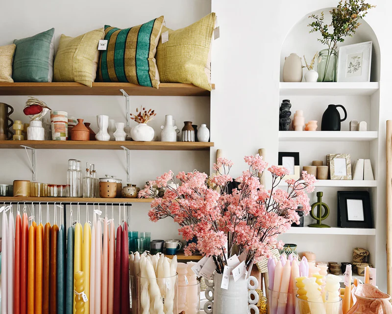
Place related items together to help customers envision how they look combined and encourage additional purchases. For example, put a tie next to a dress shirt or a handbag near a dress. This cross-promotion adds convenience and can increase the chance of multiple-item sales.
Leif, a home goods retailer, groups complementary items like pillows, vases, and throws together to encourage bundled purchases.
Curate a show home ambiance
Creating a home-like environment can help customers visualize your products in their own space. Use furniture, lighting, and decor to stage areas of your boutique, like a living room or bedroom. Add little touches like books or vases to complete the look.
Parachute, a home essentials brand, creates a homey environment with a bed, couch, and sitting area for product visualization.

Combine simplicity with an element of surprise
You can bring a simple layout and display to life with surprising elements like a sudden pop of color or an unexpected accessory. Keep the overall design simple, but add one or two surprise components to draw a visitor’s attention.
RSVP, a leather handbag retailer, maintains a simple color-coordinated display but adds a twist with a unique reflective ceiling mirror.

Implementing creative boutique display ideas can transform your retail space and elevate the shopping journey for every browser. By applying these tips, you’re not just showcasing your products, you’re also building your brand and inviting more interaction from potential buyers.
Boutique display ideas FAQ
What is the most common display type?
The most common display type in boutiques is freestanding displays. These standalone displays often consist of shelves, racks, or tables that can easily showcase various products.
What is the difference between display and merchandising?
Display refers to the specific arrangement of products in a retail setting, while merchandising encompasses a broader set of strategies to drive sales, including pricing, promotion, and product placement.
How do I choose the right color scheme for my boutique display?
Choose a color scheme that aligns with your brand’s style and resonates with your target audience. Choose colors that complement the products to create a visually cohesive environment.
How often should I update my boutique display to keep it fresh and appealing?
Update your boutique display approximately every one to two months to keep it fresh and engaging; however, the frequency may increase based on seasons, holidays, and special promotions.
