Products are the backbone of most ecommerce sites , heavily tied to a merchant’s branding and design. When working with a client, leveraging their products in different ways can help engage and delight potential buyers.
To help get the wheels in your head turning, we picked nine online stores that leverage products in unique ways. Each store’s focus ranges from convincing product visuals, to interactive product shots, and user generated content.
Browse through the list and you might find some inspiration for your next ecommerce project!
Or, learn more how to build a customizable related products section for your own clients.
Convincing product visuals
In this first section, we look at three stores that use strong color schemes, visuals, and videos to make their products stand out.
1. Momentous
Store URL: https://www.livemomentous.com/
Created By: https://gliffen.com/
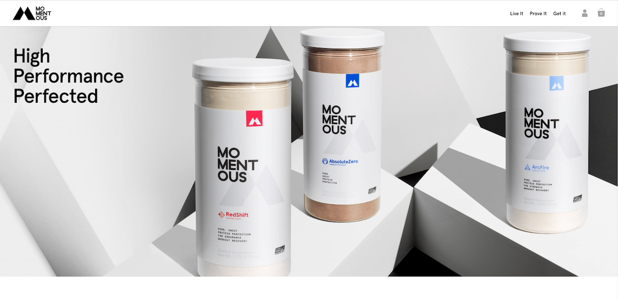
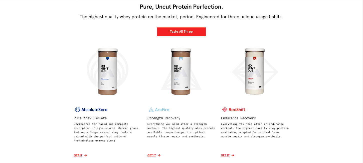
Momentous nutritional supplements are naturally brown and beige. Rather than succumb to the dull, they’ve adopted a color scheme and font that gives their simple product a memorable edge. Adding bright colors gives their brand and product a clean look, and allows users to easily read the flow of information.
2. Formaticum
Store URL: https://www.formaticum.com/
Created By: http://aeolidia.com/
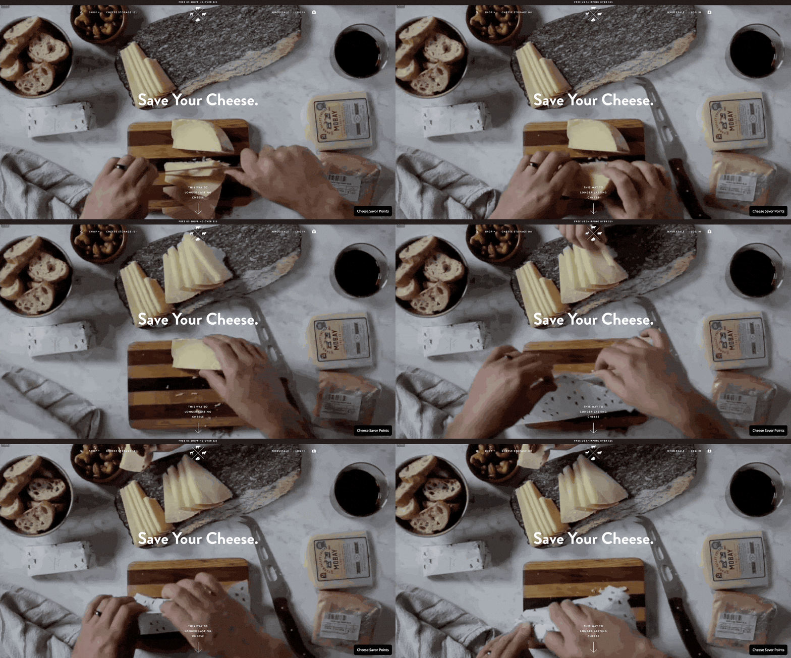
Who knew cheese wrap could be so mesmerizing? Formaticum captured their whole product experience from start to finish, all above the fold. This is a fun and effective way to showcase product usability.
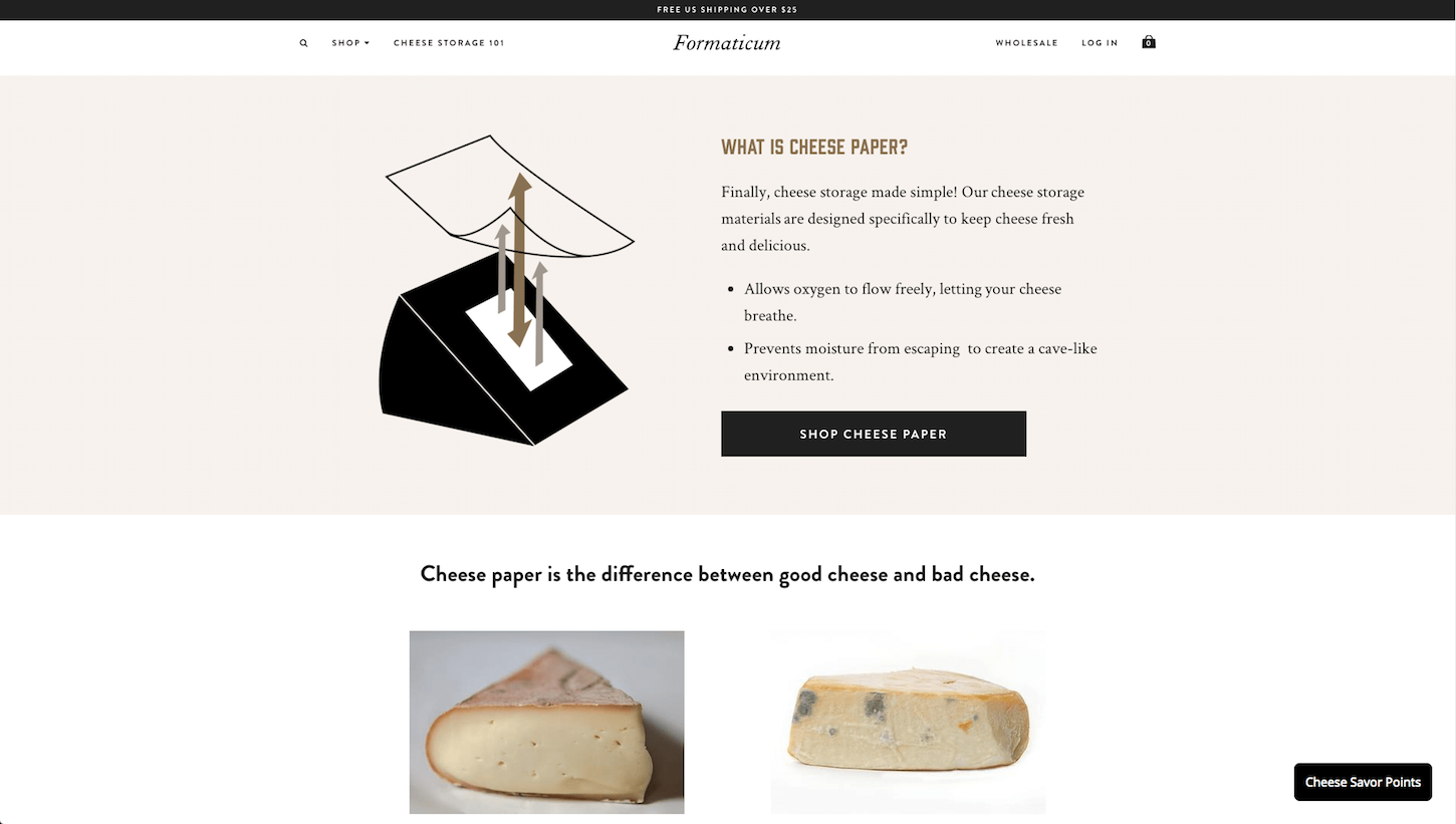
A bonus shot of their cheese 101 page — a dedicated section emphasizing why their product is important.
3. 91 Vocals
Store URL: https://91vocals.com/
Created by: https://eastsideco.com/
How do you sell an invisible product? Through the use of powerful colors and edgy visuals , Vocals 91 was able to paint a picture of their vocal samples. Without using too many words, they’re able to communicate their product’s feel, fulfilling user satisfaction.

Interactive product shots
One of the biggest obstacles in ecommerce is the inability to touch and feel products . The following three online stores tackle that issue using interactive product shots.
4. Santamaria Shirt Makers
Store URL: https://santamariashirtmakers.com/
Created by: https://webowski.me/
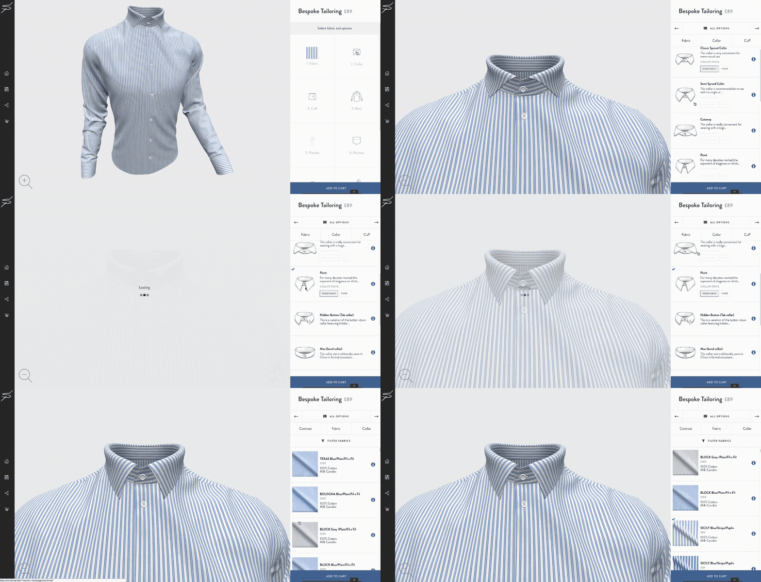
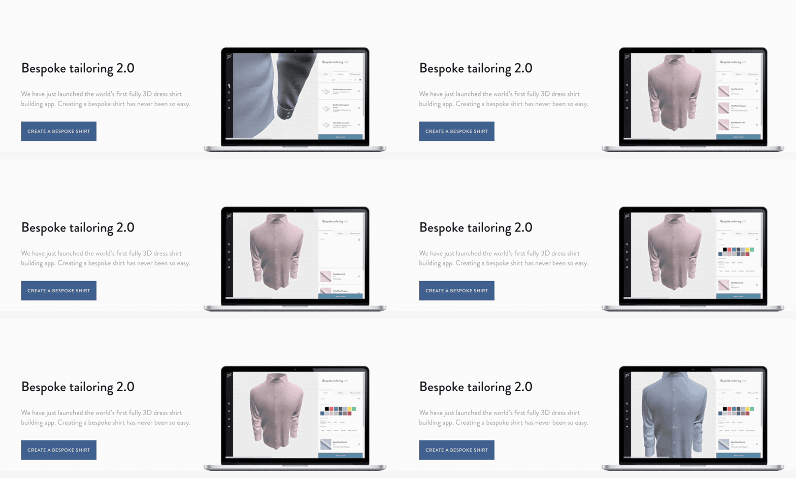
This t-shirt store uses 3D imaging to give their customers an up-close look at their products.
5. TEAK HAUS
Store URL: https://teakhaus.com/
Created By: http://www.triciclo.mx/
Using hover animation, this merchant’s product photography cuts to (pun intended) an image of their cutting boards being used in real life scenarios. The second visual helps customers imagine the product in their day-to-day life. 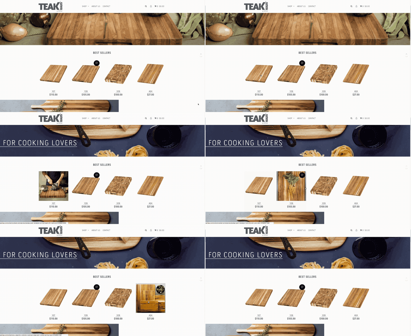
6. Batch Organics
Store URL: https://batch-organics.com/
Created By: https://paralel.ca/
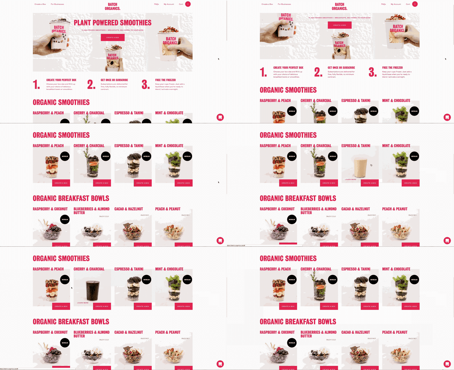
Using hover animation, Batch Organic uses product shots that skip from ingredients to the final product for a mouth watering finish.
Authentic user generated content
Our last section covers three online stores that utilize user generated content on their respective sites. This type of content is growing in popularity and with good reason; it helps create more authentic messaging, increase engagement, and gives customers a voice.
You might also like: 6 Places to Find Design Inspiration Early in Your Process.
7. String Berry
Store URL: https://stringberry.com/
Created By: https://webowski.me/
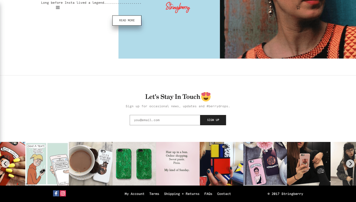
Instagram is a popular channel for creating user generated content. String Berry, an ecommerce site for phone cases, reposts photos taken by customers on their company Instagram account creating a strong sense of community. The feed is promoted at the bottom of their website where it builds credibility for their products.
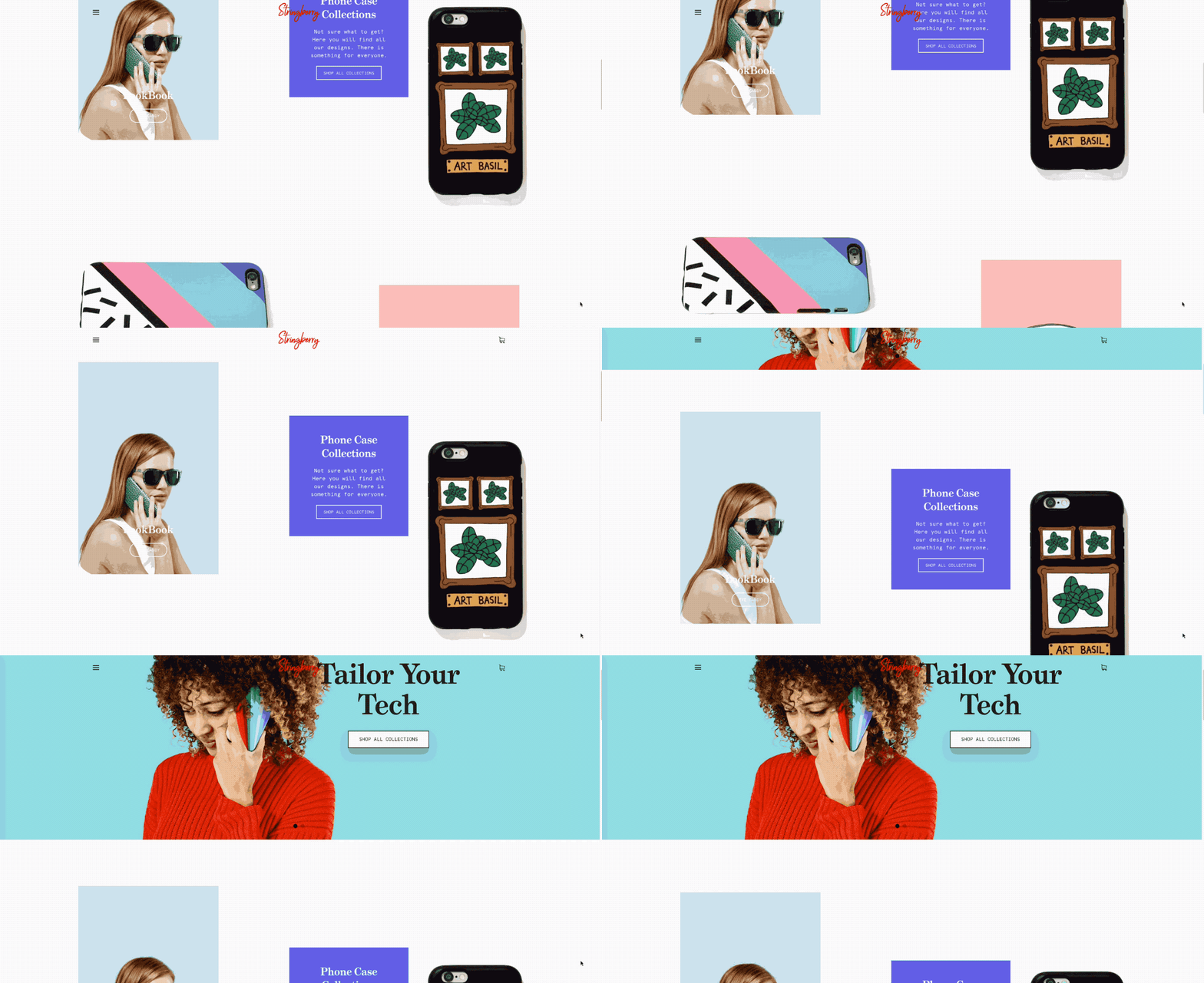
 We also had to include a shot of their broken grid. They didn’t make a mess of all the different visuals featured, and instead kept a sense of harmony that’s pleasing to the eye.
8. Skinnydip London
Store URL: https://www.skinnydiplondon.com/
Created By: https://wemakewebsites.com/
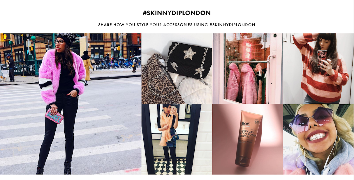
Skinnydip London, a bag and accessory seller features their Instagram feed in a larger section on their website. Their photos are a mix of original content and republished photos from their customers wearing or using Skinnydip products.
This is a good example of how user generated content contributes to brand image and drives traffic. They also included a subtle call-to-action with their hashtag, encouraging people to share their photos for a chance to get featured.
9. Owlet Baby Care
Store URL: https://owletcare.com/blogs/stories
Created By: https://voltagead.com/
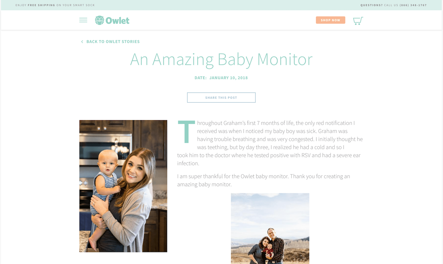
When your customers are parents, it’s important to build a strong foundation of trust.
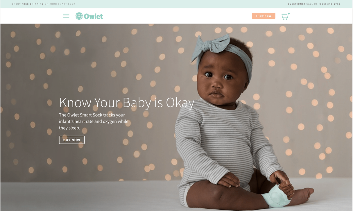
Owlet dedicated a section of their website to “Owlet stories” where the spotlight is on their customers. They kill two birds with one stone, thanks to these stories working both as engaging content and testimonial.
Read more
- This is What Happens When Dribbble + Shopify Team Up in Toronto
- Shopify's Web Design and Development Blog in Review: The Top 10 Articles of 2017
- 10 Halloween Graphics to Make Your Client’s Website Spooktacular
- Tips for Offering Product Unboxing Consultation Services to Your Clients
- 3 Essential Content Marketing Trends To Watch In 2022
- 10 Podcasts to Help You Get Creative
How do you feature products in a visually compelling way? Let us know in the comments below!

