When I start talking to new clients about a potential redesign for their Shopify store, they’ll often turn up with a wish list: sliding full-screen images; slickly animated image popups; Instagram feeds scrolling across the page.
If I start asking questions in order to understand why clients are after this stuff, more often than not it comes from them seeing it on the sites of competitors or others.
Now, this isn’t necessarily a bad thing. Consumers often have certain expectations on how sites should look and behave when shopping online – that’s why all high-end UK fashion stores look the same.
So, when a client wants to sell in the clothing brand space, where everyone offers a slick lightbox to zoom in and cycle through photos of their products, I’m not going to think it’s the worst idea to follow suit.
However, way too often the client’s ideas actually constitute a “Frankenlist” – a set of features cobbled together from every website they’ve seen without any real thought behind how they should work on their site, or why they’re there in the first place.
You might also like: Shopify Tutorial: The product.liquid template
How to work with Frankenlists
In this article, I’m going to pick out four things I’ve commonly seen on Frankenlists, and try to provide suggestions on working out when and how to best implement them in a way that complements your client’s site.
1. Carousels
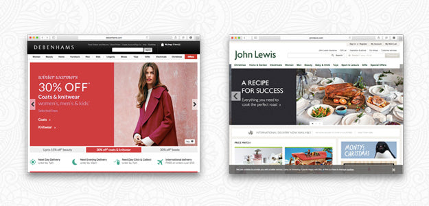
Clients love carousels almost as much as designers love to bash them. They’re popular with clients because they allow the inclusion of “more” content without taking up lots of space, as well as looking flashy and adding a bit of animated spice to the page. Plus, everyone else is using them!
The problem is, carousels are pretty sucky when it comes to user experience and accessibility. Jared Smith, a usability expert, has a good overview of the issues with carousels on his site Should I Use A Carousel? (yes, it’s a little tongue in cheek).
When a carousel comes up as a potential feature for a theme, the first thing I try to do is understand why it’s being suggested. If it’s mostly just because it “looks cool” or is “standard,” I find it’s a good idea to present an alternative way to present the same content in a wireframe or mockup. Often, you can meet the business needs of a client without introducing the usability issues of a carousel.
There are, of course, situations where you decide a carousel is the way to go (or a client twists your arm). In those cases, here are a couple of implementation suggestions:
- Use high-quality images that render well on retina screens, and are all the same size.
- Use text labels to allow navigation between slides, instead of ambiguous “dots.”
- Don’t automatically animate slide transitions (don’t you hate it when something you’re looking at disappears?). At the very, very least, turn off automatic animation when the user moves their mouse over the carousel.
- Mark up your carousel with WAI-ARIA attributes to improve their accessibility.
2. Newsletter Popups
Because more and more store owners are realizing the importance of a large, engaged email list, ecommerce stores are getting more and more aggressive in their push to collect visitors’ email addresses. This has led to the rise of the “Newsletter Popup” – a floating box that appears when a visitor first arrives on your site, asking for their email address.
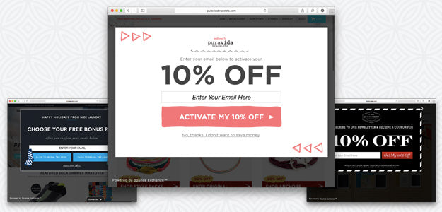
As a designer, I’m a bit torn when it comes to this sort of feature. Personally, when I’m browsing the web, I find these things incredibly annoying and will almost never subscribe.
However, it’s hard to argue with data, and the data generally suggests that these things work. Ultimately, if your client is going to see a lot of value from building their email list, then some form of popup is probably going to be useful.
Here are a couple of things to keep in mind:
- Offer an easily understandable value proposition. “Newsletter subscribers get 15% off everything, join now” is better than “Subscribe to our list,” especially for visitors landing on your page for the first time.
- Ask at the right time. Instead of throwing the box up in their face as soon as they land on your page, consider timing it to display when they’ve already shown some interest in your site – after a certain time period, or after they’ve scrolled through 60% of an article page.
- Respect the user. If a user dismisses your popup, don’t show it to them again on the next page they visit. You won’t get their email address, and you won’t get their business.
- Measure holistically. Don’t just look at the effect the popup has on your email signup rate – also measure any impact it might have on your store’s overall conversion rate.
You might also like: The Essential List of Resources for Shopify Theme Development
3. Fancy Navigation
One of the most important design considerations for an ecommerce store is working out how customers are going to find their way around the site. It’s not only important for people to be able to easily find their way to the products they’re interested in, but also to have a good sense of where they are at any point in time.
The biggest problems I see with ecommerce navigation occur when store owners pick up a navigation system they like from another store and wedge it in to their own without considering their own customers and use case.
For example, a common navigation pattern is the “mega menu” – a dropdown from a header menu that provides a large number of subcategories.
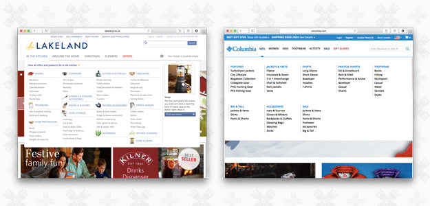
Obviously, this pattern works well for retailers with large product ranges, where categories need to be broken down into subcategories which themselves may have dozens of products. However, the mega menu is not a good idea when you don’t have many products.
In general:
- Navigation should be designed for your customers, not someone else’s. Categorize products in ways that make sense for visitors – for example, “Men’s Fashion”/“Women’s Fashion” for a clothes brand.
- Make a product search box available, friendly, and easy to use, so that if a customer is confused by your navigation they can always fall back to the search.
- Make sure your navigation works on mobile and tablet devices. With over 50% of ecommerce traffic on these devices, you want to make sure navigating your site is easy for mobile users.
- If the store uses categories and subcategories, make use of breadcrumb navigation to help customers understand where they are in your site and how to get back to higher levels.
4. Lightboxes
High-quality product photos are an essential part of almost every successful online store, so it’s natural for clients to want to show them off. Lightboxes are a common way for stores to let their customers get a closer look at their products, without taking them out of the flow of the purchase process.
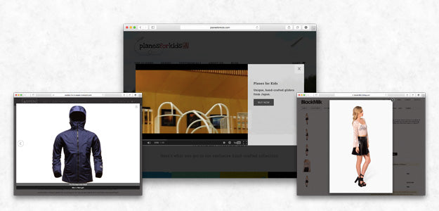
Here are a couple of tips for making your your lightboxes work well:
- Use progressive enhancement. If a customer has Javascript turned off, or something goes wrong (it does happen), the basic functionality of your lightbox – allowing the customer to see a larger version of a product image – should still work. The best way to do this is to start by having your lightbox trigger elements as simple links to a larger version of the image that opens in a new window, then have your Javascript progressively enhance those links to add lightbox functionality.
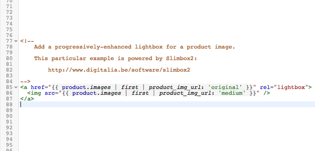
- You could also consider using this default behaviour on mobile devices, where light boxes are generally less useful (as the “regular” images displayed on your product pages are often going to be nearly full-screen to begin with).
- Make sure it’s keyboard accessible. You might expect visitors to open a lightbox using their mouse or a tap, but that doesn’t mean that should be the only way to interact with your images.
- Customers should be able to close your lightbox using the Escape key, as well as be able to navigate through multiple images using the arrow keys.
- Don’t break the user flow. Remember that a lightbox is a tool to aid in your overall goal of getting the customer to the checkout. A lightbox that spends too much time on flashy animation or makes a customer lose their place on the page has the potential to hurt rather than help sales.
When your lightbox opens, it should be clear to the customer how they can close the box, navigate through multiple images, and proceed with adding the product they’re looking at to their cart.
Read more
- How to Create a Customizable Logo Bar Section
- 8 Development Tips for Building Better Custom Shopify Sites
- Using Placeholder Images for Products with the placeholder_svg_tag Filter
- How to work with Metafields when building Shopify themes
- Understanding Shopify Theme Styles and Presets With settings_data.json
- How to Work With Shopify Theme Blocks
- Shopify’s Buy Button 101: How to Use BuyButton.js in a WordPress Theme
- How to Optimize Your Clients’ Themes to Sell Digital Products
You might also like: Customize Shopify Password Pages With the password.liquid Template

