


Wander around a Disney theme park, and you might come across hidden Mickeys: the company’s iconic mouse-head logo cleverly integrated into design elements like tiling, ironwork, and paving stones. Once you’ve seen one hidden Mickey, you’ll notice them everywhere.
That’s the immediate power of a great logo design: once you see it, it’s instantly recognizable.
If you want to have the same effect on your customers, check out these 20 logo design ideas to help make your company emblem unforgettable.
Why are logo designs important?
A good logo is a powerful tool to convey your brand values, aesthetics, and character at a glance to a wide array of potential customers. Good logos communicate across platforms and media and help distinguish your brand from others, set you apart from the field, and create a lasting, recognizable impression for your customers.
An inspired brand identity can provide:
- Brand recognition. Logos are memorable and help your customers spot your company, even amid a crowded industry. A consistent and striking logo, thus, is a foundation for brand recognition.
- Trust and credibility. Logos give a sense of professionalism and a coherent, thoughtful approach to your company and its public presentation.
- Consistency. A great logo is versatile and can work everywhere, from a business card to an Instagram post to a storefront display. Logos help keep a clear identity throughout all manifestations of your brand.
20 logo design ideas
- Try text-only logos
- Combine different typefaces
- Incorporate simple graphics
- Layer text over images
- Use a single image or icon
- Limit your color palette
- Match your brand’s vibe
- Take inspiration from nature
- Make it memorable
- Incorporate illustrations
- Create something ultra-unique
- Make it easy to recognize
- Give it movement
- Have fun with it
- Go retro
- Use bold fonts and shapes
- Reflect your brand’s values
- Highlight quality with a bit of flair
- Let your products shine
- Communicate what you sell
Great logos are often simple, but many decisions go into creating even the most basic-looking designs. There are infinite ways to blend text and images, colors, and fonts to create an impactful icon. Here are 20 logo design ideas to inspire you to find the right look for your own logo and brand identity:
1. Try text-only logos
Text-only logos—also called logotypes or wordmarks—are great opportunities to play with fonts, because each font conveys its own set of connotations. Think of the modernist grace of Futura and Helvetica, or the staid, journalistic weight of serifed type like Times New Roman. Hand-drawn fonts can give your logo a personal touch and show your unique style.
Have fun playing with type effects like repetition, motion blur, or three-dimensional shading.
Examples of text-only logos include the natural deodorant brand Wild and the sustainable shoe brand Allbirds.


2. Combine different typefaces
Combining distinct typefaces creates a hierarchy of meanings and can help convey different layers of information about your brand. Play with contrasting colors and line weights of typefaces to ensure each layer is readable.
Type effects like pattern fills (using patterns or images to color in boldface type), drop shadows (adding a three-dimensional effect), and bevelling (another 3D effect often used in classic academic logos to mimic stone carving) can help further distinguish one font from another.
The secondhand clothing retailer Goodfair uses a bold script font for its company name and a subtler sans-serif font underneath for its motto.

3. Incorporate simple graphics
Incorporate simple graphics into a type-based logo to add another layer of meaning. You can modify letter shapes to represent objects related to your brand, or you might shape the company name into a recognizable image, silhouette, or gesture. Legibility is key here, so make sure your brand name is clear.
The sustainable fashion brand Tentree uses a logo that combines the number 10 with an image of a tree. Lifestyle fashion brand Skinnydip replaces the “i” in its brand name with a stylized triangle.


4. Layer text over images
Layering text over images is a classic approach used in monograms and emblems. This technique can lend a time-honored sense of gravitas to your brand, or it can make your brand name pop when paired with a striking image. Make the text simple enough to be legible over the image beneath. A basic, solid-color background can help silhouette your brand name and make it pop.
For example, Kylie Cosmetics uses a logo that pairs an arresting image with an overlaid brand name.

5. Use a single image or icon
Some logos are as simple as a single image, a product icon, a brand mascot, or something abstract but gestural and significant to the company’s aesthetic sensibility and values.
An example of this is the grooming products company Beardbrand, which incorporates an image of a beard into its minimalist logo.

6. Limit your color palette
Many successful logos use only one or two colors. These might become part of your brand’s style guide and inform other design decisions like website graphics, social media post templates, and letterheads.
Some impactful logos are only one color—or even just black and white. This can help with scalability and versatility. A simple, clear single-color design is easy to translate across many different platforms and even onto physical media and merchandise. Black-and-white designs lend themselves well to quick and easy branding opportunities like rubber stamps for packaging and cost-effective print jobs for one- or two-color t-shirts, stationery, or other swag.
Death Wish Coffee is an example of a brand that uses a straightforward black-and-white logo with a red accent to catch the eye.

7. Match your brand’s vibe
As Eastside Golf’s founder Olajuwon Ajanaku set out to develop a logo, he wanted to see himself represented in the sport. Olajuwon merged two photos of himself––one swinging a golf club as a child and another of him wearing a gold chain––into what became an iconic image for the brand.
“In combination,” says cofounder Earl A. Cooper, “it represents being your true, authentic self and the freedom of just getting up there and crushing it.”
That feeling of unwavering confidence is part of Eastside Golf’s vision for the brand, and its logo clearly represents that.

If you’re looking to capture a central vibe, goal, or belief for your store, consider developing a logo that represents it.
8. Take inspiration from nature
Whether your brand celebrates the outdoors or just takes its name from the natural world, using nature as a jumping-off point could be a great place to start.
Consider pulling in your color palette from a favorite flower, depicting an iconic location, or illustrating a plant that represents your brand. Some, like Atlas Pet Company, play with combining text and imagery. Atlas Pet Co, which creates dog gear that stands the test of time, incorporates a mountain into its logo’s first A.

Marine Layer, a clothing brand, uses a stylized sunset for its logo, reflecting its nature-based name.

9. Make it memorable
If you’ve ever seen a can of Liquid Death on a grocery store shelf, you’ve probably never forgotten its iconic melting zombie iconography and retro tattoo parlor-esque font.

Aside from using the design on its products, the company also sells branded merch with logo variations, like the one below where the brand name melts like the face below. This creates an entirely separate product line for them, expanding their revenue opportunities.

If you’re interested in crafting a brand that stands out, consider making a logo that’s just as memorable as your products are.
10. Incorporate illustrations
Adding fun illustrations to your brand identity or your logo is a great way to differentiate your brand from competitors. It gives your brand a sense of dynamism, creates opportunities for playful moments across your website and packaging, and can help you further connect with a growing customer base.
The olive oil brand Graza is a great example of this. While the shop’s standard logo is simple, stylized text, you’ll almost always see at least one funky drawing accompanying the letters. This gives the brand versatility.

Its bold font is instantly recognizable on its own so it scales up or down easily. But the brand can also choose to add any one of its illustrations into the mix to get playful and reflect its fun vibe.

11. Create something ultra-unique
Your products are awesome, so why shouldn’t your logo be, too? While there’s always an argument for simple, understated logos, a unique and eye-catching logo can be the difference between a sale and a missed opportunity.
Take Fishwife, for example. The tinned seafood company makes premium quality products, and its beautiful branding has made just as much of a splash.

12. Make it easy to recognize
Some logos instantly instill trust in shoppers. PayPal, Plaid, Chewy, and Shopify are a few great examples.
Of course, a big part of that is creating an incredibly dependable, trustworthy brand. But another aspect is crafting a logo that’s easy to recognize.
Shopify’s logo design, for example, has remained relatively the same since the company launched in 2006. Its bold yet sleek font and colors, versatile elements, and green shopping bag icon create the perfect recipe for instant brand recognition.

13. Give it movement
Make your logo stand out by giving it a sense of motion.
TikTok’s logo is a great example of this. Designed to emulate the vibrant energy of a rock concert and nod to TikTok’s “virtual stage” for users, the turquoise and magenta overlays give it a dynamic feel.

14. Have fun with it
Give yourself the creative freedom to dream up a playful logo. A fun logo not only attracts attention but can also foster a sense of joy and connection with your brand.
Take the barista oat milk brand Minor Figures’ logo, for example. It features bold, minimalistic typography paired with a quirky yet simple drawing that breaks the mold of traditional coffee branding.
The choice to incorporate a lighthearted, whimsical touch speaks to the brand’s mission of delivering specialty oat milk with a creative twist. The logo’s fun approach captures the spirit of the brand: fresh, approachable, and just a little bit unconventional, making it memorable and easy to relate to.

15. Go retro
Fonts that evoke the era of the 1970s are having a moment, but it might last longer than you think. According to Google Trends, searches for “retro font” have doubled in the past 10 years. Retro fonts feel both timeless and trendy, balancing vintage and modern in a really fun way.
By drawing on visual elements from past decades—whether it’s bold typography, vintage color palettes, or classic iconography—retro logos give brands an authentic feel.
Andie Swim and Great Jones, a colorful cookware brand, both embrace stylized fonts that showcase a retro, ’70s vibe.


16. Use bold fonts and shapes
Try creating a logo that stands out and commands attention. Think strong colors, impactful typography, and contemporary visual elements.
Goldie Swimwear’s logo, for example, exudes a cool confidence. The brand’s tagline, “Statement Swim for Statement Girls,” needed a similarly catchy logo––one that reflects the funky and bright styles Goldie is known for.

17. Reflect your brand’s values
A logo is not just a visual mark—it’s an embodiment of your brand’s core values.
A well-designed logo should reflect what your shop stands for and communicate those values to your target audience. Whether it’s sustainability, innovation, or inclusivity, a logo that mirrors your brand’s principles can foster a deeper connection with shoppers.
Who Gives a Crap, a brand focused on eco-friendly toilet paper, uses its logo to reflect its commitment to sustainability and fun, cheeky humor. The playful typography and bold, bright colors in its logo align with the company’s mission to provide high-quality, sustainable products while making a positive environmental impact.

18. Highlight quality with a bit of flair
If you sell high-end products, a fancy logo signals that right away to shoppers. Consider choosing an elegant font or a chic, muted color palette.
Avant-garde chocolatier Compartés does just that. An art deco font and a timeless black and white color palette complement its ultra-gourmet chocolates and museum-worthy packaging.

19. Let your products shine
Kelly Slater’s clothing shop Outerknown crafts beautiful articles of clothing that protect the environment and are produced ethically with fair labor practices. The brand opted for a simple monotone black logo that lets the products speak for themselves.

Rather than putting its logo front and center on each item of clothing, Outerknown opts to let its pieces shine instead. The brand places a small embroidered version of its logo in clever places on clothing items. It’s there, a signal of each piece’s quality, but it doesn’t dominate.

20. Communicate what you sell
Your logo could simply be a stylized depiction of what you sell.
Luxury beach and outdoor furniture brand Business & Pleasure Co. includes a bird’s-eye view of a colorful umbrella as part of its logo design. Aside from capturing the brand’s chic yet playful vibe, the icon lets shade-seeking shoppers know they’re in the right place––even out of context.

Logo design ideas by industry
Food and beverage logo design ideas
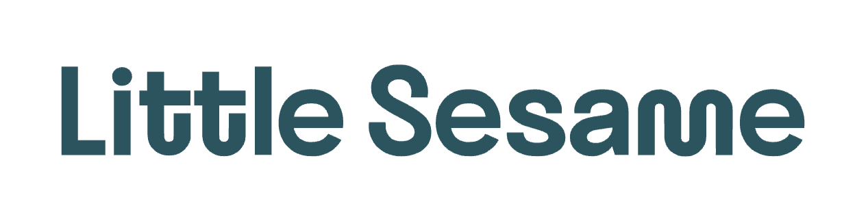
Captivate hungry and thirsty shoppers alike with logo design ideas from healthy soda shop Olipop and hummus retailer Little Sesame. Similarly simple yet playful, both logos leverage unique fonts and fun shapes.

Clothing logo design ideas
Simple and chic yet easy to recognize, Dôen’s logo reflects the brand’s laid-back, effortless elegance.

Personal care logo design ideas
Both Credo Beauty and Saje Natural Wellness choose dark colors and typography-forward looks for their logos.


Jewelry logo design ideas
Fine jewelry purveyors Fewer Finer and Mejuri both choose simple and elegant font styles that reflect the simple and elegant pieces they sell.


Ecommerce logo design ideas
Take some ecommerce logo inspiration from the wildly successful skin care brand Bushbalm.

Retail logo design ideas
Let MUJI and ALOHA Collection inspire your retail shop logo design.


Logo design tips and examples
- Know thyself
- Choose the right font
- Pay attention to negative space
- Remember scale
- Make it dynamic
- Simplicity is key
With so many different cool logo ideas to choose from, there are a few best practices to keep in mind:
Know thyself
Before starting a logo design journey, know your brand—not just your aesthetics and design sensibility but your values, mission, and overall vibe. Play with word clouds and mood boards; study your market for potential trends to follow or avoid; free-write or sketch potential logos for your online store; and ask for input from friends and coworkers.
For example, Joshua Tree Coffee takes its logo inspiration from both its name and the flora that surrounds the shop. Its vibe, similar to the funky trees that give the shop its name, is both welcoming and quirky.

Choose the right font
Typefaces can be wonderfully complex, with the slightest variations making powerful changes in meaning and appearance. Different types have different connotations, from the modernist simplicity of sans serifs to the academic heft of beveled type.
Jewelry shop Aurate goes all in on font by choosing a loud, ultra-bold, all-caps style for its logo.

Pay attention to negative space
Some of the most recognizable logos use negative space to add layers of meaning. Think about the arrow in the FedEx logotype or the peacock silhouette in the NBC logo.

Remember scale
A good logo is a good logo anywhere—on an Instagram post, in an email signature, in a window display, or on a billboard. Think about how your logo will look in all sizes. Will it stay legible? Do the individual elements pop or blend together?
Great logos are simple and versatile and can tell your brand’s story across a wide array of formats. For example, Great Jones has an abbreviated logo designed for use in smaller places. Great Jones chose a stylized G enclosed in a dark green oval, which nods to the brand’s main logo.

Make it dynamic
A strong logo provides visual interest, can adapt to different contexts, and exudes energy. For example, Crap Eyewear’s logo suggests that it’s moving, much like the ripples on the surface of the ocean or a pool that reflect in your sunglasses on the perfect summer day.
The movement keeps it interesting, reflects what the brand sells, mirrors its playful vibe, and is easily adaptable in different situations.

Keep it simple
Simple, clean logos are timeless and versatile and can grow with your brand over time. They also allow your products and packaging to stand out more.
For example, luxe olive oil company Brightland opted for an ultra-simple logo to let the custom art on its bottles shine.

What are the best logo design tools?
Here are some of the top software options for creating your logo design:
Shopify’s free logo maker
The Shopify logo maker is a free logo generator that guides you through the logo design process with a series of questions about your aesthetic and design preferences, your business and audience, and the kinds of places you’ll be using the logo. It’s incredibly easy and fast to use and creates dozens of customized logos for you to choose from in seconds.
Canva
Canva has a vast collection of logo templates for every design style. Browse or use search terms to narrow the results and find a basic form to get you started. Once you choose a template, you can customize your text, logo colors, and shapes. Canva also makes it easy to collaborate on your project with friends, team members, and other designers.
LogoMakr
LogoMakr starts with icons and graphics (rather than templates) and lets you mix and match different images and shapes to create your own custom logo. The brand boasts millions of graphic choices and a fast turnaround time.
Adobe Illustrator
Adobe Illustrator is a professional tool for more advanced users. Illustrator is the industry standard, allowing for total customization and endlessly scalable vector designs. However, there is a bit of a learning curve for those who are unfamiliar with the tool.
Logo design FAQ
What makes a good logo?
A good logo should be simple but strategic in its messaging and balance legibility with meaning. Great logos have these qualities in common:
- Simplicity. Is it instantly recognizable?
- Scalability. Does it translate to different media and platforms?
- Story. Does it convey some larger truth about your brand?
- Staying power. Is it timeless or trendy?
How do I design a logo?
The process of designing a logo includes:
- Define your brand identity.
- Seek inspiration.
- Determine your logo type.
- Decide on a color scheme.
- Pick a font.
- Fine-tune a few logo designs.
- Solicit feedback.
- Choose the most representative option.
Can you design a logo yourself?
Yes. Start by researching the current landscape. Consider what resonates with you and your customers. Sketch some potential ideas, and use an online logo design tool to refine your concepts.
What is the golden rule of logo design?
The golden rule of logo design is distinctiveness. You need a logo that sets your brand apart from the competition, catches your target consumer’s eye, and perfectly encapsulates your brand. Try starting with your company’s unique value proposition, and use it as a jumping-off point for creating a logo that is just as unique.

