Once you complete the initial development of a website, there are still a lot of things to do. In order to keep things running smoothly, it’s important to maintain and monitor a site for possible issues, which could affect both its usability and profitability.
For merchants who run an ecommerce business, their whole business depends on the website . Even a tiny issue can significantly affect their bottom line.
To improve your client’s profit and avoid any issues, consider these five actionable pieces of advice on maintaining a healthy ecommerce site for your clients — based on our own website maintenance strategies — that you can implement today.
You might also like: 5 Lesser Known but Powerful Web Developer Tools that Increase Productivity.
1. Move third-party code into Google Tag Manager
The site you’re maintaining probably has Google Analytics, Adwords, and other code snippets. Google Tag Manager lets you centralize and manage all that code from one place, without having to manually go through the code and hard code things.
It works like this: you put Google Tag Manager's code snippet in `<head>`, and whenever you need to install some tool (e.g. Analytics, Hotjar, or LiveChat), you go to the Google Tag Manager website, and add that code as a new tag.
The great thing about Google Tag Manager is that you can choose when you want which tags to fire, by defining a trigger (e.g. when URL contains 'thank-you').
Tag Manager is a better alternative than having third-party code all over the website because:
- You can make the site faster by having greater control when each script is called.
- The marketing team doesn't need developers just to try out some new tool.
- Everything is in one place for the easier management.
- You can easily remove tools you no longer use.
- You can trigger tracking events without messing up HTML code.
- You can set up advanced analytics, using variables, triggers, and data layers.
- You can quickly revert the changes in case something goes wrong.
- You can test new code to make sure everything works as expected before making going live.
Here are some of the things we did with Google Tag Manager: Google Analytics is fired up for every page; an event is triggered in Google Analytics whenever someone creates a trial (or fails); whenever someone converts into a paying user, their data in Google Analytics is tagged with how much money they've paid, so we can see how much revenue each marketing campaign brought in.
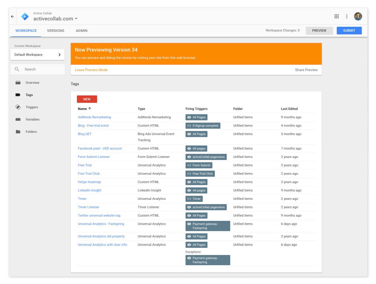 All code snippets you’d otherwise hard-code are placed as tags in Google Tag Manager for easier management.
Shopify also lets you simply add Google Tag Manager to your client’s ecommerce website.
2. Monitor 404 pages in Search Console
Google Search Console lets you see how Google sees the website you’re working on. It suggests what HTML improvements you can make, lets you see how the site appears in search results, who links to the site, all the pages Google indexed, and more.
I find one of the most useful things about the Search Console, is the Crawl Errors section. It lets you see all the websites that link to non-existing, 404 pages on the website. This is bad both for SEO and user experience.
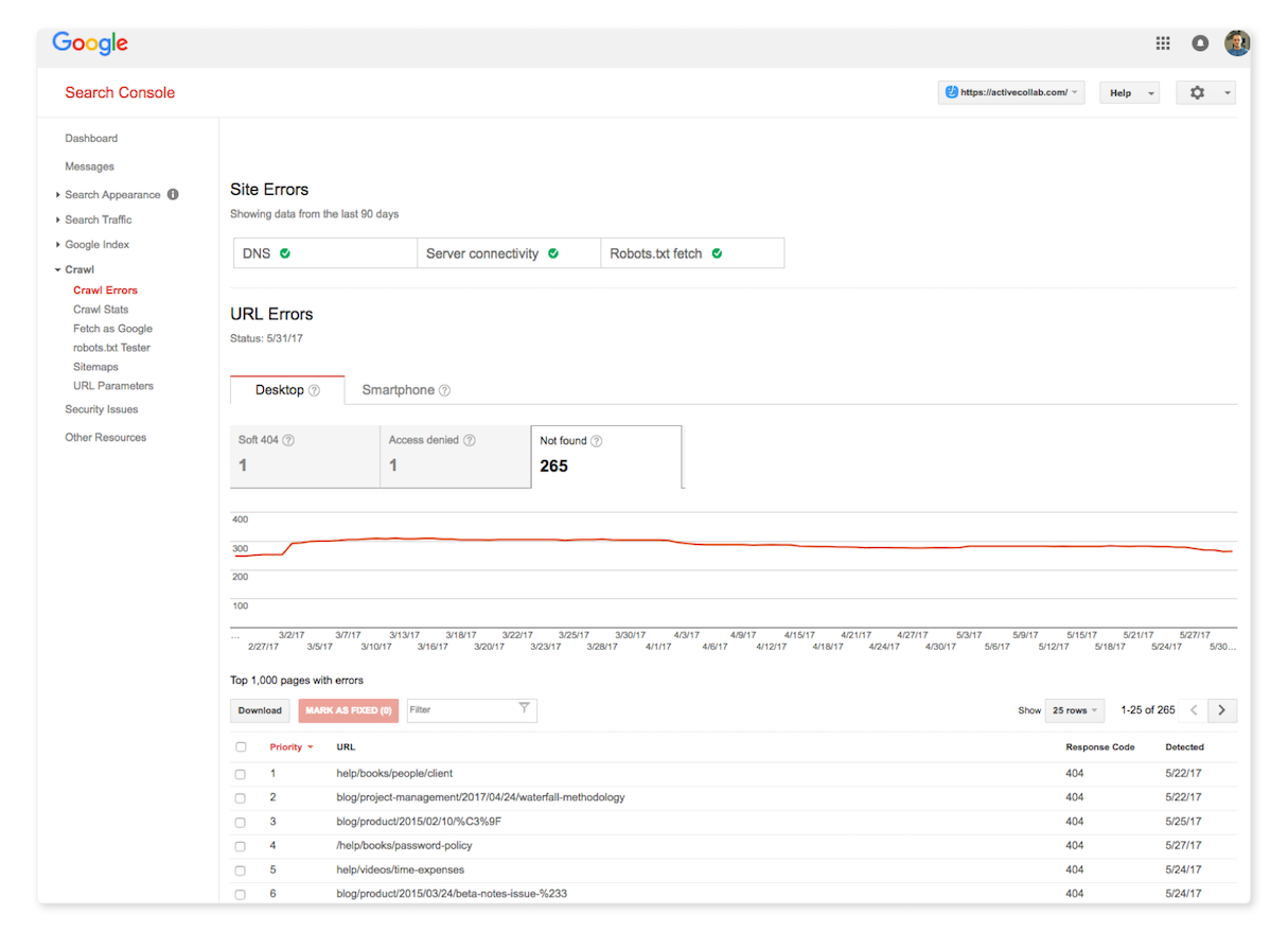 Once you round up all the 404 errors, you have two options: you can create pages for the missing links, or you can set up 301 (moved permanently) redirects. Of the two, setting up a redirect is much easier and faster, plus you consolidate all the link juice and divert it to where you choose.
Here’s an example of what we did: a lot of websites linked to our plug-ins page. When we updated our software, we replaced plug-ins with add-ons. We didn't want to lose the SEO value of those links (and we wanted to help our users find what they need), so we added this line to our Nginx server configuration, which redirects anyone who visits any URL that has plug-ins to our add-ons page:
rewrite ^/plug-ins.* https://activecollab.com/add-ons/ permanent;
You might also like: The 20 Best Atom Packages for Front End Developers.
3. Conduct NPS surveys
Net Promoter Score (NPS) is a tool that lets you measure customer relationship. It works like this:
- The company sends each customer an email with a question: "How likely is it that you would recommend our company/product/service to a friend or colleague?"
- The customer has to click a number from one-to-ten, and provide an optional comment.
The beauty of NPS is that it’s both easy to implement for the business owner, and valuable for developers (so they can figure out what needs redesign or additional coding).
Based on the score people give you, you put them in one of the three categories:
Promoters — People who give the company nine-to-ten are its promoters. They love the service and the marketing team can ask them for testimonials, reviews, guest posts, SEO links, and more. For example, we ask our promoters to write a testimonial, and have a special category on our blog called Customer Stories that’s filled with stories from people who love our product, of which, we then use for remarketing.
Passives — Those who give seven-to-eight are passives. They are somewhat satisfied but could switch to competitors and churn. The company should focus its energy on these and give them special offers, webinars, etc.
Detractors — People who give anywhere between one to-six are detractors. The company should try to understand why they aren't satisfied, and remedy the root cause through redesign.
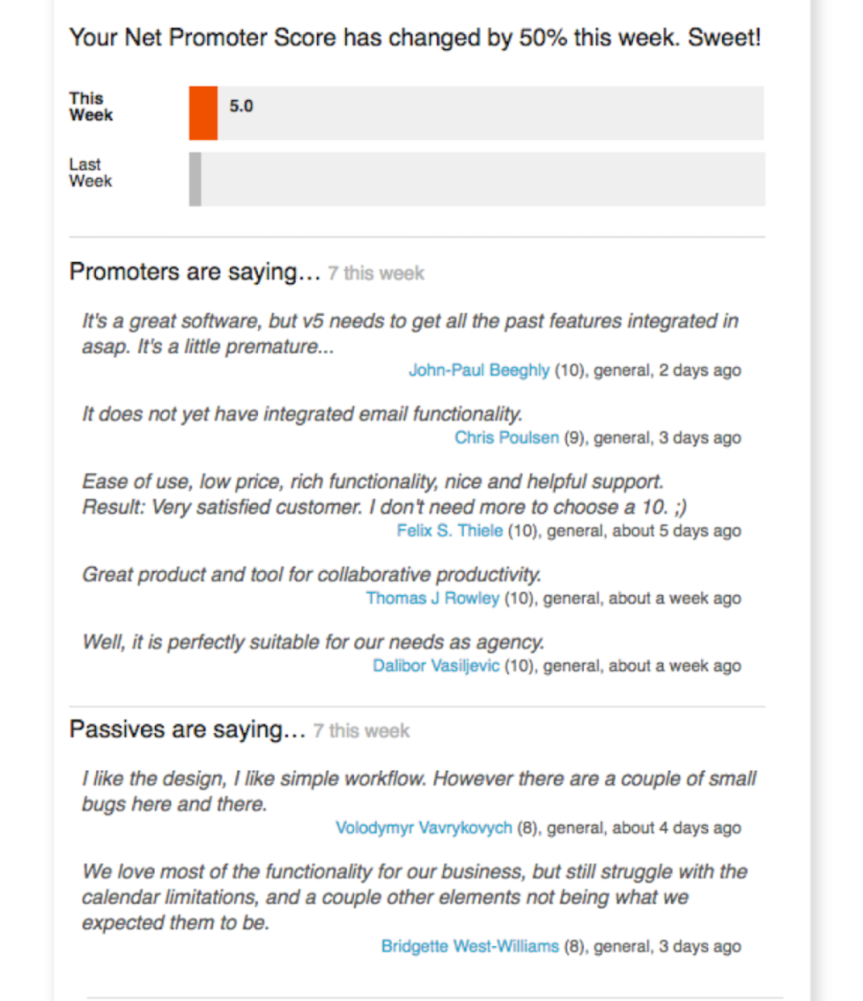 Here’s a guide on how to connect your Shopify store through Zapier with AskNicely, so that the business owner can do efficient NPS surveys and improve the website.
4. Do A/B testing on problematic pages and search results
When it comes to ecommerce, you as a designer should play around with the size and layout of product grid. Hugo Jenkins from Usabilityhub conducted an experiment, and found that larger images increased sales. This makes sense. When someone’s on a product page, they want to see the product up-close, without having to squint.
Baymard Institute also gave a great suggestion regarding images: product pictures should be in a real environment so people can get a sense of the scale of the product (and not have to wonder whether the backpack they're looking at is actually large enough for their camping trip).
You should test things and see how they affect conversion rate.
Next, based on the funnel analysis, you should test pages with the biggest drop-off rates. You should focus on these pages because they can give you the best return on your investment. For example, design and development costs you the same, no matter if it's a high-traffic or a low-traffic page, but the high-traffic page will make 10x more impact than the low-traffic one.
Here’s an example of what we did: we made an A/B test on one of our landing pages, where our pay-per-click ads are directed to. After the test, we found out that more people will try out our product if there's a footer — which goes against the common advice that you shouldn't include a footer on a landing page, so visitors can focus on one thing. Based on that, we decided to include the footer on all our landing pages.
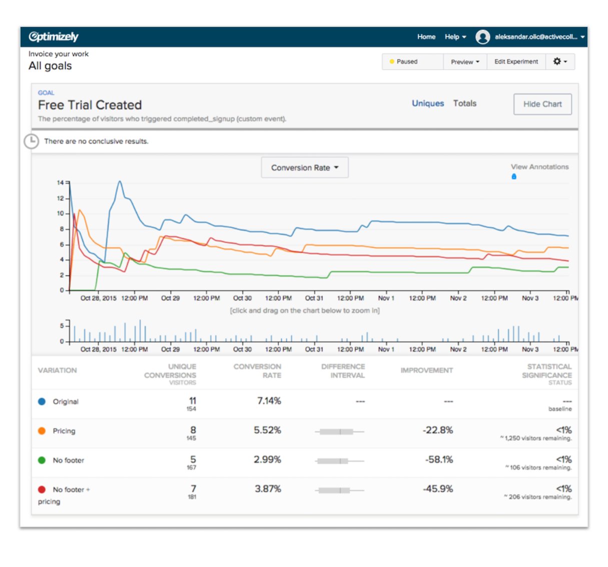 Multivariate testing of one our landing pages resulted in some valuable insight into how we use footers.
You might also like: How to Use Google Analytics to Improve Your Web Design Projects.
5. Watch how real people use the site
When the site is being built, you often overlook some things because you’re trying to finish the site on time. Or, you simply decide to cut testing time and fix non-critical bugs once the site is live. The best way to find bugs and come up with improvements is to watch video sessions on how real visitors use the site, and to put yourself in their shoes.
For example, when we built our site, it didn't occur to us to see how it looks once Google Translate goes through it. Once we watched user sessions, we noticed that a lot of people translate the site to their native language, which breaks the layout, e.g. the text on a button gets longer than the button's width, and so the CTA overflows.
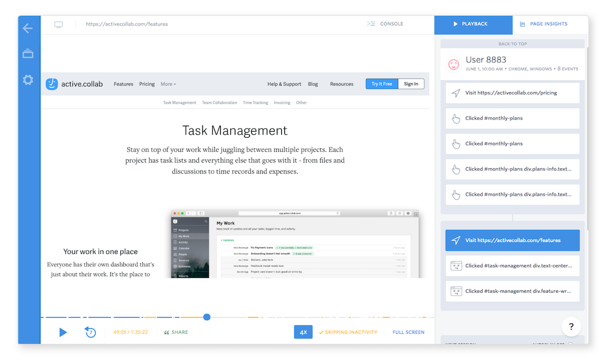
We've put FullStory on our site, and watch the sessions once every two months (you should do it more often if you work on a larger website). Video sessions are invaluable because you can see the website through someone else's eyes, the narrative, and the job the user wants to do.
We can see how a visitor uses our site and track their whole journey, from the moment they land to the moment they create a trial (or leave).
After each session, we write down at least 20 bug fixes and improvements ideas, which we later implement. For example, we can see where people tried to click a million times in frustration (which is why those clicks are called "rage clicks").
The best thing is that we can see those rage clicks happening within wider context (what they visited before, what they did on the page before/after that, etc.), so we can then try and guess why they clicked a bunch of times, and develop the missing functionality. This wider context makes video sessions more valuable than simple heatmaps.
Video sessions help us see customer journey from one page to another, which in turn helps us come up with ideas on how to make their journey even better.
 A note of warning: if you film sessions, be sure to blur any personally identifiable information and sensitive data, for a host of ethical and legal reasons.
Wrap-up
Maintaining a website takes as much work as developing it in the first place. It’s important to keep in mind that development and maintenance are two totally different types of work. Most designers and developers build something and never learn how their work performs.
 But once you know what it’s like to maintain the site you’ve built, you can improve your skills and build better sites in the future.
Read more
- Free Webinar] Developing with Shopify: Using JavaScript to Add Ecommerce to Any Website
- Getting the Most Out of Chrome Developer Tools: 4 Modern Features You Need to Know
- A Modern Approach to CSS Pt. 2: Building Resources
- The 10 Most Useful Browser Dev Tools for Front End Developers
- Free Webinar] Getting Started with Sass and Shopify

