 You can hear the admiration in Carson McComas’ voice when he describes one of his favorite clients, business owner Thomas Pool.
“He’s always game to push the envelope,” McComas said. “My own personality is I’m going to get all my ducks in a row, polish them all up, test them, and make sure everything’s perfect before I pull the trigger. Thomas is like, ‘people want this, let’s do this.’ And then he’s super successful doing it.”
The contrast in how these two get business done is no negative, instead it’s only made their working relationship stronger.
Pool’s willingness to try out new ideas, made the job of revamping his entire ecommerce site, Inked Gaming, that much more successful.
And the constant research, testing, and iterating McComas and his agency Fuel Made performed, increased overall site revenue for Inked Gaming by 30 per cent.
Yeah, just let that number sink in.
The relationship between a merchant and web design or development professional is critical, and the impact you have on a merchant’s bottom line can be stunning, if not outright radical.
You might also like: How Bold Commerce Built an App Development Company From the Basement Up [Part I]
One quirky entrepreneur masters Reddit
Once a contestant on TV show ‘The Biggest Loser,’ Thomas Pool has a colorful history (think jack-of-all-trades type), but has been an entrepreneur through-and-through. Originally, he started a bricks and mortar retail gaming store, which he sold, switching his attention to online instead.
Pool launched Inked Gaming, an ecommerce site that sells custom gaming playmats (picture something like a big mouse pad). A unique product, Inked Gaming did well playing to a niche market of online gamers.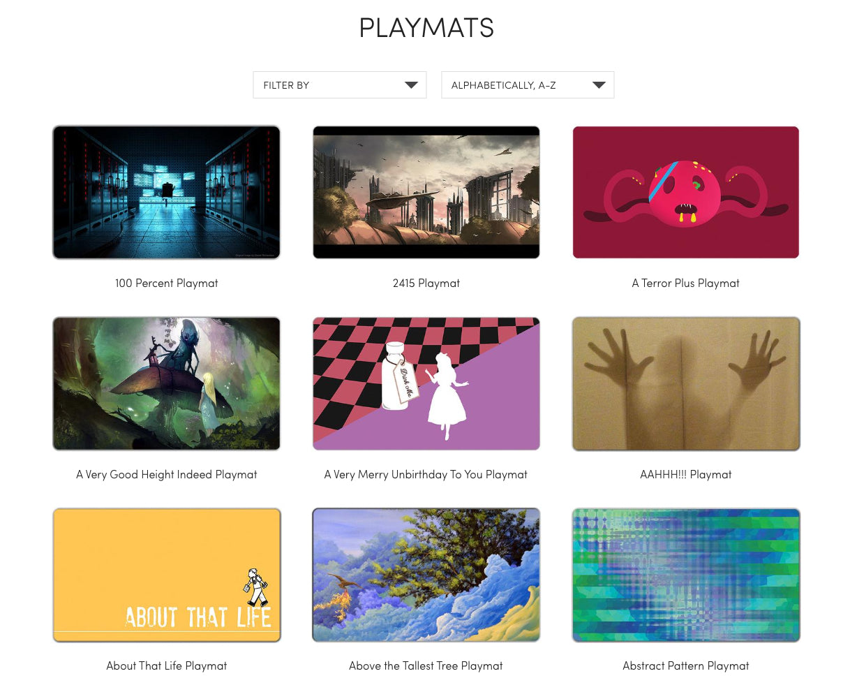
“He very successfully used Reddit and other platforms to spread the word, and built a crazy engaged audience of tabletop gamers who love these playmats,” McComas explained.
Despite growing a devoted group of customers, Pool’s big challenge lay in his website’s user experience.
McComas says because the product was so well-loved, and by a group of users who were often more technically inclined, most were willing to tolerate a sub-optimal experience in order to figure out how to order the custom product.
“That initial group of users were very tolerant of a pretty crummy user experience because they wanted it pretty bad.”
That initial group of users were very tolerant of a pretty crummy user experience because they wanted it pretty bad.
The way Inked Gaming works is that customers upload artwork, which has to be sized and cropped correctly. Most customers want to see what their custom order will look like before they hit the buy button, which wasn’t an option at the time. Additionally, customers typically need to upload high resolution art, something Shopify’s 25 MB file upload limitation wouldn’t allow, causing further problems.
All these issues meant support requests were through the roof, and averaged two support emails per order (yes, you read that right), wreaking havoc on Pool’s small team. And custom products meant shipping times could vary significantly, meaning more questions from eager customers.
“He was struggling to grow beyond that crowd and that’s when he engaged with us,” McComas said.
Fuel Made goes 1, 2, 3
Pool brought in Shopify Expert Fuel Made with the hope of hitting a number of goals:
- Improving conversion rates overall
- Improving mobile experience
- Addressing any technical limitations (customers upload high-resolution custom art to make products)
- Reducing customer service costs
- Addressing concerns customers have about shipping time
The first and largest challenge McComas and his team tackled was the upload process.
“We put a lot of careful thought and user research into coming up with a solution that would address all the key pain points of this process — and we nailed it.” (Tweet this)
Many of the support questions from customers revolved around how exactly the uploaded image would cut out, what size it would be, and how it would look.
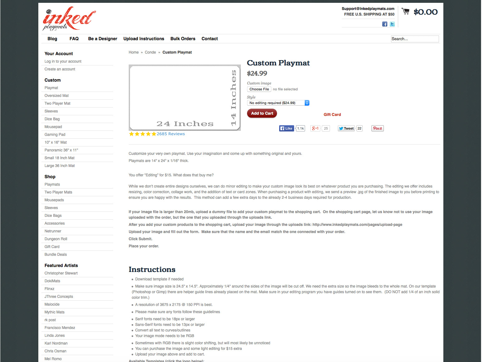 The original page where customers could place an order.
The first step was doing the research; McComas had several conversations with Pool and his support team about the common user pain points. A self-described “user experience guy” for many years, McComas suspected that what he calls a “one, two, three process” would be a good place to start.
“It’s walking you through one step at a time. It’s a lot to deal with when you’re buying a custom product, and with every little ounce of complexity conversion goes down,” McComas said.
It’s a lot to deal with when you’re buying a custom product, and with every little ounce of complexity conversion goes down.
The team then created wireframes that outlined each step:
- Upload image from Dropbox, Google Drive, or your computer.
- Custom crop guides make sure the image is the right size and remove ambiguity around how the product will look, where it will be cut, etc. They even offer an upgrade for help with editing.
- Add to cart (which you can't do until you've completed the correct steps).
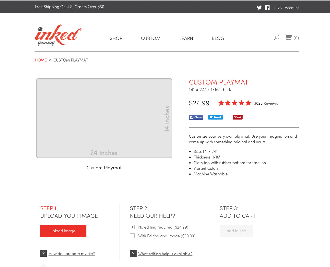 Today, customers place their custom orders here.
It’s a lot to deal with when you’re buying a custom product, and with every little ounce of complexity conversion goes down,” “We really tried to pull the complexity out of it, by breaking it into simple steps that customers they could follow, one, two, three through the process.”
You might also like: 2 Guys. 6 Months. 7 Apps.
Tutorial time: Uploadcare
When it came to addressing the issue of uploading high resolution art, the Fuel Made team brought in a tool called Uploadcare, and decided some theme work needed to be done.
McComas even outlined his technical process in detail for the Web Design and Development Blog below:
Here’s a quick tutorial on how to create a simple Uploadcare integration with Shopify, so you can give your customers a way to easily upload large files with their order, during the checkout process. This can be used for several different use cases, such as custom print shops, audio/video files for transcribing, and more.
We’re using the Minimal theme for simplicity, but the process shouldn’t be too different for any other theme.
- Create an Uploadcare account, and an uploadcare project.
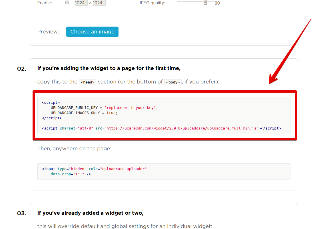
- Configure your widget using this page (don’t close it, we’ll need it in a minute).
-
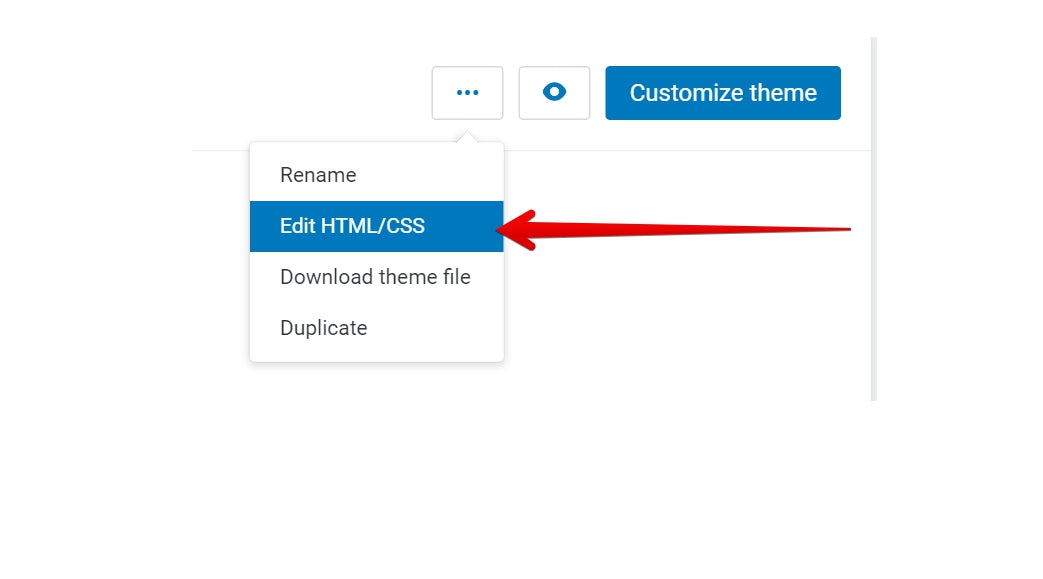
In your Shopify admin, open the Edit HTML/CSS interface for the theme where you’ll add the upload widget.

-
Create two new snippets, name them
uploadcare-settingsanduploadcare-fields. - Copy the “script” part of the widget configuration from step two to the
uploadcare-settingssnippet.
Example:
This file contains bidirectional Unicode text that may be interpreted or compiled differently than what appears below. To review, open the file in an editor that reveals hidden Unicode characters. Learn more about bidirectional Unicode characters<script> UPLOADCARE_PUBLIC_KEY = 'replace-with-your-key'; UPLOADCARE_IMAGES_ONLY = true; </script> <script charset="utf-8" src="https://ucarecdn.com/widget/2.9.0/uploadcare/uploadcare.full.min.js"></script> - Add the following code to the
theme.liquidfile before closing the</body>tag:
This will add the widget script to the cart page.This file contains bidirectional Unicode text that may be interpreted or compiled differently than what appears below. To review, open the file in an editor that reveals hidden Unicode characters. Learn more about bidirectional Unicode characters{% if template == 'cart' %} {% include 'uploadcare-settings' %} {% endif %} -
Use the cart attribute wizard to create a markup for your new input field, use the “text - short” type.
Copy the generated code and paste it to theuploadcare-fieldssnippet. -
Copy all of the “data-” attributes from an “input” part of the widget configuration from step two to
uploadcare-fieldssnippet.
-
Replace the
type=”text”withtype=”hidden”,and add therole="uploadcare-uploader"attribute to your input field.
You should end up with something similar to this in youruploadcare-fieldssnippet:
This file contains bidirectional Unicode text that may be interpreted or compiled differently than what appears below. To review, open the file in an editor that reveals hidden Unicode characters. Learn more about bidirectional Unicode characters<p class="cart-attribute__field"> <label for="photo-1">Add a photo to your order</label> <input required class="required" id="photo-1" type="hidden" name="attributes[photo-1]" data-crop="1:1" role="uploadcare-uploader" value="{{ cart.attributes["photo-1"] }}"> </p> -
Add the following code somewhere in between the
<form></form>tags in your cart template:{% include 'uploadcare-fields' %} -
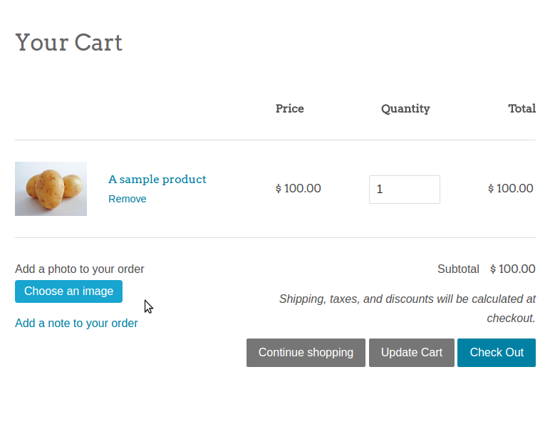
If everything is done correctly, you should see a new Uploadcare widget in your cart:
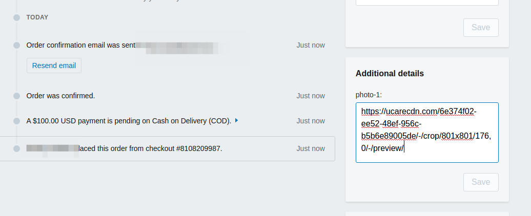
 And when the customer creates an order, you should see a new URL to the uploaded file in the additional details section of order in your admin interface:
The launch
After finding initial solutions to Inked Gaming’s user experience problems, McComas and his team iterated on the design, discussed with Pool and his team, and then repeated that process a few more times. Once the first version of the new site was launched they installed Lucky Orange, a tool that records what users are doing on your site, and in this instance, observed where customers were stumbling.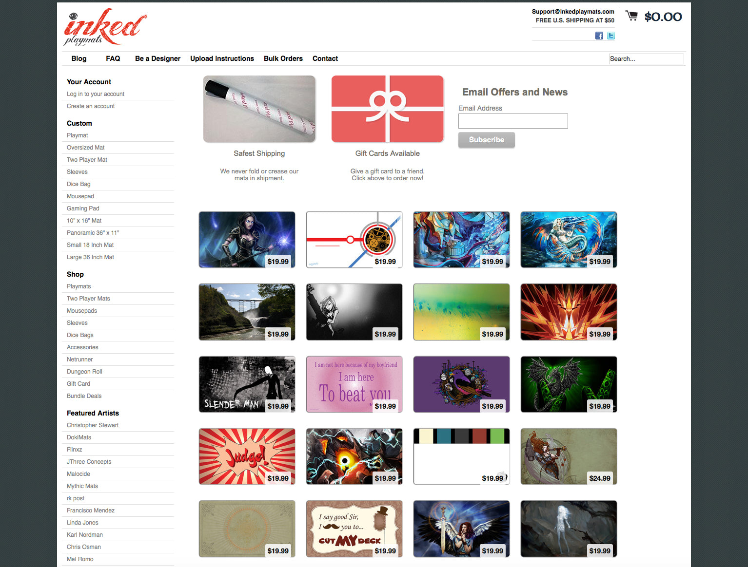 Inked Gaming’s homepage before the redesign.
“We were looking to see if our assumptions about the process were valid,” McComas explained. “Some obvious problems surfaced right away, which we started to address, and then we would watch again. Soon, we got it pretty good and now it’s pretty slick.”
The recordings helped Fuel Made iterate further, with a larger emphasis on getting the file uploaded into the editor smoothly. A big initial change was adding the ability to edit the uploaded image after it was added to cart. Users now have the option to see a preview and edit from there.
Another feature Fuel Made built to help lower Inked Gaming’s support costs was a shipping calculator. Confusion over delivery times wreaked havoc in the past, but these days the calculator sits on the cart page and creates some organization, by:
- Geo-locating the customer to determine their location for calculating shipping arrival times (no customer entry of location required).
- Letting the customer know when their order will arrive. “The algorithm behind this is tied to the shopper’s lead time, set per product by the store owner,” McComas explained.
- Presenting some urgency to ‘order within the next x hours’ to get it shipped by the given date.
Overall, the biggest change to the user experience was the design sensibility the Inked Gaming website suddenly possessed; it’s now open, clean, and inviting. According to McComas, design played a key role in creating a good user experience and helped solve difficult challenges.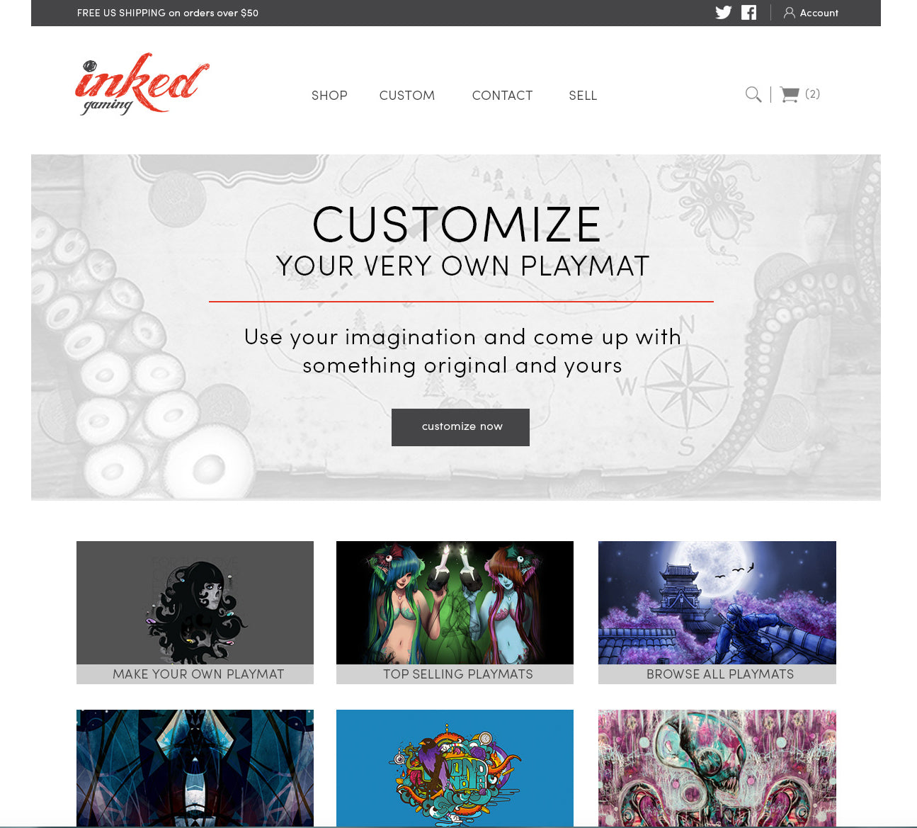 Inked Gaming’s homepage today.
“We put a lot of care into how the page felt when the shopper was on it. ‘Am I distracted? Is the content structured so that my focus is on the one, two, three experience?’” he explained. “Content is contextually connected to the step that you’re on. I think that’s important.”
The bottom line
After the relaunch of Inked Gaming, Pool saw his desktop conversion rate grow by 34 per cent, while his mobile conversion rate, which was abysmal beforehand, increased by 32 per cent.
Before, Pool was getting an average of two customer support emails per order — now it’s one customer support email for every 30 orders.
While the numbers truly speak for themselves, the redesign has also affected something less data driven; Inked Gaming’s industry perception. McComas says one of Pool’s major goals with the redesign was the ability to expand his business.
“He needed a website that looked less like a Reddit guy that put something cool together, and more like a professional company that knows what they’re doing,” McComas said.
He needed a website that looked less like a Reddit guy that put something cool together, and more like a professional company that knows what they’re doing.
The new look has had lots of positive benefits for Inked Gaming’s reputation, including increased interest from other retailers for wholesale opportunities. Pool’s also in the midst of expanding beyond playmats, and diversifying his business.
Removing barriers
For McComas, working with merchants means removing barriers.
“Our expertise is helping merchants leverage what they already have, and getting rid of barriers so that they can really grow.” (Tweet this)
Whether that means growing into new market areas or learning how to better convert traffic, McComas says user experience and design sensibility elevates the overall ecommerce experience.
“It’s a marriage between what a merchant has already accomplished and what we love to do, which is taking that business to a whole new level.”
*Special thanks to Francisco Mendez for his graphic art.
Read more
- How to Use Relative Pagination In Your Application
- Building Superpowered Merchants One Migration at a Time: How ICEE Social Found Success with Shopify
- Partner Spotlight: How Skyrocket Created a Brand-Based UX for Enerex
- Partner Spotlight: Disco Brings Useful Gifts to Shopify Plus
- How Verbal+Visual helped an international home decor brand get a 163% revenue boost
- Determination and Devotion: How Two Entrepreneurs Changed the Ecommerce Industry in Mexico
- How We Built a Global Empire from a Small Island in the Pacific Ocean
- How Shopify Plus Partner Maestrooo Balances Building Themes and Apps, with Client Work
- How Bold Commerce is Innovating in the Present, and Dreaming Big for the Future [Part III
You might also like: How Pixel Union Diversified Their Service Offerings and 10x’d Their Business

