Attractive and unique ecommerce website design has always played a key role in a successful online sales and marketing strategy.
In fact, studies have shown that it takes 50 milliseconds for visitors to decide if they’ll stay on an ecommerce site or not. You get only an instant to impress users, which is why website design is so important for your ecommerce business.
Whether you’re about to create your first online store or you’re thinking about redesigning your current site, this guide is for you. Browse examples of great ecommerce websites, tips for choosing the right ecommerce platform, and advice to get your online business looking its best.
4 elements of great ecommerce website design
The best ecommerce websites all have one thing in common: they center the user experience from first visit to post-checkout. There are four main components every ecommerce business should consider when designing a website.
1. Building trust with customers
When someone visits your ecommerce store or website for the first time, they may not know anything about your brand, the quality of your products, or your commitment to making customers happy. Deals might earn their consideration, but they’ll need to trust you before they actually go through with a purchase.
Customer trust is hardest to earn when you don’t have any customers, so you’ll want to incorporate the following trust indicators as you build your website.
Contact information
Include an email and, if possible, a phone number and a mailing address on a contact page and in the footer of your site. This type of information, along with an about page, helps potential customers feel they’re buying from a real person.
A return policy
A return policy not only makes it easier for people to send back products that don’t satisfy them, it actually increases sales by lowering shopping cart abandonment and instilling the customer with a sense of confidence and trust that they can send back an item if they need to, without any transaction fees.
Not only does Supergoop have a comprehensive returns page and self-directed returns portal, it also boasts its free returns policy on every product page.

Technical certifications
By adding Shopify Payments to your ecommerce website, you’ll have access to advanced features and payment services featuring the latest security technology for protecting your customers’ information. Add graphics or badges to show your security compliance and all the payment methods you accept.
Customer reviews and testimonials
Many ecommerce solutions have app integrations that let you import content into your site. This includes customer photos, your Instagram feed, and even customer reviews. These are signals to potential customers that your brand is trustworthy.

Free Reading List: Online Store Design Tips
Your online store's appearance can have a big impact sales. Unleash your inner designer with our free, curated list of high-impact articles.
2. Creating a visually compelling experience
Perception is everything when selling your products online. People form their first impression of your ecommerce store in mere milliseconds. Making that impression count rests largely on high-quality images, consistent branding design, smart use of psychological design, and a clear visual hierarchy.
Here are some best practices for each of these elements:
- Photography: Product photography is like an ambassador, sharing the promise of your product online. Shoot product photos on a plain background and in many angles. Lifestyle photos are important to show your product in use and in context within an environment. They also reinforce a brand aesthetic.
- Color: Color is one of the most powerful tools you can use to spark interest and emotion on your ecommerce site. It can also be used to draw attention to specific sections of your website and lead the customer journey. Smart use of color can help with accessibility, too.
- Fonts: While the words you write on your ecommerce site share information, it’s the typography that communicates the emotion behind that information. It’s a good idea to stick to two fonts and create a hierarchy between them. Choose one font as your header or title font and another to be your body font.
- Psychological design and visual hierarchy: Using psychological design principles allows you to influence customers’ decisions and guide their eyes with strategically placed elements, colors, and text.
Outdoor Voices’ homepage features lifestyle images to communicate its brand aesthetic and an aspirational lifestyle. It focuses on limited fonts for a clean look and a clear visual hierarchy.

3. Focusing on responsive design for mobile and desktop
The average American spends 4 hours and 37 minutes on a mobile phone each day. Luckily, if you’re building your business with Shopify, your store is already responsive. This means the site is user friendly on different devices and screen sizes, whether customers view it on a desktop, smartphone, or tablet.
When choosing an ecommerce website design based on mobile optimization, it’s best to personally test it to see if you’re happy with the transactional flow. If you’re not, there’s a good chance your customers won’t be either.
4. Designing clear navigation
Your website navigation should help customers find your products quickly and easily. Good navigation also helps improve SEO on your site so you get found in search results.
Stick to only a few menu headers in your top-level navigation. Be clear and direct when labeling these headers—this is no time to be clever. Key headers to include in your top-level navigation could include:
- Shop
- About Us
- Bestsellers
- Contact Us
Additional navigation links can go in your footer—the section at the bottom of your website. Return Policy, Terms of Service, and Contact Us pages can be linked here.

Free Download: SEO Checklist
Want to rank higher in search results? Get access to our free, checklist on search engine optimization.
25 ecommerce website design examples (and why they work)
The best ecommerce website design examples are those that consider all the elements above for a clean, appealing, user friendly design that communicates the brand and products clearly. Here are a few ecommerce website examples to inspire your own ecommerce design.
1. Thesus
 Sustainable shoe store Thesus (formerly Alice + Whittles) masters trust-building by promising customers a super-easy online shopping experience. It highlights its shipping and returns policy, plus an option to pay in installments if shoppers don’t have the cash upfront. Stellar customer support is highlighted right on the homepage with a handy size chart and returns links.

2. Welly
 Welly positioned itself as the fun first-aid brand with cute convenient packaging and kid-friendly bandage designs. That brand aesthetic is woven through its colorful website, complete with catchy copy and a clear CTA to Shop Now. The homepage is bold and dynamic without being cluttered.
3. Fred Jourdain
 Artists wanting to sell their art online, should follow Fred Jourdain’s lead. The homepage lets the arts speak for itself, filling most of the page. You can also find interviews on the website and read more about the inner workings of how he creates his art. This content offers value to the customer with a subtle nudge to shop the artist’s works.
4. MVMT
 MVMT’s core brand value, “Style shouldn’t break the bank,” is reflected in its website design. It presents sleek, sophisticated colors and styling that showcases watches, eyewear, and jewelry at affordable prices. Plus, it highlights collaborations with designers and provides a Trending Now section on its homepage so people can quickly check the latest designs.
5. Pure Cycles
 Pure Cycles uses a simple layout that makes it clear why you should care about the brand, and showcases its bestselling bikes. Its product pages also work to give you an in-person experience while shopping online. You can see close-up pictures of specific parts, learn specs, and read other information you need to make an informed buying decision.
6. Verve Coffee Roasters
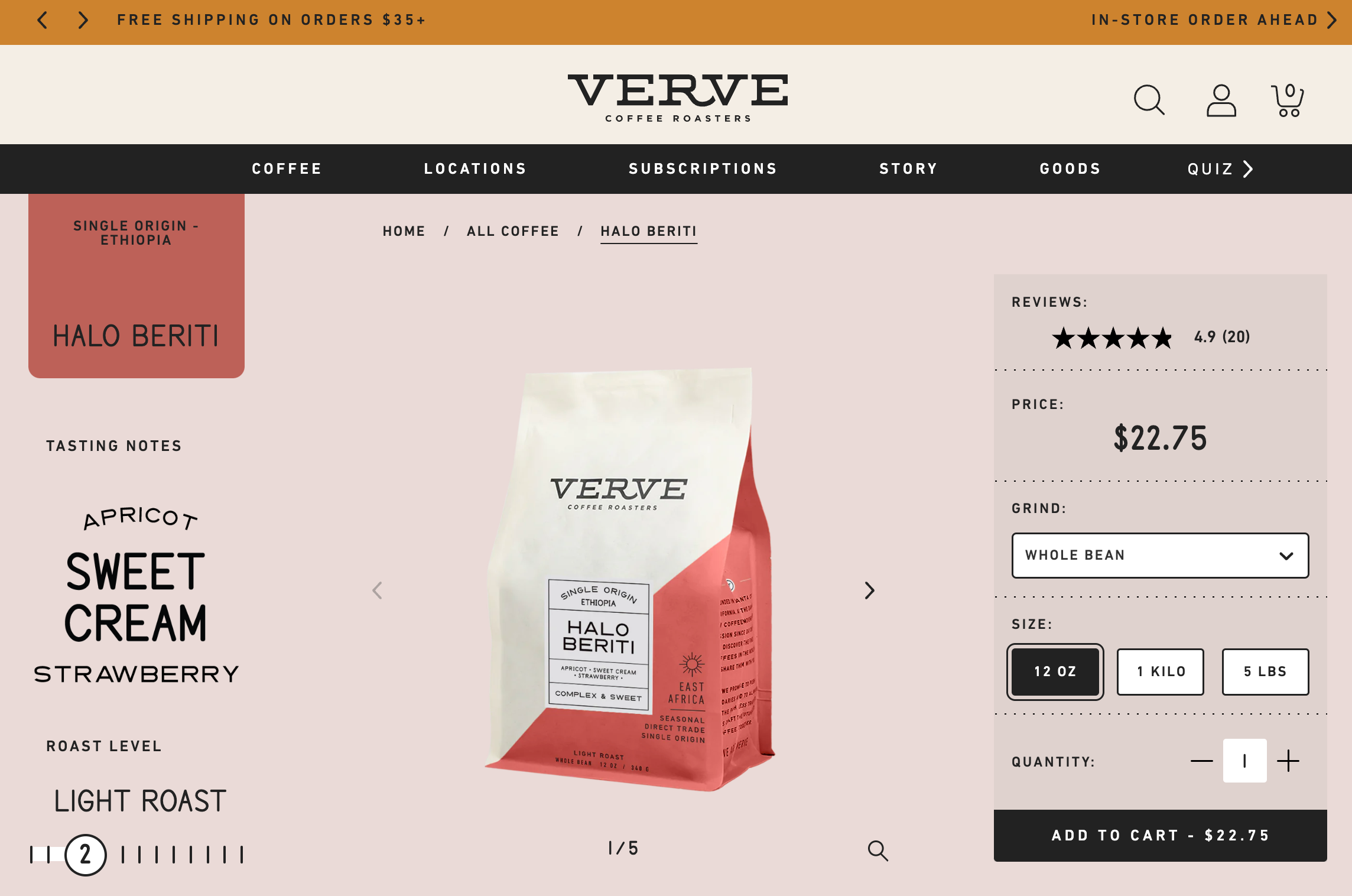 Verve Coffee Roasters uses customer reviews to build trust throughout its ecommerce website.
The online coffee retailer also uses evocative language paired with stylish photography to keep customers on the page, promising to be “classic and delicious” and serving lively descriptions, such as “the sweetness of golden marmalade.”
7. Finn
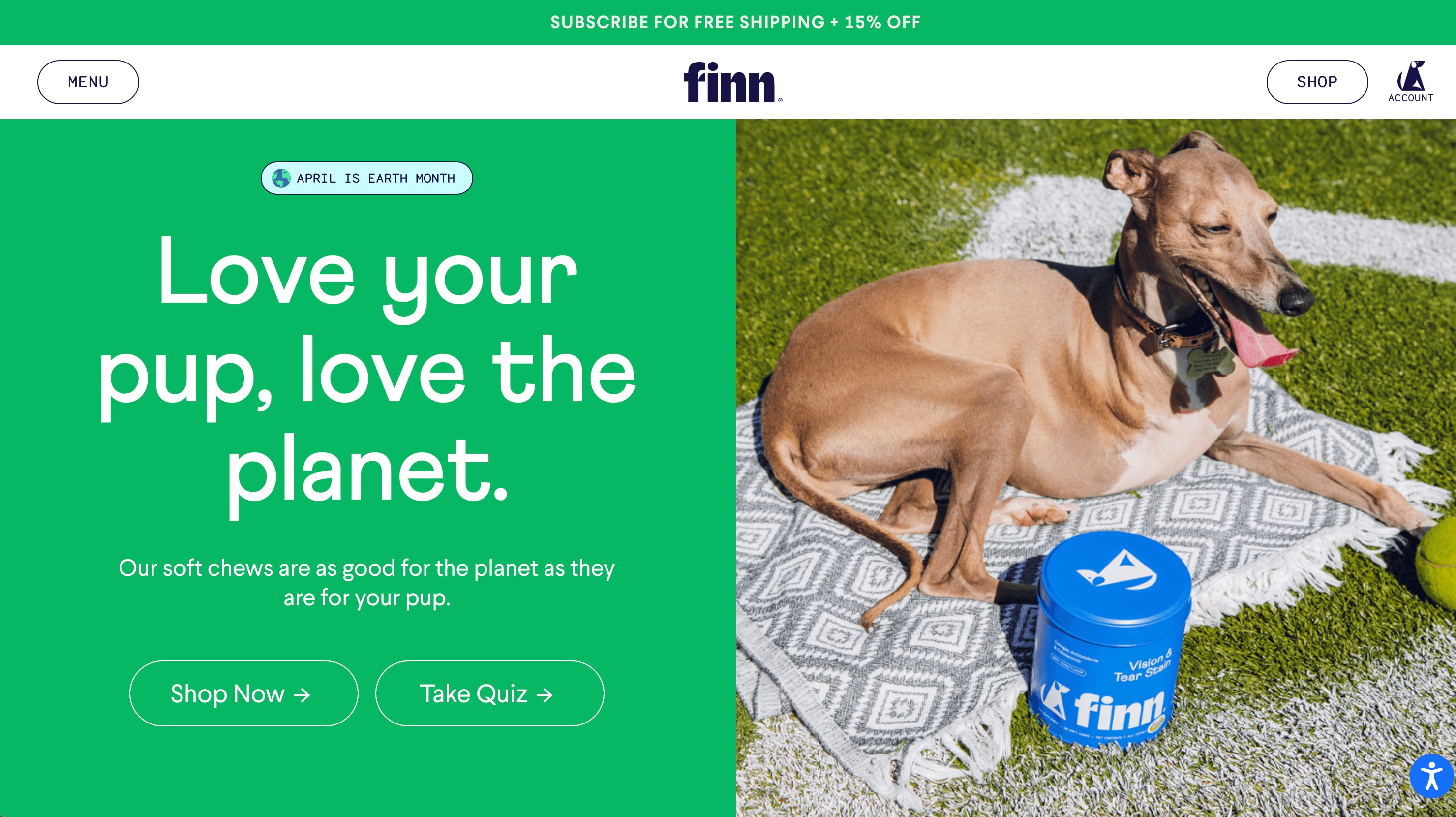 Finn gives pet owners what they’re looking for: big photos of happy dogs that inspire them to pamper their own. The brand’s website also uses simple fonts, lots of contrast, and page hierarchy that directs visitors to Shop Now or Take Quiz. An interactive quiz helps customers feel more confident about their purchases.
8. Hardgraft
 Hardgraft’s ecommerce store builds trust with buyers who want luxury goods and appreciate rugged, earthy aesthetics. Its brand mission and values are on display, telling visitors right away what they’re about. The brand’s product pages are on point, with crisp, bold images that share important product features and value propositions. And, it offers safe, worldwide shipping appealing to a broad international audience.
9. Topo designs
 Outerwear shop Topo Designs uses images that resonate with its target market—young and stylish outdoor enthusiasts—while using unique backgrounds to stand out from other outerwear brands. Another key website design best practice is how the brand communicates sales and incentivizes larger order values with free shipping over a threshold. The brand also offers a newsletter signup perk of a 15% discount, compelling customers to take action.
10. KETNIPZ
 Ketnipz is an Instagram comic turned brand empire created by Harry Hambley. You can find Bean, the main character, on murals around the world, throughout social media, and even tattooed on the bodies of fans. Ketnipz’s website design reflects Bean’s quirky personality, with bright colors, unique fonts, and seasonal updates to align product launches with upcoming holidays.
11. Chubbies
 Chubbies’ website design evokes its brand values with captivating product photography and witty copy. The sidebar navigation, although different from most ecommerce website designs, presents a neat menu where shoppers can find their products faster and easier.
12. KITH
 KITH’s homepage design grabs your attention the minute you land on it. The site feels clean, yet sparks interest, with links to treats and content such as lookbooks, films, journals, and more. KITH’s catalog is big, but product categories are still presented in a way that lets you quickly explore and find what you’re looking for.
13. Personal Fav
 Personal Fav appeals to its target audience by using trendy color palettes and fonts, with provocative imagery. While the site is bold and colorful, it’s not busy. Clear top level navigation gets customers quickly to the brand’s mission and product pages.
14. Satya Organic
 You can tell branding was a priority in skin care brand Satya Organic’s ecommerce website design. Once you land on the homepage, you’re met with earthy tones and signals that say, “If you’re looking for plant-based goods, you’re in the right place.” The footer of the website clearly lists the products’ benefits and certifications like USDA Organic, cruelty-free, fragrance-free, and Indigenous-owned.
15. Beardbrand
 Beardbrand takes a sophisticated, mature, and Old World approach to presenting its grooming products throughout its website design. Using a quiz, video of the founder, and blog posts that are worth reading, the site encourages you to stick around, engage with the brand, and buy.
16. Kylie Cosmetics
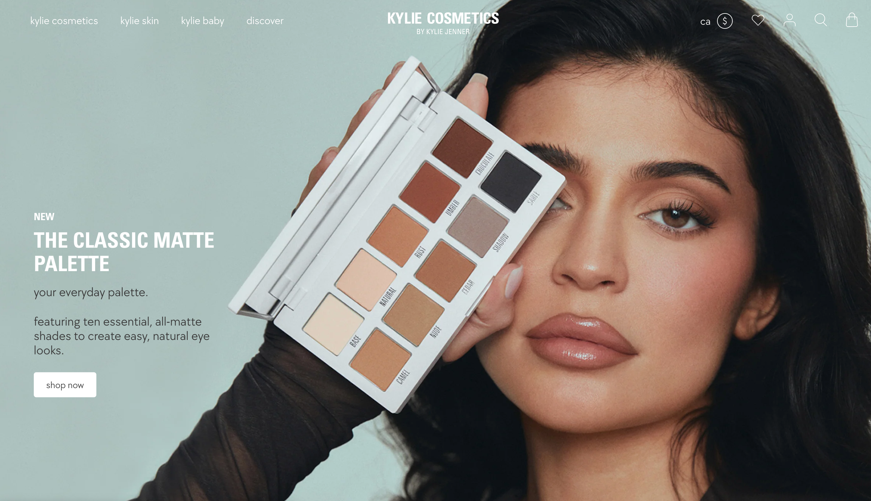 As soon as you land on the Kylie Cosmetics homepage, you see a picture of Kylie Jenner, a beauty icon for its target audience. Her endorsement immediately gives the site a huge trust and credibility boost. Each product is also well displayed on a white background, plus, when you hover over an image, you can see a person using the product in action.
17. Allbirds
 Sustainable apparel store Allbirds reinforces itself as a brand eco-conscious shoppers can trust through the targeted language in its copy, such as “Made with natural materials.” Trust is also achieved through its B Corporation certification and a full section of the site dedicated to sustainability and transparency. Allbirds’ lifestyle photos feature models that fit with its target market, making customers think, “These are my kind of clothes.”
18. Tiny Organics
 Tiny Organics’ ecommerce website design is crafted to alleviate the concerns of anxious parents. From high-quality photos showcasing the ingredients in each meal to a carousel of testimonials from real parents to endorsements from doctors and dieticians, Tiny Organics’ ecommerce website answers parents’ burning questions and reduces common barriers to purchase. Certifications and press endorsements add to this sense of security.
19. Tessemae’s
 Tessemae’s uses fan photos on its ecommerce site—user-generated content to help build trust. It tells visitors that Tessemae’s products are well loved among existing customers. Plus, the brand provides inspiration for the many ways its dressings and condiments can be used to create delicious meals, adding an extra incentive to buy.
20. Death Wish Coffee
 Death Wish Coffee has a really bold brand and it’s not afraid to express it in its storefront. It claims to sell “the world’s strongest coffee,” and everything from the website copy to the use of red throughout its website design makes you feel like you just drank a cup of it. Death Wish Coffee knows why most people land on its site: to buy its beans. Once you scroll down the homepage, the first thing you see is the option to buy ground or whole beans, or coffee cups.
21. Almond Surfboards
 Almond Surfboards uses soft elegant tones throughout its online store to give it a stylish but beachy feel. The imagery is creative and unique, which makes it feel like a high-quality brand from the minute you land on the page. In-context photography sells an aspirational lifestyle—even if you don’t need a surfboard, you might be compelled to own a piece of the brand through t-shirts, accessories, wall art, and more.
22. Leather Head
 Leather Head’s homepage layout is simple and matches the brand feel of refinement and luxury. The choice of color, font, product images, and copy voice and tone reflect the brand aesthetic that appeals to its target customer. Even if you’re not into sports, you’ll definitely want to browse and find a product for a friend or loved one who is.
23. Pura Vida Bracelets
 To foster trust, jewelry retailer Pura Vida Bracelets showcases five-star product reviews from thousands of customers on its ecommerce website landing page, on top of reviews from target-audience-appropriate media outlets like BuzzFeed and HuffPost. Pura Vida Bracelets sticks with the powerful and simple CTA Shop Now to get customers clicking. A ticker bar at the top of the page highlights promotions like free shipping.
24. Boba Love
 Boba Love is a small business with ecommerce design that guides visitors right into the shopping experience. It uses lifestyle images and product photography to communicate its brand values. Boba Love gets the product grid right—it’s clean and clear in directing what it wants visitors to do: buy Boba tea-inspired products.
25. Partake Foods
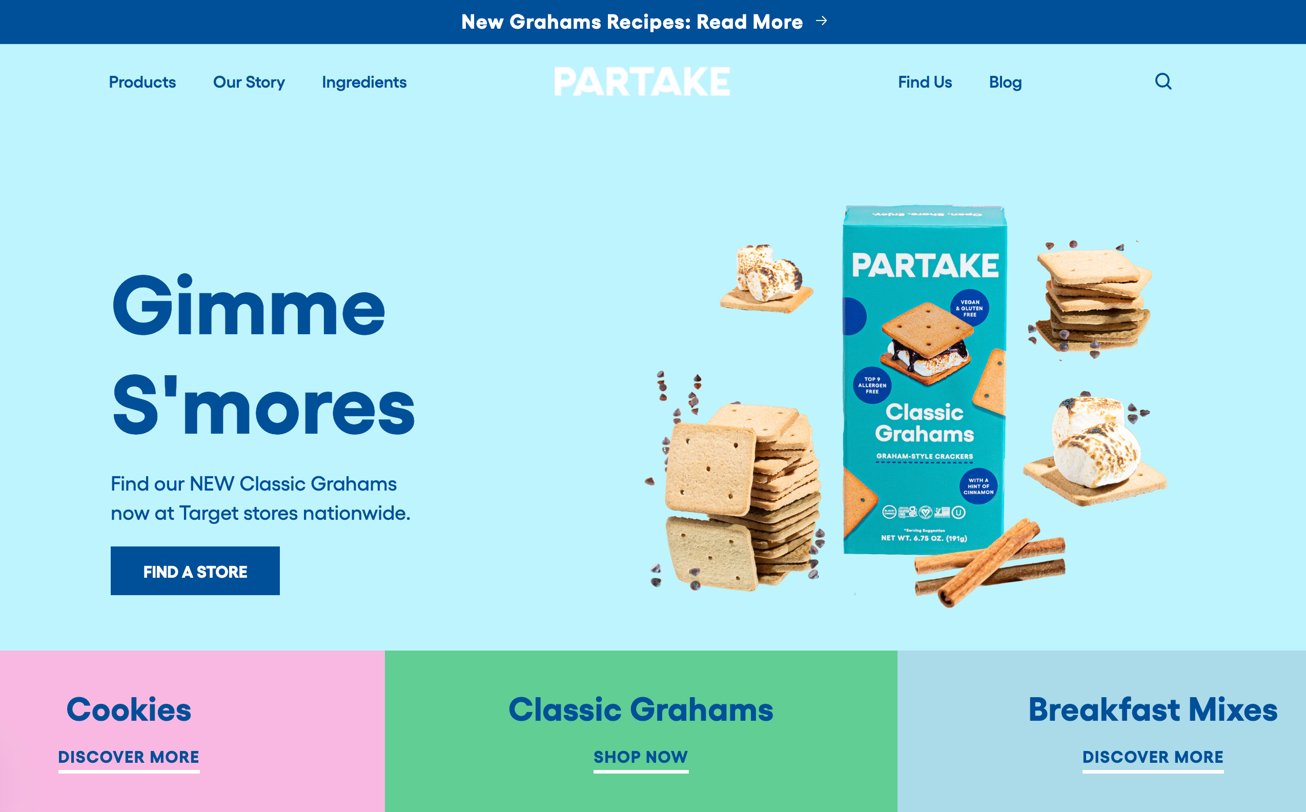 If you love healthy and eco-conscious cookies, you’ll love the website design for cookie shop Partake. Right away, you see reassuring copy, including “gluten-free,” “vegan,” and “allergy friendly” on its homepage. The deal is then sealed through ample social proof—press mentions and glowing customer reviews. The website footer also builds trust through allergy-specific certifications.
8 best ecommerce website design tips
While you’ll want to design your online store based on your established brand guidelines, there are a few best practices to consider to improve usability and customer experience. Your ecommerce site is the résumé for your online business. Whether you’re a startup or building your fifth ecommerce store, keep these website design tips in mind:
1. Keep it simple
Simple is always key to making more sales in your ecommerce business. The more distractions you put on your ecommerce website (think banner ads, pop-ups, too many colors), the more it takes away from making the sale. A good ecommerce platform will have a number of ecommerce website templates to choose from to help you keep your design streamlined.
2. Express your brand
It doesn’t matter if you’re a photographer, beautician, or dropshipper running an online business. People want to buy from established brands they trust and identify with. Take the time to define your brand and figure out what makes you different from competitors—then apply it to your web design.
3. Use the right platform
Use the best ecommerce platform for your online store. When using a platform like Shopify, you can set up a beautiful store with powerful ecommerce features and sell online quickly. A great ecommerce platform should be flexible and easy to use, allowing you to customize your ecommerce website to your exact needs. You can use Shopify’s online store builder, which offers the functionality to create your own store from scratch.
4. Have empathy
Put yourself in your potential customers’ shoes. How easy is it to navigate your ecommerce website? How does it make someone feel when shopping? How easy is the checkout process? Think about what your customer needs to make a purchase in your store and design it accordingly.
5. Upload high quality images
Images can improve a website’s conversion rate by 40%. But they have to be high-quality. Invest in good product photos and use images from free stock photo websites to help increase the visual appeal throughout the shopping experience.
6. Lead with professionalism
Want to start an online store that builds trust with shoppers? You need a professional website. Customers won’t give you their hard-earned money or sensitive information like credit card numbers if it’s anything less.
7. Leverage social proof
When designing your ecommerce site, look for places to show social proof like positive reviews and user-generated content. The more shoppers see the good experiences other people have had with your products, the more likely they’ll be to buy.
8. Focus on checkout
Even if you have a beautiful, innovative ecommerce website design, if checkout is a pain, customers may not buy from you. Make checkout for your ecommerce business simple, straightforward, and fast. Use payment gateways like Shop Pay, Amazon Pay, PayPal, Stripe, and other accelerated payment options to make it as easy as possible for shoppers to buy.
Design a website for your ecommerce business today
 Great ecommerce website design centers the user by being optimized for mobile devices, creating memorable online shopping experiences, and navigating buyers through a clear buying process with a secure checkout. Build trust for your ecommerce business by focusing on these key elements.
When it comes to building a successful ecommerce business, design is one of the most important things business owners and marketers need to consider. After all, your ecommerce store visitors can form an opinion about your site in milliseconds. First impressions matter.
Feature illustration by Rachel Tunstall
Read more
- The Ultimate Guide To Dropshipping (2024)
- AliExpress Dropshipping- How to Dropship From AliExpress
- How To Source Products To Sell Online
- How to Start a Dropshipping Business- A Complete Playbook for 2024
- The 9 Best Dropshipping Websites for Your Online Store
- The 13 Best Dropshipping Suppliers in 2024
- Amazon Dropshipping Guide- How To Dropship on Amazon (2024)
- Product Pages: 16 Beautiful Product Landing Page Examples (2024)
- Lookbooks- How to Use High-Quality Lifestyle Photography to Boost Sales
- How to Optimize Your Images for the Mobile Web
Ecommerce website design FAQ
Can I build an ecommerce website on my own?
Ecommerce website platforms like Shopify make it easy for business owners to build a beautiful and user-friendly website for their online stores, with features like free hosting, custom domains, design templates, and search engine optimization. If you want to build an ecommerce website but have no design or coding skills, an ecommerce platform provides all the tools you need.
How can I improve my ecommerce navigation?
When designing your ecommerce site navigation, stick to a few core pages for your header navigation (Shop, About Us, Bestsellers, Contact), then place any other important links in your site’s footer.
Which is the best platform to build an ecommerce website?
Shopify’s ecommerce platform can help you build an attractive and functional online store with industry-leading ecommerce transaction architecture and a range of design options, including templates and drag-and-drop customization.
How much does it cost to build an ecommerce website?
Building an ecommerce website from scratch can be costly if you have to hire a web design expert or coder. But you can build an ecommerce business quickly and for a relatively small investment to get selling online right away. Many ecommerce platforms offer a free trial so you can play with ecommerce design and use fully customizable templates to build your website. After you’re happy, choose a plan that fits the budget for your ecommerce business.
What’s the best ecommerce website builder?
Shopify is an all-in-one ecommerce website builder to help you get online and sell your products. You can start by choosing from over 100 ecommerce website templates in the Shopify Theme Store. Each is fully customizable, and you can use Shopify's site builder to shape your template by choosing a domain name, adding your logo, brand colors, fonts, and more.
You can also support your online store with more than 3,000 apps in the Shopify App Store to help with marketing, sales, customer service, and more.
With secure ecommerce hosting, a streamlined admin dashboard, and unlimited bandwidth, you can set up your ecommerce business quickly and easily. Plus, you have full control over your site’s appearance with the ability to edit your theme’s HTML and CSS.


