Design is communication. Writers use the right words to communicate a message; designers use the right visual elements to do the same. And when it comes to selecting the right visual elements for a design, it’s hard to understate the importance of having a visual language.
Visual communication is a complex thing. Many designers tend to oversimplify the role of a visual language to purely aesthetic purposes. However, a visual language is a lot more powerful than that. In this article, I want to discuss what a visual language is and how to create one for your next design project.
For more inspiration, check out our roundup of what makes a strong web design portfolio.
The Complete Guide to Web Design Project Management
Read our complete guide to web design project management for developers, designers, and marketers. Learn how to work with stakeholders, manage budgets, and keep your clients happy.
Learn moreWhat is a visual language?
A visual language is a system of communication using visual elements. Visual languages helps users perceive and comprehend visible signs.
Visual languages aren’t only applicable to digital products; they’re also applicable to anything that can be visualized. A map is an example of visual communication because it transmits visible signs (shapes, colors, text) that an observer decodes using vision.

How a visual language is different from a design system
The question many designers have is whether a visual language and design system are the same thing. The answer is no, though they are related concepts.
Design systems usually contain a style guide and/or component and pattern libraries, as well as a set of instructions that gives the team a clear idea of how to put the components together. Design systems allow the product team to manage the chaos and create products in a scalable way.

The visual language is a part of the overall design language which is an integral part of the design system. The visual language is focused on the visual comprehension of information. It’s not only about how to use components/styles together to create a consistent UI, but also about why we choose to use the components/styles in the first place.In other words, the visual language is a philosophy that provides background or explanation as to why things have been put together in a certain way.
"In other words, the visual language is a philosophy that provides background or explanation as to why things have been put together in a certain way."
The elements of a visual language
A visual language is made of visual units. There are two basic types of visual units: atoms and molecules. Color, typeface, shape, form, space, and proportion are all atoms. Atoms can be combined into more complex, larger objects called molecules. For example, label, input field, and button atoms join together to create a search form molecule. A component can be a combination of atoms and molecules. The search form can be a part of the top header of the website, which itself would be a component.
There are two important things about visual units that are worth mentioning:
- There are no random visual units in a visual language. Every element of the visual language has meaning and intent. It is especially important to define the atomic design elements in a way that gives semantic meaning because all other visual units will be based on them.
- There should be no isolated units in visual language. Every unit in a visual language should be a part of a greater whole.
You might also like: Inclusive Design: 12 Ways to Design for Everyone..
Why you should invest in a visual language
The global goal of building a robust visual language is to improve user experience. The visual language is a foundation of visual design, and visual design is about using the visual aspect of a product to improve the user’s experience of that product. The visual language creates a better UX in three main ways.
1. Shared vision
Digital products are rarely built by a single person. In most cases, a few different teams work on creating a product. The larger the teams are, the more challenging it becomes to create a consistent experience. Team members tend to produce new solutions and styles, and without a shared visual language, this can causes a disjointed user experience. Visual language can define a more systematic way to guide and leverage team efforts.
2. Shared rules
Just like any spoken language has rules that allow one human to communicate with another, a visual language also has rules that enable designers and developers to communicate with one another, and allows your brand to communicate with your users.
Rules also create constraints for designers. ‘Constraints’ might sound like a restriction to creativity, but in reality, they allow designers to work more efficiently. Digital product design has few physical constraints compared to many other design fields, such as industrial design. And while the lack of constraints isn’t bad per se, it can often lead to situations where designers propose solutions that can cause disjointed user experiences. By establishing clear rules, we create constraints that prevent team members from creating bad UX.
"'Constraints’ might sound like a restriction to creativity, but in reality, they allow designers to work more efficiently."
3. Better brand identity
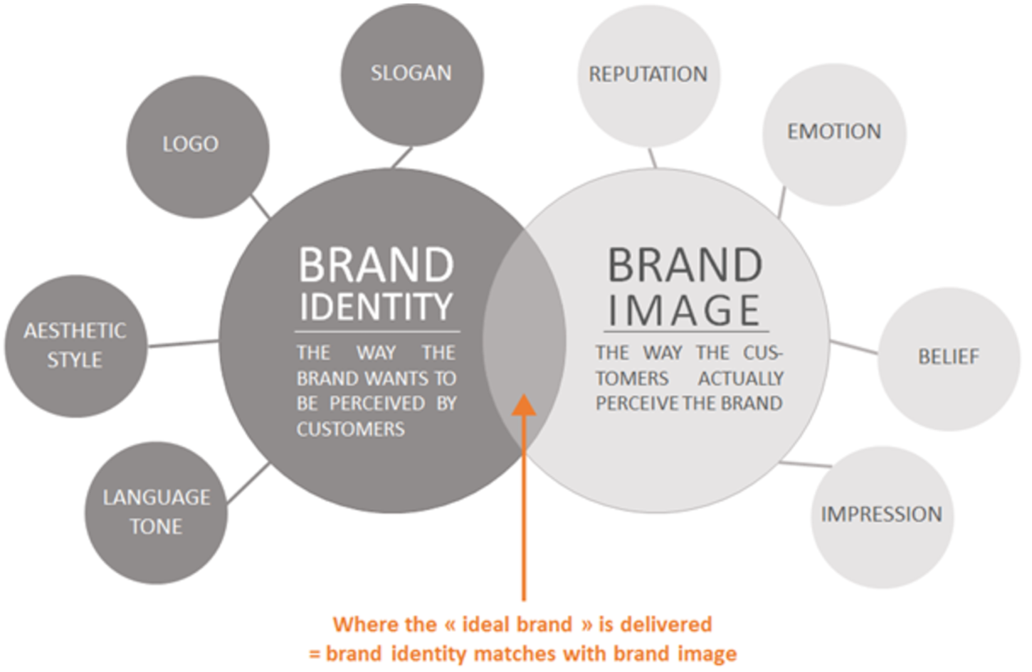
A brand is how customers perceive you. A successful product cannot exist without a brand. A visual language is one of the strongest ties a designer can use for effective branding. Specifically, it helps create better first impressions, and better brand recall.
Better first impressions
Studies prove that product creators have 50 milliseconds before users make their initial judgments on products. Your visual design is the first impression your product will make on users, even before they start using your product. It’s something that has a substantial impact on whether they become your customers.
Better brand recall
Users rarely think about the visual language a product uses, but when they interact with a product that has a strong visual language, users tend to remember it better. A strong visual language creates a personality for a digital product. A personality gives the product its own identity and allows it to be recognized in the overcrowded market.
"A strong visual language creates a personality for a digital product. A personality gives the product its own identity and allows it to be recognized in the overcrowded market."
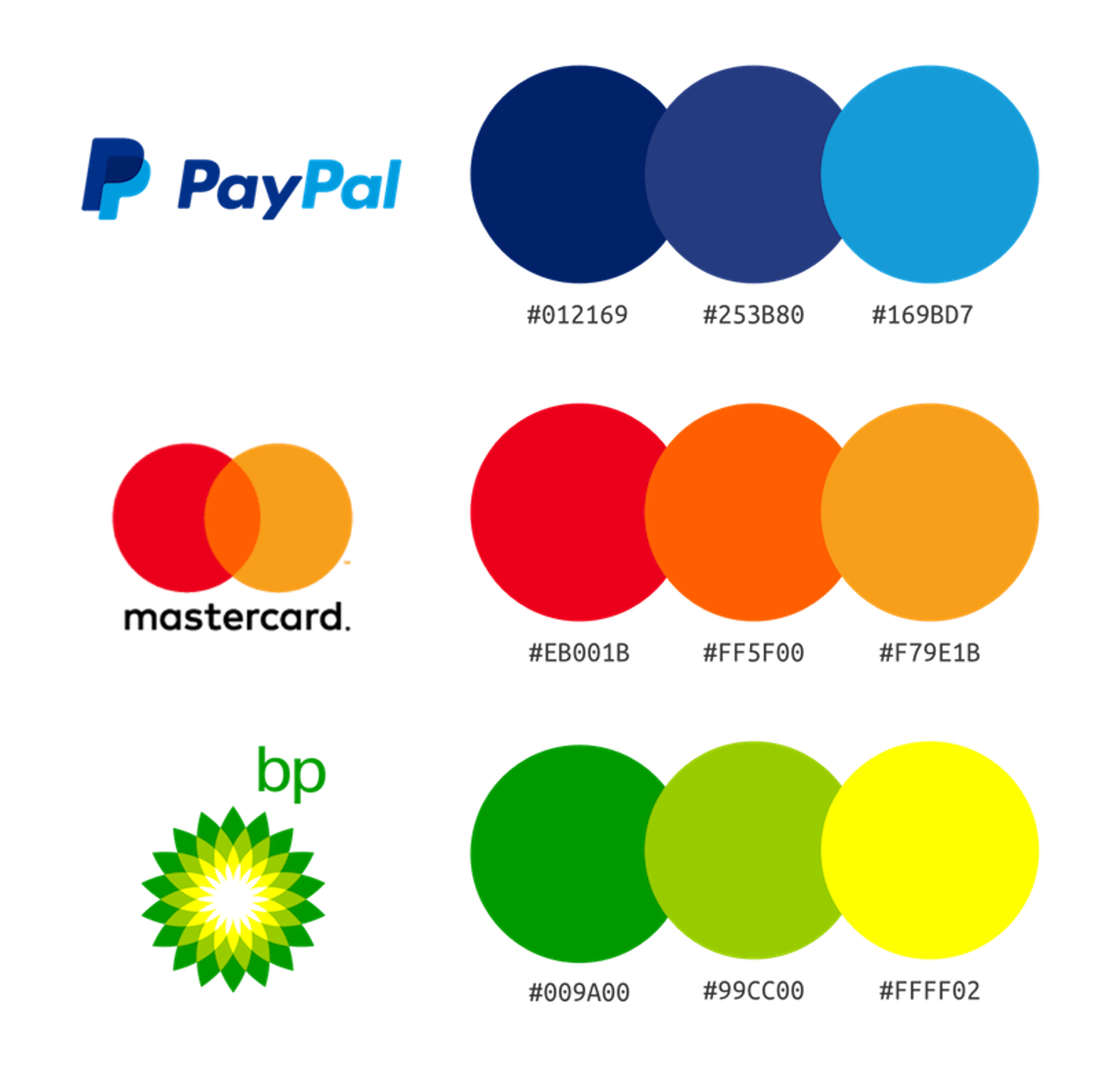
The colors, typefaces, photos, and illustrations are all part of a brand. These visual elements tie together in a structured and conventional way that people understand.
You might also like: Mobile Design Trends in 2019.
How to create and use a visual language
Like all great things, a great visual language very rarely happens by accident. Usually, it’s the result of long and intensive work. The seven following rules will help make the process of creating a visual language more efficient.
1. Understand the anatomy of the product
Even before starting work on a visual language, you need to conduct a UI audit of your client’s product, to get a clear understanding of what colors, fonts, and shapes are being used currently. It’s also worth getting any brand guidelines from stakeholders. These will help you understand the general look and feel of the company's branding.

Without all this information and understanding, you’ll work entirely in the dark and risk wasting your time building something that might be undone. Spend time acquiring the required information and analyzing it. As you start working on the language, make sure that your design decisions follow the findings you’ve learned.
2. Understand how users perceive your brand
As mentioned above, visual language is an integral part of brand identity. The visual language must represent who and what you are. When working on visual language, it’s always essential to have a clear understanding of who you’re designing for.
Invest enough time in user research, so at the end of the research phase, you have a clear understanding of your target audience and how they perceive your brand. This understanding will give you a reason for your visual direction. Every bit of your design should reflect your visual identity.

3. Create a dictionary for your visual language
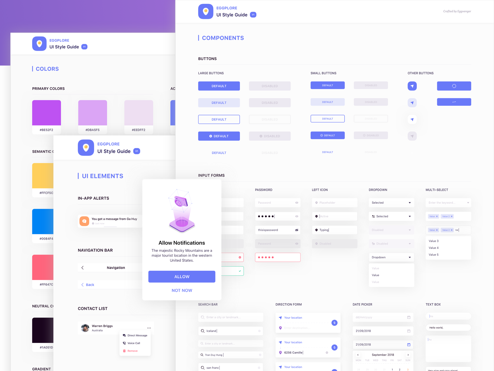
Just like spoken language starts with words and meanings, visual language is beginning with a dictionary that defines visual units and their meaning. A pattern library (reusable building blocks which can be categorized and grouped) and a style guide are the pieces that make up the dictionary for your visual language.

This dictionary should define the reusable visual units with clear meaning. Mapping elements of design with clear purposes and meanings can be challenging, but it’s possible to evaluate the meaning of elements through the prism of communication. The following template can help you identify and communicate the meaning of each unit:
Use this technique whenever you evaluate a particular visual unit. For example, if you’re selecting a color for a primary call to action button on a landing page, you could say, “The vibrant orange used in the signup form helps to communicate the importance of this action for users.”
4. Define clear design principles
The next step after defining a dictionary is establishing the clear syntax and semantics of the language. Design principles are the grammar of the language—they define rules on how to use a particular element when creating a design. Design principles are hands-on rules to always keep in mind when designing the product.
Design principles should be:
- Genuine. They should reflect the philosophy of product design that your team follows.
- Actionable. Design principles shouldn't be general recommendations on how to design products. For example, they shouldn’t say, “Make things beautiful.” That doesn’t really mean anything to the person designing the product, because no one wants to intentionally build ugly products.
- Clear. Design principles should be understood by everyone who participates in product development.
- Inspiring. Design principles shouldn’t limit creativity. They should guide the team's work in a unified direction and provide enough room for exploring creative design solutions.
For example, one of the design principles of Medium, a popular blogging platform, is direction over choice. The Medium team provides the following description for it:
“This principle was often referred to while we were designing the Medium editor. We purposely traded layout, type, and color choices for guidance and direction. Direction was more appropriate for the product because we wanted people to focus on writing, and not get distracted by choice.”
It’s a clear directive to build something that is authentic and actionable for the Medium designers.
I highly recommend reading the book Design Systems by Alla Kholmatova to learn more about design principles.
5. Document the process
No matter how tight your deadlines for creating a visual language are, you should never overlook the documentation process. Comprehensive documentation about the visual communication system is something that can be tremendously important for the product design process.
Lack of thorough documentation is a common cause of confusion during the implementation phase of a design. Creating documentation throughout the creation process allows for smoother decision making, because you will have a better rationale behind each decision.
6. Stick to the rules you’ve established
Once a product team has developed a set of guidelines for a visual language and reached an agreement on them, it’s vital to stick to them. The biggest misstep when building a visual language is inconsistency. Inconsistency happens when team members don’t follow guidelines. Remember, there is no use for a language if nobody wants to speak it.
"Remember, there is no use for a language if nobody wants to speak it."
7. Think of the visual language as a living organism
Spoken languages tend to change over time, as cultural influences shape and impact them. Visual languages are absolutely the same. This is why a visual language should not be a set of static rules set in stone, but instead should be an evolving ecosystem that grows together with a product. And this ecosystem should be easily adaptable to changes.
You might also like: Microinteractions: The Importance of Micro-Moment Design.
The benefits of a visual language
Creating a beautiful and accessible visual language takes time. You probably won’t have a robust visual language right from the first iteration, and that’s perfectly fine. It’s essential to invest time in building a solid foundation for the language to ensure it grows and matures together with your team.
What is your experience with visual languages? Share your thoughts below.
Read more
- How to Build a Winning Ecommerce Design: An Interview with Vitaly Friedman
- How to Use Icons to Enhance Your Ecommerce Website
- Top 10 Color Palette Generators for Website Colors
- Top Ecommerce Resources for December
- Top Ecommerce Resources for August
- How to Integrate Shopify into your Client's WordPress Website with Zillacommerce
- Minimalist Web Design: How To Achieve More With Less
- 3 Digital Marketing Strategies for High-Priced Inventory
- Top Ecommerce Resources for July
Visual Language FAQ
What is a visual language in design?
Why is visual language important?
What are examples of visual language?
- Color: Colors can be used to represent different ideas, emotions, and symbols.
- Symbols: Symbols are a type of visual language that can convey messages without the need for words.
- Shapes: Shapes are a powerful form of visual language. They can convey meaning in a variety of ways.
- Typography: The choice of font and size of written words can communicate the tone of a message.


