As Shopify spreads to more countries, we sometimes encounter design and development cultural differences. While the internationalization of UI (user interface) makes localization easier for target audiences, HTML and CSS can also be strong tools that allow us to achieve localization and internationalization at the same time.
For designers, the challenge is to design content with localization in mind, considering aspects such as text direction or local language characters. For developers, the challenge is to implement these aspects with minimum code input.
In this article, we look at six considerations that will help you achieve both of these requirements when building localized products.
Also be sure to check out how pseudo-localization can help you build for international.
1. Writing mode

writing-mode: vertical-lr;
The writing-mode property sets the writing direction of the content, for example, horizontally or vertically.
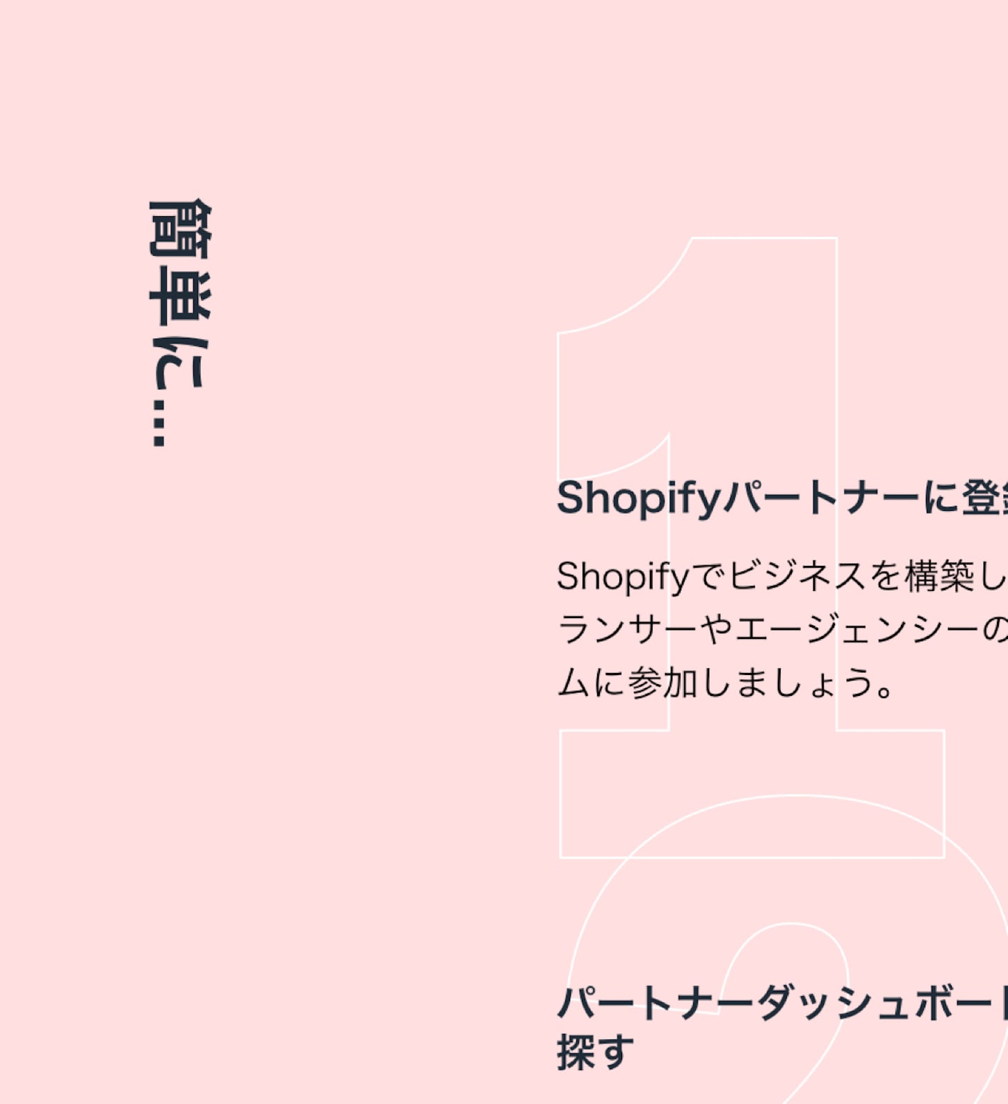
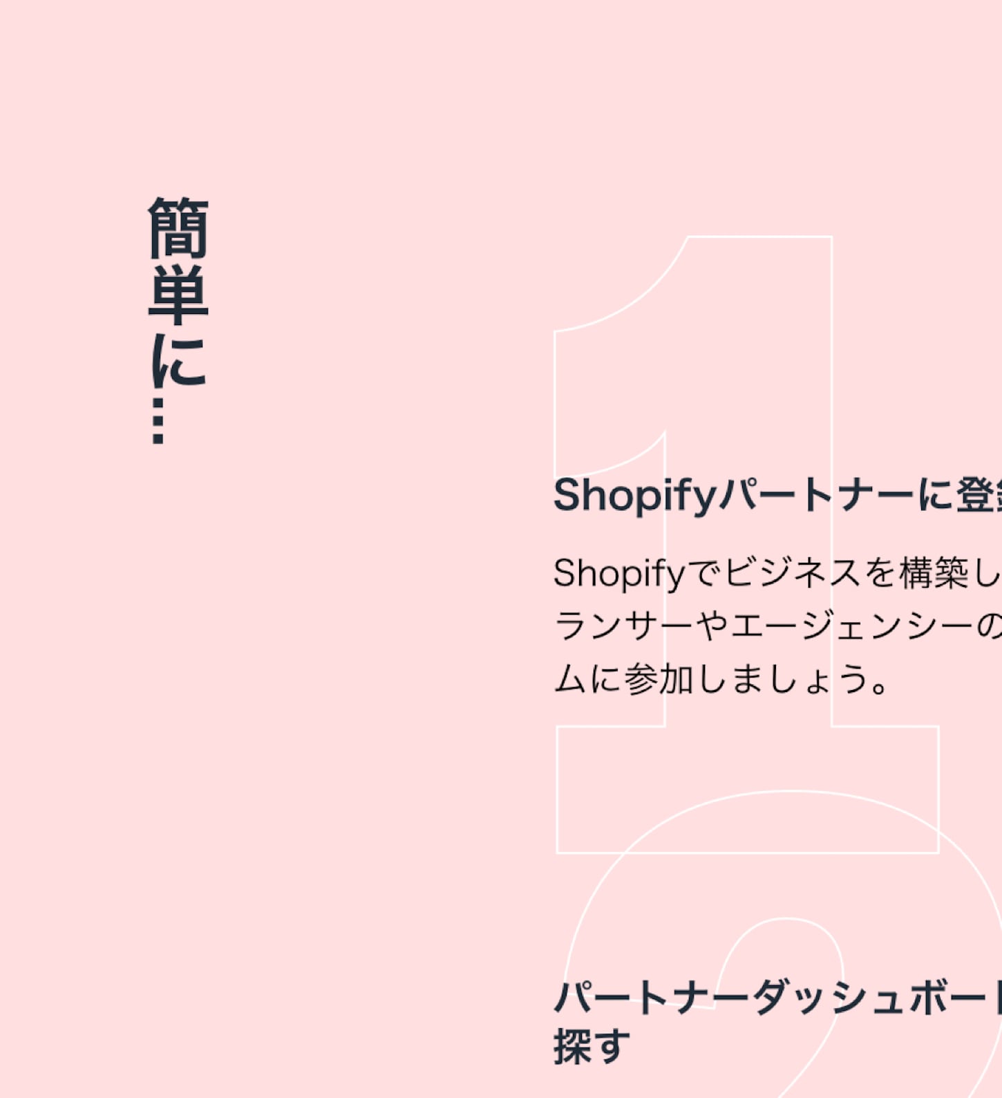
When designing content that is laid out vertically by applying writing-mode: vertical-lr, characters in Eastern language scripts will not rotate, as opposed to Latin language scripts (including Arabic numbers and notation). On Japan’s Shopify Partner Perks page, changing from transform: rotate(90deg) to writing-mode: vertical-lr, creates a proper display for Japanese speakers, and still keeps the English locale the same.

transform: rotate(90deg).
writing-mode: vertical-lr;.For purely decorative purposes, writing-mode still provides sideways-lr and sideways-rl, which has the same results as transform: rotate(90deg) and transform: rotate(-90deg). The sideways writing mode is currently only supported in Firefox.
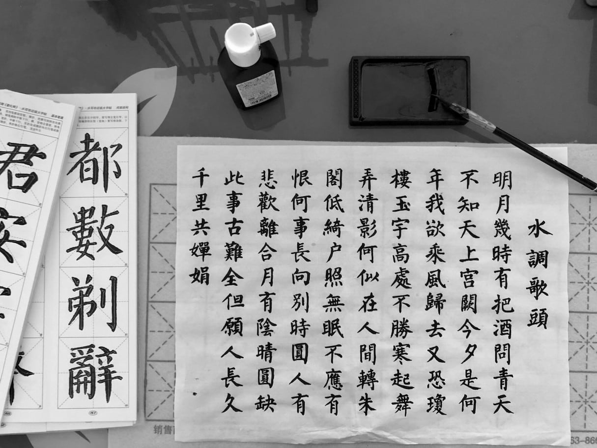
Traditional Japanese and Chinese content should be laid out from right to left. Huijing Chen demonstrates Chinese typography switching between the traditional vertical layout and modern horizontal layout to highlight their differences. Writing mode is designed to handle cultural differences in content display, which is important for localization.
You might also like: Tips for Creating Multilingual Digital Products.
2. The ch length unit
max-width: 20ch;
The ch CSS length unit represents 1 halfwidth form character width of glyph “0”. Due to the features of Eastern languages, characters always have a fixed width, including annotation, which is known as fullwidth form. When ch is applied to the width of text, fullwidth characters take 2ch for one character, compared with two characters in the halfwidth form of Latin language characters.

In typical English typography, less than 60 characters per line is preferred, which in turn means 30 characters per line for Eastern languages in fullwidth form. When comparing pixel values, the ch unit applies to all font sizes and can be useful for a responsive layout that changes font size across breakpoints. It's also easier to control the character number for typography purposes.
3. Quotation marks and multilingual content
<q lang="ja">こんにちは<q>世界</q></q>
The <q> HTML element indicates quotations in short inline form. Quotation marks have a different appearance based on language. For example, we use “” in English 🇬🇧🇨🇦🇺🇸🇦🇺, «» in French 🇫🇷🇨🇩🇨🇦, and 「」 in Japanese 🇯🇵🇵🇼.
The obvious advantage besides the semantic of using the <q> tag is that it not only saves time in translation for quotation marks, but also shows proper quotation marks on the right level of quotation, for example 『』 as secondary level quotes for Japanese, helping build language responsiveness.
The quotation marks are styled by :before and :after on the <q> tag, which can be further styled if a different look is preferred, or for browsers that don’t support it.
4. Font family fallbacks for mixed language
Nowadays, it’s common to see English characters in Chinese and Japanese. While English fonts only have English glyphs, Chinese fonts contain both English and Chinese glyphs.
When designing localized content, it’s important to understand what glyphs you want to show on the page if two or more languages are displayed. In some cases, using only Chinese fonts is sufficient to have a unified font face look; however, some may complain that the English glyphs in the Chinese font don’t work well, in which case it may be necessary to use some English fonts instead.
Below are examples of mixed languages displayed in multiple font faces. The first example, Latin numbers and characters are displayed using a Latin-character font. The second example, Latin numbers and characters are displayed using a Japanese font face.

font-family: ShopifySans, 'Hiragino Kaku Gothic Pro', 'ヒラギノ角ゴ Pro W3', 'メイリオ', Meiryo, 'MS Pゴシック', sans-serif;
font-family: 'Hiragino Kaku Gothic Pro', 'ヒラギノ角ゴ Pro W3', 'メイリオ', Meiryo, 'MS Pゴシック', sans-serif;Above is an example from the Shopify Japan home page. We declare a Japanese native font stack, which uses English glyphs that come from the Japanese font:
font-family: 'Hiragino Kaku Gothic Pro', 'ヒラギノ角ゴ Pro W3', 'メイリオ', Meiryo, 'MS Pゴシック', sans-serif;
In some cases, you may want to leverage English glyphs that come from an English font. To declare English glyphs from an English font, with Japanese fonts as the fallback of Japanese glyphs, declare the following:
font-family: ShopifySans, 'Hiragino Kaku Gothic Pro', 'ヒラギノ角ゴ Pro W3', 'メイリオ', Meiryo, 'MS Pゴシック', sans-serif;
5. Language-specific default font
<p lang="zh-TW">雪</p>
The lang HTML attribute defines the context of the language in the element.
The Chinese language has variants that are used in Taiwan (Traditional Chinese), Japan (Kanji), Korea (Sino-Korean), and more. Their language characters are partially included in the CJK characters set 🇨🇳🇭🇰🇹🇼🇯🇵🇰🇷.
Using a language-specific default font becomes useful when providing the same wording but in different font glyphs, such as Simplified Chinese and Traditional Chinese. Both share the same vocabulary, because Simplified Chinese was introduced after Traditional Chinese in the last century.
The language attribute is helpful because it forces the use of glyphs for a specified language variant.
You might also like: How To Use Translation Keys To Create Internationalized Themes.
6. :lang() pseudo-class
<ol lang="zh">
 <li>子鼠</li>
 <li>丑牛</li>
 <li>寅虎</li>
 <li>卯兔</li>
</ol>
ol:lang(zh) { list-style-type: cjk-earthly-branch; }
Using the :lang() CSS pseudo-class matches selectors with a specified language. Use the lang HTML attribute with the :lang() CSS pseudo-class to target language-specific adjustments. The example below shows how traditional list order is applied in Chinese. For layouts that contain phases in other languages, :lang() is also a great tool to easily apply style without introducing additional CSS classes. The :lang() CSS pseudo-class can also render the context of language that is applied for a desired language in mixed language content.
Building for international users
The world we live in today has opened channels of communication between different regions and countries. To reflect this reality, web standards are constantly improving to make internationalization easier. Using appropriate markup to detect language in HTML, and the right style choices in CSS, helps to improve localization and multilingual content with respect to these cultural differences.
Read more
- Free Webinar] Developing with Shopify: Using JavaScript to Add Ecommerce to Any Website
- 4 Easy Ways to Deploy Your Website or App
- How Google’s AMP Project is Changing the Mobile Web
- The 10 Most Useful Browser Dev Tools for Front End Developers
- Free Webinar] Getting Started with Sass and Shopify
- A Modern Approach to CSS Pt. 2: Building Resources
- How to Get Published in the Shopify Theme Store
- Using Responsive Images to Decrease Page Loading Times

