Shopping on the web can be a frustrating experience. Scrolling through a wall of products, understanding what is and isn’t in your cart, and navigating through endless checkout screens is exhausting.
Web designers and developers need to work with ecommerce sites to reduce distractions to make the path to conversion seamless, which will provide a more enjoyable experience for their customers.
For many, animation on websites equals distraction. Flashing ads, GIFs, and unnecessary motion can be overwhelming and discourage users from staying onsite. Yet animation done with the proper amount of restraint can actually help improve the user experience.
You might also like: How to Add CSS Text Animation to Custom Themes.
Animation as a tool for usability, not distraction
The best website animations have both purpose and style. Intentional animation can create a level of feeling and perception close to what a person experiences when interacting with a physical object in real life.
Consider this animation of Canadian actor Ryan Gosling. He receives information, processes, then shakes his head in disapproval. Without even hearing what is happening, we can understand that he does not agree with the information he was provided.

On the right is a Stripe checkout form. When a user attempts to submit the form without filling out the required fields, the form shakes side-to-side like a person would shake their head in disapproval.
This sort of interaction can help boost the user experience because the effort to understand why the form didn’t submit is essentially off-loaded from their brain to the animation on-screen. The user expends less energy comprehending the behavior of the site, and can focus their efforts on more important things, such as purchasing a product onsite. Well-designed animations can reduce unnecessary cognitive load and help direct focus to the task at hand.
The science of understanding
Cognitive load refers to the total amount of information your working memory can handle. Every day you are bombarded with information you can see, feel, hear, taste, and smell. Your sensory memory filters out a majority of this information but keeps an impression of the most important items long enough to pass to your working memory.

Cognitive overload happens when your working memory receives more information than it can handle comfortably, which can lead to frustration and compromised decision-making.
The study of cognitive load can help inform when and how you use animation, so that information is presented at a pace and a level of complexity that the user can fully understand without being overwhelmed.
Three strategic approaches that support clean, functional user experiences are show and tell, connecting contexts, and call and response.
Strategies to reduce cognitive load
Show and tell
A common practice in ecommerce sites is to display all products in a product wall. Without providing focus, the user can experience decision fatigue and get distracted. Show, not tell, which products you would like the user to explore, rather than putting the brunt of discovery on the user.
1. Brilliant Bicycles
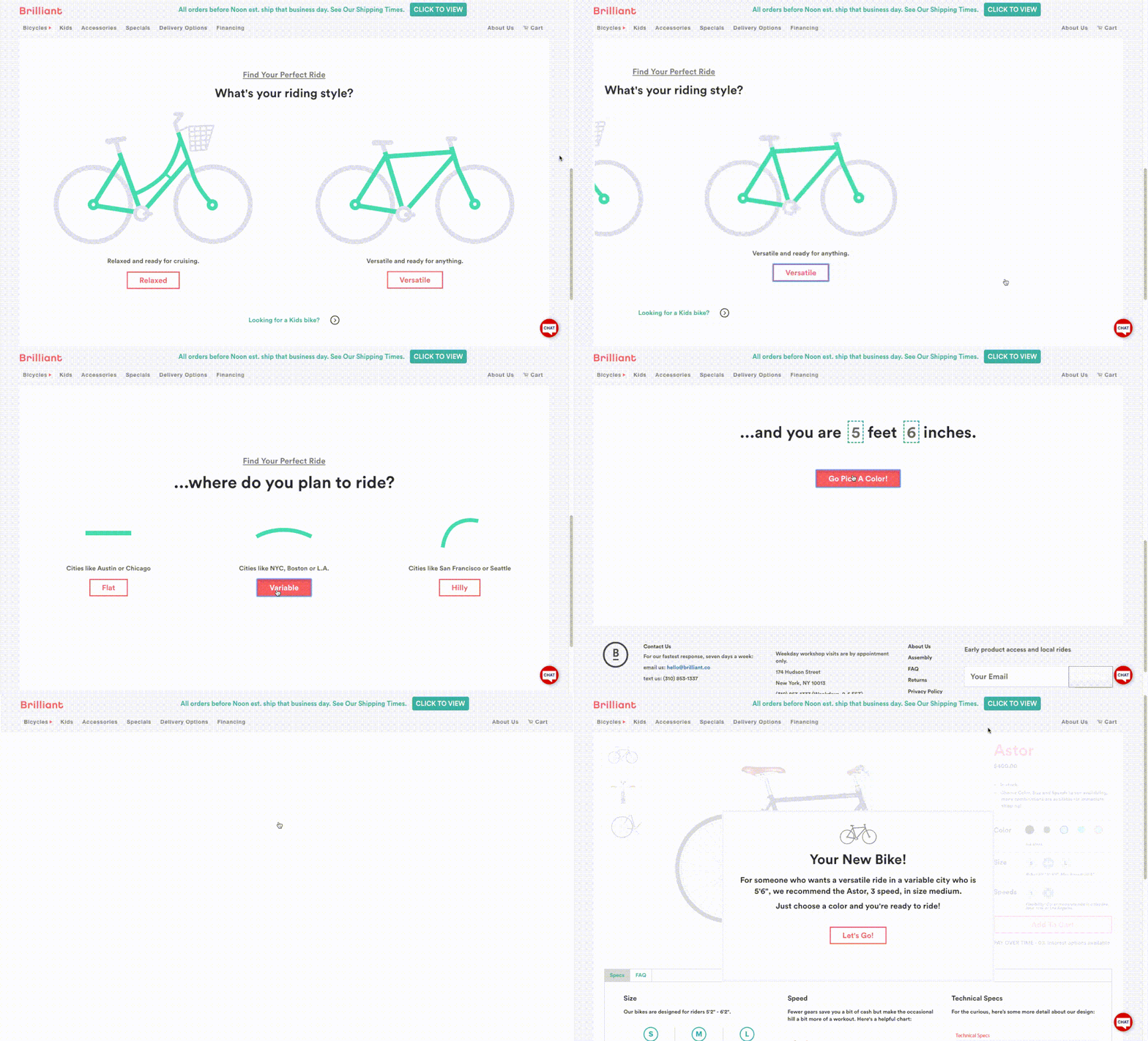
Brilliant Bicycles cycles the user through multiple screens to help them decide which bike is the best fit for them. Each screen asks the user questions about their height, riding style and where they plan to ride before navigating the user to the product page of the recommended bike.
These animated screens also help educate the user on the various considerations that go into the process of purchasing a bike, all by bringing the user through the journey instead of explaining through text.
2. Nice Laundry
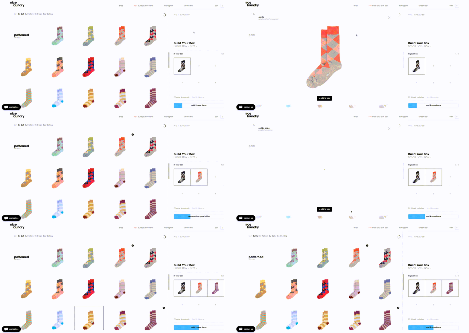
The process of buying socks on Nice Laundry becomes a fun DIY experience through the use of animation. Nice Laundry helps visualize the user’s custom pack as they select options on the screen. The digital box displays the selected socks and animates a progress bar to show how many socks the user has left to choose.
More information is conveyed with animations than any written content could explain, making the creation of a custom pack an enjoyable process instead of a burden.
Connecting contexts
As devices and screens have become smaller, off-screen patterns and layered interfaces have emerged to help keep the user experience clean and decluttered. These patterns keep a section of content waiting just outside the viewable screen area for when it’s needed. Animation connects these screens through visual cues and transitions.
One of the biggest challenges in creating an ecommerce site is to make it obvious to the user when a product has been added to the cart. When people can’t quickly identify that they’ve added an item to the cart, it creates undue friction.
If a real-life shopping experience behaved like a typical online experience, it would feel like the user was throwing products into an endless void while they shopped, and then having to locate the physical checkout with the hopes that the products they selected would somehow be there. Connecting contexts solves this problem.
1. Cotton Bureau
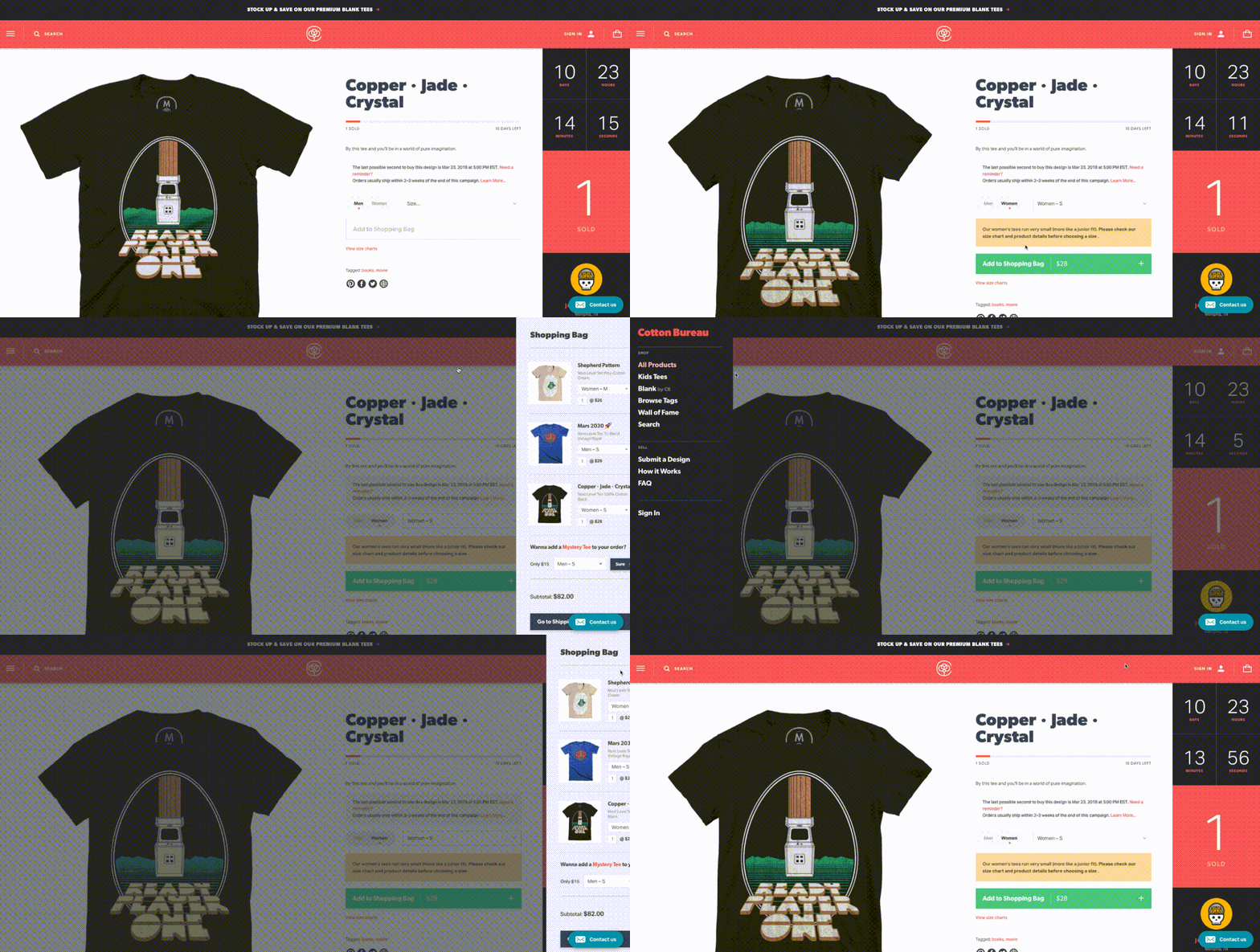
Cotton Bureau animates its off-screen navigation and shopping cart in and out of view to visually reinforce the location. The icons also provide visual cues by pointing in the direction of where the screen is located and where it will be returned to.
Keeping the duration, easing, and movement of the animation consistent helps maintain these connections, so the experience feels expected and not jarring.
2. Conceptual add to cart
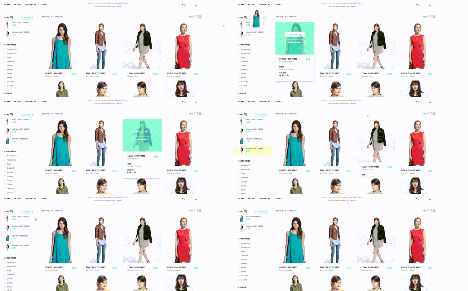
Another option is to keep the cart visible at all times on the screen. After clicking ‘add to cart’ in this conceptual demo, a small image of the product is animated from the card to the cart. This saves the user from wondering where the items are located and allows the user to easily edit their cart while staying on the page.
Keeping a user on the product page rather than navigating to the cart can encourage continued shopping. Another fun use of animation is allowing the user the ability to see multiple views of the product without visiting a separate page.
Call and response
Visual feedback is crucial for any digital experience. It makes the user feel in control, and control means knowing and understanding their current position in a system at any given time. In the physical world, buttons, controls, and other objects respond to our interactions with them. People expect a similar level of responsiveness from the controls on a site.
When a user is ready to purchase a product, the sole focus should be on getting them through the payment process with minimal friction. Too many checkout screens slow the user down, or even worse, confuse them. By providing feedback to the user, we can let them know what just happened, what is happening now, and what is happening next. It’s important to keep the user informed and confident that they are on track to finish the task.
You might also like: 6 Animation Libraries to Save Time and WOW Clients.
1. For Him
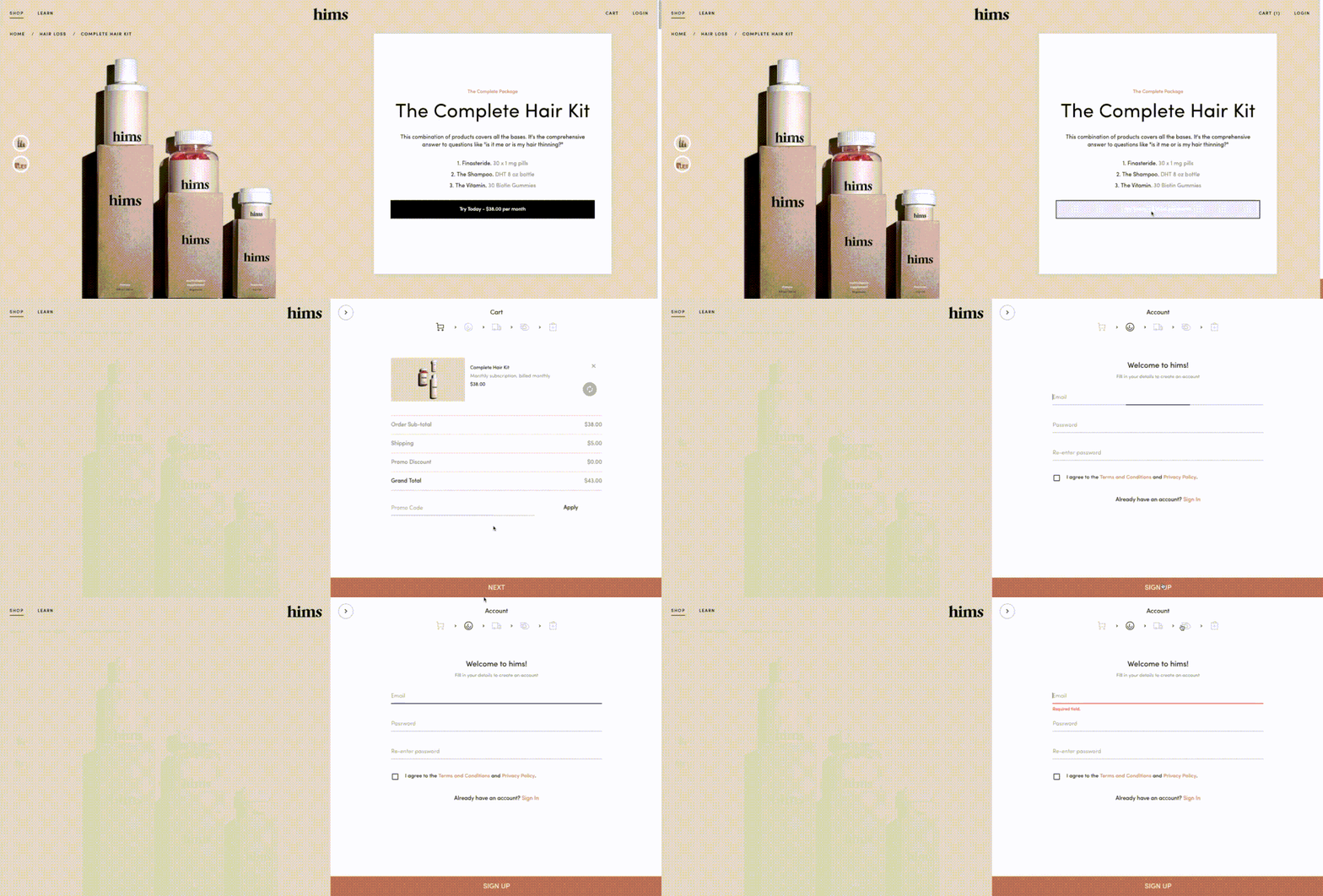
Animations can be a helpful tool for guiding the user through the checkout process. For Him shows the number of steps through descriptive icons to help the user know how much is expected from them before they complete an order. Their progress is easily tracked and provides a hint of what is to come, making the experience feel manageable and not overwhelming.
2. Conceptual sign-up form
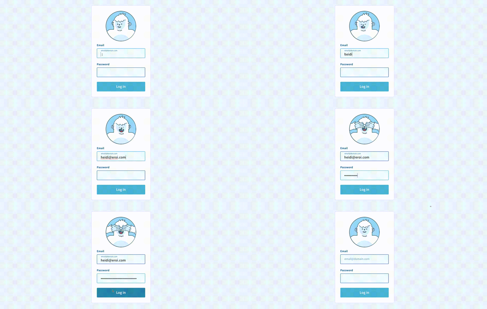
Many ecommerce sites want users to sign up for an account before they buy. Thirty-five percent of users abandon their cart due to forced registrations. Asking your users to sign-up for an account before checkout is a lot to ask. You can make it a fun experience so users are more enticed to do so. On this sign-up form, a yeti watches as the user enters their email address and then covers his eyes as a password is entered to be mindful of sensitive information. The animation provides a great opportunity to show personality and brand tone.
Use animation to help the user
By following the strategies above, you can drastically reduce the user’s cognitive load and ensure their attention is focused on the task at hand. With the right animations, you can guide your user through tasks, provide visual cues, and even add a little bit of fun.
Read more
- How to Build a Customizable Related Products Section
- How to Use Liquid to Create Custom Landing Page Templates
- 10 Ways to Improve User Engagement for Your App This Valentine's Day
- Content Strategy: The Principles we Followed to Build the New Shopify App CLI
- Frictionless Experience: How to Create Smooth User Flows
- Speed Things Up: Designing a Fast Experience for Better Mobile UX
- What Makes or Breaks an Ecommerce Shopping Experience? This Survey has the Answers
- Five Useful Usability Testing Tools Proven to Convince Clients
- Is Your Mental Model a Confusing Mess to Users?
- Typography in UI Design
What user experience challenges could be solved by adding animation? Share your ideas in the comments section below!


