Good usability is an integral part of successful app design. Back in 1994, Jakob Nielsen coined 10 general principles for interaction design, which he called usability heuristics. These heuristics were developed based on years of experience in human-computer interaction and became guiding standards for designers who want to create easy-to-use interfaces.
This article will review the 10 usability heuristics and share helpful examples of how you can apply these principles to your app.
1. Visibility of system status
Don’t make the user guess what is happening. Apps should always keep the user informed about what’s going on through appropriate feedback within a reasonable amount of time.
Why it’s important

A lack of information leads to a lack of control. On the other hand, when a user knows what's going on at every moment of time, they feel in control and start to trust the system.
How designers can use this rule
- Communicate the current system’s state to the user. If the system is busy doing something, tell the user. Set up progress indicators to let the user know that the system is working to respond to their actions.
- When a user triggers some action, present feedback as quickly as possible. Offering immediate feedback on user interaction is the best way to reassure a user that the system received their request.

You might also like: Using Animation to Improve the Mobile App User Experience.
2. Match between system and the real world
Use language (words and terms) and visual concepts (icons and symbols) that are familiar to the user.
Why it’s important
Since a person’s mental models of technology are based on their previous experiences with digital and physical products, they can be confused by unfamiliar terms or concepts. On the other hand, when design speaks the user’s language, it becomes easier for a user to learn and remember how the app works.
How designers can use this rule
- Avoid jargon. Avoid industry-specific and technical terms; use words and phrases that are familiar to the user. Carry out user research to understand what your users are used to.
- Use familiar icons. Unfamiliar icons can make users search for meaning. Always test your icons for clarity: conduct some quick usability testing with people who represent your target audience, show your icons to the participants, and ask them to say what they think the meaning of each icon is. Avoid using an icon if test participants are unable to understand its meaning.
- Follow real-world conventions. When you design a digital app, try to rely on analogies from the real world. For example, when you design forms, ensure that questions appear in a natural and logical order. When you ask for shipping details, you start with a full name, and only after that ask for an address.
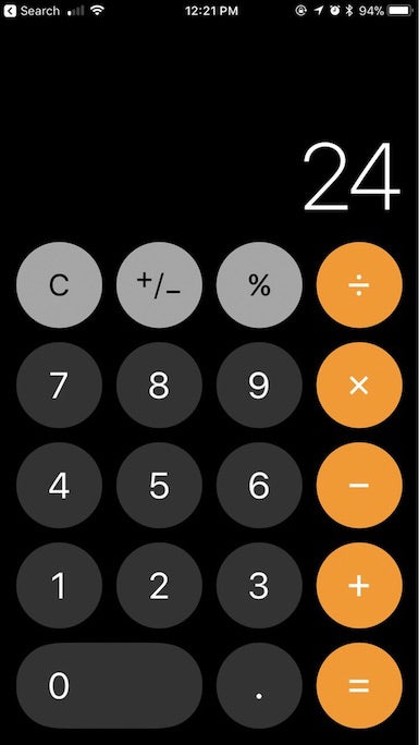
- Rely on skeuomorphism to create familiar concepts. Skeuomorphism in graphical UI design can help you create objects that mimic their real-world counterparts. This technique allows designers to create visual affordances—visual cues that give users hints on how they can interact with certain objects. For example, when a calculator app looks like a real world calculator, it becomes easier for users to understand how to interact with it.
3. User control and freedom
When users interact with apps, they sometimes click or tap things by accident. When users perform actions by mistake, they should be able to undo the operation to leave the unwanted state.
"When users perform actions by mistake, they should be able to undo the operation to leave the unwanted state."
Why it’s important

When users know that it’s easy to undo an action, it fosters a sense of freedom and confidence. It’s also a great way to support exploratory learning—users aren’t afraid of making mistakes and start to explore the product.
How designers can use this rule
- Support undo and redo for common operations. It’s essential to support undo for potentially dangerous operations (such as data deletion).
- Provide UI controls that help users leave an unwanted state (such as a link or button).

You might also like: How to Use Smart Defaults to Reduce Cognitive Load.
4. Consistency and standards
Good app design should never confuse users by using different words, visuals, or actions for the same concepts.
Why it’s important
Consistency in UI design is about making sure the elements in the UI are uniform. Consistency helps improve the user experience by eliminating confusion. There are two types of consistency—in-app consistency and platform consistency:
- In-app consistency refers to the consistency of individual design decisions in your app. For example, the visual design of call-to-action buttons should remain the same on different pages of an app. When designers fail to maintain consistency in app design, they force users to learn something new as they interact with an app, increasing the effort it takes to understand how to use the app.
- Platform consistency refers to the consistency of a platform’s standards. Users may spend time using apps other than yours, and they form some expectations on how something should look and work. Have a look at the requirements for public apps on Shopify to get to know some of Shopify’s standards.
How designers can use this rule
- Follow platform guidelines and conventions. Make sure you reference Shopify’s public app guidelines and policies for getting your app approved.
- Follow established industry conventions. For example, for something in your app that represents editing the shopping cart functionality, you probably would need to incorporate a shopping cart icon to make the experience more predictable for your users.
5. Error prevention
Good design prevents problems from occurring in the first place. Designers should find and eliminate error-prone conditions.
Why it’s important
By preventing users from making mistakes, you make interaction with an app more comfortable for users.
How designers can use this rule
- Provide helpful constraints in input forms. Do not allow users to type or select something that is not valid. For example, when you ask for a product name in a form, you shouldn’t allow users to select products that don’t exist.
- Offer good defaults. Good defaults in input forms free users from selecting values in the first place, saving them time and making their lives easier.
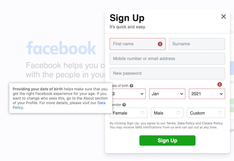
- Use inline validations in input forms. Inline validation is a mechanism that provides visual feedback if a user’s input was wrong for some reason. It also helps them correct their errors.

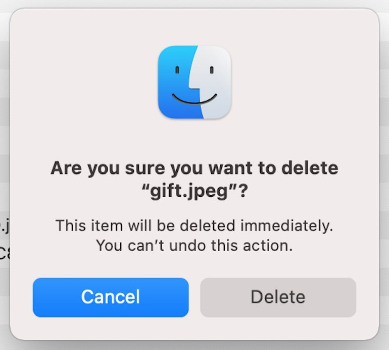
- Warn your users. When a user performs a potentially dangerous operation, your app should inform users of what will happen next, and let users decide whether they want to do it or not. For example, when a user wants to delete a file, the app should present users with a confirmation option before committing to this action (i.e., show a dialog box that says, "Are you should you want to delete this file?" when users want to carry out an irreversible operation).
6. Recognition rather than recall
The user should not have to remember information from one part of the interface to another. Minimize the user's memory load by making content and interactive elements visible or easily discoverable.
Why it’s important
Humans have limited capacity for short-term memory. Apps that require users to recall something from the past make apps less user friendly and produce poor UX interactions.
As Steve Krug would say, “Don’t make users think”. Provide all of the required information in the moment when users need it.
How designers can use this rule
- Focus on user goals. Make key information or interactive elements required to achieve the goal either visible or easily discoverable.
- Offer help in the context of operation. It will help you reduce the information that users have to remember.
7. Flexibility and efficiency of use
Offer shortcuts—quick ways to get one or more tasks done with your apps. They should speed up the interaction with an app for the expert user.
Why it’s important
It’s possible to improve the efficiency of interaction with an app for experienced users by introducing changes in the UI that will allow them to complete frequent actions faster.
How designers can use this rule
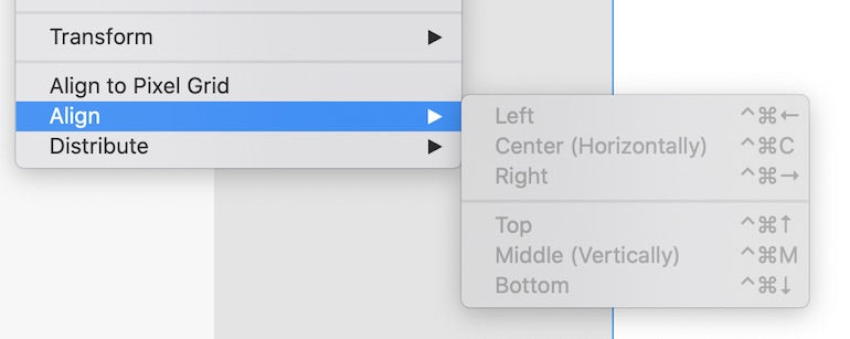
- Introduce accelerators. Accelerators reduce the number of steps required to complete an operation. If we examine the wider world of app development, when it comes to desktop apps, it can be keyboard shortcuts, while for mobile apps, it might be voice search.
- Personalized content and features. Personalization allows a product to fit more naturally into a user's lifestyle because the content and functionality that a product offers are tailored to the users' needs. For example, popular music services such as Apple Music or Spotify analyze user preferences and suggest music that will match their taste.
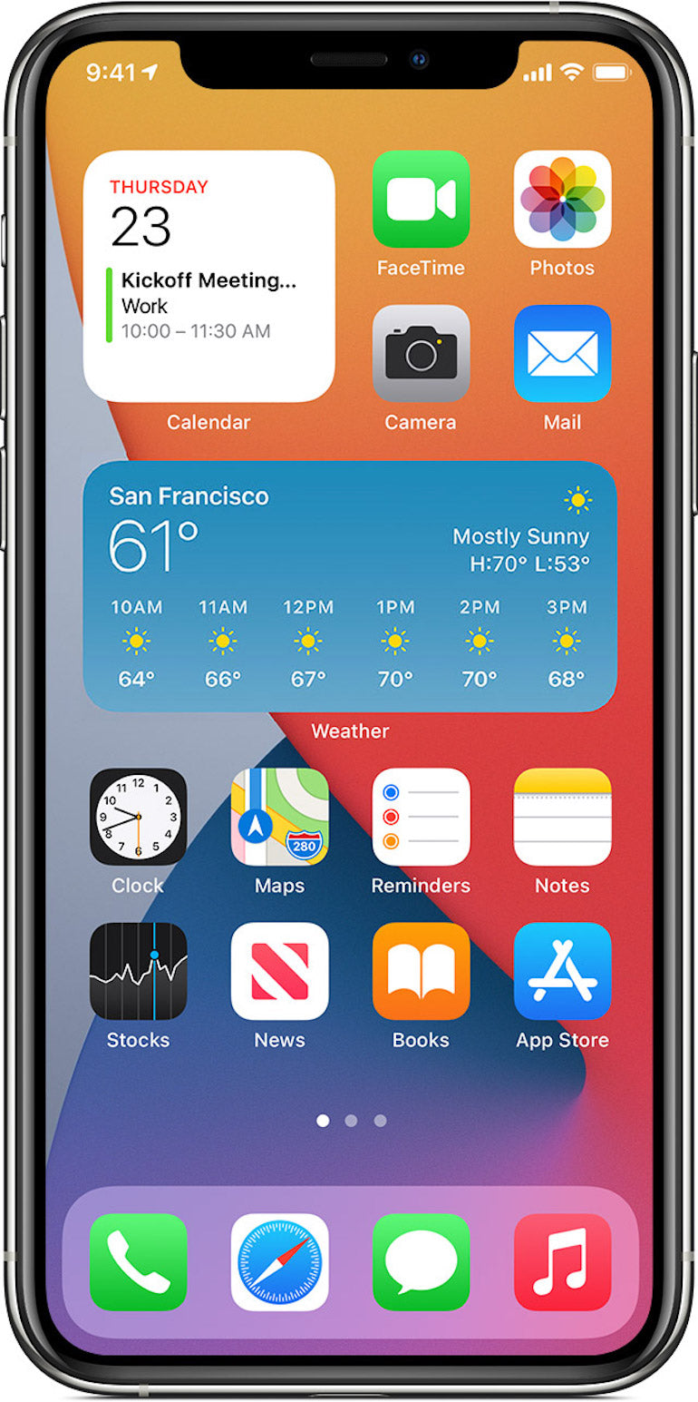
- Let users customize their experience. By giving users the freedom to choose content or functionality that they want to see, you make interactions with a product more efficient. For example, if we looked at mobile app design, you could offer widgets that users use on their home screen. Users will use widgets that are important to them and this will reduce the need of accessing individual apps (since the key content will be easily visible and quick to access).
8. Aesthetic and minimalist design
It’s important to get rid of all elements and content that do not support a user’s goals. Interfaces should contain only essential information. All irrelevant or rarely needed information should be removed or hidden by default.
Why it’s important
Follow the “less is more” approach in your design. Remove all unnecessary elements that do not have a positive impact on user experience. When you design an app, remember to focus on user goals. Both content and visual design should be selected to support the user goal. Remember, as Antonie de Saint-Saint-Exupéry said: “Perfection is achieved, not when there is nothing more to add, but when there is nothing left to take away.”
Perfection is achieved, not when there is nothing more to add, but when there is nothing left to take away.
How designers can use this rule
- Use whitespace to highlight important information or interactive elements. Whitespace (or negative space) gives more visual prominence to the content/interactive option. Using whitespace, designers can declutter the screen and make the app easier to navigate.
- Prioritize the content and features to support users’ primary goals. Use progressive disclosure to reveal more information on demand (for example, hide additional information under a “Learn More” button).

9. Help users recognize, diagnose, and recover from errors
Error conditions can be frustrating to users, especially when they’re poorly designed and communicated. When users face error conditions, the app should indicate the problem and suggest a solution.
Why it’s important
When users know what went wrong and what they can do about it, they are more likely to overcome the error, and not get frustrated. Or, even worse, giving up and uninstalling your app.
How designers can use this rule
- Avoid using technical error messages. Error messages that contain only error codes look cryptic and scary for regular users. They are also incredibly frustrating for the user.

- Avoid generic error messages. Error message that sounds like “Something went wrong” doesn’t communicate the problem to the user. Be specific, let the user know what happened, and what their next action step should be.
You might also like: Frictionless Experience: How to Create Smooth User Flows.
10. Help and documentation
It’s worth providing documentation to help users understand how to complete their tasks or make the interaction with an app more efficient.
Why it’s important
The less time users spend searching for answers to their questions, the more comfortable interaction with a product becomes, and the happier your users will be.
How designers can use this rule
- Make it easier for users to search for help. Ideally, users should be able to reach for help right at the moment when they need it. It’s usually worth making help contextual (presenting the documentation in the context of the user’s task).
- Use analytics and insights to improve your app. For example: the data could come from usability testing to understand the areas in your product in which users might need extra help.
- Offer concrete steps that users should carry out to solve the problem. Always help your users as much as possible. Make it easy for them. The more you help them, the more they’ll appreciate your app and want to stay with you.
Foundational principles of app design
Good usability is an integral part of human-centered design. Although these 10 usability heuristics were coined by Jakob Nielsen in 1994, they remain relevant to modern digital products. No matter what app you design, you can rely on the heuristics to improve your product's usability.
Take the Partner Blog content survey
In an effort to bring you even better content in 2021, we’ve put together a quick survey to learn more about what you’d like to see on the blog next year. Find it below.
Take surveyRead more
- How to Conduct a User Interview That Actually Uncovers Valuable Insights
- Give Your Clients a Leg Up: 4 IoT Use Cases to Consider
- How to Work with Shopify’s query Argument in GraphQL
- Building a Shopify App That Makes a Positive Difference in the World (And Makes a Profit)
- How to Level Up Your App with Theme App Extensions
- Three Types of Trending Apps in 2017 and What You Can Learn for 2018
- How We’re Improving Discoverability On The Shopify App Store
- 5 Community-Built API Tools Developers Should Check Out
- How to Improve Your App’s Design and Gain More Users

