You’re busy with client work and running your business, which leaves little time to focus on your company or freelance website. But when we neglect our sites, they can quickly begin to look dated. This can lead potential clients to think that the business is no longer active.
Today, I will run through five easy ways for you to update your website, and make it look fresh and ready for business. Better still, these tips won’t even require you to design and develop a completely new site.
1. Update your icons
 Instagram recently released a new logo; if you have the old logo on your site, you should replace it with the new one as soon as possible. This has a twofold effect; your site will look fresh with the up-to-date icon, and your visitors will intuitively know that you are up on the latest changes, and keeping up with trends.
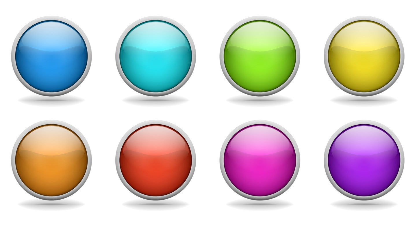
Also, remember when skeuomorphism was all the rage and we had glossy textured shadowed icons everywhere? Update those icons. Whether they are social media icons, or company icons for things like the contact page, change icons to a flatter look, and remove the gloss, shadows, and texture. In a few months or years, change them again to reflect new design trends.
You might also like: 12 Incredible Resources for Downloading Icon Packs.
2. Change your homepage hero image
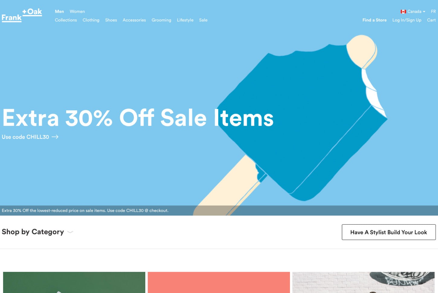
 This is most likely the easiest item to change because it’s one image, yet it can have the most impact on your site. Have you ever visited a site, and noticed the image was in reference to something that happened in the past? Or that the hero image was just the same outdated one from years ago?
Whatever your company or freelance site may be, updating your homepage hero image regularly will inform visitors that your company or freelance business is thriving and doing great work. If the hero image is still the same one from years ago, it could lead visitors to think that the business or product is no longer active.
3. Update devices
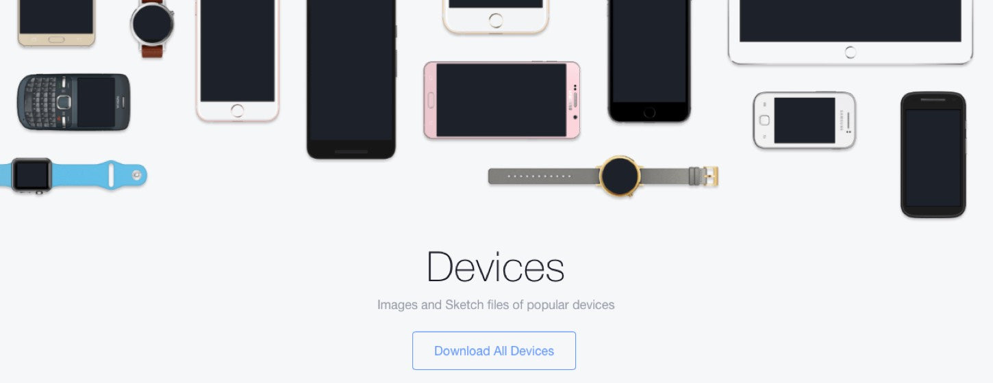
 Your portfolio may showcase the most beautiful sites and apps, and your project’s screenshots may be arranged within a device to frame the project, such as a laptop for a site or an iPhone for an app.
Using a device can be visually appealing, but not if you’re recently released iPhone app is framed within the iPhone casing from an older model. This is problematic for several reasons: your app most likely doesn’t run on the older iPhone model, users may question whether the app works with the newest devices, and the older model will make your site look dated.
This goes for all mobile devices, as well as other devices like laptops on your site. You can download recent devices for free, on sites like Dribbble and Sketch App sources.
Also, Facebook’s design team is constantly adding to their list of device resources. If your app only runs on an older iPhone model, I’d still suggest removing the device frame, and leaving just the screenshots of the project to display your work. Don’t date your work and your site by plastering visuals of old tech.
You might also like: 12 Beautiful Portfolio Websites to Inspire Your Own Design
4. Post often
 If you have a blog or a social feed on your site, make sure to write often. Even posting just once a month on your blog, can show your visitors that you’re an active company. For those of you who have social feeds on your site, like a Twitter feed on your footer, make sure to actually write new posts.
Furthermore, avoid writing posts that are not relevant to your work. If a potential client is visiting your site, and sees a completely unrelated comment posted months ago, they may be inclined to hit the back button.
If you plan to have a blog or live Twitter feed on your site, make sure that you post relevant posts often. Writing often on your blog will also have a good impact on your site’s SEO; to learn more about content marketing, watch our recent Shopify Partner session on how We Make Websites doubled their web agency’s revenue through content marketing.
5. Add to your portfolio
 Updating your portfolio may be one of the most obvious pieces of advice, but it’s important nonetheless. Potential clients are interested to see your work, but if you’re a developer, they’ll be more keen to see if you’re using up-to-date technology to develop your projects.
For example, if you’re an app developer using Swift and you’ve just finished a project, make sure to get the project on your site as soon as possible. This will quickly inform potential clients that you know how to work with Swift, which can be great for generating new leads. This also applies if you’re working on Shopify shops; if you’re a designer or front-end developer, add Shopify to your portfolio.
There are times when you are working for clients where you won’t be able to share your work, or post it on your portfolio site. In those cases, I recommend working on a side project that you can share. It doesn’t need to be a project that takes up all of your free time – it can even be something that you worked on for a weekend. It just has to be something that you can share with the world to let everyone know that you are still active in your field.
You might also like: Why Your Contact Page is the Most Important Part of Your Portfolio Website
Looking fresh
We’ve all been there. We have worked piled up with deadlines approaching, and the last thing we have time for is our own site. In the back of our minds, we also have a feeling that if we look at our site, we may need to take down the whole thing and start over again, but that’s not necessarily the case.
If you don’t have a lot of time to work on your site, the five tips listed above should help you easily and quickly update it with minimum effort. Potential clients will see that you’re active in your field, up on the latest tech, and ready to work.
Read more
- Why We’re Sending a Shopify Developer Around the World (And How You Can Connect With Her)
- Jeffrey Zeldman Shares His Advice for Aspiring Freelance Web Designers
- What is Impostor Syndrome? 6 Ways for Designers and Developers to Overcome it
- How to Grow From Freelancing to Founding Your Own Agency
- Designing for Designers: Jen Mussari on her Shopify Partners Mug Design

