To come up with a proper design, product teams use a lot of different tools and techniques. The information gathered from contextual inquiries and user interviews become product requirements on top of which the actual design is built. But somewhere in all of this, there are the real people for whom the products are designed for. To design products that make the user’s life better, product teams must understand what’s going on in the user’s world. And that’s where storyboards come in.
In this article, I will explore the concept of UX storyboards and how storyboarding help designers create better products.
What is a storyboard?
A storyboard is a linear sequence of illustrations, arrayed together to visualize a story. As a tool, storyboarding comes from motion picture production. Walt Disney Studios has used sketches of frames to visualize a story since the 1920s. Storyboarding became an essential tool of movie makers because it allowed them to create the world of a future film without investing too much time and resources into the actual production.
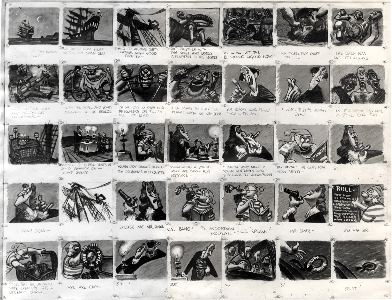
How storyboarding can help product design
A UX storyboard is a great instrument for ideation. Storyboarding helps visually predict and explore a user’s experience with a product. Visualizing interactions leads to an explosion of creativity in problem solving.
Here are some ways storyboarding can help product teams to design better products.
Build empathy for users
Many product teams use the concept of user personas when they work on a product. A user persona is an extremely valuable tool for product designers because it brings empathy in design process. It helps product creators recognize that different people have different needs, wants, and expectations. But all this happens only when a persona is considered in the context of a specific flow.

Without proper context, a user persona will be nothing more than a design artifact. A product team can use it as a reference, but it won’t deliver much value.
By visualizing the user journey in the form of a UX storyboard, you create context for user interactions. Well-designed storyboards make you believe that a real person in a real place is doing real things. And this brings empathy in interactions—as human beings, we often empathize with characters who have challenges similar to our own.
You might also like: Using JQuery Image Zoom and JavaScript Zoom for Product Images on Shopify.
Gain a better understanding of a user journey
After reading the previous point, some designers might argue that they can create context using user journey mapping. That’s true. A journey map is a tool designers use to visualize experiences from the user’s point of view, across all the different touch points they have with a product as they seek to achieve a specific goal or goals.
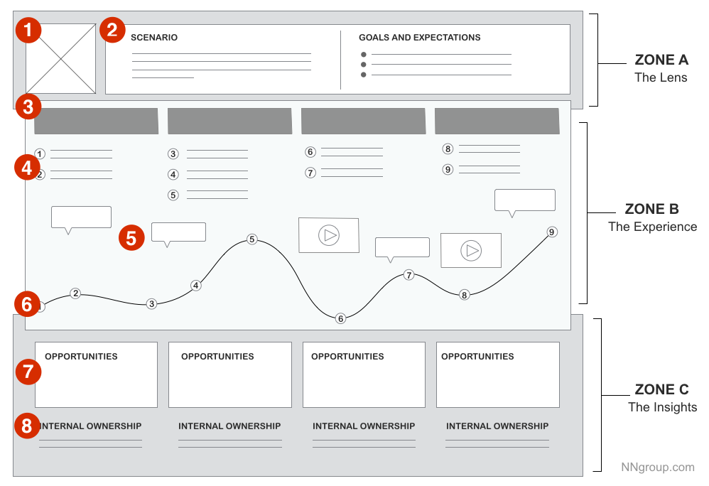
But similar to user personas, user journey map can be limiting. Of course, a well-designed user journey map will help you find barriers people face when using a product, but it will be hard to step into the user's shoes and walk through an actual process of interaction, step-by-step.
By illustrating a user journey, you help people understand it. An image speaks more powerfully than just words because it adds extra layers of meaning. Storyboards allow you to visualize the user's actions as well as the emotions they feel during each interaction. And this ultimately leads to a better user experience—product creators start to think through a process in a step-by-step manner, and it allows them to design in a streamlined way. See Chelsea Hostetter’s storyboard as an example of how they can build strong, clear narratives.
When storyboarding is especially useful
Storyboards are excellent tools for communicating ideas and building empathy. They are particularly useful in the following scenarios.
When you want to shape product strategy
If a product team is at an early stage of the design process, storyboarding allows product designers to quickly and inexpensively test multiple product visions. This is especially crucial for innovative products because a UX storyboard will help to visually predict and explore a user’s experience with a future product. A team can easily create multiple storyboards and evaluate different approaches to find the most efficient concept.
Airbnb is an excellent example of how storyboarding can help a company understand the customer experience and shape a product strategy. One of the most valuable insights the team gained from storyboarding is that their service isn’t the website—most of the Airbnb experience happens offline, in and around the homes it lists on the site. This understanding forced Airbnb to focus on the mobile app as a medium that links online and offline.

When you need to get buy-in from stakeholders
It's fairly common that in order to design a product, a team needs to get some funds from investors. Many teams try to sell ideas to stakeholders by talking about the benefits a product will bring. But words alone are not enough to express how people will use the product.
Storyboarding can be an excellent tool for communicating ideas. But showing storyboards, you can reach stakeholders on an emotional level. Stakeholders can empathize with users, their pain points, and how a proposed product can improve their lives.
When you want to minimize miscommunication
Having an agreement on a particular direction is key to successful product development.
Storyboards are great for “pitch and critique” sessions—when a team member introduces an idea, which is then critiqued by all team members. Approaching product design with storytelling inspires collaboration, which results in a clearer picture of what’s being designed.
You might also like: How to Build Usability Testing Into Everything You Do.
Tips for creating UX storyboards
There's no one right or wrong way to create storyboards. Each product is different, and product teams can follow different paths. But there are a few general tips that can make storyboarding more efficient:
1. Understand what problem you want to solve
Before you start building a storyboard, it’s essential to know exactly why you want to do it. If you don’t have a clear goal in mind, you might end up with a well-crafted UX storyboard, but it won’t give your team important insights. That’s why framing a problem should be the first step.
Storyboarding can be used for solving large scale problems (such as finding product strategy) or small scale problems (such as solving a particular usability issue).
2. Write a script
Storyboards are all about the interactions. That’s why to design good storyboard you need to write out exactly what should happen in the user experience.
Set the stage
Create a context where user interaction will take place. You need to answer four essential questions:
- Who is the user?
- Where is the user?
- How is she feeling?
- What does she need?
A technique called CROW (an acronym for Character, Relationship, Objective, and Where) can help you find answers to those questions.
As a general rule of thumb, a first few panels in your UX storyboard should establish the setting and create context.
Build the storyboard around the selected user
Your design approach should be human-centered, and all the tools that you use should put people at the heart of the design process. Storyboards should be focused on a user of the product, not the product itself. If you don’t know who your user is, don’t try to draw a storyboard. Instead, invest more time in user research.
Storyboards should make the user’s objective clearer. That’s why you should think about the sequence of actions from the user’s perspective. There is an excellent tool called a Job Story that can help you get this perspective. The pattern for each user interaction can be expressed as follows:
When <situation or context>, the user wants to <take action motivated by context>, so that <expected outcome>.
Make it authentic
If you’re writing a non-authentic story, it won’t bring any value to you and your users. The more realistic the story is, the better the outcome of a UX storyboard.
Build an arc
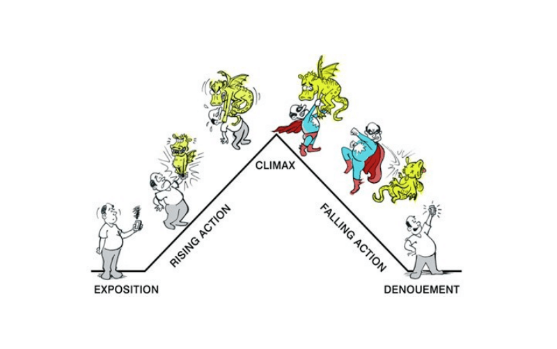
You should always strive to make a story more engaging for readers. One way to achieve this goal is by making sure that a user’s experience with your product follows a story arc. Your story should have an obvious beginning, middle, and end. When framing a story, you can use a traditional story arc, such as Gustav Freytag’s pyramid:
Don’t limit yourself to positive experiences
Ben Crothers’s drawing above visualizes a positive experience—a scenario when a user solved the problem. But UX storyboards don’t have to be limited to only happy outcomes. In fact, you can use storyboards to call attention to potential issues that users can face during their interaction with a product.
The outcome of the story should be clear for anyone who sees it: if you use a storyboard to communicate an existing problem, end with the full weight of the problem.
You might also like: How to Conduct Research That Drives A/B Testing.
3. Draw a storyboard
Once you have a finished script, you can begin drawing. When drawing, remember the following.
Don’t worry about your drawing skills
When you search for storyboards online, most of them look really nice. You might think that in order to do them properly, you have to be really good at drawing. Good news: you don’t.
If you’re a product designer with questionable drawing skills, don’t worry—your storytelling skills are more important than your art skills (especially in the early stages of product design). The worst thing you can do is to ruin a piece of paper.
Don’t put everything you have in a storyboard
Storyboards don't have to capture every single detail of user interaction. In fact, if you try to include too much information about interactions in your storyboard, you risk overloading readers with too many details, and it will probably detract from the really important elements.
When it comes to selecting details for your storyboard, you need to provide just enough detail to move forward. Always keep in mind the problem you’re solving, prioritize details, and emphasize the things that are the most important.
Bake emotion into the story
Try to communicate the emotional state of your character throughout their experience. There are two common ways of baking emotions into the story:
- You can add emoticons at each step, to give a feeling for what’s going on in the character’s head
- Or you can draw in each emotional state as a simple expression (for example, a smile on the user’s face)
Select the right fidelity for your UX storyboard
Storyboarding can take anywhere from five minutes to a full day, depending on the desired fidelity of your storyboards. But how to decide what is appropriate fidelity?
Again, there is no simple answer to this question, only general recommendations:
-
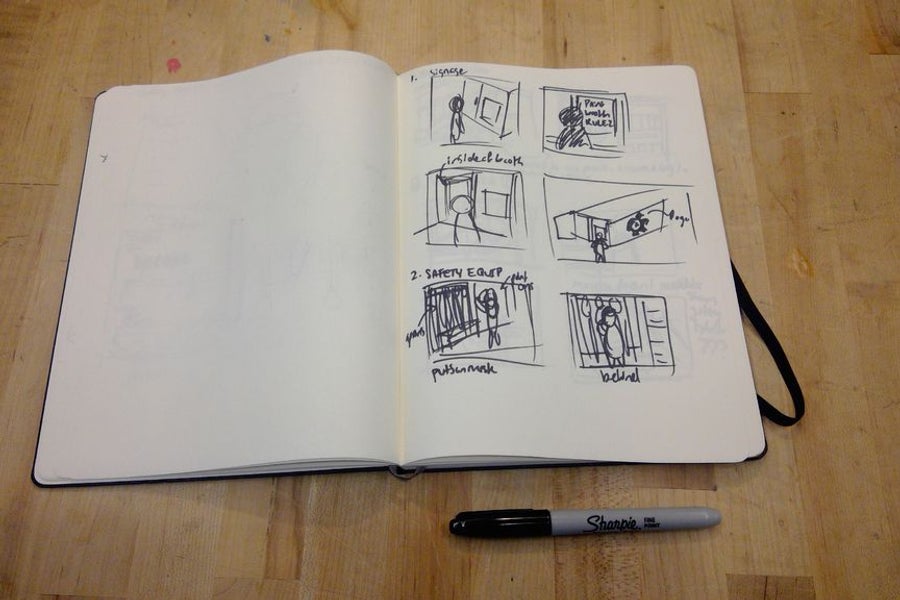
Low fidelity storyboards: These are low-quality drawings, usually on a piece of paper or a whiteboard. They typically take between five and 15 minutes. Often, such storyboards are created not for sharing with other people but for structuring your own thoughts—it’s much easier to evaluate the user experience after you visualize it.
-
Medium fidelity storyboards: Medium fidelity storyboards are crisp drawings created for design reviews with colleagues or stakeholders. The drawings must be clear enough to showcase the experience you are proposing.
- High fidelity storyboards: High fidelity storyboards are beautiful drawings, usually done in digital mediums created for important presentations (for stakeholders, clients, or external audiences). They are typically built off of low or medium fidelity storyboards and may be accompanied by a brief text description.
User color to emphasize elements
Storyboards are primarily black and white drawings, and a splash of color can be used to highlight important elements. For example, color can be used to indicate the same character in multiple frames or direct the eye towards important part on the scene.
Don’t go overboard with colors. Each new color you introduce to your storyboard will reduce the power of existing colors.
Add a caption to each frame
A brief description of the frame will help readers understand what’s happening. Try to provide a clear one-sentence description for every frame in your UX storyboard. Use as few words as possible.
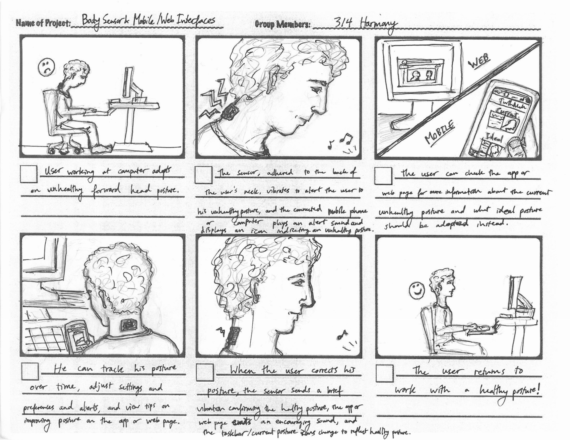
Every great product starts with a compelling story
Dieter Rams once said, “You cannot understand good design if you do not understand people; design is made for people.”
Storyboards help you put a human face on research findings. The product team can use them as a north star—well-designed storyboards will guide them towards the excellent user experience.
Read more
Have you worked with storyboards? Share your experiences in the comments below.

